标签:
版权声明:本文为博主原创文章,只可用于学习使用。
首先导入ECharts包
<script src="resources/admin/js/echarts.js"></script>
然后创建DIV标签,用于存放图表
<div id="numTu" style="width:1650px;height:400px"></div>
接下来就直接贴代码了,里面都有注释
<script>
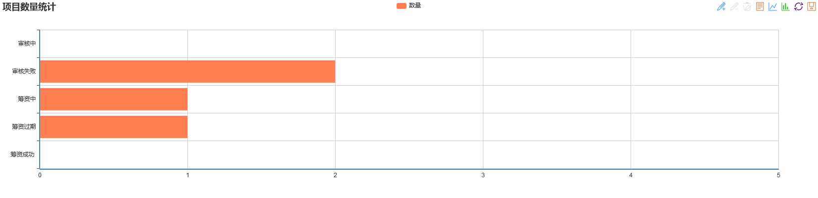
//echart配置文件,指向js路径 require.config({ paths : { echarts : ‘resources/admin/js‘ } }); //引入图表插件 require([ ‘echarts‘, ‘echarts/chart/bar‘, ‘echarts/chart/line‘, ‘echarts/chart/pie‘ ], function (ec) { var myChart = ec.init(document.getElementById(‘numTu‘));var option = { //设置标题 title: { text: ‘项目数量统计‘, subtext: ‘‘ }, tooltip: { trigger: ‘axis‘, axisPointer: { type: ‘shadow‘ } }, //设置图例 legend: { data: [‘数量‘] }, //添加工具栏 toolbox : { show : true, feature : { mark : {show : true}, dataView : {show : true,readOnly : false}, magicType : {show : true,type : [ ‘line‘, ‘bar‘ ]}, restore : {show : true}, saveAsImage : {show : true} } }, grid: { left: ‘3%‘, right: ‘4%‘, bottom: ‘3%‘, containLabel: true }, //设置坐标轴 xAxis: { type: ‘value‘ }, yAxis: { type: ‘category‘, data: [‘筹资成功 ‘,‘筹资过期‘,‘筹资中‘,‘审核失败‘,‘审核中‘] }, series: [ { name: ‘数量‘, type: ‘bar‘, data: [a1, b1, c1, d1, e1]//添加数据 } ] }; //将图表显示在div中 myChart.setOption(option);
</script>
效果图预览
另一种形式的柱状图
<script>
var echarts;
//echart配置文件,指向js路径
require.config({
paths : {
echarts : ‘resources/admin/js‘
}
});
//引入图表插件
require([ ‘echarts‘,
‘echarts/chart/bar‘,
‘echarts/chart/line‘,
‘echarts/chart/pie‘ ],
function (ec) {
var myChart = ec.init(document.getElementById(‘chartdiv1‘));
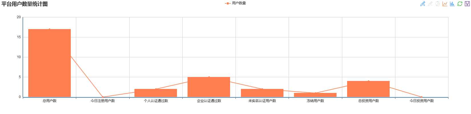
var option = {
//设置标题
title:{
text:‘平台用户数量统计图‘,
subtext:‘‘
},
//设置提示
tooltip: {
show: true
},
//工具栏
toolbox: {
show : true,
feature: {
mark : {show : true},
magicType : {show : true,type : [ ‘line‘, ‘bar‘ ]},
restore : {show : true},
saveAsImage : {show : true}
}
},
//设置图例
legend: {
data:[‘用户数量‘]
},
//设置坐标轴
xAxis : [
{
type : ‘category‘,
data : [‘总用户数‘,‘今日注册用户数‘,‘个人认证通过数‘,‘企业认证通过数‘,
‘未实名认证用户数‘,‘冻结用户数‘,‘总投资用户数‘,‘今日投资用户数‘]
}
],
yAxis : [
{
type : ‘value‘
}
],
//设置数据
series : [
//条形图
{
"name":"用户数量",
"type":"bar",
"data":[a,b,c,d,e,f,g,h]
},
//折线图
{
"name":"用户数量",
"type":"line",
"data":[a,b,c,d,e,f,g,h]
}
]
};
myChart.setOption(option);
});
</script>
效果图预览
ECharts学习文档:http://echarts.baidu.com/examples.html
标签:
原文地址:http://www.cnblogs.com/xzp0222/p/5514758.html