标签:
<!DOCTYPE html>
<html>
<head>
<title></title>
<meta charset="utf-8">
<style type="text/css">
body{
perspective: 1000px;
}
.one{
position: relative;
width: 200px;
margin:150px auto;
transform-style: preserve-3d;
transform: rotateX(-45deg) rotateY(45deg);
/*animation: ranwanqiang 3s infinite;*/
}
.one>div{
position: absolute;
width: 200px;
height:200px;
/*background:rgba(0,0,0,0.4);*/
border:1px solid #999;
/*opacity: 0.1px;*/
color:white;
font-size: 120px;
text-align: center;
line-height: 200px;
}
.front{
transform:translateZ(100px);
}
.top {
transform: rotateX(90deg) translateZ(100px);
}
.right {
transform: rotateY(90deg) translateZ(100px);
}
.left {
transform: rotateY(-90deg) translateZ(100px);
}
.bottom {
transform: rotateX(-90deg) translateZ(100px);
}
.back {
transform: rotateY(-180deg) translateZ(100px);
}
/*@keyframes ranwanqiang{
to{transform: rotateX(90deg);}
}*/
</style>
</head>
<body>
<div class="one">
<div class="front">1</div>
<div class="back">2</div>
<div class="right">3</div>
<div class="left">4</div>
<div class="top">5</div>
<div class="bottom">6</div>
</div>
</body>
</html>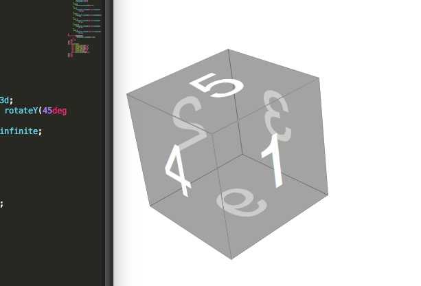
标签:
原文地址:http://www.cnblogs.com/ran849340618/p/5663522.html