标签:
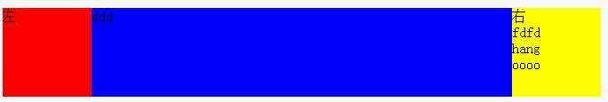
1.左右固定,中间自适应
代码:
<!DOCTYPE html>
<html>
<head>
  <meta charset="utf-8">
  <title></title>
  <style>
    .test{
      position:relative;
      height:100px;
    }
    .left,.right,.center{
      position:absolute;
      top:0;bottom:0;
    }
    .left{
      background:red;
     width:100px;
      left:0;
    }
    .center{
      left:100px;
      right:100px;
      background:blue;
    }
    .right{
      right:0;
      width:100px;
      background:yellow;
    }
  </style>
</head>
<body>
<div class="test">
   <div class="left">左</div>
  <div class="center">ddd</div>
   <div class="right">右<br>fdfd <br>hang <br>oooo</div>
</div>
</body>
</html>
效果:
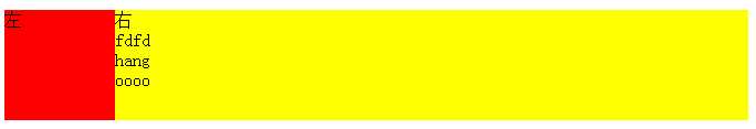
2.左侧固定,右侧自适应
<!DOCTYPE html>
<html>
<head>
  <meta charset="utf-8">
  <title></title>
  <style>
    .test{
     position:relative;
     height:100px;
    }
    .left,.right{
      position:absolute;
      top:0;bottom:0;
    }
    .left{
      background:red;
      width:100px;
    }
    .right{
      left:100px;
      right:0;
      background:yellow;
    }
  </style>
</head>
<body>
<div class="test">
   <div class="left">左</div>
   <div class="right">右<br>fdfd <br>hang <br>oooo</div>
</div>
</body>
</html>
效果:
总结:有固定,有自适应,用定位来布局,固定的写固定宽度,不固定的分别设置left值和right值;
left:0;right:0,可以让容器和父容器一样宽,top:0;bottom:0;可以让元素和父元素一样高。
标签:
原文地址:http://www.cnblogs.com/lichaoqing/p/5674318.html