标签:
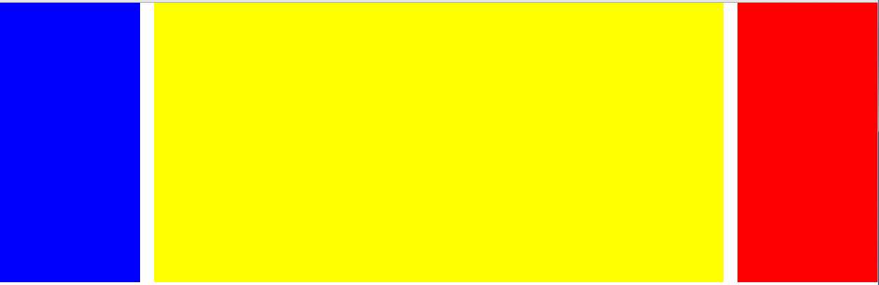
如上图所示对页面进行布局
左右两部分是固定宽度的,中间黄色的区域可以随页面宽度的不同而调整,且与两边div有个间距。
方法一:浮动
<!DOCTYPE html>
<html>
<head lang="en">
    <meta charset="UTF-8">
    <title></title>
    <style>
        body,div{
            margin:0;padding:0;
        }
        .box1{
            float:left;
            width:200px;
            height:400px;
            background:blue;
        }
        .box3{
            height:400px;
            background:yellow;
            margin:0 220px;/*margin值是让3个div之间有个20px的间距*/
        }
        .box2{
            float:right;
            width:200px;
            height:400px;
            background:red;
        }
    </style>
</head>
<body>
<div class="box1"></div>
<div class="box2"></div>
<div class="box3"></div>
</body>
</html>
元素只能影响后面的浮动元素的位置,对前面的没有影响,所以box1、box2左右浮动后位置就固定了,然后加入的box3因为有高度,所以宽度会自适应。
方法二:中间定位
<!DOCTYPE html>
<html>
<head lang="en">
    <meta charset="UTF-8">
    <title></title>
    <style>
        body,div{
            margin:0;padding:0;
        }
        .box1{
            float:left;
            width:200px;
            height:400px;
            background:blue;
        }
        .box2{
            float:right;
            width:200px;
            height:400px;
            background:red;
        }
        .box3{
            height:400px;
            background:yellow;
            position:absolute;
            left:220px;
            right:200px;
        }
    </style>
</head>
<body>
<div class="box1"></div>
<div class="box2"></div>
<div class="box3"></div>
</body>
</html>
附:元素居中的方法:{position:absolute;left:0;right:0;top:0;bottom:0;margin:auto;}
方法三:两边定位
<!DOCTYPE html>
<html>
<head lang="en">
    <meta charset="UTF-8">
    <title></title>
    <style>
        body,div{
            margin:0;padding:0;
        }
        .box1{
            position:absolute;
            left:0;
            top:0;
            width:200px;
            height:400px;
            background:blue;
        }
        .box2{
            position:absolute;
            right:0;
            top:0;
            width:200px;
            height:400px;
            background:red;
        }
        .box3{
            height:400px;
            background:yellow;
            margin:0 220px;
        }
    </style>
</head>
<body>
<div class="box1"></div>
<div class="box2"></div>
<div class="box3"></div>
</body>
</html>
方法四:弹性盒模型
<!DOCTYPE html>
<html>
<head lang="en">
    <meta charset="UTF-8">
    <title></title>
    <style>
        body,div{
            margin:0;padding:0;
        }
        body{
            width:100vw;
            display:flex;/*弹性盒*/
            flex-flow:row nowrap;/*主轴方向 子元素横向排列*/
            justify-content: space-between;/*主轴上的对齐方式*/
        }
        .box1{
            width:200px;
            height:400px;
            background:blue;
        }
        .box2{
            width:200px;
            height:400px;
            background:red;
        }
        .box3{
            flex-grow:1;/*设置元素的扩展比率*/
            height:400px;
            background:yellow;
            margin:0 20px;
        }
    </style>
</head>
<body>
<div class="box1"></div>
<div class="box3"></div>
<div class="box2"></div>
</body>
</html>
标签:
原文地址:http://www.cnblogs.com/GaiaBing/p/5747485.html