标签:
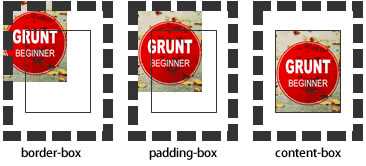
设置元素背景图片的原始起始位置。必须保证背景是background-repeat为no-repeat此属性才会生效。
background-origin :border-box | padding-box | content-box;
padding-box:从padding区域(含padding)开始显示背景图像。
border-box:从border区域(含border)开始显示背景图像。
content-box:从content区域开始显示背景图像。
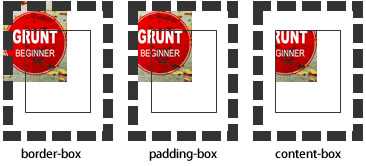
background-clip
设定背景图像向外裁剪的区域。
background-clip : border-box | padding-box | content-box | text
background-size
设置背景图片的大小,以长度值或百分比显示,还可以通过cover和contain来对图片进行伸缩。
background
例如:
background:url(test1.jpg) no-repeat scroll 10px 20px/50px 60px padding-box,
       url(test1.jpg) no-repeat scroll 10px 20px/70px 90px padding-box,
       url(test1.jpg) no-repeat scroll 10px 20px/110px 130px padding-box #aaa;
简写格式如下:
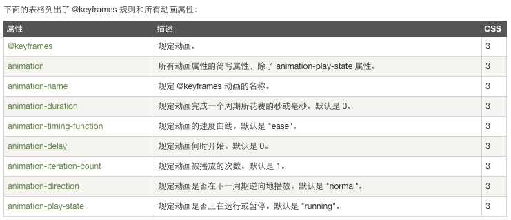
当在 @keyframes 创建动画,把它绑定到一个选择器,否则动画不会有任何效果。
指定至少这两个CSS3的动画属性绑定向一个选择器:
 1 <!DOCTYPE html>
 2 <html>
 3 <head>
 4 <meta charset="utf-8">
 5 <title>菜鸟教程(runoob.com)</title>
 6 <style>
 7 div
 8 {
 9     width:100px;
10     height:100px;
11     background:red;
12     position:relative;
13     animation:myfirst 5s linear 2s infinite alternate;
14     /* Firefox: */
15     -moz-animation:myfirst 5s linear 2s infinite alternate;
16     /* Safari and Chrome: */
17     -webkit-animation:myfirst 5s linear 2s infinite alternate;
18     /* Opera: */
19     -o-animation:myfirst 5s linear 2s infinite alternate;
20 }
21
22 @keyframes myfirst
23 {
24     0%   {background:red; left:0px; top:0px;}
25     25%  {background:yellow; left:200px; top:0px;}
26     50%  {background:blue; left:200px; top:200px;}
27     75%  {background:green; left:0px; top:200px;}
28     100% {background:red; left:0px; top:0px;}
29 }
30
31 @-moz-keyframes myfirst /* Firefox */
32 {
33     0%   {background:red; left:0px; top:0px;}
34     25%  {background:yellow; left:200px; top:0px;}
35     50%  {background:blue; left:200px; top:200px;}
36     75%  {background:green; left:0px; top:200px;}
37     100% {background:red; left:0px; top:0px;}
38 }
39
40 @-webkit-keyframes myfirst /* Safari and Chrome */
41 {
42     0%   {background:red; left:0px; top:0px;}
43     25%  {background:yellow; left:200px; top:0px;}
44     50%  {background:blue; left:200px; top:200px;}
45     75%  {background:green; left:0px; top:200px;}
46     100% {background:red; left:0px; top:0px;}
47 }
48
49 @-o-keyframes myfirst /* Opera */
50 {
51     0%   {background:red; left:0px; top:0px;}
52     25%  {background:yellow; left:200px; top:0px;}
53     50%  {background:blue; left:200px; top:200px;}
54     75%  {background:green; left:0px; top:200px;}
55     100% {background:red; left:0px; top:0px;}
56 }
57 </style>
58 </head>
59 <body>
60
61 <p><b>注意:</b> 该实例在 Internet Explorer 9 及更早 IE 版本是无效的。</p>
62
63 <div></div>
64
65 </body>
66 </html>
transform

#8.12.16总结#background transition、animation、transform
标签:
原文地址:http://www.cnblogs.com/churjan/p/5769362.html