标签:example 响应式 学习 排列 initial 页面布局 present break 绘制
一、关于引入bootstrap文件
<!-- 为了确保适当的绘制和触屏缩放,需要在 <head> 之中添加 viewport 元数据标签。 -->
<meta name="viewport" content="width=device-width, initial-scale=1.0">
<!-- 新 Bootstrap 核心 CSS 文件 -->
<link rel="stylesheet" href="http://cdn.bootcss.com/bootstrap/3.3.0/css/bootstrap.min.css">
<!-- 可选的Bootstrap主题文件(一般不用引入) -->
<link rel="stylesheet" href="http://cdn.bootcss.com/bootstrap/3.3.0/css/bootstrap-theme.min.css">
<!-- jQuery文件。务必在bootstrap.min.js 之前引入 -->
<script src="http://cdn.bootcss.com/jquery/1.11.1/jquery.min.js"></script>
<!-- 最新的 Bootstrap 核心 JavaScript 文件 -->
<script src="http://cdn.bootcss.com/bootstrap/3.3.0/js/bootstrap.min.js"></script>
二、布局容器
Bootstrap 需要为页面内容和栅格系统包裹一个 .container 容器:
1、.container 类用于固定宽度并支持响应式布局的容器。
2、.container-fluid 类用于 100% 宽度,占据全部视口(viewport)的容器。
三、栅格系统
栅格系统用于通过一系列的行(row)与列(column)的组合来创建页面布局,你的内容就可以放入这些创建好的布局中。下面就介绍一下 Bootstrap 栅格系统的工作原理:
.container (固定宽度)或 .container-fluid (100% 宽度)中,以便为其赋予合适的排列(aligment)和内补(padding)。.row 和 .col-xs-4 这种预定义的类,可以用来快速创建栅格布局。Bootstrap 源码中定义的 mixin 也可以用来创建语义化的布局。padding 属性,从而创建列与列之间的间隔(gutter)。通过为 .row 元素设置负值margin 从而抵消掉为 .container 元素设置的 padding,也就间接为“行(row)”所包含的“列(column)”抵消掉了padding。.col-xs-4..col-md- class to an element will not only affect its styling on medium devices but also on large devices if a .col-lg- class is not present.四、栅格参数
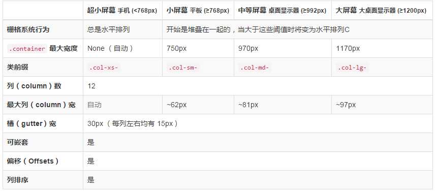
1、列偏移:使用 .col-md-offset-* 类可以将列向右侧偏移。这些类实际是通过使用 * 选择器为当前元素增加了左侧的边距(margin)。例如,.col-md-offset-4 类将 .col-md-4 元素向右侧偏移了4个列(column)的宽度。
2、优先级
当屏幕宽度u≥1200px时,bootstrap会自动选用col-lg-*这个class;
当屏幕宽度u≥992px时,bootstrap会自动选用col-sm-*这个class;
当屏幕宽度u≥768px时,bootstrap会自动选用col-md-*这个class;
当屏幕宽度u<768px时,bootstrap会自动选用col-lg-*这个class;
3、嵌套列:为了使用内置的栅格系统将内容再次嵌套,可以通过添加一个新的 .row 元素和一系列 .col-sm-* 元素到已经存在的.col-sm-* 元素内。被嵌套的行(row)所包含的列(column)的个数不能超过12(其实,没有要求你必须占满12列)。
4、列排序:通过使用 .col-md-push-* 和 .col-md-pull-* 类就可以很容易的改变列(column)的顺序。
Bootstrap《第一篇》,关于container、jumbotron、row、col、text-center等的学习
标签:example 响应式 学习 排列 initial 页面布局 present break 绘制
原文地址:http://www.cnblogs.com/onPemako/p/6115138.html