标签:ott 旋转 abs color div order height before 技术分享
大都知道border属性有四个参数,那么border-radius必然也是有四个参数
我们知道border属性的四个参数分别是border-top,border-right,border-bottom,border-left.(按顺时针方向)
那么border-radius四个参数是什么了?
border-radius:上左,上右,下右,下左;
下面我们利用border-radius绘制一些大家平时常见的图片。
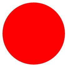
1.简单的圆形
<!DOCTYPE html>
<html>
    <head>
        <meta charset="utf-8">
        <title></title>
        <style type="text/css">
            #div{
                width: 200px;
                height: 200px;
                background: red;
                border-radius: 50%;
            }
        </style>
    </head>
    <body>
        <div id="div">

        </div>
    </body>
</html>
效果图
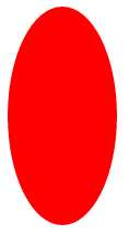
2.椭圆
<!DOCTYPE html>
<html>
    <head>
        <meta charset="utf-8">
        <title></title>
        <style type="text/css">
            #div{
                width: 100px;
                height: 200px;
                background: red;
                border-radius: 50%;
            }
        </style>
    </head>
    <body>
        <div id="div">

        </div>
    </body>
</html>
效果图
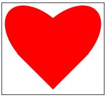
3.心型
<!DOCTYPE html>
<html>
    <head>
        <meta charset="utf-8">
        <title></title>
        <style type="text/css">
            #div{
                position: relative;
                width: 200px;
                height: 180px;
                border: 1px solid black;
            }
            .left{
                position: absolute;
                top: 0;
                left: 100px;
                width: 100px;
                height: 170px;
                background: red;
                /*左下角为旋转基点*/
                transform-origin: 0 100%;
                transform: rotate(-45deg);
                border-radius: 50% 50% 0 0;
                /*让left的上左和上右变成圆形就可以*/
            }
            .right{
                position: absolute;
                top: 0;
                left: 0px;
                width: 100px;
                height: 170px;
                background: red;
                /*右下角为旋转基点*/
                transform-origin: 100% 100%;
                transform: rotate(45deg);
                border-radius: 50% 50% 0 0;
                /*让right的上左和上右变成圆形就可以*/
            }
        </style>
    </head>
    <body>
        <div id="div">
            <div class="left"></div>
            <div class="right"></div>
        </div>
    </body>
</html>
效果图
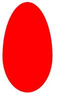
4.鸡蛋
我们听说达芬奇画鸡蛋,我在这里用css画鸡蛋
<!DOCTYPE html>
<html>
    <head>
        <meta charset="utf-8">
        <title></title>
        <style type="text/css">
            #div{
                position: relative;
                width: 100px;
                height: 180px;
                background: red;
                border-radius: 50% 50% 50% 50%/60% 60% 40% 40%;
                /*border-radius参数在/左右的区别,/左边是四个圆角的水平半径/右边是四个圆角垂直半径*/
            }

        </style>
    </head>
    <body>
        <div id="div">
        </div>
    </body>
</html>
效果图
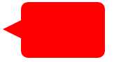
5.对话框
<!DOCTYPE html>
<html>
    <head>
        <meta charset="utf-8">
        <title></title>
        <style type="text/css">
            #div {
                width: 120px;
                height: 80px;
                background: red;
                position: relative;
                border-radius: 10px;
                margin-left: 50px;
                }
                #div:before {
                content:"";
                position: absolute;
                right: 100%;
                top: 26px;
                width: 0;
                height: 0;
                border-top: 13px solid transparent;
                border-right: 26px solid red;
                border-bottom: 13px solid transparent;
                }
        </style>
    </head>
    <body>
        <div id="div">
        </div>
    </body>
</html>
效果图
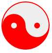
6.阴阳八卦
<!DOCTYPE html>
<html>
    <head>
        <meta charset="utf-8">
        <title></title>
        <style type="text/css">
            #baGua {
                width: 96px;
                height: 48px;
                background: #eee;
                border-color: red;
                border-style: solid;
                border-width: 2px 2px 50px 2px;
                border-radius: 100%;
                position: relative;
            }
            #baGua:before {
                content: "";
                position: absolute;
                top: 50%;
                left: 0;
                background: #eee;
                border: 18px solid red;
                border-radius: 50%;
                width: 12px;
                height: 12px;
            }
            #baGua:after {
                content: "";
                position: absolute;
                top: 50%;
                left: 50%;
                background: red;
                border: 18px solid #eee;
                border-radius:100%;
                width: 12px;
                height: 12px;
            }
        </style>
    </head>
    <body>
        <div id="baGua">
        </div>
    </body>
</html>
效果图
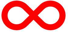
7.无穷符号
<!DOCTYPE html>
<html>
    <head>
        <meta charset="utf-8">
        <title></title>
        <style type="text/css">
            #wuQ{
                position: relative;
                width: 212px;
                height: 100px;
                }
            #wuQ:before{
                content: "";
                position: absolute;
                top: 0;
                left: 0;
                width: 60px;
                height: 60px;
                border: 20px solid red;
                border-radius: 50px 50px 0 50px;
                /*下右不变圆弧*/
                transform: rotate(-45deg);
                }
            #wuQ:after{
                content: "";
                position: absolute;
                top: 0;
                right: 0;
                width: 60px;
                height: 60px;
                border: 20px solid red;
                border-radius: 50px 50px 50px 0;
                /*下左不变圆弧*/
                transform: rotate(45deg);
                }
        </style>
    </head>
    <body>
        <div id="wuQ">
        </div>
    </body>
</html>
效果图
标签:ott 旋转 abs color div order height before 技术分享
原文地址:http://www.cnblogs.com/duanduanyie/p/6308901.html