标签:lan rgb aof rom use mobile pixel sso bug
移动端布局:
rem方案:页面中的任何元素都采用rem布局,包括字体。
 1 <!DOCTYPE html>
 2 <html lang="zh-CN">
 3
 4     <head>
 5         <meta charset="UTF-8">
 6         <meta http-equiv="X-UA-Compatible" content="IE=edge,chrome=1">
 7         <meta name="viewport" content="width=device-width,initial-scale=1,minimum-scale=1,maximum-scale=1,user-scalable=no" />
 8         <style type="text/css">
 9             * {
10                 margin: 0;
11                 padding: 0;
12             }
13
14             body {
15                 width: 7.5rem;
16                 font-size: 32px;
17                 font-size: .32rem;
18                 max-width: 1080px;
19                 margin: 0 auto;
20                 background: #f6f6f6;
21                 font-family: ‘STHeiti‘, ‘Microsoft YaHei‘, Helvetica, Arial, sans-serif;
22                 -webkit-tap-highlight-color: rgba(0, 0, 0, 0);
23             }
24         </style>
25     </head>
26
27     <body>
28         <script type="text/javascript">
29             var Dpr = 1,
30                 uAgent = window.navigator.userAgent;
31             var isIOS = uAgent.match(/iphone/i);
32             var isYIXIN = uAgent.match(/yixin/i);
33             var is2345 = uAgent.match(/Mb2345/i);
34             var ishaosou = uAgent.match(/mso_app/i);
35             var isSogou = uAgent.match(/sogoumobilebrowser/ig);
36             var isLiebao = uAgent.match(/liebaofast/i);
37             var isGnbr = uAgent.match(/GNBR/i);
38
39             function resizeRoot() {
40                 var wWidth = (screen.width > 0) ? (window.innerWidth >= screen.width || window.innerWidth == 0) ? screen.width :
41                     window.innerWidth : window.innerWidth,
42                     wDpr, wFsize;
43                 var wHeight = (screen.height > 0) ? (window.innerHeight >= screen.height || window.innerHeight == 0) ?
44                     screen.height : window.innerHeight : window.innerHeight;
45                 if(window.devicePixelRatio) {
46                     wDpr = window.devicePixelRatio;
47                 } else {
48                     wDpr = isIOS ? wWidth > 818 ? 3 : wWidth > 480 ? 2 : 1 : 1;
49                 }
50                 if(isIOS) {
51                     wWidth = screen.width;
52                     wHeight = screen.height;
53                 }
54                 if(wWidth > wHeight) {
55                     wWidth = wHeight;
56                 }
57                 wFsize = wWidth > 1080 ? 144 : wWidth / 7.5;
58                 wFsize = wFsize > 32 ? wFsize : 32;
59                 window.screenWidth_ = wWidth;
60                 if(isYIXIN || is2345 || ishaosou || isSogou || isLiebao || isGnbr) { //YIXIN 和 2345 这里有个刚调用系统浏览器时候的bug,需要一点延迟来获取
61                     setTimeout(function() {
62                         wWidth = (screen.width > 0) ? (window.innerWidth >= screen.width || window.innerWidth == 0) ?
63                             screen.width : window.innerWidth : window.innerWidth;
64                         wHeight = (screen.height > 0) ? (window.innerHeight >= screen.height || window.innerHeight ==
65                             0) ? screen.height : window.innerHeight : window.innerHeight;
66                         wFsize = wWidth > 1080 ? 144 : wWidth / 7.5;
67                         wFsize = wFsize > 32 ? wFsize : 32;
68                         document.getElementsByTagName(‘html‘)[0].style.fontSize = wFsize + ‘px‘;
69                         document.getElementById("fixed").style.display = "none";
70                     }, 500);
71                 } else {
72                     document.getElementsByTagName(‘html‘)[0].style.fontSize = wFsize + ‘px‘;
73                     document.getElementById("fixed").style.display = "none";
74                 }
75             }
76             resizeRoot();
77         </script>
78     </body>
79
80 </html>
html的font-size大小是根据移动设备自动计算的。
设计师完成的设计稿宽度为:750px,此时html跟节点的大小是50px,其他元素根据这个基准值设置rem大小。
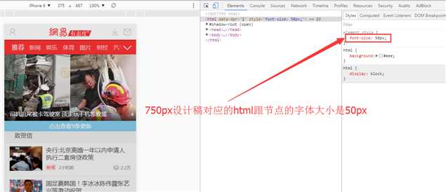
html设置基准字体大小的测试地址为:http://3g.163.com/touch/all?dataversion=B&version=v_standard
页面上html的font-size不是预先通过媒介查询在css里定义好的,而是通过js计算出来的,如上述代码中的js代码部分就是计算html的font-size的大小。
标签:lan rgb aof rom use mobile pixel sso bug
原文地址:http://www.cnblogs.com/mengfangui/p/6610773.html