标签:选择器 box outside target selectors 单选按钮 设置 触摸 strong
iCheck
特色:
1、在不同浏览器(包括ie6+)和设备上都有相同的表现 — 包括 桌面和移动设备
2、支持触摸设备 — iOS、Android、BlackBerry、Windows Phone等系统
4、方便定制 — 用HTML 和 CSS 即可为其设置样式 (多套皮肤)
5、体积小巧 — gzip压缩后只有1 kb
6、25 种参数 用来定制复选框(checkbox)和单选按钮(radio button)
7、8 个回调事件 用来监听输入框的状态
8、7个方法 用来通过编程方式控制输入框的状态
9、能够将输入框的状态变化同步回原始输入框中, 支持所有选择器
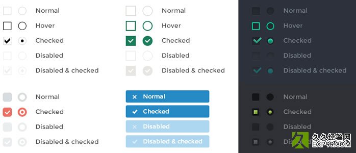
iCheck插件表单美化效果图
iCheck使用方法:
- $(‘input‘).iCheck(‘check‘);
- $(‘input‘).iCheck(‘uncheck‘);
- $(‘input‘).iCheck(‘toggle‘);
- $(‘input‘).iCheck(‘disable‘);
- $(‘input‘).iCheck(‘enable‘);
- $(‘input‘).iCheck(‘update‘);
- $(‘input‘).iCheck(‘destroy‘);
调用iCheck时,只需要将修改了默认值的参数列出来即可:
- $(‘input‘).iCheck({
- labelHover : false,
- cursor : true,
- checkboxClass : ‘icheckbox_square-blue‘,
- radioClass : ‘iradio_square-blue‘,
- increaseArea : ‘20%‘
- });
下面是参数列表及其默认值:
- {
- handle: ‘‘,
- checkboxClass: ‘icheckbox‘,
- radioClass: ‘iradio‘,
- checkedClass: ‘checked‘,
- checkedCheckboxClass: ‘‘,
- checkedRadioClass: ‘‘,
- uncheckedClass: ‘‘,
- uncheckedCheckboxClass: ‘‘,
- uncheckedRadioClass: ‘‘,
- disabledClass: ‘disabled‘,
- disabledCheckboxClass: ‘‘,
- disabledRadioClass: ‘‘,
- enabledClass: ‘‘,
- enabledCheckboxClass: ‘‘,
- enabledRadioClass: ‘‘,
- hoverClass: ‘hover‘,
- focusClass: ‘focus‘,
- activeClass: ‘active‘,
- labelHover: true,
- labelHoverClass: ‘hover‘,
- increaseArea: ‘‘,
- cursor: false,
- inheritClass: false,
- inheritID: false,
- insert: ‘‘
- }
我们可以对上面列出的任何class重置样式。借助iCheck自定义图标后的效果:
iCheck皮肤
Black — minimal.css //黑色
Red — red.css //红色
Green — green.css //绿色
Blue — blue.css //蓝色
Aero — aero.css //win7中的那种玻璃效果
Grey — grey.css //银灰色
Orange — orange.css //橙色
Yellow — yellow.css //黄色
Pink — pink.css //粉红色
Purple — purple.css //紫色
(请自行下载这些皮肤包)
iCheck初始化
首先,引入jQuery库文件
其次,引入jquery.icheck.js插件文件
(如果要引入相关皮肤,则需引入:相关主题颜色.css文件)
iCheck回调事件
iCheck支持所有选择器(selectors),并且只针对复选框checkbox和单选radio按钮起作用
iCheck提供了大量回调事件,都可以用来监听change事件
| 事件名称 | 使用时机 |
|---|
| ifClicked |
用户点击了自定义的输入框或与其相关联的label |
| ifChanged |
输入框的 checked 或 disabled 状态改变了 |
| ifChecked |
输入框的状态变为 checked |
| ifUnchecked |
checked 状态被移除 |
| ifDisabled |
输入框状态变为 disabled |
| ifEnabled |
disabled 状态被移除 |
| ifCreated |
输入框被应用了iCheck样式 |
| ifDestroyed |
iCheck样式被移除 |
使用on()方法绑定事件:
- $(‘input‘).on(‘ifChecked‘, function(event){
- alert(event.type + ‘ callback‘);
- });
bootstrap iCheck中的radio和checkbox的大小可以调整吗?
- .icheckbox_square-blue, .iradio_square-blue {
- display: block;
- margin: 0;
- padding: 0;
- width: 22px;
- height: 22px;
- background: url(blue.png) no-repeat;
- border: none;
- cursor: pointer;
- }
如果要调整icheck的radio或checkbox样式,通过上面的css修改width和height,同时修改blue.png图片对应的尺寸。
iCheck插件下载 (在github上托管,如果无法下载,请从我的百度云盘里下载iCheck插件包)
ICHECK
标签:选择器 box outside target selectors 单选按钮 设置 触摸 strong
原文地址:http://www.cnblogs.com/lcf1314/p/6625291.html