标签:turn custom reference parent led 维护成本 操作 min inflate
自定义组合控件的好处:
1.提高布局文件开发效率
2.降低布局文件维护成本
3.降低布局文件和activity代码的耦合性
4.容易扩展
5.简单易用
下面实现一个自定义的组合控件 actionBar
第一步 : 创建一个xml布局文件
<merge xmlns:android="http://schemas.android.com/apk/res/android">
<Button
android:id="@+id/title_bar_left"
android:layout_width="wrap_content"
android:layout_height="wrap_content"
android:layout_alignParentLeft="true"
android:layout_centerVertical="true"
android:layout_marginLeft="5dp"
android:background="@null"
android:minHeight="45dp"
android:minWidth="45dp"
android:textSize="14sp" />
<TextView
android:id="@+id/title_bar_title"
android:layout_width="wrap_content"
android:layout_height="wrap_content"
android:layout_centerInParent="true"
android:singleLine="true"
android:textSize="17sp" />
<Button
android:id="@+id/title_bar_right"
android:layout_width="wrap_content"
android:layout_height="wrap_content"
android:layout_alignParentRight="true"
android:layout_centerVertical="true"
android:layout_marginRight="7dp"
android:background="@null"
android:minHeight="45dp"
android:minWidth="45dp"
android:textSize="14sp" />
</merge>
用merge的好处,自定义组合控件会继承RelativeLayout、LinearLayout等,如果不用merge会导致布局无形之中多加了一层,渲染布局的时候会慢。
使用merge要切记一点,在inflate添加布局的时候,不需要指定一个父布局,并添加到父布局中,如果不添加会报错。例如:
View inflate = LayoutInflater.from(context).inflate(R.layout.customactionbar, this,true);
第二步: 自定义actionBar的属性,用来控制actionBar的属性改变。 这里自定一属性就比较多了,但定义完成之后,再以后使用就会很方便。
<?xml version="1.0" encoding="utf-8"?>
<resources>
    <declare-styleable name="CustomActionBarProtivity">
        <attr name="title_background_color" format="color"/>
        <attr name="left_button_visible" format="boolean"/>
        <attr name="right_button_visible" format="boolean"/>
        <attr name="title_text" format="string"/>
        <attr name="title_text_color" format="color"/>
        <attr name="title_text_drawable" format="reference|integer"/>
        <attr name="right_button_text" format="string"/>
        <attr name="right_button_text_color" format="color"/>
        <attr name="right_button_drawable" format="reference|integer"/>
        <attr name="left_button_text" format="string"/>
        <attr name="left_button_text_color" format="color"/>
        <attr name="left_button_drawable" format="reference|integer"/>
    </declare-styleable>
</resources>
第三步:写一个继承ViewGroup的类,把merge中的布局添加到这个ViewGroup中,然后拿到对应的属性值,通过findViewById找到对应的控件,把属性给他们配置上就OK了。
public class CustomActionBar extends RelativeLayout {

    private Button leftButton;
    private Button rightButton;
    private TextView textview;

    public CustomActionBar(Context context) {
        super(context);
        init(context,null);
    }

    public CustomActionBar(Context context, AttributeSet attrs) {
        super(context, attrs);
        init(context,attrs);

    }

    public CustomActionBar(Context context, AttributeSet attrs, int defStyleAttr) {
        super(context, attrs, defStyleAttr);
        init(context,attrs);

    }

    private void init(Context context, AttributeSet attrs) {
        View inflate = LayoutInflater.from(context).inflate(R.layout.customactionbar, this,true);
        leftButton = (Button) inflate.findViewById(R.id.title_bar_left);
        rightButton = (Button) inflate.findViewById(R.id.title_bar_right);
        textview = (TextView) inflate.findViewById(R.id.title_bar_title);

        TypedArray typedArray = context.obtainStyledAttributes(attrs, R.styleable.CustomActionBarProtivity);
        if (typedArray != null){
            int actionBarBackGround = typedArray.getColor(R.styleable.CustomActionBarProtivity_title_background_color, Color.RED);
            setBackgroundColor(actionBarBackGround);
            boolean leftButtonVisible = typedArray.getBoolean(R.styleable.CustomActionBarProtivity_left_button_visible, true);
            if (leftButtonVisible){
                leftButton.setVisibility(View.VISIBLE);
            }else {
                leftButton.setVisibility(View.GONE);
            }
            boolean rightButtonVisible = typedArray.getBoolean(R.styleable.CustomActionBarProtivity_right_button_visible, true);
            if (rightButtonVisible){
                rightButton.setVisibility(View.VISIBLE);
            }else {
                rightButton.setVisibility(View.GONE);
            }
            String titleText = typedArray.getString(R.styleable.CustomActionBarProtivity_title_text);
            int titleTextColor = typedArray.getColor(R.styleable.CustomActionBarProtivity_title_text_color, Color.BLUE);
            int titleTextDrawable = typedArray.getResourceId(R.styleable.CustomActionBarProtivity_title_text_drawable, -1);
            if (titleTextDrawable != -1){
                textview.setBackgroundResource(titleTextDrawable);
            }else {
                if (!TextUtils.isEmpty(titleText)){
                    textview.setText(titleText);
                    textview.setTextColor(titleTextColor);
                }
            }
            String rightButtonText = typedArray.getString(R.styleable.CustomActionBarProtivity_right_button_text);
            int rightButtonTextColor = typedArray.getColor(R.styleable.CustomActionBarProtivity_right_button_text_color, Color.GREEN);
            int rightButtonDrawable = typedArray.getResourceId(R.styleable.CustomActionBarProtivity_right_button_drawable, -1);
            if (rightButtonDrawable != -1){
                rightButton.setBackgroundResource(rightButtonDrawable);
            }else {
                if (!TextUtils.isEmpty(rightButtonText)) {
                    rightButton.setText(rightButtonText);
                    rightButton.setTextColor(rightButtonTextColor);
                }
            }
            String leftButtonText = typedArray.getString(R.styleable.CustomActionBarProtivity_left_button_text);
            int leftButtonTextColor = typedArray.getColor(R.styleable.CustomActionBarProtivity_left_button_text_color, Color.YELLOW);
            int leftButtonDrawable = typedArray.getResourceId(R.styleable.CustomActionBarProtivity_left_button_drawable, -1);
            if (leftButtonDrawable != -1){
                leftButton.setBackgroundResource(leftButtonDrawable);
            }else {
                if (!TextUtils.isEmpty(leftButtonText)){
                    leftButton.setText(leftButtonText);
                    leftButton.setTextColor(leftButtonTextColor);
                }
            }
        }
        typedArray.recycle();
    }

    public Button getLeftButton(){
        return leftButton;
    }
    public Button getRightButton(){
        return rightButton;
    }

    public TextView getTextview(){
        return textview;
    }
}
在这要注意一步,之前也忘记了 ,自定义获取资源的对象,在使用完毕后要释放掉 typedArray.recycle();
第四步:在xml布局文件中添加自定义控件和自定义属性
<com.kallaite.rxjavademo.customcontrols.CustomActionBar
    android:layout_width="match_parent"
    android:layout_height="wrap_content"
    qiao:title_background_color="#ff0000"
    qiao:left_button_visible="true"
    qiao:right_button_visible="true"
    android:id="@+id/title1"
    qiao:title_text="标题1"
     qiao:title_text_color="#000"
     qiao:right_button_text="右按钮"
     qiao:right_button_text_color="#ff4"
     qiao:left_button_drawable="@drawable/ic_launcher"
    />
第五步:找到控件,做一些点击操作,界面设置:
LinearLayout customActionBar =  (LinearLayout) findViewById(R.id.custom_ActionBar);
CustomActionBar title1 = (CustomActionBar) customActionBar.findViewById(R.id.title1);
title1.getLeftButton().setOnClickListener(new View.OnClickListener() {
    @Override
    public void onClick(View v) {
        Log.d(TAG,"标题1左按钮点击事件");
    }
});
title1.getRightButton().setOnClickListener(new View.OnClickListener() {
    @Override
    public void onClick(View v) {
        Log.d(TAG,"标题1右按钮点击事件");
    }
});
这样就OK了,直接放到项目里就可以直接使用了,效果如图;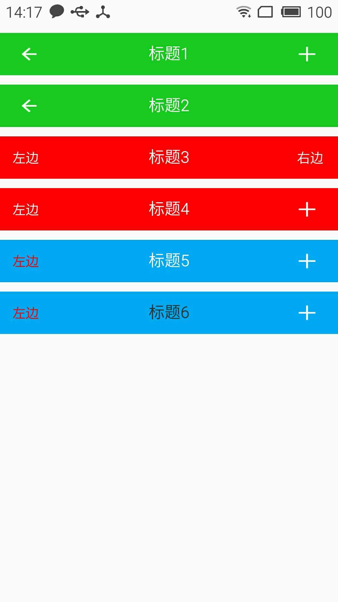
标签:turn custom reference parent led 维护成本 操作 min inflate
原文地址:http://www.cnblogs.com/wlwqnj/p/7066330.html