标签:log val com 增加 levels rar 水平线 heat 2-2
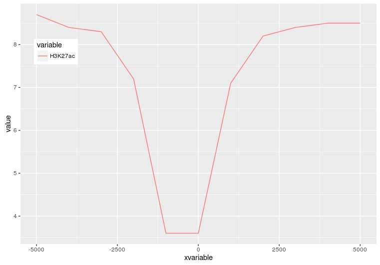
profile="Pos;H3K27ac
-5000;8.7
-4000;8.4
-3000;8.3
-2000;7.2
-1000;3.6
0;3.6
1000;7.1
2000;8.2
3000;8.4
4000;8.5
5000;8.5"
profile_text <- read.table(text=profile, header=T, row.names=1, quote="",sep=";")

# 在melt时保留位置信息
# melt格式是ggplot2画图最喜欢的格式
# 好好体会下这个格式,虽然多占用了不少空间,但是确实很方便
# 这里可以用 `xvariable`,也可以是其它字符串,但需要保证后面与这里的一致
# 因为这一列是要在X轴显示,所以起名为`xvariable`。
profile_text$xvariable = rownames(profile_text)
library(ggplot2)
library(reshape2)
data_m <- melt(profile_text, id.vars=c("xvariable"))
data_m
   xvariable variable value
1      -5000  H3K27ac   8.7
2      -4000  H3K27ac   8.4
3      -3000  H3K27ac   8.3
4      -2000  H3K27ac   7.2
5      -1000  H3K27ac   3.6
6          0  H3K27ac   3.6
7       1000  H3K27ac   7.1
8       2000  H3K27ac   8.2
9       3000  H3K27ac   8.4
10      4000  H3K27ac   8.5
11      5000  H3K27ac   8.5
# variable和value为矩阵melt后的两列的名字,内部变量, variable代表了点线的属性,value代表对应的值。
p <- ggplot(data_m, aes(x=xvariable, y=value), color=variable) + geom_line()
# 图会存储在当前目录的Rplots.pdf文件中,如果用Rstudio,可以不运行dev.off()
dev.off()
geom_path: Each group consists of only one observation.Do you need to adjust the group aesthetic?
p <- ggplot(data_m, aes(x=xvariable, y=value, color=variable, group=variable)) + geom_line() + theme(legend.position=c(0.1,0.9))
p
summary(data_m)
  xvariable      variable
 Length:11       H3K27ac:11
 Class :character
 Mode  :character
data_m$xvariable <- as.numeric(data_m$xvariable)

#再检验下
is.numeric(data_m$xvariable)
[1] TRUE
# 注意断行时,加号在行尾,不能放在行首
p <- ggplot(data_m, aes(x=xvariable, y=value,color=variable,group=variable)) +
     geom_line() + theme(legend.position=c(0.1,0.8))
p
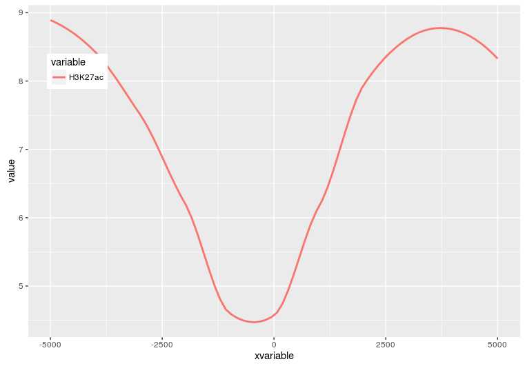
p <- ggplot(data_m, aes(x=xvariable, y=value,color=variable,group=variable)) +
     geom_line() + stat_smooth(method="auto", se=FALSE) +
     theme(legend.position=c(0.1,0.8))
p
p <- ggplot(data_m, aes(x=xvariable, y=value,color=variable,group=variable)) +
     stat_smooth(method="auto", se=FALSE) + theme(legend.position=c(0.1,0.8))
p
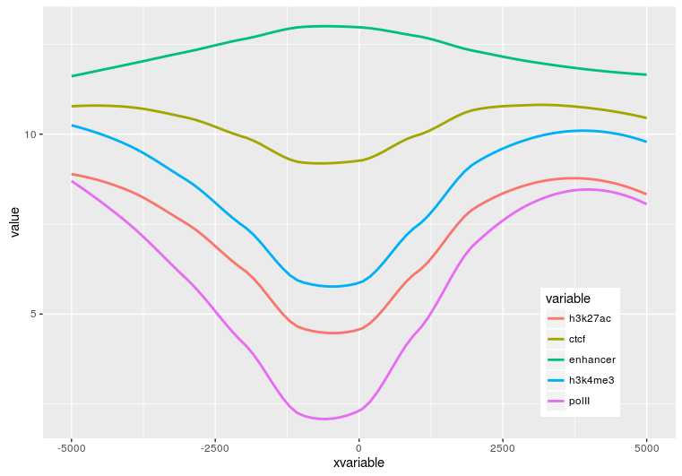
profile = "Pos;h3k27ac;ctcf;enhancer;h3k4me3;polII
-5000;8.7;10.7;11.7;10;8.3
-4000;8.4;10.8;11.8;9.8;7.8
-3000;8.3;10.5;12.2;9.4;7
-2000;7.2;10.9;12.7;8.4;4.8
-1000;3.6;8.5;12.8;4.8;1.3
0;3.6;8.5;13.4;5.2;1.5
1000;7.1;10.9;12.4;8.1;4.9
2000;8.2;10.7;12.4;9.5;7.7
3000;8.4;10.4;12;9.8;7.9
4000;8.5;10.6;11.7;9.7;8.2
5000;8.5;10.6;11.7;10;8.2"

profile_text <- read.table(text=profile, header=T, row.names=1, quote="",sep=";")

profile_text$xvariable = rownames(profile_text)
data_m <- melt(profile_text, id.vars=c("xvariable"))
data_m$xvariable <- as.numeric(data_m$xvariable)

# 这里group=variable,而不是group=1 (如果上面你用的是1的话)
# variable和value为矩阵melt后的两列的名字,内部变量, variable代表了点线的属性,value代表对应的值。
p <- ggplot(data_m, aes(x=xvariable, y=value,color=variable,group=variable)) + stat_smooth(method="auto", se=FALSE) + theme(legend.position=c(0.85,0.2))
p
profile = "Pos;h3k27ac;ctcf;enhancer;h3k4me3;polII
-5000;8.7;10.7;11.7;10;8.3
-4000;8.4;10.8;11.8;9.8;7.8
-3000;8.3;10.5;12.2;9.4;7
-2000;7.2;10.9;12.7;8.4;4.8
-1000;3.6;8.5;12.8;4.8;1.3
0;3.6;8.5;13.4;5.2;1.5
1000;7.1;10.9;12.4;8.1;4.9
2000;8.2;10.7;12.4;9.5;7.7
3000;8.4;10.4;12;9.8;7.9
4000;8.5;10.6;11.7;9.7;8.2
5000;8.5;10.6;11.7;10;8.2"

profile_text <- read.table(text=profile, header=T, row.names=1, quote="",sep=";")

profile_text_rownames <- row.names(profile_text)

profile_text$xvariable = rownames(profile_text)
data_m <- melt(profile_text, id.vars=c("xvariable"))

# 就是这一句,会经常用到
data_m$xvariable <- factor(data_m$xvariable, levels=profile_text_rownames, ordered=T)

# geom_line设置线的粗细和透明度
p <- ggplot(data_m, aes(x=xvariable, y=value,color=variable,group=variable)) + geom_line(size=1, alpha=0.9) + theme(legend.position=c(0.85,0.2)) + theme(axis.text.x=element_text(angle=45,hjust=1, vjust=1))

# stat_smooth
#p <- ggplot(data_m, aes(x=xvariable, y=value,color=variable,group=variable)) + stat_smooth(method="auto", se=FALSE) + theme(legend.position=c(0.85,0.2)) + theme(axis.text.x=element_text(angle=45,hjust=1, vjust=1))
p
到此完成了线图的基本绘制,虽然还可以,但还有不少需要提高的地方,比如在线图上加一条或几条垂线、加个水平线、修改X轴的标记(比如0换为TSS)、设置每条线的颜色等。
标签:log val com 增加 levels rar 水平线 heat 2-2
原文地址:http://www.cnblogs.com/freescience/p/7451166.html