标签:tran translate meta 9.png text images image har doc
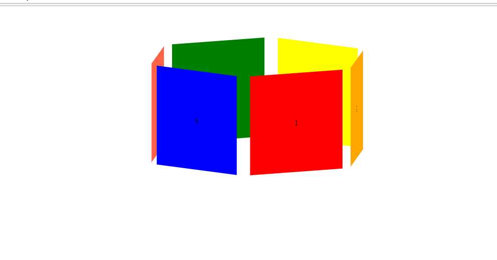
<!doctype html>
<html lang="en">
<head>
<meta charset="UTF-8">
<title>Document</title>
<style>
*{margin: 0;padding: 0;}
ul{
width: 200px;
height: 200px;
list-style: none;
margin: 100px auto;
position: relative;
transform-style: preserve-3d;
animation:xuanzhuan 6s linear infinite;
}
ul li{
width: 200px;
line-height: 200px;
text-align: center;
position: absolute;
left: 0;
top: 0;
}
ul li:nth-child(1){
background-color: red;
transform:rotateY(60deg) translateZ(200px);
}
ul li:nth-child(2){
background-color: orange;
transform:rotateY(120deg) translateZ(200px);
}
ul li:nth-child(3){
background-color: yellow;
transform:rotateY(180deg) translateZ(200px);
}
ul li:nth-child(4){
background-color: green;
transform:rotateY(240deg) translateZ(200px);
}
ul li:nth-child(5){
background-color: tomato;
transform:rotateY(300deg) translateZ(200px);
}
ul li:nth-child(6){
background-color: blue;
transform:rotateY(360deg) translateZ(200px);
}
ul:hover{
animation-play-state:paused;
}
@keyframes xuanzhuan{
from{
transform:rotateX(-10deg) rotateY(0deg);
}
to{transform:rotateX(-10deg) rotateY(360deg);
}
</style>
</head>
<body>
<ul>
<li>1</li>
<li>2</li>
<li>3</li>
<li>4</li>
<li>5</li>
<li>6</li>
</ul>
</body>
</html>
标签:tran translate meta 9.png text images image har doc
原文地址:http://www.cnblogs.com/lushj/p/7526177.html