标签:style blog http color os io ar div cti
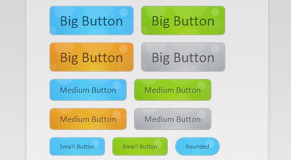
这款CSS3动画按钮非常的有创意,鼠标在滑过按钮时并不像其他按钮那样仅仅改变按钮的背景颜色,而是出现很酷的冒泡动画。这么惊艳的CSS3动画按钮,这篇文章主要将按钮实现的过程和代码分享给大家,希望能给在学习CSS3的同学带来实质性的帮助。可以下来看看在线演示效果:
接下来我们来讲解一下这款CSS3气泡动画的按钮实现过程,主要由HTML代码和CSS代码组成。
<div id="buttonContainer">

    <a href="#">Big Button</a>
    <a href="#">Big Button</a>
    <a href="#">Big Button</a>
    <a href="#">Big Button</a>

    <a href="#">Medium Button</a>
    <a href="#">Medium Button</a>
    <a href="#">Medium Button</a>
    <a href="#">Medium Button</a>

    <a href="#">Small Button</a>
    <a href="#">Small Button</a>
    <a href="#">Rounded</a>

    <a href="#">Small Button</a>
    <a href="#">Small Button</a>

    <a href="#">Rounded</a>

</div>
HTML代码相对比较简单,即用一个个a链接构造按钮,当然演示中的效果还需要CSS的大力渲染才行。
接下来的重点是CSS代码,首先我们来为每一个button渲染基础的样式,这些样式都是每一个按钮所共有的:
.button{
    font:15px Calibri, Arial, sans-serif;

    /* A semi-transparent text shadow */
    text-shadow:1px 1px 0 rgba(255,255,255,0.4);

    /* Overriding the default underline styling of the links */
    text-decoration:none !important;
    white-space:nowrap;

    display:inline-block;
    vertical-align:baseline;
    position:relative;
    cursor:pointer;
    padding:10px 20px;

    background-repeat:no-repeat;

    /* The following two rules are fallbacks, in case
       the browser does not support multiple backgrounds. */

    background-position:bottom left;
    background-image:url(‘button_bg.png‘);

    /* Multiple backgrounds version. The background images
       are defined individually in color classes */

    background-position:bottom left, top right, 0 0, 0 0;
    background-clip:border-box;

    /* Applying a default border raidus of 8px */

    -moz-border-radius:8px;
    -webkit-border-radius:8px;
    border-radius:8px;

    /* A 1px highlight inside of the button */

    -moz-box-shadow:0 0 1px #fff inset;
    -webkit-box-shadow:0 0 1px #fff inset;
    box-shadow:0 0 1px #fff inset;

    /* Animating the background positions with CSS3 */
    /* Currently works only in Safari/Chrome */

    -webkit-transition:background-position 1s;
    -moz-transition:background-position 1s;
    transition:background-position 1s;
}

.button:hover{

    /* The first rule is a fallback, in case the browser
       does not support multiple backgrounds
    */

    background-position:top left;
    background-position:top left, bottom right, 0 0, 0 0;
}

.button:active{
    /* Moving the button 1px to the bottom when clicked */
    bottom:-1px;
}
同样也定义了按钮在鼠标滑过和被激活时的样式。
最后是气泡动画特效,我们拿其中一个按钮为例,代码如下:
.blue.button{
    color:#0f4b6d !important;

    border:1px solid #84acc3 !important;

    /* A fallback background color */
    background-color: #48b5f2;

    /* Specifying a version with gradients according to */

    background-image:    url(‘button_bg.png‘), url(‘button_bg.png‘),
                        -moz-radial-gradient(    center bottom, circle,
                                                rgba(89,208,244,1) 0,rgba(89,208,244,0) 100px),
                        -moz-linear-gradient(#4fbbf7, #3faeeb);

    background-image:    url(‘button_bg.png‘), url(‘button_bg.png‘),
                        -webkit-gradient(    radial, 50% 100%, 0, 50% 100%, 100,
                                            from(rgba(89,208,244,1)), to(rgba(89,208,244,0))),
                        -webkit-gradient(linear, 0% 0%, 0% 100%, from(#4fbbf7), to(#3faeeb));
}

.blue.button:hover{
    background-color:#63c7fe;

    background-image:    url(‘button_bg.png‘), url(‘button_bg.png‘),
                        -moz-radial-gradient(    center bottom, circle,
                                                rgba(109,217,250,1) 0,rgba(109,217,250,0) 100px),
                        -moz-linear-gradient(#63c7fe, #58bef7);

    background-image:    url(‘button_bg.png‘), url(‘button_bg.png‘),
                        -webkit-gradient(    radial, 50% 100%, 0, 50% 100%, 100,
                                            from(rgba(109,217,250,1)), to(rgba(109,217,250,0))),
                        -webkit-gradient(linear, 0% 0%, 0% 100%, from(#63c7fe), to(#58bef7));
}
从代码中我们可以看出,当鼠标滑过按钮时,按钮中的气泡背景图片将实现渐变的动画效果,并加以一定的透明效果,这样便出现了气泡上升的动画特效。所有的代码就是这样,你可以下载源代码来研究。
标签:style blog http color os io ar div cti
原文地址:http://www.cnblogs.com/html5tricks/p/3962138.html