标签:des style blog http color io os ar for
最近研究了slider的一些功能。主要是修改他们的样式,换成我们想要的控件模型。进度度显示等。首先说一下slider的组成
Slider 控件允许用户选择值从值的范围。 下面的插图演示了 Slider 控件的一个示例。
slider 控件的示例

可以通过设置 Slider 控件的属性来自定义该控件。 下表描述可以自定义的 Slider 的一些属性:
Slider 的方向,水平或垂直。
沿 Slider 跟踪的刻度线位置。
显示 Slider的当前值的工具提示显示。
Thumb 的能力。对齐的滴答标记或在任意点沿 Slider。
增加价值的方向沿 Slider的。
有关如何自定义 Slider 控件的更多信息,请参见各个成员。
http://msdn.microsoft.com/zh-cn/library/system.windows.controls.slider.aspx
MSDN中的Slider 样式和模板,有兴趣的可以看看
http://msdn.microsoft.com/zh-cn/library/ms753256.aspx
下面是我自己设计的一个slider样式。上图
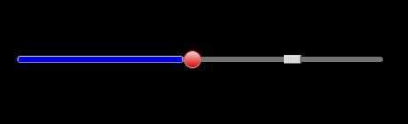
以后还可以扩展一些功能。比如像拖拽右边的小按钮!!!目前没时间搞。马上给出样式。。。。

  1 <ResourceDictionary xmlns="http://schemas.microsoft.com/winfx/2006/xaml/presentation"
  2                     xmlns:x="http://schemas.microsoft.com/winfx/2006/xaml">
  3
  4     <Color x:Key="DisabledControlDarkColor">Red</Color>
  5     <Color x:Key="ControlLightColor">White</Color>
  6     <Color x:Key="ControlMediumColor">Yellow</Color>
  7     <Color x:Key="ControlDarkColor">Orange</Color>
  8     <Color x:Key="ControlMouseOverColor">Red</Color>
  9     <Color x:Key="ControlPressedColor">Green</Color>
 10     <Color x:Key="GlyphColor">Red</Color>
 11     <!--Border colors-->
 12     <Color x:Key="BorderLightColor">Red</Color>
 13     <Color x:Key="BorderMediumColor">Black</Color>
 14     <Color x:Key="BorderDarkColor">Pink</Color>
 15     <Color x:Key="SliderTrackDarkColor">Red</Color>
 16
 17
 18     <Style x:Key="RepeatButton1" TargetType="{x:Type RepeatButton}">
 19         <Style.Setters>
 20             <Setter Property="SnapsToDevicePixels"
 21             Value="true" />
 22             <Setter Property="OverridesDefaultStyle"
 23             Value="false" />
 24             <Setter Property="IsTabStop"
 25             Value="false" />
 26             <Setter Property="Background" Value="Blue"> </Setter>
 27             <Setter Property="Height" Value="10"/>
 28             <Setter Property="BorderBrush" Value="Transparent"/>
 29             <Setter Property="BorderThickness" Value="0"></Setter>
 30             <Setter Property="Focusable" Value="False"/>
 31         </Style.Setters>
 32         <Style.Triggers>
 33             <Trigger Property="IsPressed" Value="True">
 34                 <Setter Property="Background">
 35                     <Setter.Value>
 36                         <LinearGradientBrush StartPoint="0.5,0"  EndPoint="0.5,1">
 37                             <!--<GradientStop Color="Gray" Offset="0"/>-->
 38                             <GradientStop Color="LightBlue" Offset="1"/>
 39                         </LinearGradientBrush>
 40                     </Setter.Value>
 41                 </Setter>
 42             </Trigger>
 43         </Style.Triggers>
 44     </Style>
 45
 46     <Style x:Key="abtn" TargetType="Button">
 47         <Style.Triggers>
 48             <Trigger Property="IsMouseOver" Value="true">
 49                 <Setter Property="Background" Value="Red"></Setter>
 50             </Trigger>
 51
 52         </Style.Triggers>
 53     </Style>
 54
 55     <Style x:Key="RepeatButton2"
 56          TargetType="{x:Type RepeatButton}">
 57         <Setter Property="SnapsToDevicePixels"
 58             Value="true" />
 59         <Setter Property="OverridesDefaultStyle"
 60             Value="true" />
 61         <Setter Property="IsTabStop"
 62             Value="false" />
 63         <Setter Property="Focusable"
 64             Value="false" />
 65         <Setter Property="Height" Value="10"/>
 66         <Setter Property="Background" Value="Blue"/>
 67         <Setter Property="Template">
 68             <Setter.Value>
 69                 <ControlTemplate TargetType="{x:Type RepeatButton}">
 70                     <Grid>
 71                         <Thumb Name="tumb" Width="20" Height="30"></Thumb>
 72                     </Grid>
 73                 </ControlTemplate>
 74             </Setter.Value>
 75         </Setter>
 76     </Style>
 77
 78     <Style x:Key="SliderThumbStyle"
 79          TargetType="{x:Type Thumb}">
 80         <Setter Property="SnapsToDevicePixels"
 81             Value="true" />
 82         <Setter Property="OverridesDefaultStyle"
 83             Value="true" />
 84         <Setter Property="Height"
 85             Value="20" />
 86         <Setter Property="Width"
 87             Value="20" />
 88         <Setter Property="Template">
 89             <Setter.Value>
 90                 <ControlTemplate TargetType="{x:Type Thumb}">
 91                     <Ellipse x:Name="Ellipse"
 92                    StrokeThickness="1">
 93                         <Ellipse.Stroke>
 94                             <LinearGradientBrush StartPoint="0,0"
 95                                    EndPoint="0,1">
 96                                 <LinearGradientBrush.GradientStops>
 97                                     <GradientStopCollection>
 98                                         <GradientStop Color="{DynamicResource BorderLightColor}"
 99                                   Offset="0.0" />
100                                         <GradientStop Color="{DynamicResource BorderDarkColor}"
101                                   Offset="1.0" />
102                                     </GradientStopCollection>
103                                 </LinearGradientBrush.GradientStops>
104                             </LinearGradientBrush>
105                         </Ellipse.Stroke>
106                         <Ellipse.Fill>
107                             <LinearGradientBrush EndPoint="0.5,1"
108                                    StartPoint="0.5,0">
109                                 <GradientStop Color="{DynamicResource ControlMediumColor}"
110                               Offset="1" />
111                                 <GradientStop Color="{DynamicResource ControlLightColor}" />
112                             </LinearGradientBrush>
113                         </Ellipse.Fill>
114                         <VisualStateManager.VisualStateGroups>
115                             <VisualStateGroup x:Name="CommonStates">
116                                 <VisualState x:Name="Normal" />
117                                 <VisualState x:Name="MouseOver">
118                                     <Storyboard>
119                                         <ColorAnimationUsingKeyFrames Storyboard.TargetProperty="(Shape.Fill).
120                       (GradientBrush.GradientStops)[0].(GradientStop.Color)"
121                                                   Storyboard.TargetName="Ellipse">
122                                             <EasingColorKeyFrame KeyTime="0"
123                                            Value="{StaticResource ControlMouseOverColor}" />
124                                         </ColorAnimationUsingKeyFrames>
125                                     </Storyboard>
126                                 </VisualState>
127                                 <VisualState x:Name="Pressed">
128                                     <Storyboard>
129                                         <ColorAnimationUsingKeyFrames Storyboard.TargetProperty="(Shape.Fill).
130                       (GradientBrush.GradientStops)[0].(GradientStop.Color)"
131                                                   Storyboard.TargetName="Ellipse">
132                                             <EasingColorKeyFrame KeyTime="0"
133                                            Value="{StaticResource ControlPressedColor}" />
134                                         </ColorAnimationUsingKeyFrames>
135                                     </Storyboard>
136                                 </VisualState>
137                                 <VisualState x:Name="Disabled">
138                                     <Storyboard>
139                                         <ColorAnimationUsingKeyFrames Storyboard.TargetProperty="(Shape.Fill).
140                       (GradientBrush.GradientStops)[0].(GradientStop.Color)"
141                                                   Storyboard.TargetName="Ellipse">
142                                             <EasingColorKeyFrame KeyTime="0"
143                                            Value="{StaticResource DisabledControlDarkColor}" />
144                                         </ColorAnimationUsingKeyFrames>
145                                     </Storyboard>
146                                 </VisualState>
147                             </VisualStateGroup>
148                         </VisualStateManager.VisualStateGroups>
149                     </Ellipse>
150                 </ControlTemplate>
151             </Setter.Value>
152         </Setter>
153     </Style>
154
155     <ControlTemplate x:Key="HorizontalSlider" TargetType="{x:Type Slider}">
156         <Grid>
157             <Grid.RowDefinitions>
158                 <RowDefinition Height="Auto" />
159                 <RowDefinition Height="Auto" MinHeight="{TemplateBinding MinHeight}" />
160                 <RowDefinition Height="Auto" />
161             </Grid.RowDefinitions>
162             <TickBar x:Name="TopTick"
163                SnapsToDevicePixels="True"
164                Placement="Top"
165                Height="4"
166                Visibility="Collapsed">
167                 <TickBar.Fill>
168                     <SolidColorBrush Color="{DynamicResource GlyphColor}" />
169                 </TickBar.Fill>
170             </TickBar>
171             <Border x:Name="TrackBackground"
172               Margin="0"
173               CornerRadius="3"
174               Height="6"
175               Grid.Row="1"
176               BorderThickness="0">
177                 <Border.BorderBrush>
178                     <LinearGradientBrush StartPoint="0,0" EndPoint="0,1">
179                         <LinearGradientBrush.GradientStops>
180                             <GradientStopCollection>
181                                 <GradientStop Color="Transparent" Offset="1" />
182                                 <!--<GradientStop Color="{DynamicResource BorderDarkColor}" Offset="1.0" />-->
183                             </GradientStopCollection>
184                         </LinearGradientBrush.GradientStops>
185                     </LinearGradientBrush>
186                 </Border.BorderBrush>
187                 <Border.Background>
188                     <LinearGradientBrush StartPoint="0,0" EndPoint="0,1">
189                         <LinearGradientBrush.GradientStops>
190                             <GradientStopCollection>
191                                 <!--<GradientStop Color="Gray"  Offset="0.0" />-->
192                                 <GradientStop Color="Gray" Offset="1.0" />
193                             </GradientStopCollection>
194                         </LinearGradientBrush.GradientStops>
195                     </LinearGradientBrush>
196                 </Border.Background>
197             </Border>
198             <Track Grid.Row="1"
199              x:Name="PART_Track">
200                 <Track.DecreaseRepeatButton>
201                     <RepeatButton Style="{StaticResource RepeatButton1}"
202                         Command="Slider.DecreaseLarge" />
203                 </Track.DecreaseRepeatButton>
204                 <Track.Thumb>
205                     <Thumb Style="{StaticResource SliderThumbStyle}" />
206                 </Track.Thumb>
207                 <Track.IncreaseRepeatButton>
208                     <RepeatButton Style="{StaticResource RepeatButton2}"
209                         Command="Slider.IncreaseLarge" />
210                 </Track.IncreaseRepeatButton>
211
212             </Track>
213             <TickBar x:Name="BottomTick"
214                SnapsToDevicePixels="True"
215                Grid.Row="2"
216                Fill="{TemplateBinding Foreground}"
217                Placement="Bottom"
218                Height="4"
219                Visibility="Collapsed" />
220         </Grid>
221         <ControlTemplate.Triggers>
222             <Trigger Property="TickPlacement"
223                Value="TopLeft">
224                 <Setter TargetName="TopTick"
225                 Property="Visibility"
226                 Value="Visible" />
227             </Trigger>
228             <Trigger Property="TickPlacement"
229                Value="BottomRight">
230                 <Setter TargetName="BottomTick"
231                 Property="Visibility"
232                 Value="Visible" />
233             </Trigger>
234             <Trigger Property="TickPlacement"
235                Value="Both">
236                 <Setter TargetName="TopTick"
237                 Property="Visibility"
238                 Value="Visible" />
239                 <Setter TargetName="BottomTick"
240                 Property="Visibility"
241                 Value="Visible" />
242             </Trigger>
243         </ControlTemplate.Triggers>
244     </ControlTemplate>
245
246     <Style  x:Key="progressSlider" TargetType="{x:Type Slider}">
247         <Setter Property="SnapsToDevicePixels"
248             Value="true" />
249         <Setter Property="OverridesDefaultStyle"
250             Value="true" />
251         <Setter Property="Background" Value="Transparent"></Setter>
252         <Style.Triggers>
253             <Trigger Property="Orientation"
254                Value="Horizontal">
255                 <Setter Property="MinWidth"
256                 Value="104" />
257                 <Setter Property="MinHeight"
258                 Value="21" />
259                 <Setter Property="Template"
260                 Value="{StaticResource HorizontalSlider}" />
261             </Trigger>
262         </Style.Triggers>
263     </Style>
264
265 </ResourceDictionary>
做的比较粗糙。。。有时间给大家设计一个好看的播放进度条!
感兴趣的加新浪微博一起聊哦。。。http://weibo.com/518121567
标签:des style blog http color io os ar for
原文地址:http://www.cnblogs.com/homingfly/p/3965542.html
