标签:res ash size osi relative html 代码 after value
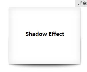
代码如下:
<!DOCTYPE html>
<html>
<head>
<meta charset=utf-8 />
<title>before、after</title>
<style>
.box h3{
text-align:center;
position:relative;
top:80px;
}
.box {
width:70%;
height:200px;
background:#FFF;
margin:40px auto;
}
.effect{
position:relative;
-webkit-box-shadow:0 1px 4px rgba(0, 0, 0, 0.3), 0 0 40px rgba(0, 0, 0, 0.1) inset;
-moz-box-shadow:0 1px 4px rgba(0, 0, 0, 0.3), 0 0 40px rgba(0, 0, 0, 0.1) inset;
box-shadow:0 1px 4px rgba(0, 0, 0, 0.3), 0 0 40px rgba(0, 0, 0, 0.1) inset;
}
.effect::before, .effect::after{
content:""; //这里的内容为空
position:absolute;
z-index:-1;
-webkit-box-shadow:0 0 20px rgba(0,0,0,0.8);
-moz-box-shadow:0 0 20px rgba(0,0,0,0.8);
box-shadow:0 0 20px rgba(0,0,0,0.8);
top:50%;
bottom:0;
left:10px;
right:10px;
-moz-border-radius:100px / 10px;
border-radius:100px / 10px;
}
</style>
</head>
<body>
<div class="box effect">
<h3>Shadow Effect </h3>
</div>
</body>
</html>
效果如下:
选择器!!!重点!!!
| <!DOCTYPE HTML> | |
| <html lang="en-US"> | |
| <head> | |
| <meta charset="UTF-8"> | |
| <title>CSS3 Full Background Slider </title> | |
| <style type="text/css"> | |
| @import url("http://www.w3cplus.com/demo/css3/base.css"); | |
| @import url("http://fonts.googleapis.com/css?family=Yesteryear"); | |
| html,body { | |
| height: 100%; | |
| } | |
| img.bg { | |
| min-height: 100%; | |
| min-width: 1024px; | |
| width: 100%; | |
| height: auto !important; | |
| height: 100%; | |
| position: fixed; | |
| top: 0; | |
| left: 50%; | |
| z-index:1; | |
| -webkit-transform: translateX(-50%); | |
| -moz-transform: translateX(-50%); | |
| -o-transform: translateX(-50%); | |
| -ms-transform: translateX(-50%); | |
| } | |
| .slider { | |
| position: absolute; | |
| width: 100%; | |
| text-align: center; | |
| z-index: 9999; | |
| bottom: 100px; | |
| } | |
| .slider li { | |
| display: inline-block; | |
| width: 170px; | |
| height: 130px; | |
| margin-right: 15px; | |
| } | |
| .slider a { | |
| display: inline-block; | |
| width: 170px; | |
| padding-top: 70px; | |
| padding-bottom: 20px; | |
| position: relative; | |
| cursor: pointer; | |
| border: 2px solid #fff; | |
| border-radius: 5px; | |
| vertical-align: top; | |
| color: #fff; | |
| text-decoration: none; | |
| font-size: 22px; | |
| font-family: ‘Yesteryear‘, cursive; | |
| text-shadow: -1px -1px 1px rgba(0, 0, 0, 0.8),-2px -2px 1px rgba(0, 0, 0, 0.3),-3px -3px 1px rgba(0, 0, 0, 0.3); | |
| } | |
| .slider li:nth-of-type(1) a { | |
| background-color: #02646e; | |
| } | |
| .slider li:nth-of-type(2) a { | |
| background-color: #eb0837; | |
| } | |
| .slider li:nth-of-type(3) a { | |
| background-color: #67b374; | |
| } | |
| .slider li:nth-of-type(4) a { | |
| background-color: #e6674a; | |
| } | |
| .slider li:nth-of-type(5) a { | |
| background-color: #e61061; | |
| } | |
| .slider a::after { | |
| content:""; | |
| display: block; | |
| height: 120px; | |
| width: 120px; | |
| border: 5px solid #fff; | |
| border-radius: 50%; | |
| position: absolute; | |
| left: 50%; | |
| margin-left: -60px; | |
| z-index: 9999; | |
| top: -80px; | |
| } | |
| .slider li:nth-of-type(1) a::after { | |
| background: url(http://www.w3cplus.com/demo/css3/CSS3Fullbackground/sbg1.jpg) no-repeat center; | |
| } | |
| .slider li:nth-of-type(2) a::after { | |
| background: url(http://www.w3cplus.com/demo/css3/CSS3Fullbackground/sbg2.jpg) no-repeat center; | |
| } | |
| .slider li:nth-of-type(3) a::after { | |
| background: url(http://www.w3cplus.com/demo/css3/CSS3Fullbackground/sbg3.jpg) no-repeat center; | |
| } | |
| .slider li:nth-of-type(4) a::after { | |
| background: url(http://www.w3cplus.com/demo/css3/CSS3Fullbackground/sbg4.jpg) no-repeat center; | |
| } | |
| .slider li:nth-of-type(5) a::after { | |
| background: url(http://www.w3cplus.com/demo/css3/CSS3Fullbackground/sbg5.jpg) no-repeat center; | |
| } | |
| .slider a::before { | |
| content:""; | |
| display: block; | |
| height: 120px; | |
| width: 120px; | |
| border: 5px solid #fff; | |
| border-radius: 50%; | |
| position: absolute; | |
| left: 50%; | |
| margin-left: -60px; | |
| z-index: 99999; | |
| top: -80px; | |
| background: rgba(0,0,0,0.3); | |
| } | |
| .slider a:hover::before { | |
| opacity:0; | |
| } | |
| /* Slide Left */ | |
| @-webkit-keyframes ‘slideLeft‘ { | |
| 0% { left: -500px; } | |
| 100% { left: 0; } | |
| } | |
| @-moz-keyframes ‘slideLeft‘ { | |
| 0% { left: -500px; } | |
| 100% { left: 0; } | |
| } | |
| @-o-keyframes ‘slideLeft‘ { | |
| 0% { left: -500px; } | |
| 100% { left: 0; } | |
| } | |
| @-ms-keyframes ‘slideLeft‘ { | |
| 0% { left: -500px; } | |
| 100% { left: 0; } | |
| } | |
| @keyframes ‘slideLeft‘ { | |
| 0% { left: -500px; } | |
| 100% { left: 0; } | |
| } | |
| .slideLeft:target { | |
| z-index: 100; | |
| -webkit-animation-name: slideLeft; | |
| -webkit-animation-duration: 1s; | |
| -webkit-animation-iteration-count: 1; | |
| -moz-animation-name: slideLeft; | |
| -moz-animation-duration: 1s; | |
| -moz-animation-iteration-count: 1; | |
| -ms-animation-name: slideLeft; | |
| -ms-animation-duration: 1s; | |
| -ms-animation-iteration-count: 1; | |
| -o-animation-name: slideLeft; | |
| -o-animation-duration: 1s; | |
| -o-animation-iteration-count: 1; | |
| animation-name: slideLeft; | |
| animation-duration: 1s; | |
| animation-iteration-count: 1; | |
| } | |
| /* Slide Bottom */ | |
| @-webkit-keyframes ‘slideBottom‘ { | |
| 0% { top: 350px; } | |
| 100% { top: 0; } | |
| } | |
| @-moz-keyframes ‘slideBottom‘ { | |
| 0% { top: 350px; } | |
| 100% { top: 0; } | |
| } | |
| @-ms-keyframes ‘slideBottom‘ { | |
| 0% { top: 350px; } | |
| 100% { top: 0; } | |
| } | |
| @-o-keyframes ‘slideBottom‘ { | |
| 0% { top: 350px; } | |
| 100% { top: 0; } | |
| } | |
| @keyframes ‘slideBottom‘ { | |
| 0% { top: 350px; } | |
| 100% { top: 0; } | |
| } | |
| .slideBottom:target { | |
| z-index: 100; | |
| -webkit-animation-name: slideBottom; | |
| -webkit-animation-duration: 1s; | |
| -webkit-animation-iteration-count: 1; | |
| -moz-animation-name: slideBottom; | |
| -moz-animation-duration: 1s; | |
| -moz-animation-iteration-count: 1; | |
| -ms-animation-name: slideBottom; | |
| -ms-animation-duration: 1s; | |
| -ms-animation-iteration-count: 1; | |
| -o-animation-name: slideBottom; | |
| -o-animation-duration: 1s; | |
| -o-animation-iteration-count: 1; | |
| animation-name: slideBottom; | |
| animation-duration: 1s; | |
| animation-iteration-count: 1; | |
| } | |
| /* Zoom In */ | |
| @-webkit-keyframes ‘zoomIn‘ { | |
| 0% { -webkit-transform: scale(0.1); } | |
| 100% { -webkit-transform: none; } | |
| } | |
| @-moz-keyframes ‘zoomIn‘ { | |
| 0% { -moz-transform: scale(0.1); } | |
| 100% { -moz-transform: none; } | |
| } | |
| @-ms-keyframes ‘zoomIn‘ { | |
| 0% { -ms-transform: scale(0.1); } | |
| 100% { -ms-transform: none; } | |
| } | |
| @-o-keyframes ‘zoomIn‘ { | |
| 0% { -o-transform: scale(0.1); } | |
| 100% { -o-transform: none; } | |
| } | |
| @keyframes ‘zoomIn‘ { | |
| 0% { transform: scale(0.1); } | |
| 100% { transform: none; } | |
| } | |
| .zoomIn:target { | |
| z-index: 100; | |
| -webkit-animation-name: zoomIn; | |
| -webkit-animation-duration: 1s; | |
| -webkit-animation-iteration-count: 1; | |
| -moz-animation-name: zoomIn; | |
| -moz-animation-duration: 1s; | |
| -moz-animation-iteration-count: 1; | |
| -ms-animation-name: zoomIn; | |
| -ms-animation-duration: 1s; | |
| -ms-animation-iteration-count: 1; | |
| -o-animation-name: zoomIn; | |
| -o-animation-duration: 1s; | |
| -o-animation-iteration-count: 1; | |
| animation-name: zoomIn; | |
| animation-duration: 1s; | |
| animation-iteration-count: 1; | |
| } | |
| /* Zoom Out */ | |
| @-webkit-keyframes ‘zoomOut‘ { | |
| 0% { -webkit-transform: scale(2); } | |
| 100% { -webkit-transform: none; } | |
| } | |
| @-moz-keyframes ‘zoomOut‘ { | |
| 0% { -moz-transform: scale(2); } | |
| 100% { -moz-transform: none; } | |
| } | |
| @-ms-keyframes ‘zoomOut‘ { | |
| 0% { -ms-transform: scale(2); } | |
| 100% { -ms-transform: none; } | |
| } | |
| @-o-keyframes ‘zoomOut‘ { | |
| 0% { -o-transform: scale(2); } | |
| 100% { -o-transform: none; } | |
| } | |
| @keyframes ‘zoomOut‘ { | |
| 0% { transform: scale(2); } | |
| 100% { transform: none; } | |
| } | |
| .zoomOut:target { | |
| z-index: 100; | |
| -webkit-animation-name: zoomOut; | |
| -webkit-animation-duration: 1s; | |
| -webkit-animation-iteration-count: 1; | |
| -moz-animation-name: zoomOut; | |
| -moz-animation-duration: 1s; | |
| -moz-animation-iteration-count: 1; | |
| -ms-animation-name: zoomOut; | |
| -ms-animation-duration: 1s; | |
| -ms-animation-iteration-count: 1; | |
| -o-animation-name: zoomOut; | |
| -o-animation-duration: 1s; | |
| -o-animation-iteration-count: 1; | |
| animation-name: zoomOut; | |
| animation-duration: 1s; | |
| animation-iteration-count: 1; | |
| } | |
| /* Rotate */ | |
| @-webkit-keyframes ‘rotate‘ { | |
| 0% { -webkit-transform: rotate(-360deg) scale(0.1); } | |
| 100% { -webkit-transform: none; } | |
| } | |
| @-moz-keyframes ‘rotate‘ { | |
| 0% { -moz-transform: rotate(-360deg) scale(0.1); } | |
| 100% { -moz-transform: none; } | |
| } | |
| @-ms-keyframes ‘rotate‘ { | |
| 0% { -ms-transform: rotate(-360deg) scale(0.1); } | |
| 100% { -ms-transform: none; } | |
| } | |
| @-o-keyframes ‘rotate‘ { | |
| 0% { -o-transform: rotate(-360deg) scale(0.1); } | |
| 100% { -o-transform: none; } | |
| } | |
| @keyframes ‘rotate‘ { | |
| 0% { transform: rotate(-360deg) scale(0.1); } | |
| 100% { transform: none; } | |
| } | |
| .rotate:target { | |
| z-index: 100; | |
| -webkit-animation-name: rotate; | |
| -webkit-animation-duration: 1s; | |
| -webkit-animation-iteration-count: 1; | |
| -moz-animation-name: rotate; | |
| -moz-animation-duration: 1s; | |
| -moz-animation-iteration-count: 1; | |
| -ms-animation-name: rotate; | |
| -ms-animation-duration: 1s; | |
| -ms-animation-iteration-count: 1; | |
| -o-animation-name: rotate; | |
| -o-animation-duration: 1s; | |
| -o-animation-iteration-count: 1; | |
| animation-name: rotate; | |
| animation-duration: 1s; | |
| animation-iteration-count: 1; | |
| } | |
| /* Not Target */ | |
| @-webkit-keyframes ‘notTarget‘ { | |
| 0% { z-index: 75; } | |
| 100% { z-index: 75; } | |
| } | |
| @-moz-keyframes ‘notTarget‘ { | |
| 0% { z-index: 75; } | |
| 100% { z-index: 75; } | |
| } | |
| @-ms-keyframes ‘notTarget‘ { | |
| 0% { z-index: 75; } | |
| 100% { z-index: 75; } | |
| } | |
| @-o-keyframes ‘notTarget‘ { | |
| 0% { z-index: 75; } | |
| 100% { z-index: 75; } | |
| } | |
| @keyframes ‘notTarget‘ { | |
| 0% { z-index: 75; } | |
| 100% { z-index: 75; } | |
| } | |
| .bg:not(:target) { | |
| -webkit-animation-name: notTarget; | |
| -webkit-animation-duration: 1s; | |
| -webkit-animation-iteration-count: 1; | |
| -moz-animation-name: notTarget; | |
| -moz-animation-duration: 1s; | |
| -moz-animation-iteration-count: 1; | |
| -ms-animation-name: notTarget; | |
| -ms-animation-duration: 1s; | |
| -ms-animation-iteration-count: 1; | |
| -o-animation-name: notTarget; | |
| -o-animation-duration: 1s; | |
| -o-animation-iteration-count: 1; | |
| animation-name: notTarget; | |
| animation-duration: 1s; | |
| animation-iteration-count: 1; | |
| } | |
| </style> | |
| </head> | |
| <body> | |
| <div class="slider"> | |
| <ul class="clearfix"> | |
| <li><a href="#bg1">Hipster Fashion Haircut </a></li> | |
| <li><a href="#bg2">Cloud Computing Services & Consulting</a></li> | |
| <li><a href="#bg3">My haire is sooo fantastic!</a></li> | |
| <li><a href="#bg4">Eat healthy & excersice!</a></li> | |
| <li><a href="#bg5">Lips so kissable I could die ...</a></li> | |
| </ul> | |
| </div> | |
| <img src="http://www.w3cplus.com/demo/css3/CSS3Fullbackground/bg1.jpg" class="bgslideLeft" id="bg1" /> | |
| <img src="http://www.w3cplus.com/demo/css3/CSS3Fullbackground/bg2.jpg" class="bgslideBottom" id="bg2" /> | |
| <img src="http://www.w3cplus.com/demo/css3/CSS3Fullbackground/bg3.jpg" class="bgzoomIn" id="bg3" /> | |
| <img src="http://www.w3cplus.com/demo/css3/CSS3Fullbackground/bg4.jpg" class="bgzoomOut" id="bg4" /> | |
| <img src="http://www.w3cplus.com/demo/css3/CSS3Fullbackground/bg5.jpg" class="bg rotate" id="bg5" /> | |
| </body> | |
| </html> | |
标签:res ash size osi relative html 代码 after value
原文地址:http://www.cnblogs.com/yimei/p/7691765.html