先让我们看看在原来的学习中遇到的问题
之前在软件工程的大作业中,自己从零开始学习如何开发一个网站,从页面,到后台,当然数据库是大二的必修课
在学习如何编写一个静态页面的时候,完全是自学,自己摸索,所以遇到了很多问题,自己花费了太多时间去解决问题,今天就拿其中一个比较让我头疼的问题来引出今天的话题
当时在初识html、css的时候,遇到了水平排放的问题,当然这个一下子就查出来了,使用 float ,但是使用了 float 会使子元素脱离父元素的布局,父元素的高度会变成 0 ,从而根本展示不出来
这个问题我当时是意识不到的,只能发现“卧槽,父元素咋就不见了呢 ?”
然后知道了要用 clear 清除浮动具体解决过程如下:
1.一开始只能垂直排放


 1 <!DOCTYPE html>
 2 <html>
 3     <head>
 4         <meta charset="utf-8">
 5         <title>flex布局学习</title>
 6         <style media="screen">
 7             .father{
 8                 width: 500px;
 9                 height: 500px;
10                 border: 2px solid black;
11             }
12             .d1{
13                 width: 200px;
14                 height: 200px;
15                 background-color: red;
16             }
17             .d2{
18                 width: 200px;
19                 height: 200px;
20                 background-color: green;
21             }
22         </style>
23     </head>
24     <body>
25         <div class="father">
26             <div class="d1"></div>
27             <div class="d2"></div>
28         </div>
29     </body>
30 </html>
2.1在css部分添加 float,并再添加一个粉色的且不需要浮动的d3
 1 <!DOCTYPE html>
 2 <html>
 3     <head>
 4         <meta charset="utf-8">
 5         <title>flex布局学习</title>
 6         <style media="screen">
 7             .father{
 8                 width: 500px;
 9                 height: 500px;
10                 border: 2px solid black;
11             }
12             .d1{
13                 width: 200px;
14                 height: 200px;
15                 background-color: red;
16                 float: left;
17             }
18             .d2{
19                 width: 200px;
20                 height: 200px;
21                 background-color: green;
22                 float: left;
23             }
24             .d3{
25                 width: 300px;
26                 height: 300px;
27                 background-color: pink;
28                 /*float: left;*/
29             }
30         </style>
31     </head>
32     <body>
33         <div class="father">
34             <div class="d1"></div>
35             <div class="d2"></div>
36             <div class="d3"></div>
37         </div>
38     </body>
39 </html>
会出现如下的bug:
2.2如果我们删除d3,且把 father的高度设为默认会出现如下的 bug:
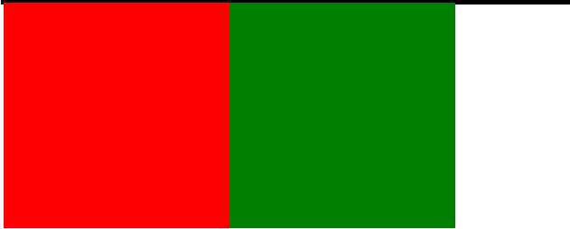
具体原因上面已经说过了这里不再赘述,反正很麻烦,很不好看就是了
我们要怎么解决呢 ?
3.给父元素加清浮动
 1 <!DOCTYPE html>
 2 <html>
 3     <head>
 4         <meta charset="utf-8">
 5         <title>flex布局学习</title>
 6         <style media="screen">
 7             .clear::after{
 8                 display: block;
 9                 content: ‘‘;
10                 clear: both;
11             }
12             .father{
13                 width: 500px;
14                 /*height: 500px;*/
15                 border: 2px solid black;
16             }
17             .d1{
18                 width: 200px;
19                 height: 200px;
20                 background-color: red;
21                 float: left;
22             }
23             .d2{
24                 width: 200px;
25                 height: 200px;
26                 background-color: green;
27                 float: left;
28             }
29             /*.d3{
30                 width: 300px;
31                 height: 300px;
32                 background-color: pink;
33             }*/
34         </style>
35     </head>
36     <body>
37         <div class="father clear">
38             <div class="d1"></div>
39             <div class="d2"></div>
40             <!-- <div class="d3"></div> -->
41         </div>
42     </body>
43 </html>
上次在一个公众号里看到了一篇文章介绍了 flex布局(弹性布局),今天打算学习一下
1.对应上面的问题我们从新写一个 display为 flex的 div
 1 <!DOCTYPE html>
 2 <html>
 3     <head>
 4         <meta charset="utf-8">
 5         <title>flex布局学习</title>
 6         <style media="screen">
 7             .clear::after{
 8                 display: block;
 9                 content: ‘‘;
10                 clear: both;
11             }
12             .father{
13                 width: 500px;
14                 /*height: 500px;*/
15                 border: 2px solid black;
16             }
17             .d1{
18                 width: 200px;
19                 height: 200px;
20                 background-color: red;
21                 float: left;
22             }
23             .d2{
24                 width: 200px;
25                 height: 200px;
26                 background-color: green;
27                 float: left;
28             }
29         </style>
30         <style media="screen">
31             .flex-father{
32                 display: flex;
33                 width: 500px;
34                 /*height: 500px;*/
35                 border: 2px solid black;
36             }
37             .f1{
38                 width: 200px;
39                 height: 200px;
40                 background-color: red;
41             }
42             .f2{
43                 width: 200px;
44                 height: 200px;
45                 background-color: green;
46             }
47         </style>
48     </head>
49     <body>
50         <div class="father clear">
51             <div class="d1"></div>
52             <div class="d2"></div>
53         </div>
54         <div class="flex-father">
55             <div class="f1"></div>
56             <div class="f2"></div>
57         </div>
58     </body>
59 </html>
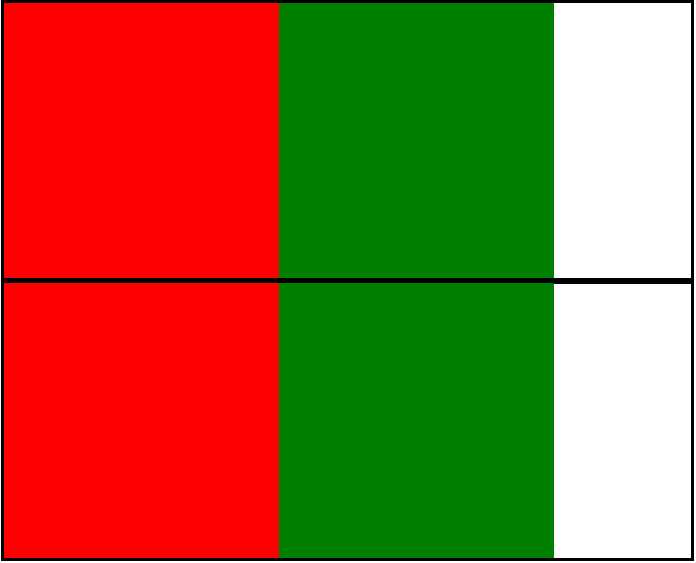
我们可以发现效果是一模一样的
2.当子元素总宽度小于父元素时,是正常展示的,那我们再加几个子元素试试
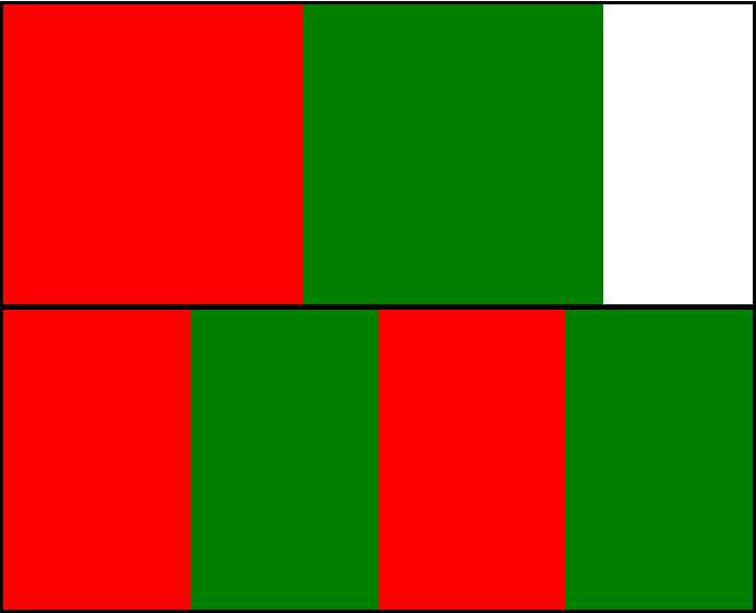
我们可以发现 flex布局中的子元素被自动压缩来适应父元素的大小
如果我们不想子元素被压缩,可以给子元素添加 flex-shrink:0;
.f1, .f2{
    flex-shrink: 0;
}
flex-shrink为1则默认收缩
flex-shirink为0则不收缩
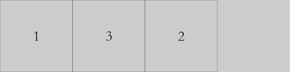
一、flex与主轴方向
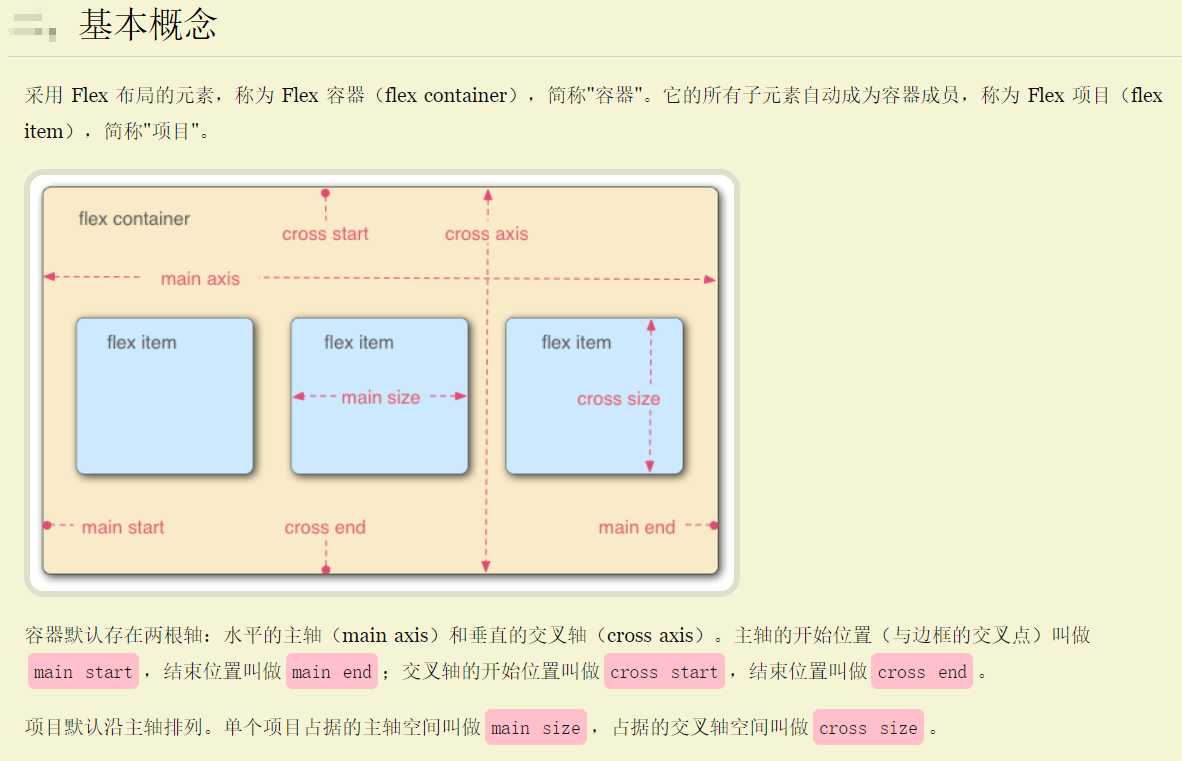
 1 <!DOCTYPE html>
 2 <html>
 3 <head>
 4     <title>flex布局的主轴</title>
 5     <style>
 6         .father-flex{
 7             width: 800px;
 8             height: 200px;
 9             background-color: #cccccc;
10             display: flex;
11             /*主轴方向默认为 水平从左向右*/
12             /* flex-direction: row;    */
13
14             /* 主轴方向,水平从右往左 */
15             /* flex-direction: row-reverse; */
16
17             /* 主轴方向从上往下 */
18             /* flex-direction: column; */
19
20             /*主轴方向从下往上  */
21             /* flex-direction: column-reverse; */
22         }
23         .item{
24             width: 200px;
25             height: 200px;
26             border: 1px dashed #333333;
27             box-sizing: border-box;
28             font-size: 40px;
29             text-align: center;
30             line-height: 200px;
31         }
32     </style>
33 </head>
34 <body>
35    <div class="father-flex">
36        <div class="item">1</div>
37        <div class="item">2</div>
38        <div class="item">3</div>
39        <div class="item">4</div>
40    </div>
41 </body>
42 </html>
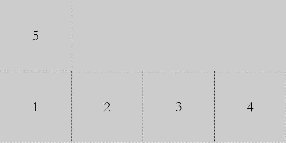
二、flex与换行
 1 <!DOCTYPE html>
 2 <html>
 3 <head>
 4     <title>flex换行</title>
 5     <style>
 6         .father-flex{
 7
 8             width: 800px;
 9             /* height: 200px; */
10             background-color: #cccccc;
11
12             display: flex;
13             /*主轴方向默认为 水平从左向右*/
14             flex-direction: row;
15
16             /* flex默认的里面的子元素是不换行,当超出时会压缩 */
17             /* 换行 第一行在上方 */
18             /* flex-wrap: wrap; */
19
20             /* 换行 第一行在下方  */
21             flex-wrap: wrap-reverse;
22         }
23         .item{
24             width: 200px;
25             height: 200px;
26             border: 1px dashed #333333;
27             box-sizing: border-box;
28             font-size: 40px;
29             text-align: center;
30             line-height: 200px;
31         }
32     </style>
33 </head>
34 <body>
35    <div class="father-flex">
36        <div class="item">1</div>
37        <div class="item">2</div>
38        <div class="item">3</div>
39        <div class="item">4</div>
40        <div class="item">5</div>
41    </div>
42 </body>
43 </html>
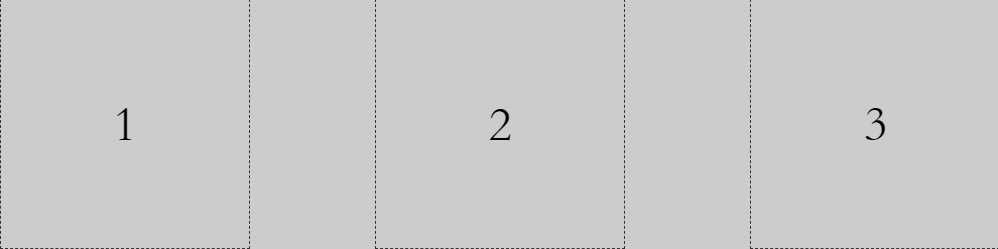
三、flex子元素在主轴上的对齐方式
 1 <!DOCTYPE html>
 2 <html>
 3 <head>
 4     <title>flex项目在主轴上的对齐方式</title>
 5     <style>
 6         .father-flex{
 7
 8             width: 800px;
 9             /* height: 200px; */
10             background-color: #cccccc;
11
12             display: flex;
13             /*主轴方向默认为 水平从左向右*/
14             flex-direction: row;
15
16             /* 项目在主轴上默认为 靠近起点 */
17             /* justify-content: flex-start; */
18
19             /* 项目在主轴上居中 */
20             /* justify-content: center; */
21
22             /* 项目在主轴上  靠近终点*/
23             /* justify-content: flex-end; */
24
25             /* 项目在主轴上 两端对齐(项目之间的间隔都相等) */
26              justify-content: space-between;
27
28             /* 每个项目两侧的间隔都相等 */
29             /*justify-content: space-around;*/
30
31
32         }
33         .item{
34             width: 200px;
35             height: 200px;
36             border: 1px dashed #333333;
37             box-sizing: border-box;
38             font-size: 40px;
39             text-align: center;
40             line-height: 200px;
41         }
42     </style>
43 </head>
44 <body>
45
46
47
48    <div class="father-flex">
49        <div class="item">1</div>
50        <div class="item">2</div>
51        <div class="item">3</div>
52        <!-- <div class="item">4</div> -->
53    </div>
54
55 </body>
56 </html>
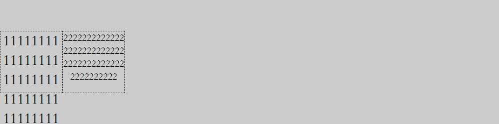
四、flex子元素在交叉轴上的对齐方式
 1 <!DOCTYPE html>
 2 <html>
 3 <head>
 4     <title>flex项目在交叉轴上的对齐方式</title>
 5     <style>
 6         .father-flex{
 7             width: 800px;
 8             height: 200px;
 9             background-color: #cccccc;
10             display: flex;
11             flex-direction: row;
12             /* 项目(子元素)在交叉轴上默认是交叉轴的起点 */
13             /* align-items:  flex-start; */
14
15             /* 项目在交叉轴上 居中对齐 */
16              /*align-items: center; */
17
18             /* 项目在交叉轴的终点 */
19             /* align-items: flex-end; */
20
21             /* 项目在交叉轴上 占满容器的高度  项目高度为auto*/
22             /* align-items: stretch; */
23
24             /* 项目在交叉轴上 基于第一行文字的基线对齐 */
25             align-items: baseline;
26         }
27         .item{
28             width: 100px;
29             height: 100px;
30             border: 1px dashed #333333;
31             box-sizing: border-box;
32             font-size: 24px;
33             text-align: center;
34             /* line-height: 100px; */
35             word-break: break-all;
36         }
37         .item2{
38             font-size: 16px;
39         }
40     </style>
41 </head>
42 <body>
43    <div class="father-flex">
44        <div class="item">111111111111111111111111111111111111111111111111111111111111</div>
45        <div class="item item2">2222222222222222222222222222222222222222222222222</div>
46
47    </div>
48 </body>
49 </html>
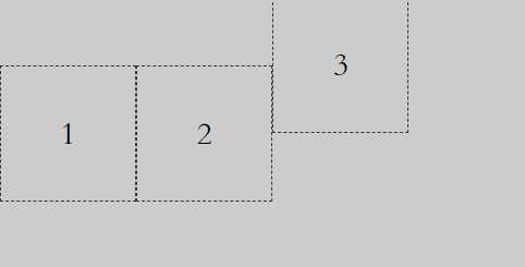
五、项目的排序
 1 <!DOCTYPE html>
 2 <html>
 3 <head>
 4     <title>flex项目的排序</title>
 5     <style>
 6         .father-flex{
 7             width: 800px;
 8             height: 200px;
 9             background-color: #cccccc;
10
11             display: flex;
12             /*主轴方向默认为 水平从左向右*/
13             flex-direction: row;
14         }
15         .item{
16             width: 200px;
17             height: 200px;
18             border: 1px dashed #333333;
19             box-sizing: border-box;
20             font-size: 40px;
21             text-align: center;
22             line-height: 200px;
23         }
24         .ff{
25             /* 数值越小,排序越靠前,默认为0 */
26             order: 1;
27         }
28     </style>
29 </head>
30 <body>
31    <div class="father-flex">
32        <div class="item">1</div>
33        <div class="item ff">2</div>
34        <div class="item">3</div>
35    </div>
36 </body>
37 </html>
六、子元素在交叉轴独自的对齐方式
 1 <!DOCTYPE html>
 2 <html>
 3 <head>
 4     <title>flex项目单独在交叉轴上的对齐方式</title>
 5     <style>
 6         .father-flex{
 7             width: 800px;
 8             height: 200px;
 9             background-color: #cccccc;
10             display: flex;
11             flex-direction: row;
12             /* 项目(子元素)在交叉轴上默认是交叉轴的起点 */
13             /* align-items:  flex-start; */
14
15             /* 项目在交叉轴上 居中对齐 */
16             align-items: center;
17
18             /* 项目在交叉轴的终点 */
19             /* align-items: flex-end; */
20
21             /* 项目在交叉轴上 占满容器的高度  项目高度为auto*/
22             /* align-items: stretch; */
23         }
24         .item{
25             width: 100px;
26             height: 100px;
27             border: 1px dashed #333333;
28             box-sizing: border-box;
29             font-size: 24px;
30             text-align: center;
31             line-height: 100px;
32
33         }
34         .item3{
35             /* 项目与其他项目不一样的对齐方式 */
36             /* align-self: flex-start; */
37             /* align-self: flex-end; */
38             /* align-self: stretch; */
39             align-self: baseline;
40         }
41
42     </style>
43 </head>
44 <body>
45    <div class="father-flex">
46        <div class="item">1</div>
47        <div class="item">2</div>
48        <div class="item item3">3</div>
49    </div>
50 </body>
51 </html>
七、flex与栅格化布局
 1 <!DOCTYPE html>
 2 <html>
 3 <head>
 4     <title>flex与栅格化布局</title>
 5     <style>
 6         .imgCnt {
 7             display: flex;
 8             width: 640px;
 9             flex-direction: row;
10             background-color: #dddddd;
11             flex-wrap: wrap;
12         }
13         .imgItem {
14             width: 20%;
15             border-bottom: 1px solid #dddddd;
16             border-right: 1px solid #dddddd;
17             box-sizing: border-box;
18         }
19         img{
20             /* 这个还蛮重要的,因为图片的默认布局是行内布局 */
21             display: block;
22             width: 100%;
23         }
24     </style>
25 </head>
26
27 <body>
28     <div class="imgCnt">
29         <div class="imgItem">
30             <img src="logo.png" />
31         </div>
32         <div class="imgItem">
33             <img src="logo.png" />
34         </div>
35         <div class="imgItem">
36             <img src="logo.png" />
37         </div>
38         <div class="imgItem">
39             <img src="logo.png" />
40         </div>
41         <div class="imgItem">
42             <img src="logo.png" />
43         </div>
44         <div class="imgItem">
45             <img src="logo.png" />
46         </div>
47         <div class="imgItem">
48             <img src="logo.png" />
49         </div>
50         <div class="imgItem">
51             <img src="logo.png" />
52         </div>
53         <div class="imgItem">
54             <img src="logo.png" />
55         </div>
56         <div class="imgItem">
57             <img src="logo.png" />
58         </div>
59     </div>
60 </body>
61 </html>
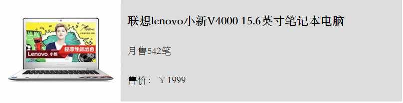
八、flex布局图文列表
 1 <!DOCTYPE html>
 2 <html>
 3 <head>
 4     <title>flex布局图文列表</title>
 5     <style>
 6         .goodList{
 7             width: 640px;
 8             background-color: #dddddd;
 9             display: flex;
10             flex-direction: column;
11         }
12         .listItem{
13             display: flex;
14             flex-direction: row;
15             align-items: stretch;
16         }
17         .imgBox{
18             flex: 3;
19         }
20         .imgBox img{
21             display: block;
22             width: 100%;
23         }
24         .goodInfoBox{
25             flex: 7;
26             padding: 10px 0;
27             padding-left:10px;
28             display: flex;
29             flex-direction: column;
30             justify-content: space-around;
31         }
32         .goodInfoBox p,
33         .goodInfoBox h3{
34             margin: 0;
35         }
36     </style>
37 </head>
38 <body>
39     <div class="goodList">
40         <div class="listItem">
41             <div class="imgBox">
42                 <img src="good.png"/>
43             </div>
44             <div class="goodInfoBox">
45                 <h3>联想lenovo小新V4000 15.6英寸笔记本电脑</h3>
46                 <p>月售542笔</p>
47                 <p>售价:¥1999</p>
48             </div>
49         </div>
50     </div>
51 </body>
52 </html>
今天的学习就告一段落
参考资料:http://www.ruanyifeng.com/blog/2015/07/flex-grammar.html