tip: 1)这些属性写在子元素中,作用于子元素(父元素中应设置display:flex)
2)作用是子元素如何分配父元素的空间
3)
flex-grow 是扩展比率,当子元素宽度总和小于父元素宽度时起作用,会按比例分配父元素剩余空间(按比例自适应)
flex-shrink 是收缩比率,当子元素宽度总和大于父元素宽度时起作用,会按比例收缩空间(按比例自适应)
flex-basis 伸缩基准值,子元素本来宽度
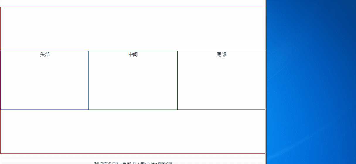
举例:flex:1 1 300px;
<template>
  <div class="test">
    <div class="top">头部</div>
    <div class="main">中间</div>
    <div class="bottom">底部</div>
  </div>
</template>
<style lang="scss">
.test{
  display: flex;
  display: -webkit-flex;
  justify-content: center;
  align-items: center;
  border: 1px solid red;
  box-sizing: border-box;
 overflow: hidden;
  width: 100%;
  height: 500px;
  .top{
    border: 1px solid blue;
    // 子元素可以随父元素自由伸缩
    -webkit-flex: 1 1 300px;
    -ms-flex: 1 1 300px;
    flex: 1 1 300px;
    // width: 200px;
    height: 200px;
  }
  .main{
    border: 1px solid green;
    // 子元素可以随父元素自由伸缩
    flex: 1 1 300px;
    // width: 200px;
    height: 200px;
  }
  .bottom{
    border: 1px solid black;
    // 子元素可以随父元素自由伸缩
     flex: 1 1 300px;
    // width: 200px;
    height: 200px;
  }
}
</style>
不管子元素宽度总和(300px+300px+300px)是否大于或小于父元素宽度,都会都会自适应父元素宽度
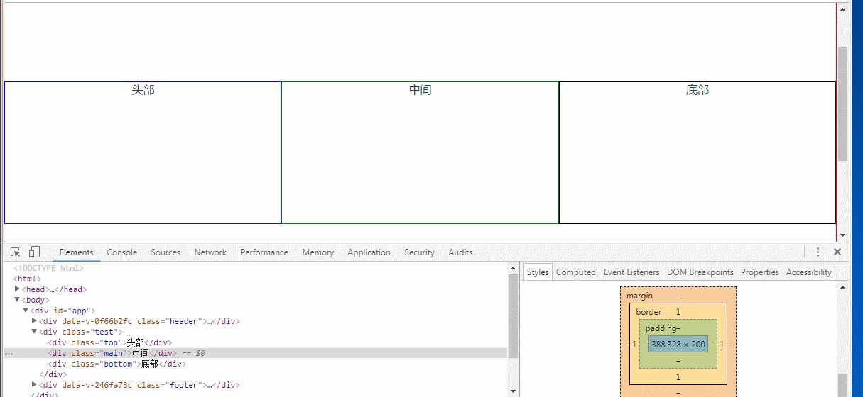
flex: 1 0 300px;扩张起作用;当父元素宽度大于900px(300px+300px+300px)时起作用,反之,不起作用
<template>
  <div class="test">
    <div class="top">头部</div>
    <div class="main">中间</div>
    <div class="bottom">底部</div>
  </div>
</template>
<style lang="scss">
.test{
  display: flex;
  display: -webkit-flex;
  justify-content: center;
  align-items: center;
  border: 1px solid red;
  box-sizing: border-box;
  overflow: hidden;
  width: 100%;
  height: 500px;
  .top{
    border: 1px solid blue;
    -webkit-flex: 1 0 300px;
    -ms-flex: 1 0 300px;
    flex: 1 0 300px;
    // width: 200px;
    height: 200px;
  }
  .main{
    border: 1px solid green;
    flex: 1 0 300px;
    // width: 200px;
    height: 200px;
  }
  .bottom{
    border: 1px solid black;
    flex: 1 0 300px;
    // width: 200px;
    height: 200px;
  }
}
</style>
注意看中间框的大小变化,还有右下角样式变化当父元素小于900px时,子元素宽度一直保持300px
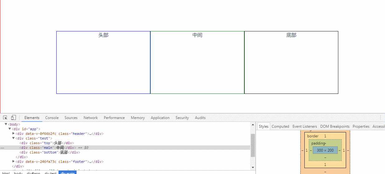
flex:0 1 300px; 收缩起作用;注意看父元素小于900px时,子元素宽度变化
<template>
  <div class="test">
    <div class="top">头部</div>
    <div class="main">中间</div>
    <div class="bottom">底部</div>
  </div>
</template>
<style lang="scss">
.test{
  display: flex;
  display: -webkit-flex;
  justify-content: center;
  align-items: center;
  border: 1px solid red;
  box-sizing: border-box;
  overflow: hidden;
  width: 100%;
  height: 500px;
  .top{
    border: 1px solid blue;
    -webkit-flex: 0 1 300px;
    -ms-flex: 0 1 300px;
    flex: 0 1 300px;
    // width: 200px;
    height: 200px;
  }
  .main{
    border: 1px solid green;
    flex: 0 1 300px;
    // width: 200px;
    height: 200px;
  }
  .bottom{
    border: 1px solid black;
    flex: 0 1 300px;
    // width: 200px;
    height: 200px;
  }
}
</style>
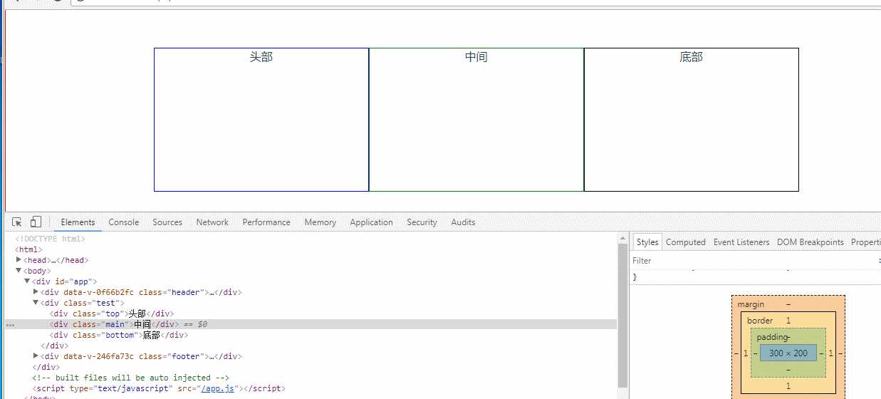
flex: 0 0 auto; width: 300px;不管子元素总和是否大于父元素,都不会随父元素大小而变化
<template>
  <div class="test">
    <div class="top">头部</div>
    <div class="main">中间</div>
    <div class="bottom">底部</div>
  </div>
</template>
<style lang="scss">
.test{
  display: flex;
  display: -webkit-flex;
  justify-content: center;
  align-items: center;
  border: 1px solid red;
  box-sizing: border-box;
  overflow: hidden;
  width: 100%;
  height: 500px;
  .top{
    border: 1px solid blue;
    -webkit-flex: 0 0 auto;
    -ms-flex: 0 0 auto;
    flex: 0 0 auto;
    width: 300px;
    height: 200px;
  }
  .main{
    border: 1px solid green;
    flex: 0 0 auto;
    width: 300px;
    height: 200px;
  }
  .bottom{
    border: 1px solid black;
    flex: 0 0 auto;
    width: 300px;
    height: 200px;
  }
}
</style>
flex主要是父元素对子元素的布局用的,要结合display: flex; justify-content: center; align-items: center;使用。
如果对display: flex; justify-content: center; align-items: center不了解的可以查看我的另一片文章