标签:忽略 变换 基础 ali ase 外部 改变 inline tween
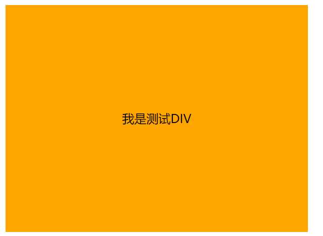
缺点必须知道居中块级元素尺寸
css:
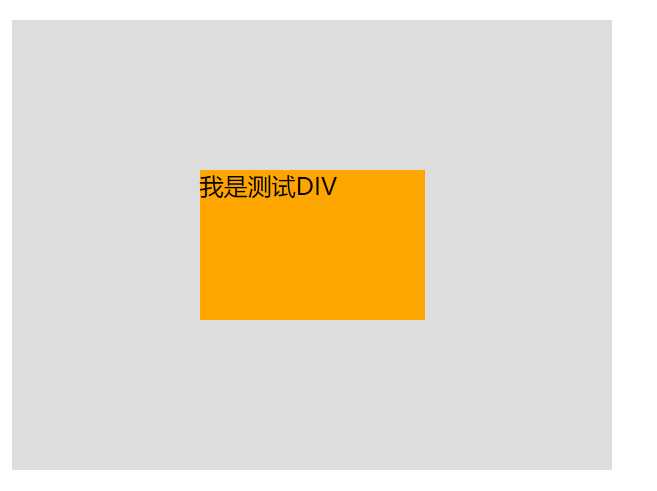
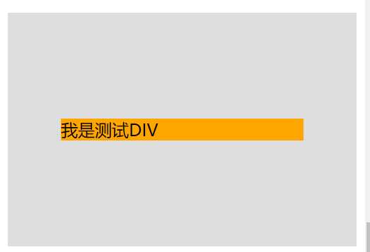
#box1 {
            width: 400px;
            height: 300px;
            background: #ddd;
            position: relative;
        }
#child1 {
           width: 150px;
            height: 100px;
            background: orange;
            position: absolute;
            top: 50%;
            left: 50%;
            margin: -50px 0 0 -75px;
            /*line-height: 100px;// 可以使内部容器文本居中*/
 }
 <div id="box1">
    <div id="child1">我是测试DIV</div>
</div>
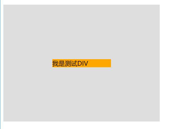
不用事先确定被定位的容器高度,使用transform的2d变换,垂直方向上平移,移动相对于元素本身长宽做参考 position: absolute; left: 50%; top: 50%; transform: translate(-50%,-50%);
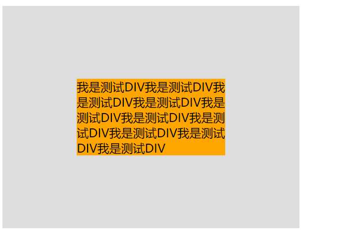
#box2 {
            width: 400px;
            height: 300px;
            background: #ddd;
            position: relative;
        }
 #child2 {
            background: orange;
            position: absolute;
            left: 50%;
            top: 50%;
            transform: translate(-50%,-50%);
 }
<div id="box2">
    <div id="child2">我是测试DIV我是测试DIV我是测试DIV我是测试DIV我是测试DIV我是测试DIV我是测试DIV我是测试DIV我是测试DIV我是测试DIV</div>
</div>
当margin/padding取形式为百分比的值时,它们都是以父元素的width为参照物的! 适合外部容器宽高相同,left+margin-left padding 和 margin 是根据包含块的宽度(content-box , width+padding)计算的 (https://www.w3.org/TR/css3-box/#the-padding) and https://www.w3.org/TR/CSS2/box.html#box-model )。 top的百分比值是按离其最近的有定位属性的祖先元素(包含块)的(内容高+padding)值来计算的,与border无关。 width和height 相对于有定位祖先元素的( width+padding-left/right , height+padingtop +padding-bottom) (pHeight-cHeight)/2 = top(+%,相对于有定位祖先元素的内容高+padding -> content-box) + margin-top( -%,相对于定位祖先元素的宽,相对于width+paddingleft+padding+right再乘以百分比) =margin-bottom(容器上半部分(top+margin-top)计算好了这里自动计算无需设置); 如果外部定位容器大小改变了, margin-top需要根据外框大小计算,margin-left 是内部容器width百分比的一半。
Note that in a horizontal flow, percentages on ‘margin-top’ and ‘margin-bottom’ are relative to the width of the containing block, not the height (and in vertical flow, ‘margin-left’ and ‘margin-right’ are relative to the height, not the width). Note that percentages on ‘padding-top’ and ‘padding-bottom’ are relative to the width of the containing block, not the height (at least in a horizontal flow; in a vertical flow they are relative to the height). https://segmentfault.com/a/1190000004231995
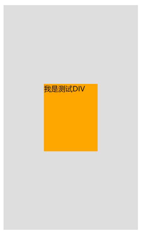
 #box3 {
            width: 200px;
            height: 400px;
            background: #ddd;
            position: relative;
            padding: 50px;
        }
 #child3 {
            width: 40%;
            height: 30%;
            background: orange;
            position: absolute;
            margin-top: -25%;
            margin-left: -20%;
            top: 50%;
            left: 50%;

}
<div id="box3">
    <div id="child3">我是测试DIV</div>
</div>
top/bottom 设置值相同,left/right 设置值相同,计算规则如下:
‘left‘ + ‘margin-left‘ + ‘border-left-width‘ + ‘padding-left‘ + ‘width‘ + ‘padding-right‘ + ‘border-right-width‘ + ‘margin-right‘ + ‘right‘ = 包含块宽度 如果“left”,“width”和“right”中的所有三个都是“auto”:首先将‘margin-left‘和‘margin-right‘的任何‘auto‘值设置为0.然后,如果‘direction‘建立静态位置包含块(establishing the static-position containing block)元素的属性为“ltr”,设置“left”为static 位置(将left设置到普通流位置?),并应用下面的规则号3;否则,将“right”设置为静态位置,然后应用规则编号1。 如果‘margin-left‘ 和‘margin-right‘ 是‘auto‘,在额外约束是两个margin获得相等的值。
如果“left”,“width”和“right”三者都不是“auto”:如果“margin-left”和“margin-right”均为“auto”,则在额外的约束下解决方程式,即两个margins获得相等的值,除非这会使它们为负值,在这种情况下,当包含块的方向为‘ltr‘(‘rtl‘)时,将‘margin-left‘(‘margin-right‘)设置为零并求解‘margin-right‘(‘margin-left‘)。如果“margin-left”或“margin-right”之一是“auto”,求解该值的方程式。如果值被过度约束,忽略‘left‘的值(如果包含块的‘direction‘属性为‘rtl‘)或‘right‘(在“direction”为“ltr”的情况下),并求这个值。 否则,将‘margin-left‘和‘margin-right‘的‘auto‘值设置为0,并选择适用的以下六条规则之一。
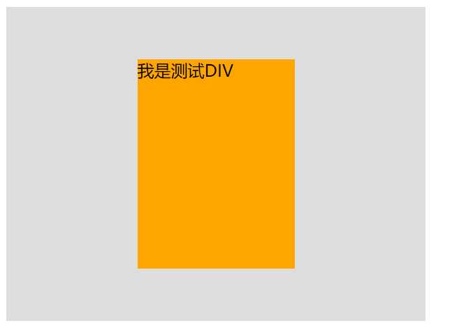
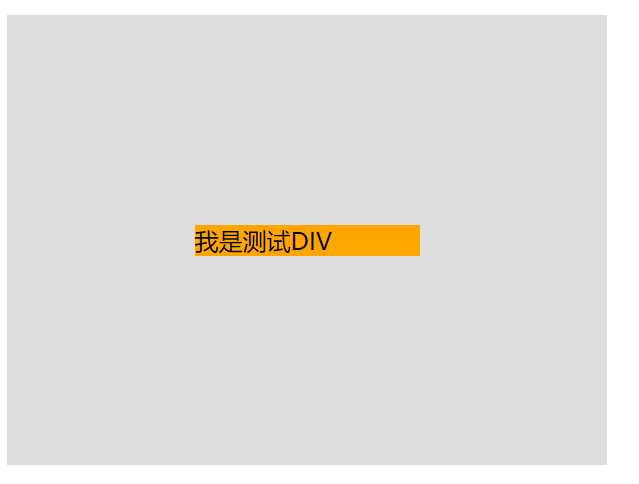
 #box4 {
            width: 400px;
            height: 300px;
            background: #ddd;
            position: relative;
        }
 #child4 {
            width:150px;
            height:200px;
          /*  height: 20%;*/
            background: orange;
            position: absolute;
            top:0;
            bottom:0;
            margin:auto;
            left: 0;
            right: 0;

   }
<div id="box4">
    <div id="child4">我是测试DIV</div>
</div>
  #box5 {

            background: #ddd;
            position: relative;
            padding: 100px 50px;
        }
 #child5 {
           /* width:150px;
            height:200px;*/
            background: orange;
 }
<div id="box5">
    <div id="child5">我是测试DIV</div>
</div>
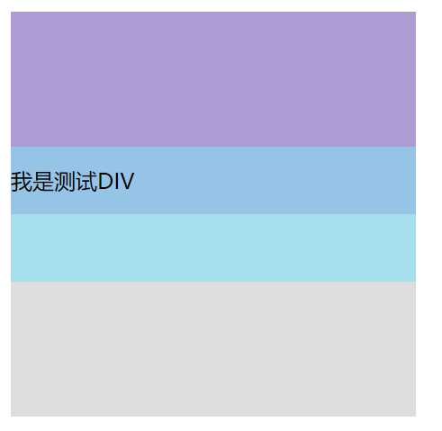
基准的高度设置为父容器的50%,基准元素的底边就是父容器的中分线; 需要居中的子容器,设置高度且上移自身高度的一半(margin-top : - 一半)
  #box6 {
            width: 300px;
            height: 300px;
            background: #ddd;
        }
  #base6{
            height: 50%;
            background: #AF9BD3;
      }
  #child6 {
            height: 100px;
            background: rgba(131, 224, 245, 0.6);
            line-height: 50px;/*可省*/
            margin-top: -50px;/*高度的一半*/
      }
<div id="box6">
    <div id="base6"></div>
    <div id="child6">我是测试DIV</div>
</div>
元素可以通过设置display:flex;将其指定为flex布局的容器,指定好了容器之后再为其添加align-items属性,该属性定义项目在交叉轴(这里是纵向轴)上的对齐方式,可能的取值有五个,分别如下: flex-start::交叉轴的起点对齐; flex-end:交叉轴的终点对齐; center:交叉轴的中点对齐; baseline:项目第一行文字的基线对齐; stretch(该值是默认值):如果项目没有设置高度或者设为了auto,那么将占满整个容器的高度。
 #box7 {
            width:400px;
            height:300px;
            background: #ddd;
            display:flex ;
            align-items:center;
            justify-content: center;
        }
 #child7 {
             width:150px;
            /*height:200px;*/
            background: orange;
 }
<div id="box7">
    <div id="child7">我是测试DIV</div>
</div>
这种方式也是首先给父元素设置display:flex,设置好之后改变主轴的方向flex-direction: column,该属性可能的取值有四个,分别如下: row(该值为默认值):主轴为水平方向,起点在左端; row-reverse:主轴为水平方向,起点在右端; column:主轴为垂直方向,起点在上沿; column-reverse:主轴为垂直方向,起点在下沿。 justify-content属性定义了项目在主轴上的对齐方式,可能的取值有五个,分别如下(不过具体的对齐方式与主轴的方向有关,以下的值都是假设主轴为从左到右的): flex-start(该值是默认值):左对齐; flex-end:右对齐; center:居中对齐; space-between:两端对齐,各个项目之间的间隔均相等; space-around:各个项目两侧的间隔相等。
#box8 {
            width:400px;
            height:300px;
            background: #ddd;
            display:flex ;
            align-items:center;
            justify-content: center;
            flex-direction:column;
        }
#child8{
            width:150px;
            /*height:200px;*/
            background: orange;
        }
<div id="box8">
    <div id="child8">我是测试DIV</div>
</div>
注意:line-height百分比是基于当前字体尺寸的百分比行间距。所以这里的百分比并不是相对于父元素尺寸而言,而是相对于字体尺寸来讲的。
 #box9{
            width:400px;
            height:300px;
            background: #ddd;
           line-height:300px;
            text-align: center;
        }
#child9{
            background: orange;
        }
<div id="box9">
    <div id="child9">我是测试DIV</div>
</div>
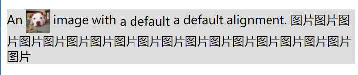
vertical-align 用来指定行内元素(inline)或表格单元格(table-cell)元素的垂直对齐方式。 大部分取值是相对于父元素来说的: box10里面的文本和图片会形成一个匿名行框。,图片在这个匿名行框中垂直居中.如果父容器使用了line-height, 行框的高度就是指定高度,否则使用默认一行撑起的高度 https://developer.mozilla.org/zh-CN/docs/Web/CSS/vertical-align
 #box10{
           /* width:400px;
            height:500px;*/
            background: #ddd;
          /*  line-height:300px;
            text-align: center;*/
        }
#child10{
            vertical-align: middle;
        }
<div id="box10" >An <img  id="child10"  src="//img.hb.aicdn.com/3d8fa34d0898f52c16fa2bc0a874f1c21ab880c9c308-xKvgJS_sq320" alt="link" width="32" height="32" /> image with
    <span style="    vertical-align: middle;">a default</span><span style="vertical-align: text-bottom"> a default</span> alignment. 图片图片图片图片图片图片图片图片图片图片图片图片图片图片图片图片图片图片</div>
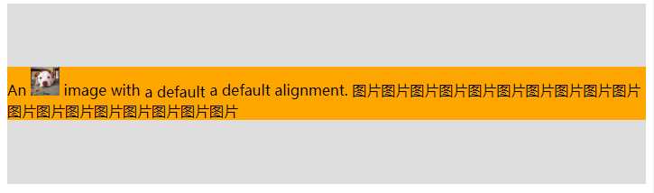
vertical-align 用来指定行内元素(inline)或表格单元格(table-cell)元素的垂直对齐方式。 大部分取值是相对于父元素来说的: box10里面的文本和图片会形成一个匿名行框。,图片在这个匿名行框中垂直居中.如果父容器使用了line-height, 行框的高度就是指定高度,否则使用默认一行撑起的高度 https://developer.mozilla.org/zh-CN/docs/Web/CSS/vertical-align
#box11{
            background: #ddd;
            display: table-cell;
            vertical-align: middle;
            height: 200px;/*可以用绝对布局用视窗宽高来设置*/
        }
#child11{
            background: orange;
        }
<div id="box11" ><div id="child11">An <img    src="//img.hb.aicdn.com/3d8fa34d0898f52c16fa2bc0a874f1c21ab880c9c308-xKvgJS_sq320" alt="link" width="32" height="32" /> image with
    <span style="    vertical-align: middle;">a default</span><span style="vertical-align: text-bottom"> a default</span> alignment.
    图片图片图片图片图片图片图片图片图片图片图片图片图片图片图片图片图片图片</div></div>
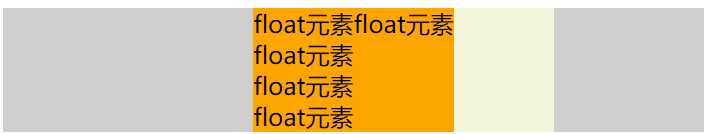
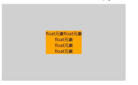
垂直居中float元素,外层包裹容器独立BCF,根据float元素宽高使得外层包裹容器获得宽高。最外层容器和包裹浮动容器需要使包裹容器 实现基本的水平和垂直居中。
宽度不固定的元素,包裹浮动元素的容器,内层元素可以浮动也可以不浮动,浮动容器需设置为:左侧50%,float: left; left: 50%; position: relative(必须,按当前所在位置移动50%); 内层元素在父级基础上再按自身宽度往左侧伸出50%。 left: -50%; position: relative 。注:由于不同于内部absolute元素, 外部float获得内部内层元素(可以加float)的宽度大小,外float包裹(可以加float)内层元素,所以此处可以用这个方法。 内层元素相对于父元素定位.
包含块的高度如果不确定,top百分比无法获得,不能垂直居中, 但是可以在box最外层布局容器中使用display:table-cell 和 vertical-align :middle 使得元素垂直居中. 如果只需水平居中则无需设置 display: table-cell; vertical-align: middle
#box12{/*仅用于定义一个高度大于浮动元素的父容器,要使浮动元素的父容器获得高度,可以生成BCF上下文处理*/
           /* height: 200px;*/
            background: #d0cece;
            display: table-cell;
            vertical-align: middle;
            height: 250px;
            width: 400px;
            /*以下样式可以用于页面水平居中*/
            /*background: #d0cece;
            position: fixed;
            left: 0;
            right: 0;
            top: 0;
            bottom: 0;*/
        }
        #floatouter12{
            float: left;
            left: 50%;
           /* top: 50%;*/
           /* width: 200px;*/
          /* height: 83px;*//*如果不设置与floatelem元素一致的高度,floatelem的top没有效果,如果外层不设置table-cell布局的话*/
            position: relative;
            background: beige;
        }
        #floatelem{
           /* float: left;*/
            left: -50%;/*和包含块宽度有关,自身内容宽度*/
            position: relative;
            background: orange;
          /*  top: -50%;*/
            /*包含块的高度如果不确定的百分比无法获得*/
        }
<div class="" id="box12">
    <div class="" id="floatouter12">
    <div class="" id="floatelem">float元素float元素<br>float元素<br>
        float元素<br>
        float元素<br>
    </div>
    </div>

</div>
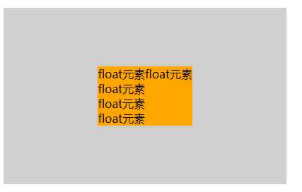
垂直居中float元素,外层包裹容器独立BCF,根据float元素宽高使得外层包裹容器获得宽高。最外层容器和包裹浮动容器需要使包裹容器 实现基本的水平和垂直居中。
宽度不固定且浮动的元素,浮动元素的父容器需设置为:display:inline-block,最外层容器text-align:center可以使得 浮动元素父容器水平居中(inline-block 文本居中),如果仅需要浮动元素中的文本居中,则可以不需要中间层容器(inline-block)。
最外层布局容器中使用display:table-cell , vertical-align :middle text-align:center,使得 中间容器水平垂直居中,然后里面的float元素也水平垂直居中。 如果只需水平居中则无需设置 display: table-cell; vertical-align: middle
#box13{
            background: #d0cece;
            display: table-cell;
            vertical-align: middle;
            height: 250px;
            width: 400px;
            text-align: center;
            font-size: 0;
        }
        #floatouter13{
           display:inline-block;
            background: beige;
            font-size: 14px;
        }
        #floatelem13{
            float: left;
            background: orange;
        }
<div class="" id="box13">
    <div class="" id="floatouter13">
        <div class="" id="floatelem13">
            float元素float元素<br>float元素<br>
            float元素<br>
            float元素<br>
        </div>
    </div>

</div>
浮动元素的父元素,左上角在整个容器的中心,浮动元素使用transform按它自身宽高的一半来定位元素的中心点就是整个容器的中心点
#box14{
            background: #d0cece;
            height: 250px;
            width: 400px;
        }
        #floatouter14{
            float: left;
            left: 50%;
            top: 50%;
            position: relative;
            background: beige;
        }
        #floatelem14{
            float: left;
            background: orange;
            transform: translate(-50%,-50%);
        }
<div class="" id="box14">
    <div id="floatouter14">
        <div class="" id="floatelem14">
            float元素float元素<br>float元素<br>
            float元素<br>
            float元素<br>
        </div>
    </div>

</div>
display: flex; flex-direction: row; flex-flow: nowrap; justify-content: center; align-items: center;
#box15{
            background: #d0cece;
            height: 250px;
            width: 400px;
            display: flex;
            flex-direction: row;
            flex-flow: nowrap;
            justify-content: center;
            align-items: center;
        }
        #floatelem15{
            float: left;
            background: orange;
        }
<div class="" id="box15">
        <div class="" id="floatelem15">
            float元素float元素<br>float元素<br>
            float元素<br>
            float元素<br>
        </div>
</div>
总结:
参考:https://www.cnblogs.com/zhouhuan/p/vertical_center.html
标签:忽略 变换 基础 ali ase 外部 改变 inline tween
原文地址:https://www.cnblogs.com/xiaozhuyuan/p/8759273.html