标签:msm ima rate position family poi bool opacity else
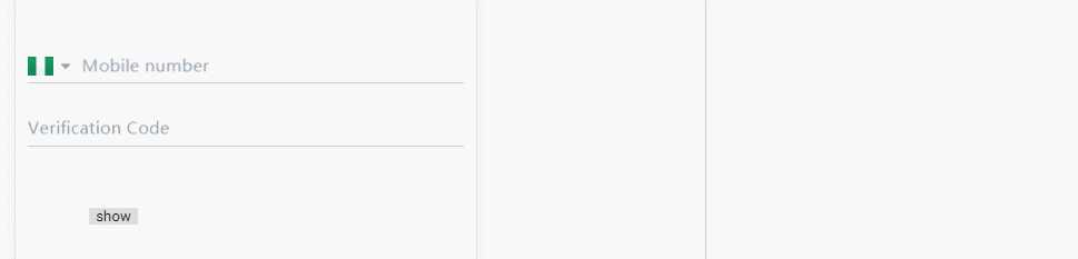
上图:
module:
import {NgModule} from "@angular/core";
import {CommonModule} from "@angular/common"
import {PpInputComponent} from ‘./pp-input‘
import {FormsModule} from "@angular/forms";

@NgModule({
  declarations: [PpInputComponent],
  imports: [
    CommonModule,
    FormsModule,
  ],
  exports: [PpInputComponent],
})

export class PpInputComponentModule {
}
ts:
import {Component, Input, Output, EventEmitter, OnInit, ViewChild, ElementRef, Renderer2, AfterViewInit} from ‘@angular/core‘;

/**
 * Generated class for the PpInputComponent component.
 *
 * See https://angular.io/api/core/Component for more info on Angular
 * Components.
 */
@Component({
  selector: ‘pp-input‘,
  templateUrl: ‘pp-input.html‘
})
export class PpInputComponent implements OnInit, AfterViewInit {
  constructor(private renderer: Renderer2) {
  }

  @ViewChild(‘ppLabel‘) private ppLabel: ElementRef; // 获取元素
  @Input() ppValue: any; // input的值,双向绑定
  @Input(‘pp-label‘) label: string = ‘Label‘; // label文案
  @Input() validate: any = function (input) { // 验证数据方法
    if (input) {
      return true
    } else {
      return false
    }
  };
  @Input() type: string = ‘text‘; // input类型
  @Input() x: string; // label的X轴偏移量
  @Input() isRequired: boolean; // false
  @Input(‘error-message‘)  errorMessage: string = ‘validate error‘; // 错误提示信息

  @Output() ppValueChange = new EventEmitter();

  actived: boolean = false; // 样式控制
  float: boolean; // label是否浮动
  showErrMsg: boolean = false; // 是否显示错误信息

  ngOnInit() {
    if (this.ppValue) {
      this.float = true;
      this.actived = true;
    } else {
      this.float = false;
    }
  }

  ngAfterViewInit() {
    if (this.x) {
      this.renderer.setStyle(this.ppLabel.nativeElement, ‘transform‘, `translate3d(${Number(this.x) / 100}rem, 0.48rem, 0)`)
    }
  }

  // 获得焦点
  ppFocus() {
    this.float = true;
  }

  // 失去焦点
  ppBlur() {
    if (this.ppValue) {
      this.float = true;
    } else {
      this.float = false;
    }
    if (this.validate(this.ppValue)) {
      this.showErrMsg = false;
    } else {
      this.showErrMsg = true;
    }
  }

  // 更新父组件model值
  changeValue() {
    this.ppValueChange.emit(this.ppValue);
    if (this.validate(this.ppValue)) {
      this.actived = true;
      this.showErrMsg = false;
    } else {
      this.actived = false;
    }
  }
}
scss
pp-input {
  .pp-input-container {
    border-bottom: 1px solid #C1CCD5;
    height: 0.92rem;
    &.actived {
      border-color: #6308C7
    }
    .label {
      font-size: 0.28rem;
      color: #95A1AB;
      position: relative;
      font-family: Avenir-Medium;
      pointer-events: none;
      transform: translate3d(0,0.48rem, 0);
      transition: all 0.2s;
      margin: 0.11rem 0.08rem 0.11rem 0;
      &.actived {
        transform: translate3d(0, 0, 0)!important;
        font-size: 0.22rem;
        transition: all 0.2s;
        .actived {
          color: #6308C7
        }
      }
      .required {
        color: #F44E4E
      }
    }
    .pp-input {
      border: none;
      font-size: 0.28rem;
      height: 0.5rem;
      line-height: 0.5rem;
    }
    .content {
      display: flex;
      align-items: center;
    }
  }
  .error-message {
    color: #F44E4E;
    font-size: 0.22rem;
    height: 0;
    line-height: 0.4rem;
    opacity: 0.5;
    transition: all 0.2s;
    overflow: hidden;
    &.show {
      opacity: 1;
      height: 0.4rem;
      transition: all 0.2s;
    }
  }
}
html
<!-- Generated template for the PpInputComponent component -->
<div class="pp-input-wrapper">
  <div class="pp-input-container" [class.actived]="actived">
    <div class="label" [class.actived]="float" #ppLabel>
      <span class="required" *ngIf="isRequired">*</span><span [class.actived]="actived">{{label}}</span>
    </div>
    <div class="content">
      <ng-content></ng-content>
      <input class="pp-input"
             (focus)="ppFocus()"
             (blur)="ppBlur()"
             (keyup)="changeValue()"
             [type]="type"
             [(ngModel)]="ppValue">
    </div>
  </div>
  <div class="error-message" [class.show]="showErrMsg">{{errorMessage}}</div>
</div>
目前实现可传入label文案, label的x轴偏移,input类型,验证数据的validate方法,input的双向绑定value值,错误提示信息等
用<ng-content></ng-content>预留的编辑位置,可以添加更多的html,方便扩展,例如上图的国家图标显示。
可以考虑把所有的@Input集合成一个config,html的font-size的值我是动态算的,所以样式rem的值可能要修改成你需要的大小。
ps: 之前用vue组件也写过类型的组件,传送门:https://www.cnblogs.com/cong-bao/p/9204940.html
[ionic3.x开发记录]参考ionic的float-label动效,写一个项目内通用的input组件,易扩展
标签:msm ima rate position family poi bool opacity else
原文地址:https://www.cnblogs.com/cong-bao/p/9448029.html