标签:形式 size 分享图片 tom absolute ati bottom 边框 虚线
前言
background是css的简写形式,可以一次性定义各种背景属性,包括color、image、origin、size,repeat方式等等。
background在活动项目中用的还是比较多的,例如布局图片、画具有规则图案的边框(类似虚线框的样式)等等。
background-color和background-image的区别
background-color的范围是以元素的边框的左上角为起点,右下角为止点。
background-image的范围是以padding边缘的左上角到border的右下角边缘为止。
决定背景绘图区域的两个因素
background-origin和background-clip:
background-orign确定相对定位位置;
background-clip决定了元素的背景(背景图片或颜色)是否延伸到边框下面,
background-clip的取值:
background-clip: border-box//延伸到边框外延
background-clip: padding-box//边框下面没有背景,即背景延伸到内边距外沿。
background-clip: content-box//背景裁剪到内容区 (content-box) 外沿
background-clip: inherit
利用background-clip画图
画虚线边框
1、不使用background-clip,直接使用border的dashed画虚线框。
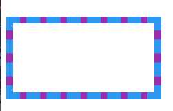
<div class="border-div">
		<style scoped>
			.border-div{
				  position: relative;
				  margin-top: 100px;
				  background:#9c27b0;
				  border:10px dashed #2196f3;
			}
			.border-div::after{
					content:"";
					position:absolute;
					top:0;
					left:0;
					bottom:0;
					right:0;
					background:#fff;
			}
		</style>
</div>
2、使用background-clip:padding-box,让背景色不延伸到边框上
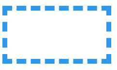
<div class="border-div2">
			<style scoped>
				.border-div2{
						position: relative;
						margin-top: 100px;
						background:#9c27b0;
						background-clip:padding-box;
						border:10px dashed #2196f3;
				}
				.border-div2::after{
						content:"";
						position:absolute;
						top:0;
						left:0;
						bottom:0;
						right:0;
						background:#fff;
				}
			</style>
 </div>
3、background-clip:content-clip的情况
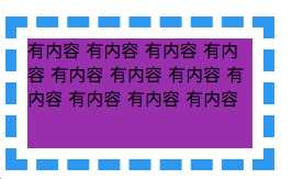
<div class="border-div3">
			有内容
			有内容
			有内容
			有内容
			有内容
			有内容
			有内容
			有内容
			有内容
			有内容
			有内容

				<style scoped>
					.border-div3{
							position: relative;
							margin-top: 100px;
							background:#9c27b0;
							background-clip:content-box;
							border:10px dashed #2196f3;
							padding: 10px;

					}
					.border-div3::after{
							content:"";
							position:absolute;
							top:0;
							left:0;
							bottom:0;
							right:0;
							/* background:#fff; */
							color: #f00;
							font-size: 16px;
					}
				</style>
</div>
标签:形式 size 分享图片 tom absolute ati bottom 边框 虚线
原文地址:https://www.cnblogs.com/yy95/p/9531720.html