标签:alt line imm from active 研究 spl group 目标
最近研究react,发现写一个组件很容易,但是要写一个全局的好像有点麻烦。不能像VUE一样,直接在原型上面扩展,注册全局组件
下面实现一个弹框,只需要引入之后,直接调用方法即可,不需要写入组件
给出我写react全局组件的思路。
创建一个 div加入到body,用这个div当容器,渲染react组件,然后由改变组件的 state来控制弹框的显示隐藏
代码结构如下:
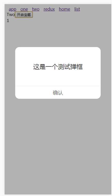
效果图如下:
alert.jsx
import React, { Component } from ‘react‘;
import { is, fromJS } from ‘immutable‘;
import ReactDOM from ‘react-dom‘;
import ReactCSSTransitionGroup from ‘react-addons-css-transition-group‘;
import ‘./alert.css‘;


class Alert extends Component{

  state = {
    alertStatus:false,
    alertTip:"提示",
    closeAlert:function(){}
  };
  // css动画组件设置为目标组件
  FirstChild = props => {
    const childrenArray = React.Children.toArray(props.children);
    return childrenArray[0] || null;
  }
  // 关闭弹框
  confirm = () => {
    this.setState({
      alertStatus:false
    })
    this.state.closeAlert();
  }

  shouldComponentUpdate(nextProps, nextState){
    return !is(fromJS(this.props), fromJS(nextProps)) || !is(fromJS(this.state), fromJS(nextState))
  }

  render(){
    return (
      <ReactCSSTransitionGroup
        component={this.FirstChild}
        transitionName=‘hide‘
        transitionEnterTimeout={300}
        transitionLeaveTimeout={300}>
        <div className="alert-con" style={this.state.alertStatus? {display:‘block‘}:{display:‘none‘}}>
          <div className="alert-context">
            <div className="alert-content-detail">{this.state.alertTip}</div>
            <div className="comfirm" onClick={this.confirm}>确认</div>
          </div>
        </div>
      </ReactCSSTransitionGroup>
    );
  }
}

let div = document.createElement(‘div‘);
let props = {

};
document.body.appendChild(div);

let Box = ReactDOM.render(React.createElement(
  Alert,
  props
),div);

let defaultState = {
  alertStatus:false,
  alertTip:"提示",
  closeAlert:function(){}
}

export default {
  open(options){
    options = options || {};
    options.alertStatus = true;

    Box.setState({
      ...defaultState,
      ...options
    })
  },
  close(){
    Box.setState({
      ...defaultState
    })
  }
}
alert.css
.alert-con {
  position: fixed;
  top: 0;
  left: 0;
  width: 100%;
  height: 100%;
  background: rgba(0, 0, 0, 0.3);
  z-index: 11;
}
.alert-context {
  background-color: #fff;
  border-radius: 16px;
  height: 200px;
  width: 80%;
  margin: 40% auto 0;
}
.alert-context .alert-content-detail {
  text-align: center;
  color: #333;
  font-size: 24px;
  height: 150px;
  line-height: 150px;
}
.alert-context .comfirm {
  border-top: 1PX solid #eee;
  box-sizing: border-box;
  height: 50px;
  line-height: 50px;
  text-align: center;
  font-size: 20px;
  color: #666;
}
.alert-enter {
  opacity: 0;
}
.alert-enter.alert-enter-active {
  transition: all 300ms;
  opacity: 1;
}
.alert-leave {
  opacity: 1;
}
.alert-leave.alert-leave-active {
  transition: all 300ms;
  opacity: 0;
}
使用方式:
import React, { Component } from ‘react‘;

import Alert from "../components/alert/alert.jsx";

class Two extends Component {
	constructor(props){
		super(props);
		this.state = {
			num:1
		};
	}

	open=()=>{
		Alert.open({
			alertTip:"这是一个测试弹框",
			closeAlert:function(){
				console.log("关闭了...");
			}
		});
	}
  render() {
    return (
       <div className="Two">
        	Two
		<button onClick={this.open}>
			 开启宝藏
		</button>
        	<div>{this.state.num}</div>
       </div>
    );
  }
}

export default Two;
上面直接引入 alert.jsx之后,调用 open函数即可
这样的好处,解决了弹框的层级问题,使用更加方便快捷
标签:alt line imm from active 研究 spl group 目标
原文地址:https://www.cnblogs.com/muamaker/p/9623425.html