标签:用法 android 笔记 方向 XML tab 截取 引用 正弦曲线
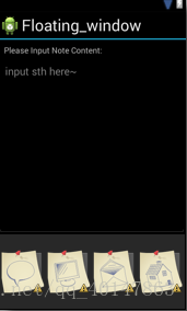
<?xml version="1.0" encoding="utf-8"?>
<LinearLayout android:orientation="vertical"
    android:layout_width="fill_parent" android:layout_height="fill_parent"
    xmlns:android="http://schemas.android.com/apk/res/android">
    <TextView android:layout_height="wrap_content" android:text="@string/note_title"
        android:layout_width="wrap_content" android:padding="10dp"></TextView>
    <LinearLayout android:layout_height="fill_parent"
        android:layout_width="fill_parent" android:layout_weight="1">
        <EditText android:id="@+id/EditText02" android:layout_width="fill_parent"
            android:layout_height="fill_parent" android:gravity="left"
            android:hint="@string/edithint"></EditText>
    </LinearLayout>
    <LinearLayout android:layout_height="fill_parent"
        android:layout_width="fill_parent" android:layout_weight="2"
        android:gravity="center"
        android:orientation="horizontal">
<ImageButton android:id="@+id/ImageButton01" android:layout_width="72dp" android:layout_height="72dp" android:src="@drawable/sketchy_paper_003" android:layout_margin="3dp"></ImageButton> <ImageButton android:id="@+id/ImageButton02" android:layout_width="72dp" android:layout_height="72dp" android:src="@drawable/sketchy_paper_004" android:layout_margin="3dp"></ImageButton> <ImageButton android:id="@+id/ImageButton03" android:layout_width="72dp" android:layout_height="72dp" android:src="@drawable/sketchy_paper_007" android:layout_margin="3dp"></ImageButton> <ImageButton android:id="@+id/ImageButton04" android:layout_width="72dp" android:layout_height="72dp" android:src="@drawable/sketchy_paper_011" android:layout_margin="3dp"></ImageButton> </LinearLayout> </LinearLayout> 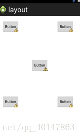
<RelativeLayout xmlns:android="http://schemas.android.com/apk/res/android"
    xmlns:tools="http://schemas.android.com/tools"
    android:layout_width="match_parent"
    android:layout_height="match_parent"
    android:paddingBottom="@dimen/activity_vertical_margin"
    android:paddingLeft="@dimen/activity_horizontal_margin"
    android:paddingRight="@dimen/activity_horizontal_margin"
    android:paddingTop="@dimen/activity_vertical_margin"
    tools:context=".MainActivity" >

    <Button
        android:id="@+id/button1"
        style="?android:attr/buttonStyleSmall"
        android:layout_width="wrap_content"
        android:layout_height="wrap_content"
        android:layout_alignParentLeft="true"
        android:layout_alignParentTop="true"
        android:text="Button" />

    <Button
        android:id="@+id/button2"
        style="?android:attr/buttonStyleSmall"
        android:layout_width="wrap_content"
        android:layout_height="wrap_content"
        android:layout_alignBaseline="@+id/button1"
        android:layout_alignBottom="@+id/button1"
        android:layout_alignParentRight="true"
        android:layout_marginRight="14dp"
        android:text="Button" />

    <Button
        android:id="@+id/button3"
        style="?android:attr/buttonStyleSmall"
        android:layout_width="wrap_content"
        android:layout_height="wrap_content"
        android:layout_below="@+id/button1"
        android:layout_centerHorizontal="true"
        android:layout_marginTop="97dp"
        android:text="Button" />

    <Button
        android:id="@+id/button4"
        style="?android:attr/buttonStyleSmall"
        android:layout_width="wrap_content"
        android:layout_height="wrap_content"
        android:layout_alignLeft="@+id/button1"
        android:layout_below="@+id/button3"
        android:layout_marginTop="89dp"
        android:text="Button" />

    <Button
        android:id="@+id/button5"
        style="?android:attr/buttonStyleSmall"
        android:layout_width="wrap_content"
        android:layout_height="wrap_content"
        android:layout_alignLeft="@+id/button2"
        android:layout_alignTop="@+id/button4"
        android:text="Button" />

</RelativeLayout>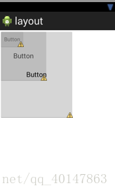
<?xml version="1.0" encoding="utf-8"?>
<FrameLayout xmlns:android="http://schemas.android.com/apk/res/android"
    android:layout_width="match_parent"
    android:layout_height="match_parent" >

    <Button
        android:id="@+id/button1"
        style="?android:attr/buttonStyleSmall"
        android:layout_width="wrap_content"
        android:layout_height="wrap_content"
        android:text="Button" />

    <Button
        android:id="@+id/button2"
        android:layout_width="126dp"
        android:layout_height="135dp"
        android:text="Button" />

    <Button
        android:id="@+id/button3"
        android:layout_width="194dp"
        android:layout_height="232dp"
        android:text="Button" />

</FrameLayout>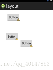
<?xml version="1.0" encoding="utf-8"?>
<AbsoluteLayout xmlns:android="http://schemas.android.com/apk/res/android"
    android:layout_width="match_parent"
    android:layout_height="match_parent" >

    <Button
        android:id="@+id/button1"
        android:layout_width="wrap_content"
        android:layout_height="wrap_content"
        android:layout_x="44dp"
        android:layout_y="18dp"
        android:text="Button" />

    <Button
        android:id="@+id/button2"
        android:layout_width="wrap_content"
        android:layout_height="wrap_content"
        android:layout_x="122dp"
        android:layout_y="173dp"
        android:text="Button" />

    <Button
        android:id="@+id/button3"
        android:layout_width="wrap_content"
        android:layout_height="wrap_content"
        android:layout_x="36dp"
        android:layout_y="133dp"
        android:text="Button" />

</AbsoluteLayout>
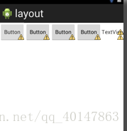
<?xml version="1.0" encoding="utf-8"?>
<TableLayout xmlns:android="http://schemas.android.com/apk/res/android"
    android:layout_width="match_parent"
    android:layout_height="match_parent" >

    <TableRow
        android:id="@+id/tableRow1"
        android:layout_width="wrap_content"
        android:layout_height="wrap_content" >

        <Button
            android:id="@+id/button1"
            style="?android:attr/buttonStyleSmall"
            android:layout_width="wrap_content"
            android:layout_height="wrap_content"
            android:text="Button" />

        <Button
            android:id="@+id/button2"
            style="?android:attr/buttonStyleSmall"
            android:layout_width="wrap_content"
            android:layout_height="wrap_content"
            android:text="Button" />

        <Button
            android:id="@+id/button3"
            style="?android:attr/buttonStyleSmall"
            android:layout_width="wrap_content"
            android:layout_height="wrap_content"
            android:text="Button" />

        <Button
            android:id="@+id/button4"
            style="?android:attr/buttonStyleSmall"
            android:layout_width="wrap_content"
            android:layout_height="wrap_content"
            android:text="Button" />

        <TextView
            android:id="@+id/textView1"
            android:layout_width="wrap_content"
            android:layout_height="wrap_content"
            android:text="TextView" />
    </TableRow>

</TableLayout>第一类:属性值为true或false
android:layout_centerHrizontal 水平居中
android:layout_centerVertical 垂直居中
android:layout_centerInparent 相对于父元素完全居中
android:layout_alignParentBottom 贴紧父元素的下边缘
android:layout_alignParentLeft 贴紧父元素的左边缘
android:layout_alignParentRight 贴紧父元素的右边缘
android:layout_alignParentTop 贴紧父元素的上边缘
android:layout_alignWithParentIfMissing 如果对应的兄弟元素找不到的话就以父元素做参照物
第二类:属性值必须为id的引用名
android:layout_below 在某元素的下方
android:layout_above 在某元素的的上方
android:layout_toLeftOf 在某元素的左边
android:layout_toRightOf 在某元素的右边
android:layout_alignTop 本元素的上边缘和某元素的的上边缘对齐
android:layout_alignLeft 本元素的左边缘和某元素的的左边缘对齐
android:layout_alignBottom 本元素的下边缘和某元素的的下边缘对齐
android:layout_alignRight 本元素的右边缘和某元素的的右边缘对齐
第三类:属性值为具体的像素值,如30dip,40px
android:layout_marginBottom 离某元素底边缘的距离
android:layout_marginLeft 离某元素左边缘的距离
android:layout_marginRight 离某元素右边缘的距离
android:layout_marginTop 离某元素上边缘的距离
EditText的android:hint 设置EditText为空时输入框内的提示信息。
android:gravity
android:gravity属性是对该view 内容的限定.比如一个button 上面的text. 你可以设置该text 在view的靠左,靠右等位置.以button为例,android:gravity="right"则button上面的文字靠右
android:layout_gravity
android:layout_gravity是用来设置该view相对与起父view 的位置.比如一个button 在linearlayout里,你想把该button放在靠左、靠右等位置就可以通过该属性设置.以button为例,android:layout_gravity="right"则button靠右
android:scaleType:
android:scaleType是控制图片如何resized/moved来匹对ImageView的size。ImageView.ScaleType / android:scaleType值的意义区别:
CENTER /center 按图片的原来size居中显示,当图片长/宽超过View的长/宽,则截取图片的居中部分显示
CENTER_CROP / centerCrop 按比例扩大图片的size居中显示,使得图片长(宽)等于或大于View的长(宽)
CENTER_INSIDE / centerInside 将图片的内容完整居中显示,通过按比例缩小或原来的size使得图片长/宽等于或小于View的长/宽
FIT_CENTER / fitCenter 把图片按比例扩大/缩小到View的宽度,居中显示
FIT_END / fitEnd 把图片按比例扩大/缩小到View的宽度,显示在View的下部分位置
FIT_START / fitStart 把图片按比例扩大/缩小到View的宽度,显示在View的上部分位置
FIT_XY / fitXY 把图片不按比例扩大/缩小到View的大小显示
MATRIX / matrix 用矩阵来绘制,动态缩小放大图片来显示。
** 要注意一点,Drawable文件夹里面的图片命名是不能大写的。
android:id 为控件指定相应的ID
android:text 指定控件当中显示的文字,需要注意的是,这里尽量使用strings.xml文件当中的字符串
android:gravity 指定View组件的对齐方式,比如说居中,居右等位置 这里指的是控件中的文本位置并不是控件本身
android:layout_gravity 指定Container组件的对齐方式.比如一个button 在linearlayout里,你想把该button放在靠左、靠右等位置就可以通过该属性设置.以button为 例,android:layout_gravity="right"则button靠右
android:textSize 指定控件当中字体的大小
android:background 指定该控件所使用的背景色,RGB命名法
android:width 指定控件的宽度
android:height 指定控件的高度
android:layout_width 指定Container组件的宽度
android:layout_height 指定Container组件的高度
android:layout_weight View中很重要的属性,按比例划分空间
android:padding* 指定控件的内边距,也就是说控件当中的内容
android:sigleLine 如果设置为真的话,则控件的内容在同一行中进行显示
android:scaleType 是控制图片如何resized/moved来匹对ImageView的siz
android:layout_centerHrizontal 水平居中
android:layout_centerVertical 垂直居中
android:layout_centerInparent 相对于父元素完全居中
android:layout_alignParentBottom 贴紧父元素的下边缘
android:layout_alignParentLeft 贴紧父元素的左边缘
android:layout_alignParentRight 贴紧父元素的右边缘
android:layout_alignParentTop 贴紧父元素的上边缘
android:layout_alignWithParentIfMissing 如果对应的兄弟元素找不到的话就以父元素做参照物
android:layout_below 在某元素的下方
android:layout_above 在某元素的的上方
android:layout_toLeftOf 在某元素的左边
android:layout_toRightOf 在某元素的右边
android:layout_alignTop 本元素的上边缘和某元素的的上边缘对齐
android:layout_alignLeft 本元素的左边缘和某元素的的左边缘对齐
android:layout_alignBottom 本元素的下边缘和某元素的的下边缘对齐
android:layout_alignRight 本元素的右边缘和某元素的的右边缘对齐
android:layout_marginBottom 离某元素底边缘的距离
android:layout_marginLeft 离某元素左边缘的距离
android:layout_marginRight 离某元素右边缘的距离
android:layout_marginTop 离某元素上边缘的距离
android:paddingLeft 本元素内容离本元素右边缘的距离
android:paddingRight 本元素内容离本元素上边缘的距离
android:hint 设置EditText为空时输入框内的提示信息
android:LinearLayout 它确定了LinearLayout的方向,其值可以为vertical,表示垂直布局horizontal, 表示水平布局
android:interpolator
可能有很多人不理解它的用法,文档里说的也不太清楚,其实很简单,看下面:interpolator定义一个动画的变化率(the rate of change)。这使得基本的动画效果(alpha, scale, translate, rotate)得以加速,减速,重复等。用通俗的一点的话理解就是:动画的进度使用 Interpolator 控制。interpolator 定义了动画的变化速度,可以实现匀速、正加速、负加速、无规则变加速等。Interpolator 是基类,封装了所有 Interpolator 的共同方法,它只有一个方法,即 getInterpolation (float input),该方法 maps a point on the timeline to a multiplier to be applied to the transformations of an animation。Android 提供了几个 Interpolator 子类,实现了不同的速度曲线,如下:
AccelerateDecelerateInterpolator 在动画开始与介绍的地方速率改变比较慢,在中间的时侯加速
AccelerateInterpolator 在动画开始的地方速率改变比较慢,然后开始加速
CycleInterpolator 动画循环播放特定的次数,速率改变沿着正弦曲线
DecelerateInterpolator 在动画开始的地方速率改变比较慢,然后开始减速
LinearInterpolator 在动画的以均匀的速率改变
对于 LinearInterpolator ,变化率是个常数,即 f (x) = x.
public float getInterpolation(float input) {
return input;
}
Interpolator其他的几个子类,也都是按照特定的算法,实现了对变化率。还可以定义自己的 Interpolator 子类,实现抛物线、自由落体等物理效果
标签:用法 android 笔记 方向 XML tab 截取 引用 正弦曲线
原文地址:https://www.cnblogs.com/xpwi/p/9690113.html