标签:大小 weight sof show 技术分享 highlight window 线图 ati
1、plot绘制折线图
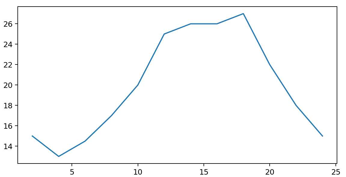
from matplotlib import pyplot as plt

x = range(2, 26, 2)
y = [15, 13, 14.5, 17, 20, 25, 26, 26, 27, 22, 18, 15]

# 设置图片大小
plt.figure(figsize=(20, 8), dpi=180)
# 绘制图形,plot折线图
plt.plot(x, y)
# 保存图形
plt.savefig("14.png")
# 展示图形
plt.show()
2、plot图片的相关设置
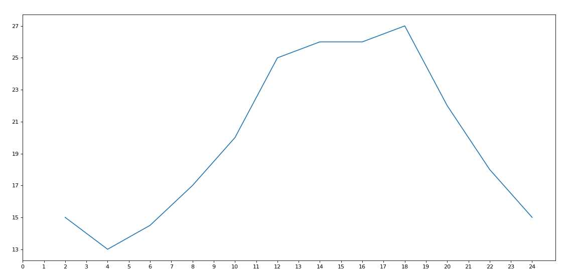
from matplotlib import pyplot as plt

x = range(2, 26, 2)
y = [15, 13, 14.5, 17, 20, 25, 26, 26, 27, 22, 18, 15]

# 设置图片大小
plt.figure(figsize=(20, 8), dpi=80)

# 绘制图形,plot折线图
plt.plot(x, y)

# 设置x轴的刻度
plt.xticks(range(0,25))

# 设置y轴的刻度
max_y=max(y)
min_y=min(y)
yticks_labels=list(range(min_y,max_y+1))[::2]
plt.yticks(yticks_labels)
3、plot相关设置2
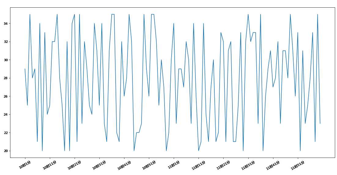
import matplotlib
from matplotlib import pyplot as plt
import random
from matplotlib import font_manager

# 设置局部字体
my_font = font_manager.FontProperties(fname="C:\Windows\Fonts\STSONG.TTF")

# 设置全局字体
# fc-list查看字体
font = {‘family‘: ‘Microsoft Yahei‘,
        ‘weight‘: ‘bold‘,
        }
matplotlib.rc("font", **font)

x = range(120)
y = [random.randint(20, 35) for i in range(120)]

# 图大小
plt.figure(figsize=(20, 8), dpi=80)

# 绘制折线图
plt.plot(x, y)

# x轴线刻度
_xticks_labels = ["10时{}分".format(i) for i in range(1, 61)]
_xticks_labels += ["11时{}分".format(i) for i in range(1, 61)]
# print(_xticks_labels)
# plt.xticks(list(x)[::10],_xticks_labels[::10],rotation=30,fontproperties=my_font)
plt.xticks(list(x)[::10], _xticks_labels[::10], rotation=30)

plt.show()
标签:大小 weight sof show 技术分享 highlight window 线图 ati
原文地址:https://www.cnblogs.com/andy9468/p/9867914.html