标签:style blog http color io os ar sp div
总结了一下两栏布局,右侧自适应的方法,欢迎指点和补充~~
方法一:要求right中的子元素不能有固定宽度的(为了IE6),right要加overflow:hidden;
如果right中的内容有固定宽度的浮动元素时,right要加overflow:hidden;,否则当浏览器缩小到right宽度小于里面子元素的宽度时,在非IE67的浏览器中right里的子元素会下移,IE7正常显示;
不论加不加overflow,在IE6中,当浏览器缩小到right宽度小于里面子元素的宽度时,right都会下移。
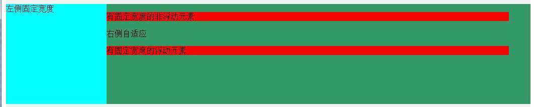
<style type="text/css">
.box01{
    padding:10px 0;
    background:#F2F2F2;
}
.box01 div{
    height:200px;
}
.box01 .left{
    width:200px;
    float:left;           /***/
    background:#0FF;
}
.box01 .right{
    background:#396;
    overflow:hidden;    /*不加overflow:hidden时,right里面的内容有固定宽度的,当浏览器缩小时,里面的内容会下移*/
}
</style>

<div class="box01">
   <div class="left">左侧固定宽度</div>
   <div class="right">
      <p style="width:800px;background:#F00;">有固定宽度的非浮动元素</p>
      右侧自适应
      <p style="width:800px;background:#F00;float:left;">有固定宽度的浮动元素</p>
   </div>
</div>
方法二:要求right中的子元素不能有固定宽度的(为了IE6),right要加overflow:hidden;
<style type="text/css">
.box02{
    padding:10px 0;
    background:#F2F2F2;
}
.box02 div{
    height:200px;
}
.box02 .left{
    width:200px;
    float:left;          /***/
    background:#0FF;
}
.box02 .right{
    margin-left:200px;   /***/
    background:#396;
    overflow:hidden;     /***/
}
</style>

<div class="box02">
   <div class="left">左侧固定宽度</div>
   <div class="right">
      <p style="width:800px;background:#F00;">有固定宽度的非浮动元素</p>
      右侧自适应
      <p style="width:800px;background:#F00;float:left;">有固定宽度的浮动元素</p>
   </div>
</div>
方法三:要求right中的子元素不能有固定宽度的(为了IE6),right要加overflow:hidden;
<style type="text/css">
.box03{
    padding:10px 0;
    background:#F2F2F2;
    margin-left:200px;     /***/
    position:relative;
}
.box03 div{
    height:200px;
}
.box03 .left{
    width:200px;
    float:left;           /***/
    margin-left:-200px;    /***/
    background:#0FF;
}
.box03 .right{
    width:100%;
    background:#396;
    overflow:hidden;     /***/
}
</style>

<div class="box03">
   <div class="left">左侧固定宽度</div>
   <div class="right">
      <p style="width:800px;background:#F00;">有固定宽度的非浮动元素</p>
      右侧自适应
      <p style="width:800px;background:#F00;float:left;">有固定宽度的浮动元素</p>
   </div>
</div>
方法四:right要加overflow:hidden;
<style type="text/css">
.box04{
    padding:10px 0;
    background:#F2F2F2;
    position:relative;      /***/
}
.box04 div{
    height:200px;
}
.box04 .left{
    width:200px;
    background:#0FF;
    position:absolute;     /***/
    top:10px;
    left:0;
}
.box04 .right{
    background:#396;
    margin-left:200px;    /***/
    overflow:hidden;
}
</style>

<div class="box04">
   <div class="left">左侧固定宽度</div>
   <div class="right">
      <p style="width:800px;background:#F00;">有固定宽度的非浮动元素</p>
      右侧自适应
      <p style="width:800px;background:#F00;float:left;">有固定宽度的浮动元素</p>
   </div>
</div>
方法五:淘宝的做法,不支持IE6
<style type="text/css">
.box05{
    padding:10px 0;
    background:#F2F2F2;
}
.box05 div{
    height:200px;
}

.box05 .left{
    width:200px;
    background:#0FF;
    float: left;            /***/
    margin-left: -100%;     /***/
}
.box05 .right_box{
    width:100%;
    float:left;            /***/
}
.box05 .right{
    background:#396;
    margin-left:200px;      /***/
    overflow:hidden;        /***/
}
</style>

<div class="box05 clear">
   <div class="right_box">
       <div class="right">
          <p style="width:800px;background:#F00;">有固定宽度的非浮动元素</p>
          右侧自适应
          <p style="width:800px;background:#F00;float:left;">有固定宽度的浮动元素</p>
       </div>
   </div>
   <div class="left">左侧固定宽度</div>
</div>
效果很丑,请看图片
标签:style blog http color io os ar sp div
原文地址:http://www.cnblogs.com/lorineying/p/4026111.html