标签:tom string 电子 htm head div text .com 图片
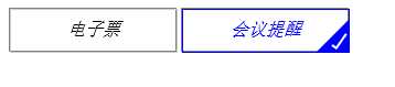
我们要创建方框中的对勾,对于这一点,我们可以使用伪类创建一个新的元素,为了实现这个样式,我们可以创建一个5px * 15px的长方形并给他加上边框。这时候我们去掉上面和右边的边框之后,它会看起来像一个字母L。然后我们可以使用CSS的属性让它旋转一下,这样看起来就像是一个对勾。
<!DOCTYPE html><html lang="en"><head> <meta charset="UTF-8"> <title>选中标签forcheck</title> <style type="text/css">.div-checked label { cursor: pointer; position: relative; display: inline-block; width: 150px; height: 38px; border: 1px solid grey; } /** * 按钮透明 * @type {String} */ input[type="checkbox"] { opacity: 0; } /** * checkbox选中样式 * @type {String} */ input[type="checkbox"]:checked + i { border-color: blue; color: blue; } /** * i标签的大小 */ i { position: absolute; top: 0; left: 0; width: 100%; height: 100%; border: 1px solid #ccc; text-align: center; line-height: 36px; } /** * 对勾√效果,使用border * @type {[type]} */ span:after { opacity: 1; content: ‘‘; position: absolute; width: 5px; height: 15px; background: transparent; top: 10px; right: 5px; border: 2px solid #fff; border-top: none; border-left: none; -webkit-transform: rotate(35deg); -moz-transform: rotate(35deg); -o-transform: rotate(35deg); -ms-transform: rotate(35deg); transform: rotate(35deg); } /** * 选中状态,span(三角形)样式 * @type {String} */ input[type="checkbox"]:checked + i + span { width: 0px; height: 0px; border-color: blue transparent; border-width: 0px 0px 30px 30px; border-style: solid; position: absolute; right: -1px; top: 10px; opacity: 1; }}} </style></head><body> <div class="div-checked"> <label> <input type="checkbox" value="cbEticket"> <i>电子票</i><span></span> </label> <label> <input type="checkbox" checked="" value="cbMeetingRemind"> <i>会议提醒</i><span></span> </label> </div></body></html>标签:border absolute poi nbsp inpu oct 中标 inline bsp
原文地址:http://www.cnblogs.com/liusc/p/57c27a929622b8de72155d98888f67cc.html
标签:tom string 电子 htm head div text .com 图片
原文地址:https://www.cnblogs.com/xiaoshen666/p/10721404.html