标签:round sel 设置 doc tle lex upd 20px hidden
想要保证自适应内容不超出容器怎么办。
通过为自适应的一侧设置width: 0;或者overflow: hidden;解决。
首先实现标题的布局,也很简单:
<div class="item">
    <div class="l">LEFT</div>
    <div class="r">
        <div class="title">OMG OMG OMG OMG OMG OMG OMG OMG OMG OMG OMG OMG OMG OMG OMG OMG OMG OMG OMG OMG OMG OMG</div>
        <div class="content">
            RIGHT FULL
        </div>
    </div>
</div>
.item {
display: flex;
}
.item .l {
width: 240px;
min-width: 240px;
background-color: #ff5f00;
}
.item .r {
background-color: mediumseagreen;
flex-grow: 1;
padding: 20px;
}
.item .r .content {
width: 100%;
word-break: break-all;
}
.item .r .title {
font-weight: bolder;
font-size: 1.4em;
width: 100%;
/*overflow: hidden;
text-overflow: ellipsis;
white-space: nowrap;*/
}let str = '';
for (var i = 0; i < 1000; i++) {
str += ('' + Math.random().toString().substr(2, 5));
}
document.querySelector('body > div.item > div.r > div.content').innerHTML = str;预览发现基本符合预期:
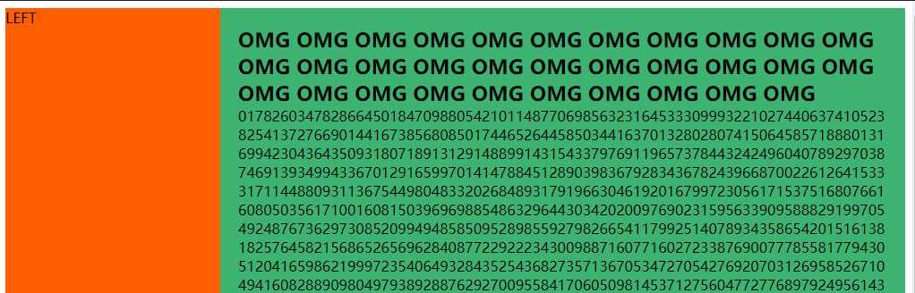
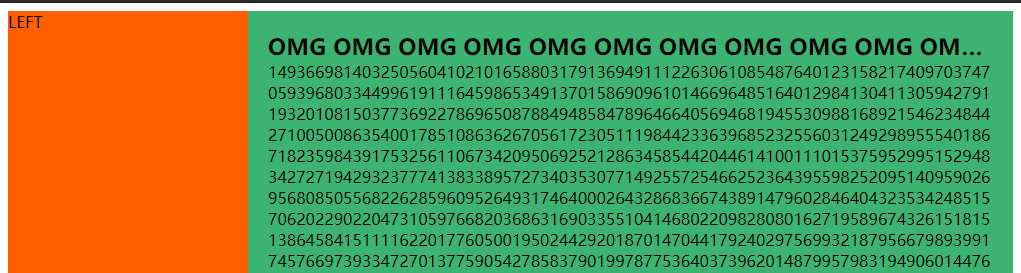
这时如果想要标题不换行,超出省略号;将CSS中注释的代码取消注释,会发现,内容将容器撑开,出现了横向滚动条,这不是我们想要的。
要解决这个问题,可以:
.item .r {
    background-color: mediumseagreen;
    flex-grow: 1;
    padding: 20px;
    /*增加一个*/
    width: 0;
}
或者:
item .r {
    background-color: mediumseagreen;
    flex-grow: 1;
    padding: 20px;
    /*增加一个*/
    overflow: hidden;
}
也可以达到预期。
The end...Last updated by Jehorn, 2:55 PM, Thursday, May 9, 2019
标签:round sel 设置 doc tle lex upd 20px hidden
原文地址:https://www.cnblogs.com/jehorn/p/10838482.html