标签:poi ace point back for 间隔 contain markdown tar
CSS 中 Flex-Box 语法链接 http://www.ruanyifeng.com/blog/2015/07/flex-grammar.html
Flex 是 Flexible Box 的缩写,意为”弹性布局”,用来为盒状模型提供最大的灵活性。任何一个容器都可以指定为 Flex 布局。
布局源码
import React, { Component } from ‘react‘;
import {
Platform,
StyleSheet,
View,
Image,
} from ‘react-native‘;
const instructions = Platform.select({
ios: ‘Press Cmd+R to reload,\n‘ +
‘Cmd+D or shake for dev menu‘,
android: ‘Double tap R on your keyboard to reload,\n‘ +
‘Shake or press menu button for dev menu‘,
});
export default class App extends Component {
render() {
return (
<View style={styles.container}>
<Image style={styles.image} source={require(‘./img/point.png‘)}/>
<Image style={styles.image} source={require(‘./img/point.png‘)}/>
<Image style={styles.image} source={require(‘./img/point.png‘)}/>
</View>
);
}
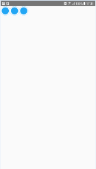
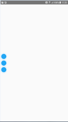
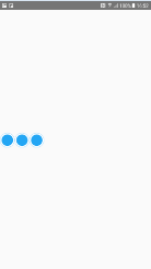
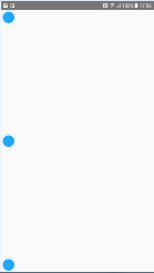
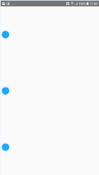
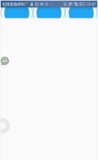
}水平布局(不设置朝向,则默认为竖直布局)
const styles = StyleSheet.create({
container: {
flexDirection: ‘row‘,
},
image: {
width: 40,
height: 40,
padding: 20,
}
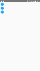
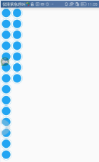
});竖直布局(不设置朝向,则默认为竖直布局)
const styles = StyleSheet.create({
    container: {
        flexDirection: ‘column‘,
    },
    image: {
        width: 40,
        height: 40,
        padding: 20,
    }
});
默认样式 顶部 水平居左/左上角
const styles = StyleSheet.create({
  container: {

  },
  image: {
    width: 40,
    height: 40,
    padding: 20,
    background: ‘#00000033‘
  }
});
或
const styles = StyleSheet.create({
  container: {
    flex: 1,
    justifyContent: ‘flex-start‘,
  },
  image: {
    width: 40,
    height: 40,
    padding: 20,
    background: ‘#00000033‘
  }
});
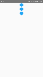
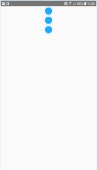
顶部 水平居中
const styles = StyleSheet.create({
  container: {
    flex: 1,
    alignItems: ‘center‘,
  },
  image: {
    width: 40,
    height: 40,
    padding: 20,
  }
});
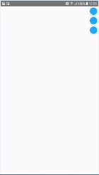
顶部 水平居右/右上角
const styles = StyleSheet.create({
  container: {
    flex: 1,
    alignItems: ‘flex-end‘,
  },
  image: {
    width: 40,
    height: 40,
    padding: 20,
  }
});
居左 竖直居中
const styles = StyleSheet.create({
container: {
flex: 1,
justifyContent: ‘center‘,
},
image: {
width: 40,
height: 40,
padding: 20,
}
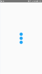
});水平且垂直居中(显示在屏幕中央)
const styles = StyleSheet.create({
  container: {
    flex: 1,
    justifyContent: ‘center‘,
    alignItems: ‘center‘,
  },
  image: {
    width: 40,
    height: 40,
    padding: 20,
  }
});
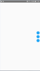
居右 竖直居中
const styles = StyleSheet.create({
container: {
flex: 1,
justifyContent: ‘center‘,
alignItems: ‘flex-end‘,
},
image: {
width: 40,
height: 40,
padding: 20,
}
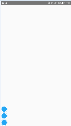
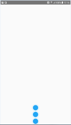
});底部 水平居左/左下角
const styles = StyleSheet.create({
  container: {
    flex: 1,
    justifyContent: ‘flex-end‘,
  },
  image: {
    width: 40,
    height: 40,
    padding: 20,
  }
});
底部 水平居中
const styles = StyleSheet.create({
container: {
flex: 1,
justifyContent: ‘flex-end‘,
alignItems: ‘center‘,
},
image: {
width: 40,
height: 40,
padding: 20,
}
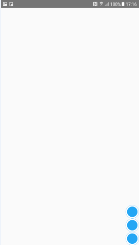
});底部 水平居右/右下角
const styles = StyleSheet.create({
  container: {
    flex: 1,
    justifyContent: ‘flex-end‘,
    alignItems: ‘flex-end‘,
  },
  image: {
    width: 40,
    height: 40,
    padding: 20,
  }
});
设置 flexDirection 属性,改变的是主轴的方向,如果不设置 flexDirection 属性,则默认布局朝向是竖直方向的,上面的例子是 flexDirection: column(竖直朝向)的效果,可以用 flexDirection: row(水平朝向) 和 flexDirection: column(竖直朝向) 来设置布局朝向。如果在 style 中添加 flexDirection: row 属性,则上述效果会改变,如下述例子(建议尝试上述样式基础上、添加 flexDirection: row 后的效果)
理解:flexDirection: column(竖直朝向)时, x 轴为主轴,justifyContent 属性控制子控件相对 x 轴的 上/中/下 位置,y 轴为副轴,alignItems 属性控制子控件相对 y 轴的 左/中/右 位置;flexDirection: row(水平朝向)时, y 轴为主轴,justifyContent 属性控制子控件相对 y 轴的 左/中/右 位置,x 轴为副轴,alignItems 属性控制子控件相对 x 轴的 上/中/下 位置
默认或设置为 flexDirection: column 时
const styles = StyleSheet.create({
    container: {
        flex: 1,
        justifyContent: ‘flex-start‘,
        alignItems: ‘center‘,
    },
    image: {
        width: 40,
        height: 40,
        padding: 20,
    }
});
或
const styles = StyleSheet.create({
    container: {
        flex: 1,
        flexDirection: ‘column‘,
        justifyContent: ‘flex-start‘,
        alignItems: ‘center‘,
    },
    image: {
        width: 40,
        height: 40,
        padding: 20,
    }
});
设置为 flexDirection: row 时
const styles = StyleSheet.create({
    container: {
        flex: 1,
        flexDirection: ‘row‘,
        justifyContent: ‘flex-start‘,
        alignItems: ‘center‘,
    },
    image: {
        width: 40,
        height: 40,
        padding: 20,
    }
});
justifyContent 的属性值
上述代码中用到了 justifyContent 属性的 flex-start(默认值):左对齐、center: 居中、flex-end:右对齐,但 justifyContent 还有2个属性值
下面的这两个属性值,可以搭配 alignItems 的 flex-start、flex-end、center 三个属性搭配使用‘space-between’:两端对齐,项目之间的间隔都相等
const styles = StyleSheet.create({
    container: {
        flex: 1,
        justifyContent: ‘space-between‘
    },
    image: {
        width: 40,
        height: 40,
        padding: 20,
    }
});
‘space-around’:每个项目两侧的间隔相等。所以,项目之间的间隔比项目与边框的间隔大一倍
const styles = StyleSheet.create({
    container: {
        flex: 1,
        justifyContent: ‘space-around‘
    },
    image: {
        width: 40,
        height: 40,
        padding: 20,
    }
});
alignItems 的属性值
上述代码中用到了 alignItems 属性的 flex-start(默认值):上对齐、center: 居中、flex-end:下对齐,但 alignItems 还有2个属性值
下面的这两个属性值,可以搭配 justifyContent 的 flex-start、flex-end、center 三个属性搭配使用‘baseline’: 项目的第一行文字的基线对齐
//TODO 没看到效果呢
const styles = StyleSheet.create({
    container: {
        flex: 1,
        alignItems: ‘baseline‘
    },
    image: {
        width: 40,
        height: 40,
        padding: 20,
    }
});
‘stretch’(默认值):如果项目未设置高度或设为auto,将占满整个容器的高度
//TODO 没看到效果呢
const styles = StyleSheet.create({
    container: {
        flex: 1,
        alignItems: ‘stretch‘
    },
    image: {
        width: 40,
        height: 40,
        padding: 20,
    }
});
flex-grow 的属性值:定义项目的放大比例
默认为0,如果所有 item 的 flex-grow 属性都为1,则它们将等分剩余空间。如果某一个 item 的flex-grow属性为2,其他 item 都为1,则该 item 占据的剩余空间将比其他 item 多一倍
const styles = StyleSheet.create({
    container: {
        flex: 1,
    },
    image: {
        flexGrow: 1,
        width: 40,
        height: 40,
        padding: 20,
    }
});
const styles = StyleSheet.create({
container: {
flexDirection: ‘row‘,
flex: 1,
},
image: {
flexGrow: 1,
width: 40,
height: 40,
padding: 20,
}
});
flex-wrap 的属性值:如果一条轴线排不下,换行。默认情况下,项目都排在一条线上(又称”主轴线”)。flex-wrap 属性定义
有三个属性值:nowrap(默认):不换行;wrap:换行、第一行在前;wrap-reverse:换行、第一行在后
const styles = StyleSheet.create({
    container: {
        flex: 1,
        flexWrap: ‘wrap‘,
    },
    image: {
        width: 40,
        height: 40,
        padding: 20,
    }
});
React Native 中的 Flex Box 的用法(水平布局、垂直布局、水平居中、垂直居中、居中布局)
标签:poi ace point back for 间隔 contain markdown tar
原文地址:https://www.cnblogs.com/xihehua/p/10857730.html

