标签:bsp str imshow field mic htm current src imp
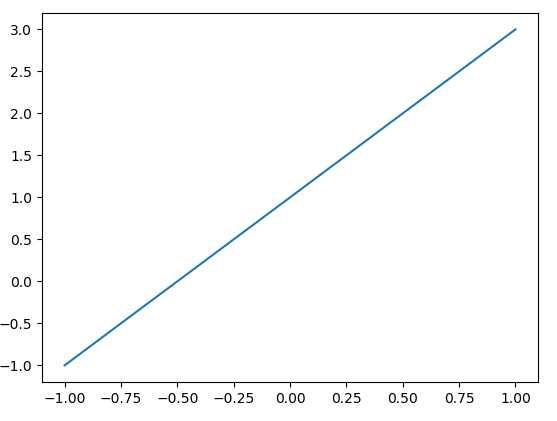
1.基本用法
import matplotlib.pyplot as plt
import numpy as np

x = np.linspace(-1, 1, 50)
y = 2*x + 1
# y = x**2
plt.plot(x, y)
plt.show()
2.figure (一个figure就是一幅图)
import matplotlib.pyplot as plt
import numpy as np

x = np.linspace(-3, 3, 50)
y1 = 2*x + 1
y2 = x**2

plt.figure()
plt.plot(x, y1)


plt.figure(num=3, figsize=(8, 5),)
plt.plot(x, y2)
# plot the second curve in this figure with certain parameters
plt.plot(x, y1, color=‘red‘, linewidth=1.0, linestyle=‘--‘)
plt.show()
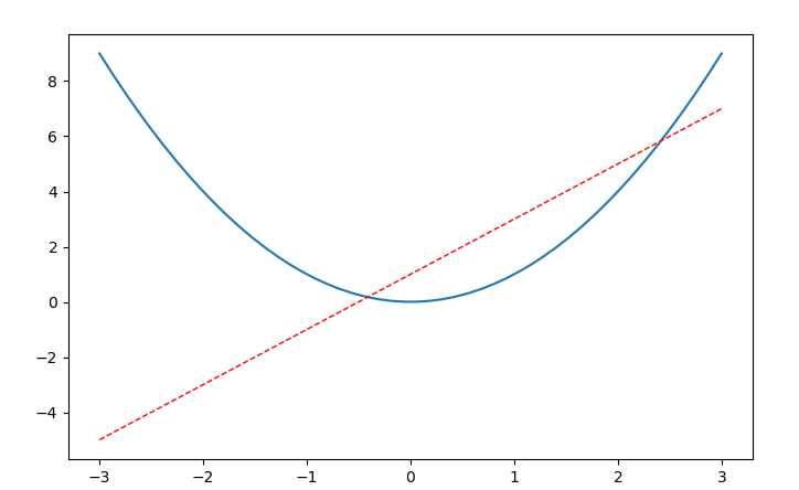
3.坐标轴的设置(一)
import matplotlib.pyplot as plt
import numpy as np

x = np.linspace(-3, 3, 50)
y1 = 2*x + 1
y2 = x**2

plt.figure()
plt.plot(x, y2)
# plot the second curve in this figure with certain parameters
plt.plot(x, y1, color=‘red‘, linewidth=1.0, linestyle=‘--‘)
# set x limits
plt.xlim((-1, 2))
plt.ylim((-2, 3))
plt.xlabel(‘I am x‘)
plt.ylabel(‘I am y‘)

# set new sticks
new_ticks = np.linspace(-1, 2, 5)

plt.xticks(new_ticks)
# set tick labels
plt.yticks([-2, -1.8, -1, 1.22, 3],
           [r‘$really\ bad$‘, r‘$bad$‘, r‘$normal$‘, r‘$good$‘, r‘$really\ good$‘])
plt.show()
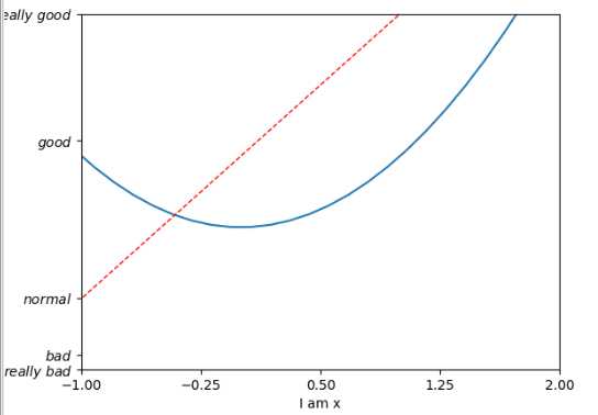
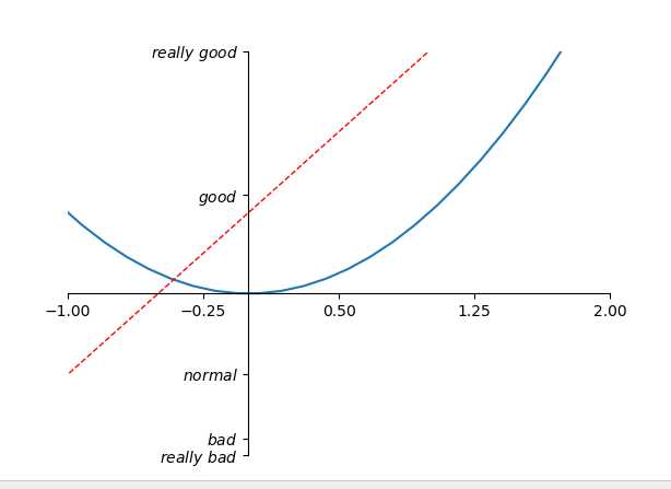
4.坐标轴的设置(二)
import matplotlib.pyplot as plt
import numpy as np

x = np.linspace(-3, 3, 50)
y1 = 2*x + 1
y2 = x**2

plt.figure()
plt.plot(x, y2)
# plot the second curve in this figure with certain parameters
plt.plot(x, y1, color=‘red‘, linewidth=1.0, linestyle=‘--‘)
# set x limits
plt.xlim((-1, 2))
plt.ylim((-2, 3))

# set new ticks
new_ticks = np.linspace(-1, 2, 5)
plt.xticks(new_ticks)
# set tick labels
plt.yticks([-2, -1.8, -1, 1.22, 3],
           [‘$really\ bad$‘, ‘$bad$‘, ‘$normal$‘, ‘$good$‘, ‘$really\ good$‘])
# to use ‘$ $‘ for math text and nice looking, e.g. ‘$\pi$‘

# gca = ‘get current axis‘
ax = plt.gca()
ax.spines[‘right‘].set_color(‘none‘)
ax.spines[‘top‘].set_color(‘none‘)

ax.xaxis.set_ticks_position(‘bottom‘)
# ACCEPTS: [ ‘top‘ | ‘bottom‘ | ‘both‘ | ‘default‘ | ‘none‘ ]

ax.spines[‘bottom‘].set_position((‘data‘, 0))
# the 1st is in ‘outward‘ | ‘axes‘ | ‘data‘
# axes: percentage of y axis
# data: depend on y data

ax.yaxis.set_ticks_position(‘left‘)
# ACCEPTS: [ ‘left‘ | ‘right‘ | ‘both‘ | ‘default‘ | ‘none‘ ]

ax.spines[‘left‘].set_position((‘data‘,0))
plt.show()
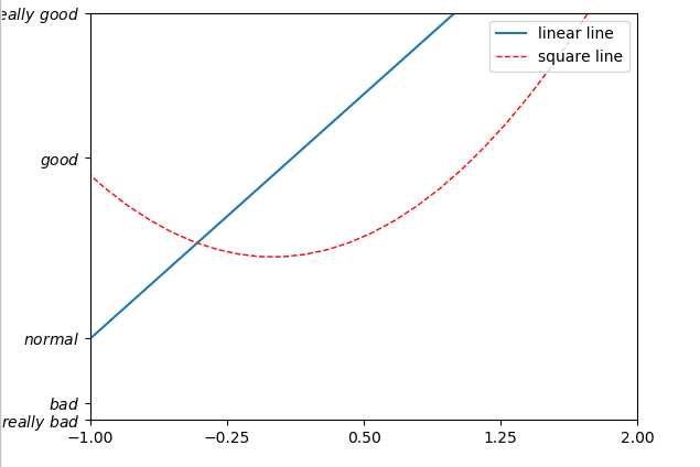
5.legend(角标)
import matplotlib.pyplot as plt
import numpy as np

x = np.linspace(-3, 3, 50)
y1 = 2*x + 1
y2 = x**2

plt.figure()
# set x limits
plt.xlim((-1, 2))
plt.ylim((-2, 3))

# set new sticks
new_sticks = np.linspace(-1, 2, 5)
plt.xticks(new_sticks)
# set tick labels
plt.yticks([-2, -1.8, -1, 1.22, 3],
           [r‘$really\ bad$‘, r‘$bad$‘, r‘$normal$‘, r‘$good$‘, r‘$really\ good$‘])

l1, = plt.plot(x, y1, label=‘linear line‘)
l2, = plt.plot(x, y2, color=‘red‘, linewidth=1.0, linestyle=‘--‘, label=‘square line‘)

plt.legend(loc=‘upper right‘)
# plt.legend(handles=[l1, l2], labels=[‘up‘, ‘down‘],  loc=‘best‘)
# the "," is very important in here l1, = plt... and l2, = plt... for this step
"""legend( handles=(line1, line2, line3),
           labels=(‘label1‘, ‘label2‘, ‘label3‘),
           ‘upper right‘)
    The *loc* location codes are::
          ‘best‘ : 0,          (currently not supported for figure legends)
          ‘upper right‘  : 1,
          ‘upper left‘   : 2,
          ‘lower left‘   : 3,
          ‘lower right‘  : 4,
          ‘right‘        : 5,
          ‘center left‘  : 6,
          ‘center right‘ : 7,
          ‘lower center‘ : 8,
          ‘upper center‘ : 9,
          ‘center‘       : 10,"""

plt.show()
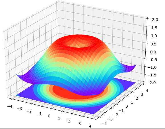
6. 3D图像
import numpy as np
import matplotlib.pyplot as plt
from mpl_toolkits.mplot3d import Axes3D

fig = plt.figure()
ax = Axes3D(fig)
# X, Y value
X = np.arange(-4, 4, 0.25)
Y = np.arange(-4, 4, 0.25)
X, Y = np.meshgrid(X, Y)
R = np.sqrt(X ** 2 + Y ** 2)
# height value
Z = np.sin(R)

ax.plot_surface(X, Y, Z, rstride=1, cstride=1, cmap=plt.get_cmap(‘rainbow‘))
"""
============= ================================================
        Argument      Description
        ============= ================================================
        *X*, *Y*, *Z* Data values as 2D arrays
        *rstride*     Array row stride (step size), defaults to 10
        *cstride*     Array column stride (step size), defaults to 10
        *color*       Color of the surface patches
        *cmap*        A colormap for the surface patches.
        *facecolors*  Face colors for the individual patches
        *norm*        An instance of Normalize to map values to colors
        *vmin*        Minimum value to map
        *vmax*        Maximum value to map
        *shade*       Whether to shade the facecolors
        ============= ================================================
"""

# I think this is different from plt12_contours
ax.contourf(X, Y, Z, zdir=‘z‘, offset=-2, cmap=plt.get_cmap(‘rainbow‘))
"""
==========  ================================================
        Argument    Description
        ==========  ================================================
        *X*, *Y*,   Data values as numpy.arrays
        *Z*
        *zdir*      The direction to use: x, y or z (default)
        *offset*    If specified plot a projection of the filled contour
                    on this position in plane normal to zdir
        ==========  ================================================
"""

ax.set_zlim(-2, 2)

plt.show()
7.animation动态图 (本人用的pycharm没动起来,想了解的可以看莫烦视频)
import numpy as np
from matplotlib import pyplot as plt
from matplotlib import animation

fig, ax = plt.subplots()

x = np.arange(0, 2*np.pi, 0.01)
line, = ax.plot(x, np.sin(x))


def animate(i):
    line.set_ydata(np.sin(x + i/10.0))  # update the data
    return line,


# Init only required for blitting to give a clean slate.
def init():
    line.set_ydata(np.sin(x))
    return line,

# call the animator.  blit=True means only re-draw the parts that have changed.
# blit=True dose not work on Mac, set blit=False
# interval= update frequency
ani = animation.FuncAnimation(fig=fig, func=animate, frames=100, init_func=init,
                              interval=20, blit=False)

# save the animation as an mp4.  This requires ffmpeg or mencoder to be
# installed.  The extra_args ensure that the x264 codec is used, so that
# the video can be embedded in html5.  You may need to adjust this for
# your system: for more information, see
# http://matplotlib.sourceforge.net/api/animation_api.html
# anim.save(‘basic_animation.mp4‘, fps=30, extra_args=[‘-vcodec‘, ‘libx264‘])

plt.show()
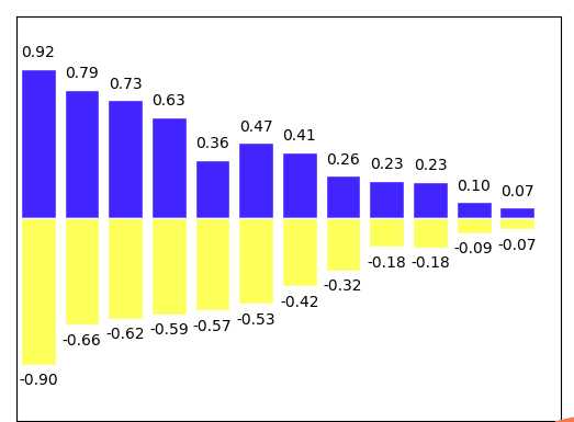
8.bar (柱状图)
import matplotlib.pyplot as plt
import numpy as np

n = 12
X = np.arange(n)
Y1 = (1 - X / float(n)) * np.random.uniform(0.5, 1.0, n)
Y2 = (1 - X / float(n)) * np.random.uniform(0.5, 1.0, n)

plt.bar(X, +Y1, facecolor=‘#4325FF‘, edgecolor=‘white‘)
plt.bar(X, -Y2, facecolor=‘#FCFF5B‘, edgecolor=‘white‘)

for x, y in zip(X, Y1):
    # ha: horizontal alignment
    # va: vertical alignment
    plt.text(x , y + 0.05, ‘%.2f‘ % y, ha=‘center‘, va=‘bottom‘)

for x, y in zip(X, Y2):
    # ha: horizontal alignment
    # va: vertical alignment
    plt.text(x , -y - 0.05, ‘-%.2f‘ % y, ha=‘center‘, va=‘top‘)

plt.xlim(-.5, n)
plt.xticks(())
plt.ylim(-1.25, 1.25)
plt.yticks(())

plt.show()
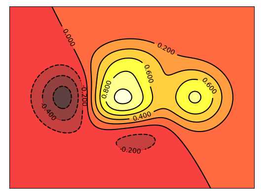
9.contours(等高线)
import matplotlib.pyplot as plt
import numpy as np

def f(x,y):
    # the height function
    return (1 - x / 2 + x**5 + y**3) * np.exp(-x**2 -y**2)

n = 256
x = np.linspace(-3, 3, n)
y = np.linspace(-3, 3, n)
X,Y = np.meshgrid(x, y)

# use plt.contourf to filling contours
# X, Y and value for (X,Y) point
plt.contourf(X, Y, f(X, Y), 8, alpha=.75, cmap=plt.cm.hot)

# use plt.contour to add contour lines
C = plt.contour(X, Y, f(X, Y), 8, colors=‘black‘, linewidth=.5)
# adding label
plt.clabel(C, inline=True, fontsize=10)

plt.xticks(())
plt.yticks(())
plt.show()
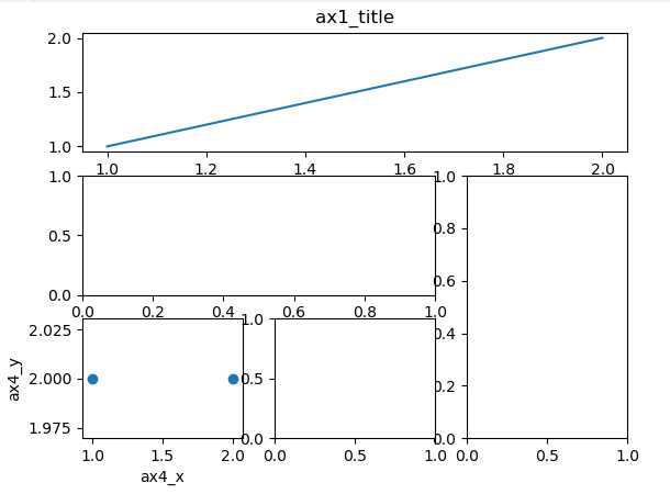
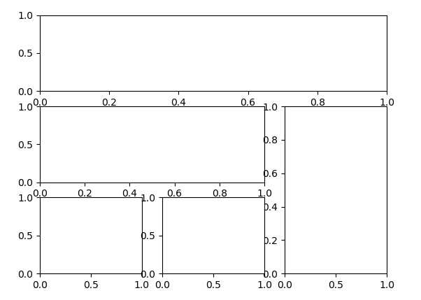
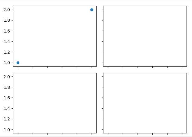
10.三种格点布局方式 grid
import matplotlib.pyplot as plt
import matplotlib.gridspec as gridspec

# method 1: subplot2grid
##########################
plt.figure()
ax1 = plt.subplot2grid((3, 3), (0, 0), colspan=3)  # stands for axes
ax1.plot([1, 2], [1, 2])
ax1.set_title(‘ax1_title‘)
ax2 = plt.subplot2grid((3, 3), (1, 0), colspan=2)
ax3 = plt.subplot2grid((3, 3), (1, 2), rowspan=2)
ax4 = plt.subplot2grid((3, 3), (2, 0))
ax4.scatter([1, 2], [2, 2])
ax4.set_xlabel(‘ax4_x‘)
ax4.set_ylabel(‘ax4_y‘)
ax5 = plt.subplot2grid((3, 3), (2, 1))

# method 2: gridspec
#########################
plt.figure()
gs = gridspec.GridSpec(3, 3)
# use index from 0
ax6 = plt.subplot(gs[0, :])
ax7 = plt.subplot(gs[1, :2])
ax8 = plt.subplot(gs[1:, 2])
ax9 = plt.subplot(gs[-1, 0])
ax10 = plt.subplot(gs[-1, -2])

# method 3: easy to define structure
####################################
f, ((ax11, ax12), (ax13, ax14)) = plt.subplots(2, 2, sharex=True, sharey=True)
ax11.scatter([1,2], [1,2])

plt.tight_layout()
plt.show()
----------------------------------------------------------------------------------------------------------------------------
------------------------------------------------------------------------------------------------------------------------------
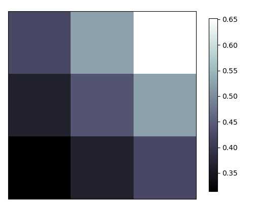
11.image
import matplotlib.pyplot as plt
import numpy as np

# image data
a = np.array([0.313660827978, 0.365348418405, 0.423733120134,
              0.365348418405, 0.439599930621, 0.525083754405,
              0.423733120134, 0.525083754405, 0.651536351379]).reshape(3,3)

"""
for the value of "interpolation", check this:
http://matplotlib.org/examples/images_contours_and_fields/interpolation_methods.html
for the value of "origin"= [‘upper‘, ‘lower‘], check this:
http://matplotlib.org/examples/pylab_examples/image_origin.html
"""
plt.imshow(a, interpolation=‘nearest‘, cmap=‘bone‘, origin=‘lower‘)
plt.colorbar(shrink=.92)

plt.xticks(())
plt.yticks(())
plt.show()
12.plot in plot
import matplotlib.pyplot as plt

fig = plt.figure()
x = [1, 2, 3, 4, 5, 6, 7]
y = [1, 3, 4, 2, 5, 8, 6]

# below are all percentage
left, bottom, width, height = 0.1, 0.1, 0.8, 0.8
ax1 = fig.add_axes([left, bottom, width, height])  # main axes
ax1.plot(x, y, ‘r‘)
ax1.set_xlabel(‘x‘)
ax1.set_ylabel(‘y‘)
ax1.set_title(‘title‘)

ax2 = fig.add_axes([0.2, 0.6, 0.25, 0.25])  # inside axes
ax2.plot(y, x, ‘b‘)
ax2.set_xlabel(‘x‘)
ax2.set_ylabel(‘y‘)
ax2.set_title(‘title inside 1‘)


# different method to add axes
####################################
plt.axes([0.6, 0.2, 0.25, 0.25])
plt.plot(y[::-1], x, ‘g‘)
plt.xlabel(‘x‘)
plt.ylabel(‘y‘)
plt.title(‘title inside 2‘)

plt.show()

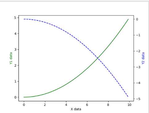
13.secondary yaix
import matplotlib.pyplot as plt
import numpy as np

x = np.arange(0, 10, 0.1)
y1 = 0.05 * x**2
y2 = -1 *y1

fig, ax1 = plt.subplots()

ax2 = ax1.twinx()    # mirror the ax1
ax1.plot(x, y1, ‘g-‘)
ax2.plot(x, y2, ‘b--‘)

ax1.set_xlabel(‘X data‘)
ax1.set_ylabel(‘Y1 data‘, color=‘g‘)
ax2.set_ylabel(‘Y2 data‘, color=‘b‘)

plt.show()
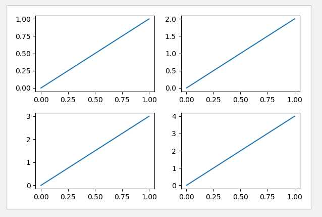
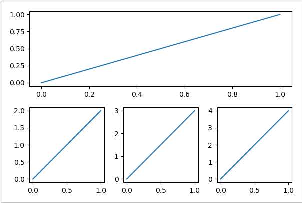
14.subplot
import matplotlib.pyplot as plt

# example 1:
###############################
plt.figure(figsize=(6, 4))
# plt.subplot(n_rows, n_cols, plot_num)
plt.subplot(2, 2, 1)
plt.plot([0, 1], [0, 1])

plt.subplot(222)
plt.plot([0, 1], [0, 2])

plt.subplot(223)
plt.plot([0, 1], [0, 3])

plt.subplot(224)
plt.plot([0, 1], [0, 4])

plt.tight_layout()

# example 2:
###############################
plt.figure(figsize=(6, 4))
# plt.subplot(n_rows, n_cols, plot_num)
plt.subplot(2, 1, 1)
# figure splits into 2 rows, 1 col, plot to the 1st sub-fig
plt.plot([0, 1], [0, 1])

plt.subplot(234)
# figure splits into 2 rows, 3 col, plot to the 4th sub-fig
plt.plot([0, 1], [0, 2])

plt.subplot(235)
# figure splits into 2 rows, 3 col, plot to the 5th sub-fig
plt.plot([0, 1], [0, 3])

plt.subplot(236)
# figure splits into 2 rows, 3 col, plot to the 6th sub-fig
plt.plot([0, 1], [0, 4])


plt.tight_layout()
plt.show()
------------------------------------------------------------------------------------------------------------------------------------------------------------
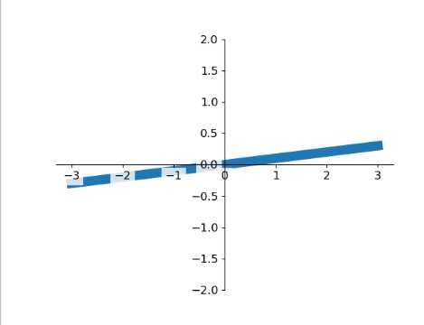
15.tick_visibility(坐标可见)
import matplotlib.pyplot as plt
import numpy as np

x = np.linspace(-3, 3, 50)
y = 0.1*x

plt.figure()
plt.plot(x, y, linewidth=10, zorder=1)      # set zorder for ordering the plot in plt 2.0.2 or higher
plt.ylim(-2, 2)
ax = plt.gca()
ax.spines[‘right‘].set_color(‘none‘)
ax.spines[‘top‘].set_color(‘none‘)
ax.spines[‘top‘].set_color(‘none‘)
ax.xaxis.set_ticks_position(‘bottom‘)
ax.spines[‘bottom‘].set_position((‘data‘, 0))
ax.yaxis.set_ticks_position(‘left‘)
ax.spines[‘left‘].set_position((‘data‘, 0))


for label in ax.get_xticklabels() + ax.get_yticklabels():
    label.set_fontsize(12)
    # set zorder for ordering the plot in plt 2.0.2 or higher
    label.set_bbox(dict(facecolor=‘white‘, edgecolor=‘none‘, alpha=0.8, zorder=2))
plt.show()
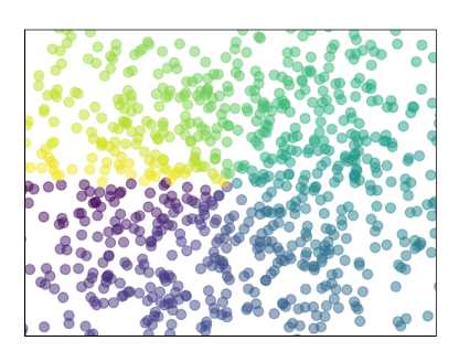
16.散点scatter
import matplotlib.pyplot as plt
import numpy as np

n = 1024    # data size
X = np.random.normal(0, 1, n)
Y = np.random.normal(0, 1, n)
T = np.arctan2(Y, X)    # for color later on

plt.scatter(X, Y, s=75, c=T, alpha=.5)

plt.xlim(-1.5, 1.5)
plt.xticks(())  # ignore xticks
plt.ylim(-1.5, 1.5)
plt.yticks(())  # ignore yticks

plt.show()
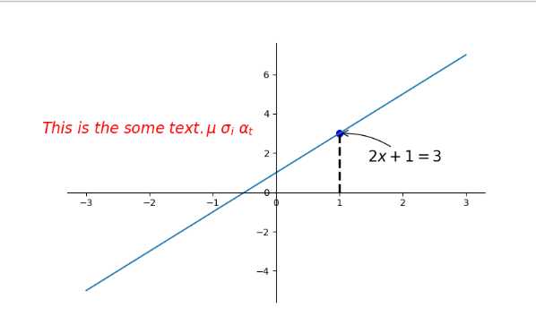
17.annotation(标注)
import matplotlib.pyplot as plt
import numpy as np

x = np.linspace(-3, 3, 50)
y = 2*x + 1

plt.figure(num=1, figsize=(8, 5),)
plt.plot(x, y,)

ax = plt.gca()
ax.spines[‘right‘].set_color(‘none‘)
ax.spines[‘top‘].set_color(‘none‘)
ax.spines[‘top‘].set_color(‘none‘)
ax.xaxis.set_ticks_position(‘bottom‘)
ax.spines[‘bottom‘].set_position((‘data‘, 0))
ax.yaxis.set_ticks_position(‘left‘)
ax.spines[‘left‘].set_position((‘data‘, 0))

x0 = 1
y0 = 2*x0 + 1
plt.plot([x0, x0,], [0, y0,], ‘k--‘, linewidth=2.5)
plt.scatter([x0, ], [y0, ], s=50, color=‘b‘)

# method 1:
#####################
plt.annotate(r‘$2x+1=%s$‘ % y0, xy=(x0, y0), xycoords=‘data‘, xytext=(+30, -30),
             textcoords=‘offset points‘, fontsize=16,
             arrowprops=dict(arrowstyle=‘->‘, connectionstyle="arc3,rad=.2"))

# method 2:
########################
plt.text(-3.7, 3, r‘$This\ is\ the\ some\ text. \mu\ \sigma_i\ \alpha_t$‘,
         fontdict={‘size‘: 16, ‘color‘: ‘r‘})

plt.show()
标签:bsp str imshow field mic htm current src imp
原文地址:https://www.cnblogs.com/sima-3/p/10986796.html