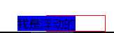
标签:通过 sssss tail only cal rop 元素 水平居中 img
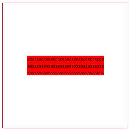
当前div的宽度和高度不确定,通过绝对定位,使用 transform: translate(-50%,-50%),来移动子div的位置
transform: translate(-50%,-50%):元素向左和向下平移自身长宽的50%
HTML
1 <div id="father">
2     <div id="son">
3      sssssssssssssssssssssssssssssssss
4      sssssssssssssssssssssssssssssssss
5      sssssssssssssssssssssssssssssssss
6     </div>
7 </div>
 1 #father{
 2     position:relative;
 3     width:400px;
 4     height:400px;
 5     border:1px solid red;
 6     }
 7 #son{
 8     background:red;
 9     position: absolute;
10     left:50%;
11     top:50%;
12     transform: translate(-50%, -50%);
13     }
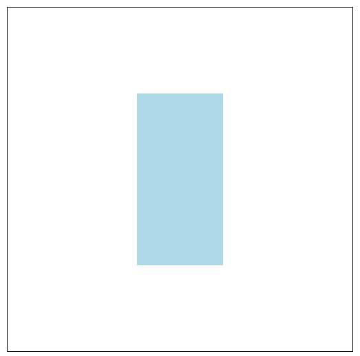
使用绝对定位,子div长宽确定,通过设置margin值实现居中
1 <div id="father2">
2     <div id="son2">
3     </div>
4 </div>
 1 #father2
 2 {
 3     position:relative;
 4     width:400px;
 5     height:400px;
 6     border:1px solid black;
 7 }
 8 #son2
 9 {
10     position:absolute;
11     width:100px;
12     height:200px;
13     top:50%;
14     left:50%;
15     margin-top:-100px;
16     margin-left:-50px;
17     background:lightblue;
18 }
使用绝对定位,top,left,right,bottom设置为0,margin设置为auto
1 <div id="father3">
2     <div id="son3">
3     </div>
4 </div>
 1 #father3
 2 {
 3     position:relative;
 4     width:400px;
 5     height:400px;
 6     border:1px solid black;
 7 }
 8 #son3
 9 {
10     position:absolute;
11     width:100px;
12     height:200px;
13     background:lightblue;
14     left:0;
15     top: 0;
16     bottom: 0;
17     right: 0;
18     margin: auto;
19 }
如方法2的效果图
通过flex布局
 1 #father4
 2 {
 3     height:800px;
 4     -webkit-display:flex;
 5     display:flex;
 6     -webkit-align-items:center;
 7     align-items:center;
 8     -webkit-justify-content:center;
 9     justify-content:center;
10     border:1px solid #ccc;
11 }
12 #son4
13 {
14     width:600px;
15     height:600px;
16     background-color:red;
17 }
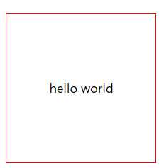
通过table-cell来实现居中
1 <div id="father5">
2     <div id="son5">
3         <p>hello world</p>
4     </div>
5 </div>
1 #father5
2 {
3     display: table-cell;
4     text-align:center;
5     vertical-align:middle;
6     width:200px;
7     height:200px;
8     border:1px solid red;
9 }
父元素设置text-align:center
1 <div style="width: 200px; height: 100px;border: 1px solid;text-align:center;">
2     <span>行级元素垂直居中</span>
3 </div>
1 <div style="width:100px;height:100px;border:1px solid red">
2     <div style="width:50px; height:50px;border:1px solid green; margin:0 auto">
3     </div>
4 </div>
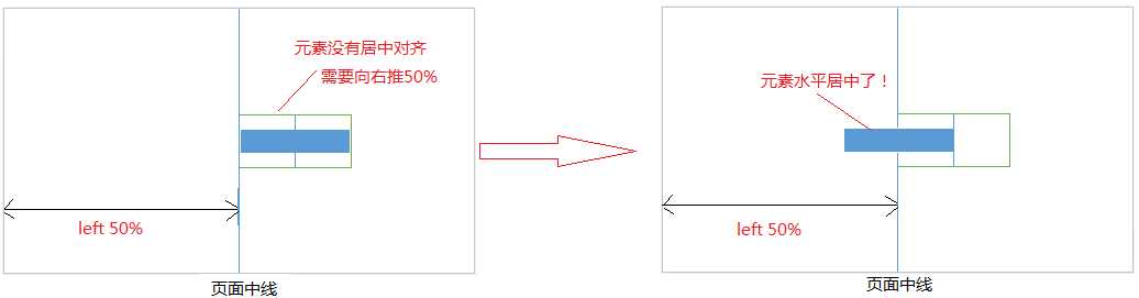
1 <div class="outerbox">
2  <div class="innerbox">我是浮动的</div>
3 </div>
 1 .outerbox
 2 {
 3       float:left;
 4       position:relative;
 5       left:50%;
 6     border:1px solid red;
 7 }
 8 .innerbox{
 9       float:left;
10       position:relative;
11      right:50%;
12     background:blue;
13 }
1 .outerbox{
2     background-color:pink;
3     width:500px ;
4     height:300px;
5     margin: -150px 0 0 -250px; /*使用marin向左移动250px,保证元素居中*/
6     position:relative;
7     left:50%;
8     top:50%;
9 }
和上面水平垂直居中的方法3一样
 1 #father
 2 {
 3     position:relative;
 4     width:400px;
 5     height:400px;
 6     border:1px solid black;
 7 }
 8 #son
 9 {
10     position:absolute;
11     width:100px;
12     height:200px;
13     background:lightblue;
14     left:0;
15     right: 0;
16     margin: auto;
17 }
heiht与line-height的值一样
1 height:300px;
2 line-height:300px;
1)父元素的height与line-height值相同
2)需要垂直居中的元素
display:inline|inline-block 块级元素转行级元素
vertical-align:middle;// 垂直居中对齐
1 <div class="center">
2     <div class="inner"></div>
3 </div>
 1 .center{
 2     width: 500px;
 3     height:300px;
 4     line-height: 300px;
 5     border:1px solid;
 6 }
 7  .inner{
 8      background: blue;
 9      width: 300px;
10      height: 100px;
11      display: inline-block;
12      vertical-align: middle;
13  }
来源:
https://www.cnblogs.com/a-cat/p/9019184.html
https://blog.csdn.net/qq_29715077/article/details/80135163
标签:通过 sssss tail only cal rop 元素 水平居中 img
原文地址:https://www.cnblogs.com/jerryblog05/p/11614684.html