标签:style 一个 pre att head http 操作 header ica
Matplotlib中的基本图表包括的元素
x轴和y轴 axis
水平和垂直的轴线
x轴和y轴刻度 tick
刻度标示坐标轴的分隔,包括最小刻度和最大刻度
x轴和y轴刻度标签 tick label
表示特定坐标轴的值
绘图区域(坐标系) axes
实际绘图的区域
坐标系标题 title
实际绘图的区域
轴标签 xlabel ylabel
实际绘图的区域
import numpy as np
import pandas as pd
import matplotlib.pyplot as plt
from pandas import Series,DataFrame

%matplotlib inline # 魔法指令x=[1,2,3,4,5]
y=[2,4,6,8,10]plt.plot(x,y)[<matplotlib.lines.Line2D at 0x2f5e4d8f160>]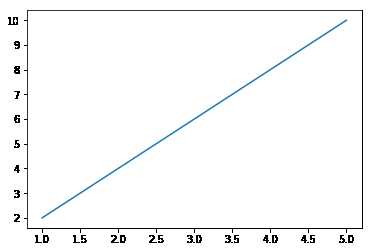
x = np.linspace(-np.pi,np.pi,num=10)
y = x**2plt.plot(x,y)[<matplotlib.lines.Line2D at 0x2f5e4e35748>]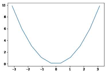
x = x
y = np.sin(x)
plt.plot(x,y)
[<matplotlib.lines.Line2D at 0x2f5e4e9ab38>]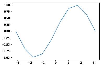
1、连续调用多次plot函数
plt.plot(x,y)
plt.plot(x-1,y+2)
[<matplotlib.lines.Line2D at 0x2f5e4eb78d0>]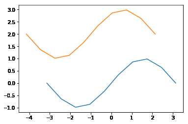
plt.plot(x,y,x+1,y-1)[<matplotlib.lines.Line2D at 0x2f5e51832e8>,
<matplotlib.lines.Line2D at 0x2f5e51834a8>]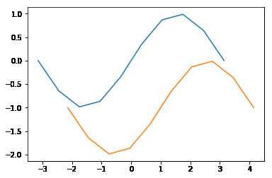
2、也可以在一个plot函数中传入多对X,Y值,在一个图中绘制多个曲线
ax1 = plt.subplot(2,2,1)
ax1.plot(x,y)

ax2 = plt.subplot(222)
ax2.plot(x+1,y-2)

ax3 = plt.subplot(223)
ax3.plot(x+3,y-1)

ax4 = plt.subplot(224)
ax4.plot(x**2,y-2)
[<matplotlib.lines.Line2D at 0x2f5e6462208>]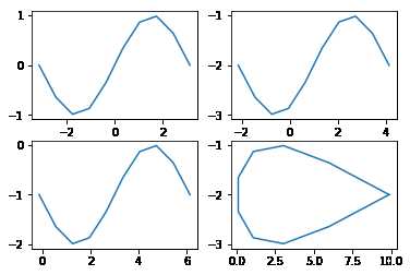
axis方法:设置x,y轴刻度值的范围
plt.plot(x,y)
plt.axis([-6,6,-2,2])
[-6, 6, -2, 2]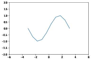
plt.axis(‘off‘)
plt.plot(x,y)
plt.axis('off')
(-3.4557519189487724,
3.4557519189487724,
-1.0832885283134288,
1.083288528313429)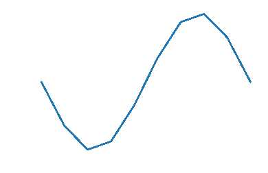
设置画布比例:plt.figure(figsize=(a,b)) a:x刻度比例 b:y刻度比例 (2:1)表示x刻度显示为y刻度显示的2倍
plt.figure(figsize=(16,8))
plt.plot(x,y)
[<matplotlib.lines.Line2D at 0x2f5e63b6400>]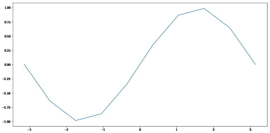
rotation 旋转角度
plt的xlabel方法和ylabel方法 title方法
plt.plot(x,y)
plt.xlabel('X')
plt.ylabel('Y')
plt.title('Title')
Text(0.5,1,'Title')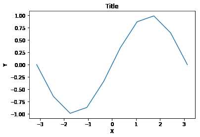
两种传参方法:

plt.plot(x,y,label='xian_1')
plt.plot(x-1,y+3,label='xian_2')
plt.legend()
<matplotlib.legend.Legend at 0x2f5e66057b8>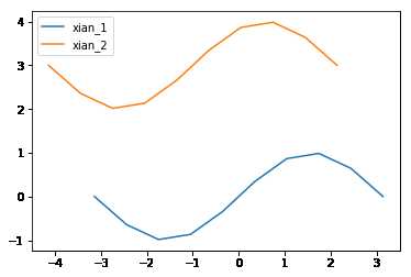
plt.plot(x,y,label='xian_1')
plt.plot(x-1,y+3,label='xian_2')
plt.legend(loc=3)
<matplotlib.legend.Legend at 0x2f5e68f6c88>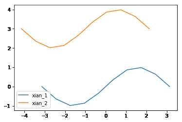
| 字符串 | 数值 | 字符串 | 数值 |
|---|---|---|---|
| best | 0 | center left | 6 |
| upper right | 1 | center right | 7 |
| upper left | 2 | lower center | 8 |
| lower left | 3 | upper center | 9 |
| lower right | 4 | center | 10 |
| right | 5 |
plt.plot(x,y,label='xian_1')
plt.plot(x-1,y+3,label='xian_2')
plt.legend(loc=3,ncol=2)
<matplotlib.legend.Legend at 0x2f5e6ab4a90>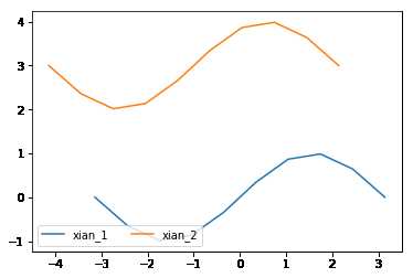
fig = plt.figure()---必须放置在绘图操作之前
figure.savefig的参数选项
fig = plt.figure()

plt.plot(x,y,label='temp')
plt.plot(x-1,y+3,label='dist')
plt.legend(loc=3,ncol=2)

fig.savefig('./123.png',dpi=300)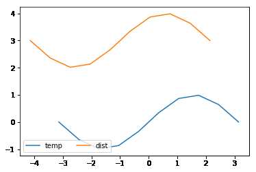
plot语句中支持除X,Y以外的参数,以字符串形式存在,来控制颜色、线型、点型等要素,语法形式为:
plt.plot(X, Y, ‘format‘, ...)
参数color或c
plt.plot(x,y,c='red',alpha=0.5,ls='steps',lw=3)[<matplotlib.lines.Line2D at 0x2f5e6a4c668>]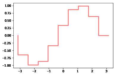
合法的HTML颜色名
| 颜色 | 别名 | HTML颜色名 | 颜色 | 别名 | HTML颜色名 |
|---|---|---|---|---|---|
| 蓝色 | b | blue | 绿色 | g | green |
| 红色 | r | red | 黄色 | y | yellow |
| 青色 | c | cyan | 黑色 | k | black |
| 洋红色 | m | magenta | 白色 | w | white |
alpha参数
参数linestyle或ls
| 线条风格 | 描述 | 线条风格 | 描述 |
|---|---|---|---|
| ‘-‘ | 实线 | ‘:‘ | 虚线 |
| ‘--‘ | 破折线 | ‘steps‘ | 阶梯线 |
| ‘-.‘ | 点划线 | ‘None‘ / ‘,‘ | 什么都不画 |
linewidth或lw参数
| 标记 | 描述 | 标记 | 描述 |
|---|---|---|---|
| ‘s‘ | 正方形 | ‘p‘ | 五边形 |
| ‘h‘ | 六边形1 | ‘H‘ | 六边形2 |
| ‘8‘ | 八边形 |
| 标记 | 描述 | 标记 | 描述 |
|---|---|---|---|
| ‘.‘ | 点 | ‘x‘ | X |
| ‘*‘ | 星号 | ‘+‘ | 加号 |
| ‘,‘ | 像素 |
| 标记 | 描述 | 标记 | 描述 |
|---|---|---|---|
| ‘o‘ | 圆圈 | ‘D‘ | 菱形 |
| ‘d‘ | 小菱形 | ‘‘,‘None‘,‘ ‘,None | 无 |
| 标记 | 描述 | 标记 | 描述 |
|---|---|---|---|
| ‘1‘ | 一角朝下的三脚架 | ‘3‘ | 一角朝左的三脚架 |
| ‘2‘ | 一角朝上的三脚架 | ‘4‘ | 一角朝右的三脚架 |
plt.plot(x,y,marker='s')[<matplotlib.lines.Line2D at 0x2f5e6b87dd8>]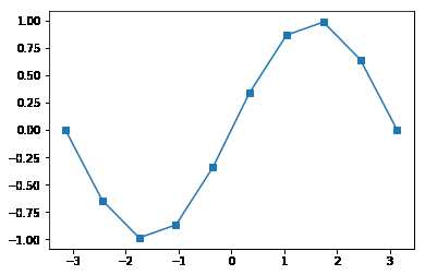
# 绘制线      plt.plot(x1,y1,x2,y2)
# 网格线      plt.grid(True)  axes.grid(color,ls,lw,alpha)
# 获取坐标系  plt.subplot(n1,n2,n3)
# 坐标轴标签  plt.xlabel() plt.ylabel()
# 坐标系标题  plt.title()
# 图例        plt.legend([names],ncol=2,loc=1)  plt.plot(label='name')
# 线风格      --  -. : None  step
# 图片保存    figure.savefig()
# 点的设置    marker markersize markerfacecolor markeredgecolor\width
# 坐标轴刻度  plt.xticks(刻度列表,刻度标签列表) plt.yticks()
#             axes.set_xticks(刻度列表) axes.set_xticklabels(刻度标签列表)
【直方图的参数只有一个x!!!不像条形图需要传入x,y】
plt.hist()的参数
data = [1,2,3,3,4,2,5]
plt.hist(data,bins=10)
(array([1., 0., 2., 0., 0., 2., 0., 1., 0., 1.]),
array([1. , 1.4, 1.8, 2.2, 2.6, 3. , 3.4, 3.8, 4.2, 4.6, 5. ]),
<a list of 10 Patch objects>)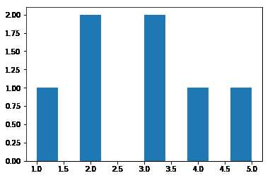
返回值 :
1: 直方图向量,是否归一化由参数normed设定
2: 返回各个bin的区间范围
3: 返回每个bin里面包含的数据,是一个list
-【条形图有两个参数x,y】
bar()、barh()
x = [1,2,3,4,5]
y = [2,4,6,8,10]
plt.bar(x,y)
<Container object of 5 artists>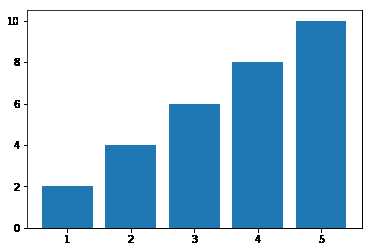
plt.barh(x,y)<Container object of 5 artists>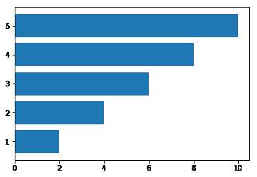
【饼图也只有一个参数x】
pie()
饼图适合展示各部分占总体的比例,条形图适合比较各部分的大小
普通各部分占满饼图
plt.pie([1,3,5])([<matplotlib.patches.Wedge at 0x2f5e6d46198>,
<matplotlib.patches.Wedge at 0x2f5e6d46668>,
<matplotlib.patches.Wedge at 0x2f5e6d46ba8>],
[Text(1.03366,0.376222,''),
Text(-0.191013,1.08329,''),
Text(-0.191013,-1.08329,'')])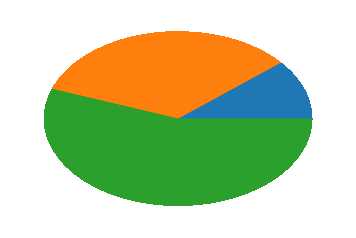
普通未占满饼图:小数/比例
plt.pie([0.2,0.3,0.4])([<matplotlib.patches.Wedge at 0x2f5e6d8d6d8>,
<matplotlib.patches.Wedge at 0x2f5e6d8dba8>,
<matplotlib.patches.Wedge at 0x2f5e6d95128>],
[Text(0.889919,0.646564,''),
Text(-0.646564,0.889919,''),
Text(-0.339919,-1.04616,'')])
饼图阴影、分裂等属性设置
arr=[11,22,31,15]
plt.pie(arr,labels=['a','b','c','d'])
([<matplotlib.patches.Wedge at 0x2f5e7da2f28>,
<matplotlib.patches.Wedge at 0x2f5e7daa438>,
<matplotlib.patches.Wedge at 0x2f5e7daa978>,
<matplotlib.patches.Wedge at 0x2f5e7daaeb8>],
[Text(0.996424,0.465981,'a'),
Text(-0.195798,1.08243,'b'),
Text(-0.830021,-0.721848,'c'),
Text(0.910034,-0.61793,'d')])
# labeldistance参数设置标签距离圆心的距离(比例值)
arr=[11,22,31,15]
plt.pie(arr,labels=['a','b','c','d'],labeldistance=0.3)
([<matplotlib.patches.Wedge at 0x2f5e7dedb38>,
<matplotlib.patches.Wedge at 0x2f5e7dedf98>,
<matplotlib.patches.Wedge at 0x2f5e7df7518>,
<matplotlib.patches.Wedge at 0x2f5e7df7a58>],
[Text(0.271752,0.127086,'a'),
Text(-0.0533994,0.295209,'b'),
Text(-0.226369,-0.196868,'c'),
Text(0.248191,-0.168526,'d')])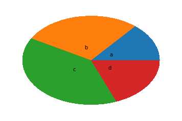
# autopct参数设置比例值小数保留位(%.3f%%);
arr=[11,22,31,15]
plt.pie(arr,labels=['a','b','c','d'],labeldistance=0.3,autopct='%.5f%%')
([<matplotlib.patches.Wedge at 0x2f5e7e3f668>,
<matplotlib.patches.Wedge at 0x2f5e7e3fd68>,
<matplotlib.patches.Wedge at 0x2f5e7e47518>,
<matplotlib.patches.Wedge at 0x2f5e7e47c88>],
[Text(0.271752,0.127086,'a'),
Text(-0.0533994,0.295209,'b'),
Text(-0.226369,-0.196868,'c'),
Text(0.248191,-0.168526,'d')],
[Text(0.543504,0.254171,'13.92405%'),
Text(-0.106799,0.590419,'27.84810%'),
Text(-0.452739,-0.393735,'39.24051%'),
Text(0.496382,-0.337053,'18.98734%')])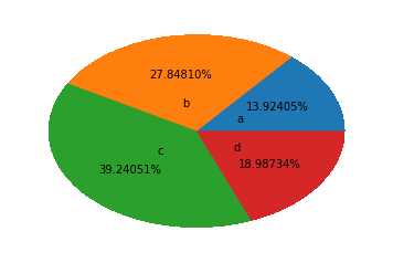
# explode参数设置每一块顶点距圆心的长度(比例值,列表);
arr=[11,22,31,15]
plt.pie(arr,labels=['a','b','c','d'],labeldistance=0.3,shadow=True,explode=[0.2,0.3,0.2,0.4])
([<matplotlib.patches.Wedge at 0x2f5e7e8ca90>,
<matplotlib.patches.Wedge at 0x2f5e7e95240>,
<matplotlib.patches.Wedge at 0x2f5e7e95a58>,
<matplotlib.patches.Wedge at 0x2f5e7e9d2b0>],
[Text(0.45292,0.21181,'a'),
Text(-0.106799,0.590419,'b'),
Text(-0.377282,-0.328113,'c'),
Text(0.579113,-0.393228,'d')])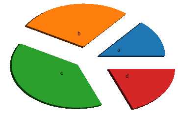
%m.nf
m 占位
n 小数点后保留几位
f 是以float格式输出
【散点图需要两个参数x,y,但此时x不是表示x轴的刻度,而是每个点的横坐标!】
scatter()
plt.scatter(x,y)<matplotlib.collections.PathCollection at 0x2f5e7edbe10>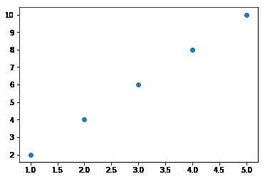
plt.scatter(x,y,marker=‘d‘,c="rbgy") 设置不同的散点颜色
x = np.random.random(size=(30,))
y = np.random.random(size=(30,))
plt.scatter(x,y)
<matplotlib.collections.PathCollection at 0x2f5e7f519e8>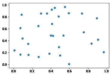
标签:style 一个 pre att head http 操作 header ica
原文地址:https://www.cnblogs.com/zyyhxbs/p/11708515.html