标签:坐标 gen pre pac figure data tom src 生成
一、Matplotlib 基础用法:
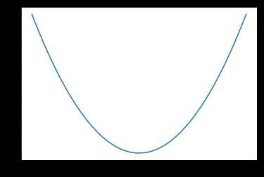
import matplotlib.pyplot as plt
import numpy as np

x = np.linspace(-1, 1, 100)  # 生成100个点
y = 2*x + 1
plt.plot(x, y)
plt.show()
结果:

二、Matplotlib figure图像:
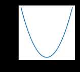
import matplotlib.pyplot as plt
import numpy as np

x = np.linspace(-1, 1, 100)
y1 = 2*x + 1
y2 = x**2

plt.figure()
plt.plot(x, y1)

plt.figure()
plt.plot(x, y2)

plt.show()
结果:

x = np.linspace(-1, 1, 100)
y1 = 2 * x + 1
y2 = x ** 2

plt.figure()
plt.plot(x, y1)

plt.figure(figsize=(2, 2))
plt.plot(x, y2)

plt.show()
结果:

plt.plot(x, y1, color='red', linewidth=1.0, linestyle='--')
plt.plot(x, y2, color='blue', linewidth=5.0, linestyle='-')
结果:
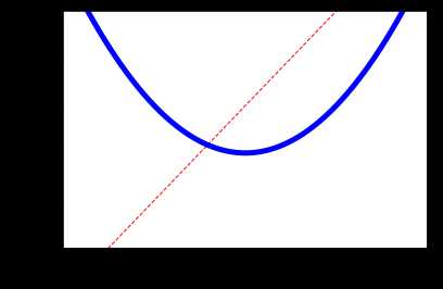
三、Matplotlib设置坐标轴
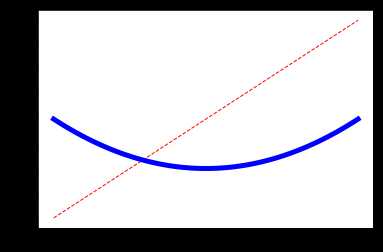
(一)
import matplotlib.pyplot as plt
import numpy as np

x = np.linspace(-3, 3, 100)
y1 = 2 * x + 1
y2 = x ** 2

# xy显示范围
plt.xlim((-1, 2))
plt.ylim((-2, 3))

# xy描述
plt.xlabel('I am x')
plt.ylabel('I am y')

plt.plot(x, y1, color='red', linewidth=1.0, linestyle='--')
plt.plot(x, y2, color='blue', linewidth=5.0, linestyle='-')
plt.show()

new_ticks = np.linspace(-2, 2, 11)
print(new_ticks)
结果:
[-2. -1.6 -1.2 -0.8 -0.4 0. 0.4 0.8 1.2 1.6 2. ]
x = np.linspace(-3, 3, 100)
y1 = 2 * x + 1
y2 = x ** 2

# xy显示范围
plt.xlim((-1, 2))
plt.ylim((-2, 3))

# xy描述
plt.xlabel('I am x')
plt.ylabel('I am y')

plt.plot(x, y1, color='red', linewidth=1.0, linestyle='--')
plt.plot(x, y2, color='blue', linewidth=5.0, linestyle='-')

plt.xticks(new_ticks)  ###
plt.yticks([-1, 0, 1, 2, 3],
           ['level1', 'level2', 'level3', 'level4', 'level5']) ###
plt.show()
结果:
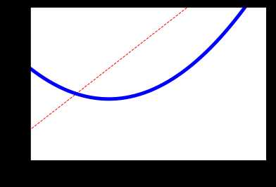
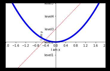
(二)
import matplotlib.pyplot as plt
import numpy as np

x = np.linspace(-3, 3, 100)
y1 = 2 * x + 1
y2 = x ** 2

# xy显示范围
plt.xlim((-1, 2))
plt.ylim((-2, 3))

# xy描述
plt.xlabel('I am x')
plt.ylabel('I am y')

plt.plot(x, y1, color='red', linewidth=1.0, linestyle='--')
plt.plot(x, y2, color='blue', linewidth=5.0, linestyle='-')

new_ticks = np.linspace(-2, 2, 11)
print(new_ticks)

plt.xticks(new_ticks)  ###
plt.yticks([-1, 0, 1, 2, 3],
           ['level1', 'level2', 'level3', 'level4', 'level5']) ###

# gca get current axis
ax = plt.gca()
# 把右边和上边的边框去掉
ax.spines['right'].set_color('none')
ax.spines['top'].set_color('none')
# 把x轴的刻度设置为 'bottom'
# 把y轴的刻度设置为 'left'
ax.xaxis.set_ticks_position('bottom')
ax.yaxis.set_ticks_position('left')
# 设置bottom对应到 0点
# 设置left对应到 0点
ax.spines['bottom'].set_position(('data', 0))
ax.spines['left'].set_position(('data', 0))

plt.show()
结果:
[-2. -1.6 -1.2 -0.8 -0.4 0. 0.4 0.8 1.2 1.6 2. ]
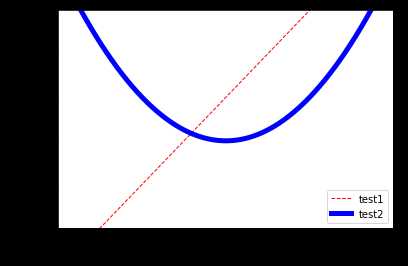
四、Matplotlib legend图例
import matplotlib.pyplot as plt
import numpy as np

x = np.linspace(-3, 3, 100)
y1 = 2 * x + 1
y2 = x ** 2

# xy显示范围
plt.xlim((-1, 2))
plt.ylim((-2, 3))

# xy描述
plt.xlabel('I am x')
plt.ylabel('I am y')

l1, = plt.plot(x, y1, color='red', linewidth=1.0, linestyle='--')
l2, = plt.plot(x, y2, color='blue', linewidth=5.0, linestyle='-')
plt.legend(handles=[l1, l2], labels=['test1', 'test2'], loc='best')  ## 图例


new_ticks = np.linspace(-2, 2, 11)
print(new_ticks)

plt.xticks(new_ticks)  ###
plt.yticks([-1, 0, 1, 2, 3],
           ['level1', 'level2', 'level3', 'level4', 'level5']) ###

plt.show()
结果:
[-2. -1.6 -1.2 -0.8 -0.4 0. 0.4 0.8 1.2 1.6 2. ]
以上。
待续。。。。
标签:坐标 gen pre pac figure data tom src 生成
原文地址:https://www.cnblogs.com/sirxy/p/12150029.html