标签:出现 context override 效果 ldb lex info round 介绍

SliverAppBar控件可以实现页面头部区域展开、折叠的效果,类似于Android中的CollapsingToolbarLayout。
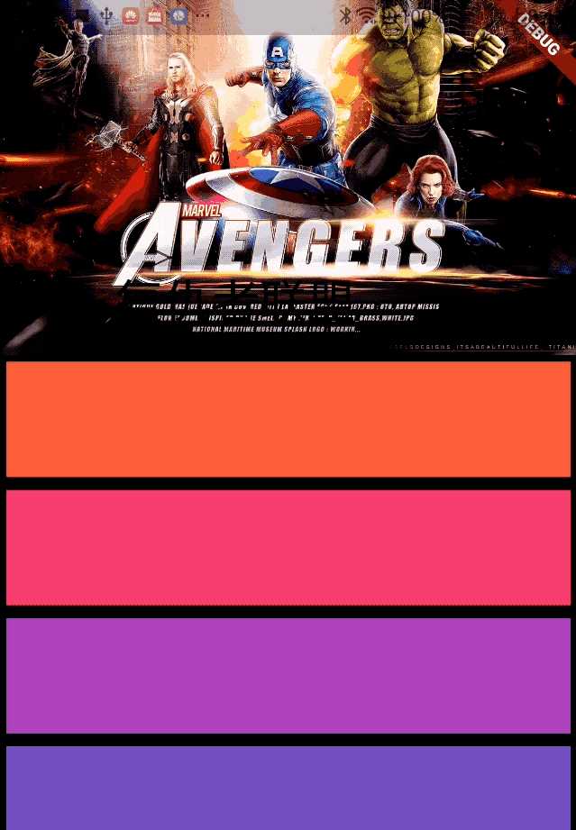
先看下SliverAppBar实现的效果,效果图如下:
SliverAppBar控件需要和CustomScrollView搭配使用,SliverAppBar要通常放在slivers的第一位,后面接其他sliver控件。
CustomScrollView(
slivers: <Widget>[
SliverAppBar(

),
//其他sliver控件
],
)
SliverAppBar和其他slivers控件的结构如下: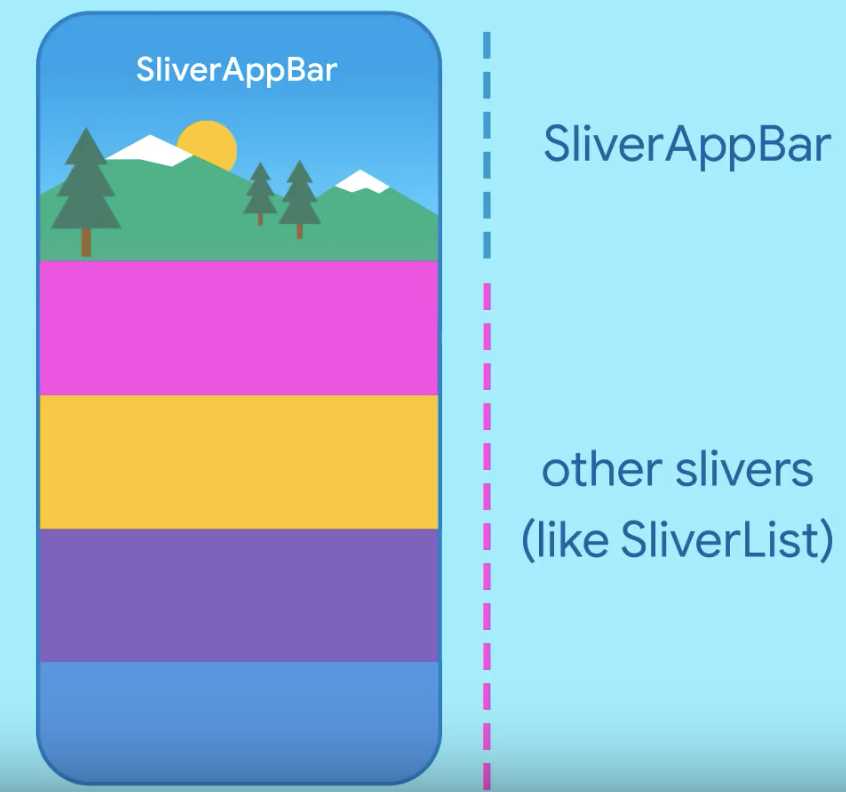
SliverAppBar中有一个非常重要的参数flexibleSpace,flexibleSpace是SliverAppBar中展开和折叠区域,flexibleSpace与expandedHeight一起使用,
expandedHeight表示flexibleSpace的高度,
SliverAppBar(
expandedHeight: 200.0,
flexibleSpace: FlexibleSpaceBar(

),
),
SliverAppBar其他常用属性说明如下:
| 属性 | 说明 |
| leading | 左侧控件,通常情况下为"返回"图标 |
| title | 标题,通常为Text控件 |
| actions | 右侧控件 |
| flexibleSpace | 展开和折叠区域 |
| bottom | 底部控件 |
| elevation | 阴影 |
| expandedHeight | 展开区域的高度 |
| floating | 设置为true时,向下滑动时,即使当前CustomScrollView不在顶部,SliverAppBar也会跟着一起向下出现 |
| pinned | 设置为true时,当SliverAppBar内容滑出屏幕时,将始终渲染一个固定在顶部的收起状态 |
| snap | 设置为true时,当手指放开时,SliverAppBar会根据当前的位置进行调整,始终保持展开或收起的状态,此效果在floating=true时生效 |
实现文章开头效果的整体代码如下:
class SliverAppBarDemo extends StatelessWidget {
@override
Widget build(BuildContext context) {
return CustomScrollView(
slivers: <Widget>[
SliverAppBar(
pinned: true,
expandedHeight: 200.0,
flexibleSpace: FlexibleSpaceBar(
title: Text(‘复仇者联盟‘),
background: Image.network(
‘http://img.haote.com/upload/20180918/2018091815372344164.jpg‘,
fit: BoxFit.fitHeight,
),
),
),
SliverFixedExtentList(
itemExtent: 80.0,
delegate: SliverChildBuilderDelegate(
(BuildContext context, int index) {
return Card(
child: Container(
alignment: Alignment.center,
color: Colors.primaries[(index % 18)],
child: Text(‘‘),
),
);
},
),
),
],
);
}
}
如果此文章对您有所帮助,欢迎扫码关注订阅号,您的点赞、转发、评论、打赏是我继续分享的最大动力。

标签:出现 context override 效果 ldb lex info round 介绍
原文地址:https://www.cnblogs.com/mengqd/p/12209840.html