标签:ota mat float 保存图片 parent 列表 may python ngui
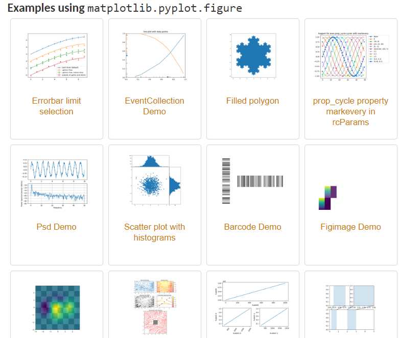
python能画的图种类非常多,而且看上去都很好看,具体种类部分可参看:https://matplotlib.org/api/_as_gen/matplotlib.pyplot.figure.html#matplotlib.pyplot.figure
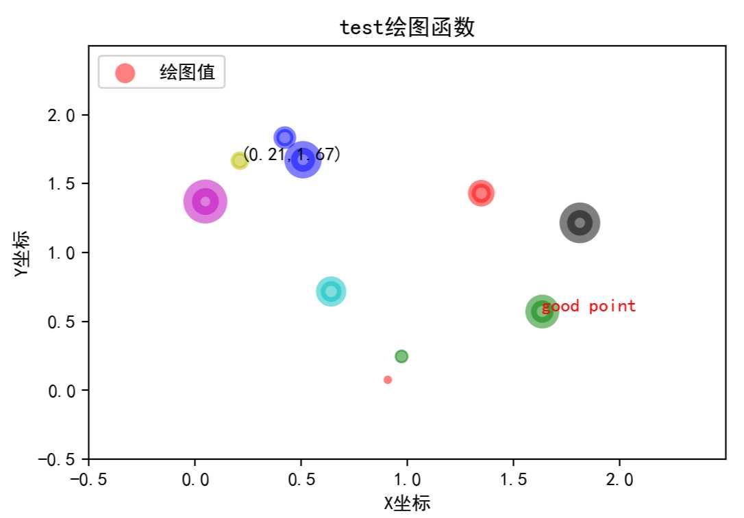
这里主要是探索下散点图绘制。
1. 首先是导入包,创建数据
import matplotlib.pyplot as plt
import numpy as np
n = 10
x = np.random.rand(n) * 2 # 随机产生10个0~2之间的x坐标
y = np.random.rand(n) * 2 # 随机产生10个0~2之间的y坐标
2. 创建一张figure
fig = plt.figure(1)
3. 设置颜色 color 值【可选参数,即可填可不填】,方式有几种
#colors = np.random.rand(n) # 随机产生10个0~1之间的颜色值,或者
colors = [‘r‘, ‘g‘, ‘y‘, ‘b‘, ‘r‘, ‘c‘, ‘g‘, ‘b‘, ‘k‘, ‘m‘]  # 可设置随机数取
4. 设置点的面积大小 area 值 【可选参数】
area = 20*np.arange(1,n+1)
5. 设置点的边界线宽度 【可选参数】
widths = np.arange(n) #0-9的数字
6. 正式绘制散点图:scatter
plt.scatter(x, y, s=area, c=colors, linewidths=widths, alpha=0.5, marker=‘o‘)
其参数主要有:
def scatter(self, x, y, s=None, c=None, marker=None, cmap=None, norm=None,
                vmin=None, vmax=None, alpha=None, linewidths=None,
                verts=None, edgecolors=None,
                **kwargs):
        """
        A scatter plot of *y* vs *x* with varying marker size and/or color.

        Parameters
        ----------
        x, y : array_like, shape (n, )
            The data positions.

        s : scalar or array_like, shape (n, ), optional
            The marker size in points**2.
            Default is ``rcParams[‘lines.markersize‘] ** 2``.

        c : color, sequence, or sequence of color, optional, default: ‘b‘
            The marker color. Possible values:

            - A single color format string.
            - A sequence of color specifications of length n.
            - A sequence of n numbers to be mapped to colors using *cmap* and
              *norm*.
            - A 2-D array in which the rows are RGB or RGBA.

            Note that *c* should not be a single numeric RGB or RGBA sequence
            because that is indistinguishable from an array of values to be
            colormapped. If you want to specify the same RGB or RGBA value for
            all points, use a 2-D array with a single row.

        marker : `~matplotlib.markers.MarkerStyle`, optional, default: ‘o‘
            The marker style. *marker* can be either an instance of the class
            or the text shorthand for a particular marker.
            See `~matplotlib.markers` for more information marker styles.

        cmap : `~matplotlib.colors.Colormap`, optional, default: None
            A `.Colormap` instance or registered colormap name. *cmap* is only
            used if *c* is an array of floats. If ``None``, defaults to rc
            ``image.cmap``.
        alpha : scalar, optional, default: None
            The alpha blending value, between 0 (transparent) and 1 (opaque).

        linewidths : scalar or array_like, optional, default: None
            The linewidth of the marker edges. Note: The default *edgecolors*
            is ‘face‘. You may want to change this as well.
            If *None*, defaults to rcParams ``lines.linewidth``.
7. 设置轴标签:xlabel、ylabel
#设置X轴标签
plt.xlabel(‘X坐标‘)
#设置Y轴标签
plt.ylabel(‘Y坐标‘)
8. 设置图标题:title
plt.title(‘test绘图函数‘)
9. 设置轴的上下限显示值:xlim、ylim
# 设置横轴的上下限值
plt.xlim(-0.5, 2.5)
# 设置纵轴的上下限值
plt.ylim(-0.5, 2.5)
10. 设置轴的刻度值:xticks、yticks
# 设置横轴精准刻度
plt.xticks(np.arange(np.min(x)-0.2, np.max(x)+0.2, step=0.3))
# 设置纵轴精准刻度
plt.yticks(np.arange(np.min(y)-0.2, np.max(y)+0.2, step=0.3))
也可按照xlim和ylim来设置
# 设置横轴精准刻度
plt.xticks(np.arange(-0.5, 2.5, step=0.5))
# 设置纵轴精准刻度
plt.yticks(np.arange(-0.5, 2.5, step=0.5))
11. 在图中某些点上(位置)显示标签:annotate
#plt.annotate("(" + str(round(x[2],2)) +", "+ str(round(y[2],2)) +")", xy=(x[2], y[2]), fontsize=10, xycoords=‘data‘)  #或者
plt.annotate("({0},{1})".format(round(x[2],2), round(y[2],2)), xy=(x[2], y[2]), fontsize=10, xycoords=‘data‘)
# xycoords=‘data‘ 以data值为基准
# 设置字体大小为 10
12. 在图中某些位置显示文本:text
plt.text(round(x[6],2), round(y[6],2), "good point", fontdict={‘size‘: 10, ‘color‘: ‘red‘})  # fontdict设置文本字体
# Add text to the axes.
13. 设置显示中文
plt.rcParams[‘font.sans-serif‘]=[‘SimHei‘] #用来正常显示中文标签
plt.rcParams[‘axes.unicode_minus‘]=False #用来正常显示负号
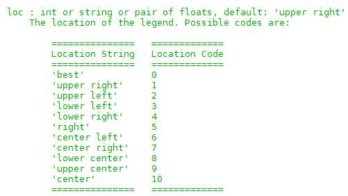
14. 设置legend,【注意,‘绘图测试’:一定要是可迭代格式,例如元组或者列表,要不然只会显示第一个字符,也就是legend会显示不全】
plt.legend([‘绘图测试‘], loc=2, fontsize = 10)
# plt.legend([‘绘图测试‘], loc=‘upper left‘, markerscale = 0.5, fontsize = 10) #这个也可
#  markerscale:The relative size of legend markers compared with the originally drawn ones.
其参数loc对应为:
15. 保存图片 savefig
plt.savefig(‘test_xx.png‘, dpi=200, bbox_inches=‘tight‘, transparent=False)
# dpi: The resolution in dots per inch,设置分辨率,用于改变清晰度
#  If *True*, the axes patches will all be transparent
16. 显示图片 show
plt.show()
结果如下:
##
参考:
https://blog.csdn.net/u014636245/article/details/82799573
https://matplotlib.org/api/_as_gen/matplotlib.pyplot.figure.html#matplotlib.pyplot.figure
https://www.jianshu.com/p/78ba36dddad8
https://blog.csdn.net/u010852680/article/details/77770097
https://blog.csdn.net/u013634684/article/details/49646311
标签:ota mat float 保存图片 parent 列表 may python ngui
原文地址:https://www.cnblogs.com/qi-yuan-008/p/12588121.html