标签:mouseover key xmlns 窗体 class pixel lock 控件 ddd
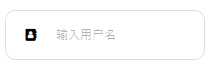
一睹为快
创建方式:
后台的代码效果图:
创建依赖属性:
输入快捷键propdp双击Tab键生成代码
public int MyProperty
        {
            get { return (int)GetValue(MyPropertyProperty); }
            set { SetValue(MyPropertyProperty, value); }
        }
        public static readonly DependencyProperty MyPropertyProperty =
            DependencyProperty.Register("MyProperty", typeof(int), typeof(ownerclass), new PropertyMetadata(0));
public string Ico
        {
            get { return (string)GetValue(IcoProperty); }
            set { SetValue(IcoProperty, value); }
        }
        public static readonly DependencyProperty IcoProperty =
            DependencyProperty.Register("Ico", typeof(string), typeof(LayuiTextBox), new PropertyMetadata("\xf007"));
返回前台代码修改其控件样式(d:DesignHeight="50" d:DesignWidth="200"-->>>是指当前界面模拟设计宽高),用鼠标右击当前界面选中编辑模板中的编辑副本,此时我们VS工具将自动在当前界面中显示改控件用到的所有内容,如图: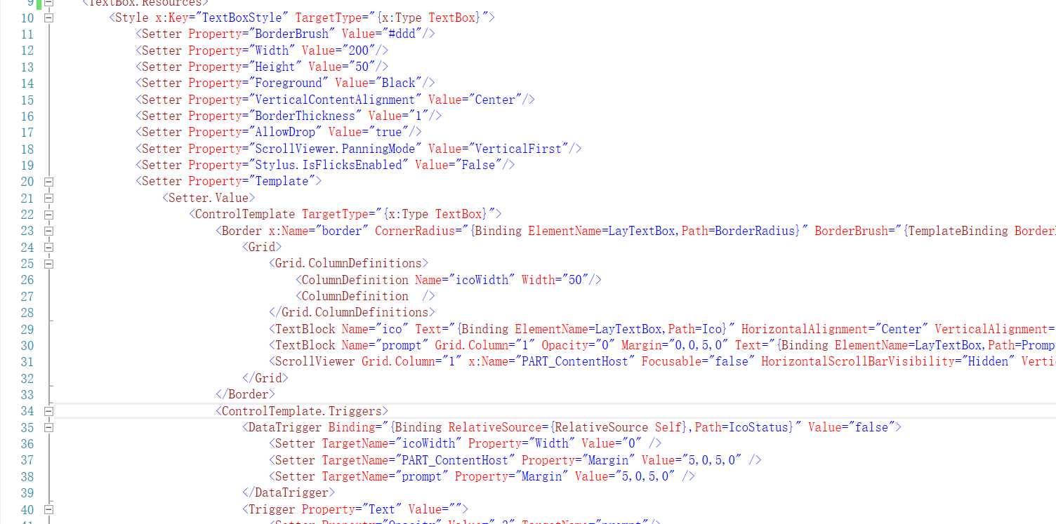
5.修改ControlTemplate中的样式,我们直接在Border中Grid,并且在Grid中加入两列,一列存放字体图标,另一列存放输入框的内容,如上图中Name为ico的TextBlock控件就是存字体图标,Nane为prompt和PART_ContentHost是分别为水印字体输入内容
<Border x:Name="border" CornerRadius="{Binding ElementName=LayTextBox,Path=BorderRadius}" BorderBrush="{TemplateBinding BorderBrush}" BorderThickness="{TemplateBinding BorderThickness}" Background="{TemplateBinding Background}" SnapsToDevicePixels="True">
                            <Grid>
                                <Grid.ColumnDefinitions>
                                    <ColumnDefinition Name="icoWidth" Width="50"/>
                                    <ColumnDefinition  />
                                </Grid.ColumnDefinitions>
                                <TextBlock Name="ico" Text="{Binding ElementName=LayTextBox,Path=Ico}" HorizontalAlignment="Center" VerticalAlignment="Center"></TextBlock>
                                <TextBlock Name="prompt" Grid.Column="1" Opacity="0" Margin="0,0,5,0" Text="{Binding ElementName=LayTextBox,Path=Prompt}" HorizontalAlignment="Left" VerticalAlignment="Center"></TextBlock>
                                <ScrollViewer Grid.Column="1" x:Name="PART_ContentHost" Focusable="false" HorizontalScrollBarVisibility="Hidden" VerticalScrollBarVisibility="Hidden" Grid.ColumnSpan="2" Margin="0,0,5,0"/>
                            </Grid>
                        </Border>
注意:红色背景文字中Text内容是在绑定我们在后台中注册的Ico属性,此Ico是用来传值,Binding ElementName=LayTextBox,Path=Ico是在说寻找当前控件LayTextBox中的Ico属性名称,ElementName是指当前控件名称,Path为属性名称
6.设置触发器
<ControlTemplate.Triggers>
                            <DataTrigger Binding="{Binding RelativeSource={RelativeSource Self},Path=IcoStatus}" Value="false">
                                <Setter TargetName="icoWidth" Property="Width" Value="0" />
                                <Setter TargetName="PART_ContentHost" Property="Margin" Value="5,0,5,0" />
                                <Setter TargetName="prompt" Property="Margin" Value="5,0,5,0" />
                            </DataTrigger>
                            <Trigger Property="Text" Value="">
                                <Setter Property="Opacity" Value=".3" TargetName="prompt"/>
                            </Trigger>
                            <Trigger Property="IsEnabled" Value="false">
                                <Setter Property="Opacity" TargetName="border" Value="0.56"/>
                            </Trigger>
                            <Trigger Property="IsMouseOver" Value="true">
                                <Setter Property="BorderBrush" TargetName="border" Value="#D2D2D2"/>
                            </Trigger>
                            <Trigger Property="IsKeyboardFocused" Value="true">
                                <Setter Property="BorderBrush" TargetName="border" Value="#D2D2D2"/>
                            </Trigger>
 </ControlTemplate.Triggers>
注意:DataTrigger为数据触发器,是指当用户输入相对应的值时出发的事件,如 Binding="{Binding RelativeSource={RelativeSource Self},Path=IcoStatus}" Value="false" 是在说当用户输入的值为空时将触发效果,Trigger是属性触发器档该控件属性达到一定条件下触发相对应的事件
7.返回当前主界面调用自定义控件(LayuiTextBox),在当前主界面引用 xmlns:layui="clr-namespace:LayUI_WPF.CustomControl",这个引用是在告诉当前窗体调用当前项目LayUI_WPF中的CustomControl文件夹下面的自定义控件并取名为layui
8.使用我们自定义好的控件<layui:LayuiTextBox Ico="" x:Name="text" Prompt="输入用户名" BorderRadius="10" FontFamily="/LayUI-WPF;component/Fonts/#FontAwesome" /> ,其中Ico就就是我们定义行的Ico属性我们可以在里面存放字体图标代码带到我们想要的效果
9.依次类推 水印,边框 甚至带清空按钮的输入框都能实现,以下是我写好的带水印和字体图标的输入框代码
前台代码为:
<TextBox.Resources>
        <Style x:Key="TextBoxStyle" TargetType="{x:Type TextBox}">
            <Setter Property="BorderBrush" Value="#ddd"/>
            <Setter Property="Width" Value="200"/>
            <Setter Property="Height" Value="50"/>
            <Setter Property="Foreground" Value="Black"/>
            <Setter Property="VerticalContentAlignment" Value="Center"/>
            <Setter Property="BorderThickness" Value="1"/>
            <Setter Property="AllowDrop" Value="true"/>
            <Setter Property="ScrollViewer.PanningMode" Value="VerticalFirst"/>
            <Setter Property="Stylus.IsFlicksEnabled" Value="False"/>
            <Setter Property="Template">
                <Setter.Value>
                    <ControlTemplate TargetType="{x:Type TextBox}">
                        <Border x:Name="border" CornerRadius="{Binding ElementName=LayTextBox,Path=BorderRadius}" BorderBrush="{TemplateBinding BorderBrush}" BorderThickness="{TemplateBinding BorderThickness}" Background="{TemplateBinding Background}" SnapsToDevicePixels="True">
                            <Grid>
                                <Grid.ColumnDefinitions>
                                    <ColumnDefinition Name="icoWidth" Width="50"/>
                                    <ColumnDefinition  />
                                </Grid.ColumnDefinitions>
                                <TextBlock Name="ico" Text="{Binding ElementName=LayTextBox,Path=Ico}" HorizontalAlignment="Center" VerticalAlignment="Center"></TextBlock>
                                <TextBlock Name="prompt" Grid.Column="1" Opacity="0" Margin="0,0,5,0" Text="{Binding ElementName=LayTextBox,Path=Prompt}" HorizontalAlignment="Left" VerticalAlignment="Center"></TextBlock>
                                <ScrollViewer Grid.Column="1" x:Name="PART_ContentHost" Focusable="false" HorizontalScrollBarVisibility="Hidden" VerticalScrollBarVisibility="Hidden" Grid.ColumnSpan="2" Margin="0,0,5,0"/>
                            </Grid>
                        </Border>
                        <ControlTemplate.Triggers>
                            <DataTrigger Binding="{Binding RelativeSource={RelativeSource Self},Path=IcoStatus}" Value="false">
                                <Setter TargetName="icoWidth" Property="Width" Value="0" />
                                <Setter TargetName="PART_ContentHost" Property="Margin" Value="5,0,5,0" />
                                <Setter TargetName="prompt" Property="Margin" Value="5,0,5,0" />
                            </DataTrigger>
                            <Trigger Property="Text" Value="">
                                <Setter Property="Opacity" Value=".3" TargetName="prompt"/>
                            </Trigger>
                            <Trigger Property="IsEnabled" Value="false">
                                <Setter Property="Opacity" TargetName="border" Value="0.56"/>
                            </Trigger>
                            <Trigger Property="IsMouseOver" Value="true">
                                <Setter Property="BorderBrush" TargetName="border" Value="#D2D2D2"/>
                            </Trigger>
                            <Trigger Property="IsKeyboardFocused" Value="true">
                                <Setter Property="BorderBrush" TargetName="border" Value="#D2D2D2"/>
                            </Trigger>
                        </ControlTemplate.Triggers>
                    </ControlTemplate>
                </Setter.Value>
            </Setter>
            <Style.Triggers>
            </Style.Triggers>
        </Style>
    </TextBox.Resources>
后台代码为:
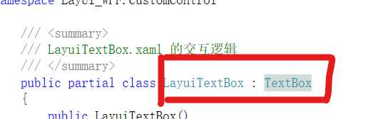
/// <summary>
    /// LayuiTextBox.xaml 的交互逻辑
    /// </summary>
    public partial class LayuiTextBox : TextBox
    {
        public LayuiTextBox()
        {
            InitializeComponent();
        }
        public string Ico
        {
            get { return (string)GetValue(IcoProperty); }
            set { SetValue(IcoProperty, value); }
        }
        public static readonly DependencyProperty IcoProperty =
            DependencyProperty.Register("Ico", typeof(string), typeof(LayuiTextBox), new PropertyMetadata("\xf007"));
        public bool IcoStatus
        {
            get { return (bool)GetValue(IcoStatusProperty); }
            set { SetValue(IcoStatusProperty, value); }
        }
        public static readonly DependencyProperty IcoStatusProperty =
            DependencyProperty.Register("IcoStatus", typeof(bool), typeof(LayuiTextBox), new PropertyMetadata(true));
        public string Prompt
        {
            get { return (string)GetValue(PromptProperty); }
            set { SetValue(PromptProperty, value); }
        }
        public static readonly DependencyProperty PromptProperty =
            DependencyProperty.Register("Prompt", typeof(string), typeof(LayuiTextBox), new PropertyMetadata("这是水印"));
        public int BorderRadius
        {
            get { return (int)GetValue(BorderRadiusProperty); }
            set { SetValue(BorderRadiusProperty, value); }
        }

        public static readonly DependencyProperty BorderRadiusProperty =
            DependencyProperty.Register("BorderRadius", typeof(int), typeof(LayuiTextBox), new PropertyMetadata(2));

    }
最终样式图为一睹为中的样式
特别提示:字体图标为 Font Awesome
作者:会害羞的青蛙
时间:2020-3-28 18:39
标签:mouseover key xmlns 窗体 class pixel lock 控件 ddd
原文地址:https://www.cnblogs.com/ShyFrog/p/12588718.html