标签:行修改 决定 encoding false ora 好的 平台无关 cal 公式
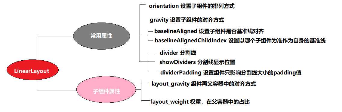
为了更好地管理Android应用的用户界面里的各组件,Android提供了布局管理器。通过使用布局管理器,Android应用图形用户界面具有良好的平台无关性。推荐使用布局管理器来管理组件的分布、大小,而不是直接设置组件的位置和大小。可以使用布局管理器嵌套布局管理器,即也可作为一个UI组件来使用。
LinearLayout可以控制组件横向排列或者纵向排列,内容不会换行,超出屏幕部分将不会显示出来。
XML: android:orientation="horizontal"
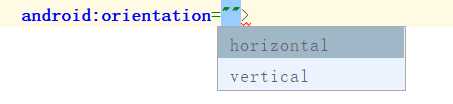
horizontal:横向排列
vertical:纵向排列
JAVA :linearLayout.setOrientation(LinearLayout.VERTICAL);
LinearLayout.HORIZONTAL 横向排列
LinearLayout.VERTICAL 纵向排列
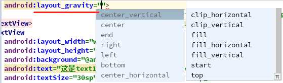
XML: android:gravity="center"
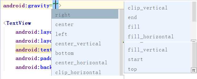
JAVA :linearLayout.setGravity(Gravity.CENTER);
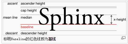
基准线:
打开的英语练习本,那条红线就是基准线
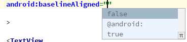
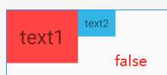
XML: android:baselineAligned="false"
JAVA: linearLayout.setBaselineAligned(true);
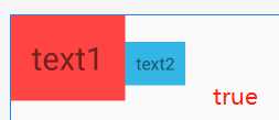
代码:true
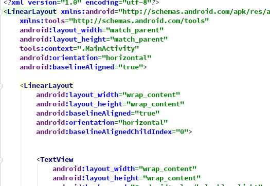
    <LinearLayout
        android:layout_width="match_parent"
        android:layout_height="wrap_content"
        android:baselineAligned="true"
        android:orientation="horizontal">

        <TextView
            android:layout_width="wrap_content"
            android:layout_height="wrap_content"
            android:background="@android:color/holo_red_light"
            android:padding="20dp"
            android:text="text1"
            android:textSize="30sp">

        </TextView>
        <TextView
            android:layout_width="wrap_content"
            android:layout_height="wrap_content"
            android:background="@android:color/holo_blue_light"
            android:padding="10dp"
            android:text="text2"
            android:textSize="16sp">

        </TextView>
    </LinearLayout>
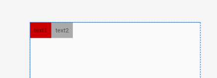
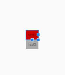
效果:
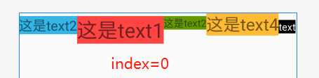
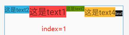
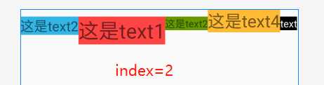
一个LinearLayout 里面有很多 textview ,每一个 textview 都有自己的基准线,那么LinearLayout可能也是另一个LinearLayout的子元素,作为子元素 baselineAlignedChildIndex 就决定这他的一个基准线
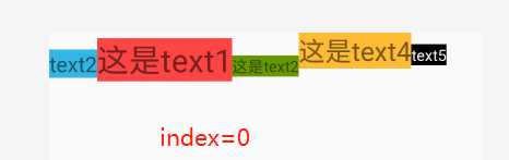
XML:android:baselineAlignedChildIndex="0"
JAVA:linearLayout.setBaselineAlignedChildIndex(0);
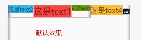
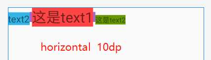
代码:?注意内部的LinearLayout,后面将在 第二个LinearLayout上添加 baselineAlignedChildIndex ,搭配 baselineAligned="false" 使用
<LinearLayout
    android:layout_width="match_parent"
    android:layout_height="match_parent"
    android:orientation="horizontal">

    <LinearLayout
        android:layout_width="wrap_content"
        android:layout_height="wrap_content"
        android:baselineAligned="false"
        android:orientation="horizontal">


        <TextView
            android:layout_width="wrap_content"
            android:layout_height="wrap_content"
            android:background="@android:color/holo_blue_light"
            android:text="这是text2"
            android:textSize="20sp">

        </TextView>
        <TextView
            android:layout_width="wrap_content"
            android:layout_height="wrap_content"
            android:background="@android:color/holo_red_light"
            android:text="这是text1"
            android:textSize="30sp">

        </TextView>
        <TextView
            android:layout_width="wrap_content"
            android:layout_height="wrap_content"
            android:background="@android:color/holo_green_dark"
            android:text="这是text2"
            android:textSize="15sp">

        </TextView>
    </LinearLayout>
    <TextView
        android:layout_width="wrap_content"
        android:layout_height="wrap_content"
        android:text="这是text4"
        android:textSize="25sp"
        android:background="@android:color/holo_orange_light"
        >

    </TextView>
    <TextView
        android:layout_width="wrap_content"
        android:layout_height="wrap_content"
        android:background="@android:color/black"
        android:text="text"
        android:textColor="@android:color/white"
        android:textSize="15sp">

   </TextView>
</LinearLayout>
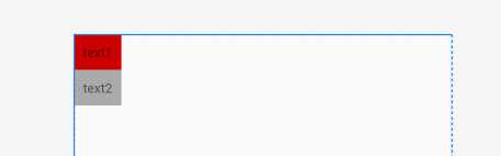
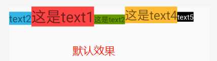
效果:
? 总结
??思考1:如果搭配 baselineAligned="true" 是什么样的效果?
代码:(修改上方代码)
效果:
?总结
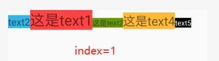
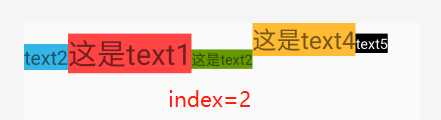
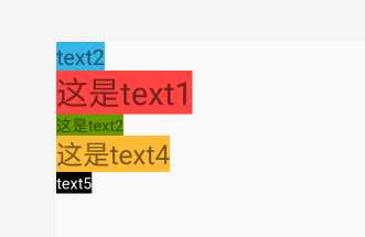
好像已经把上方的总结都打乱了,但是对比 baselineAligned="false" 的效果,可以发现,其实LinearLayout 的基准线其实还是在 baselineAligned="false" 时对应子组件的基准线位置为准的,可以参考 text4 和text5 的位置,他们所对弃的基准线,不是 前三个 text 变化后位置的基准线,而是变化之前的基准线位置。
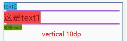
??思考2:基准线时平行的,如果设置 LinearLayout 子组件为纵向排列那还有效果吗?
答:没有效果没有变化
我第一次遇到这个divider 是在 ListView 中
??代码
<ListView
        android:layout_width="match_parent"
        android:layout_height="match_parent"
        android:divider="@color/colorPrimary"
        android:dividerHeight="3dp">
</ListView>
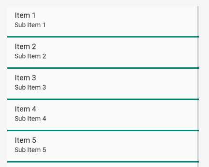
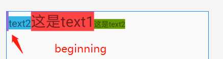
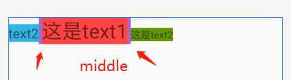
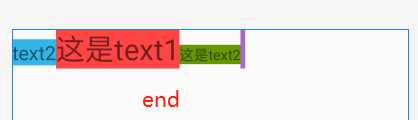
??效果
?注意这里 divider 必须和 dividerHeight 才能显示出效果。于是凭借经验,你以为在LinearLayout也能如此,那就入坑了
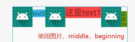
XML: android:divider="@mipmap/ic_launcher"
??必须使用图片或者是shape文件,不能直接和ListView一样直接使用颜色(会导致没效果)
??需要搭配 showDividers 使用才有效果
JAVA: linearLayout.setDividerDrawable(getResources().getDrawable(R.mipmap.ic_launcher));
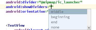
XML: android:showDividers="middle|beginning"
JAVA:linearLayout.setShowDividers(LinearLayout.SHOW_DIVIDER_MIDDLE);
??关键代码 :
 <LinearLayout
        android:layout_width="match_parent"
        android:layout_height="wrap_content"
        android:divider="@mipmap/ic_launcher"
        android:showDividers="middle|beginning"
        android:orientation="horizontal">
<···/>
</LinearLayout>
??效果:
创建 linear_line.xml
将 selector 修改成shape,如下
<?xml version="1.0" encoding="utf-8"?>
<shape xmlns:android="http://schemas.android.com/apk/res/android">

    <size android:width="5dp" android:width="5dp"/> <solid android:color="@android:color/holo_purple" /> </shape>
??这里要使用 size 来定义 线的一个宽度 width 作为横向的分割线,如果是纵向的就要定义一个 高度 height
        android:divider="@drawable/linear_line"
        android:showDividers="middle|beginning"
??效果:三种可以相互组合
XML: android:dividerPadding="10dp"
JAVA:linearLayout.setDividerPadding(10);
??代码:
<LinearLayout
        android:layout_width="match_parent"
        android:layout_height="wrap_content"
        android:divider="@drawable/linear_line"
        android:showDividers="middle"
        android:dividerPadding="10dp"
        android:orientation="horizontal">
</LinearLayout>
??效果:
?总结
所有子组件都受 LinearLayout.LayoutParams 控制
??上方讲解到了gravity,其gravity不是LinearLayout 的特有属性,但layout_gravity 是其子组件的特殊属性。具体区别请参考我的博客 layout_gravity和gravity的区别:https://www.cnblogs.com/xqz0618/p/gravity.html,这里不再详细说明
这是LinearLayout 及其重要的一个属性,根据权重来设置子组件的在整个屏幕的占比,能够达到很好的适配屏幕的效果
代码:
<LinearLayout
        android:layout_width="match_parent"
        android:layout_height="wrap_content"
        android:divider="@drawable/linear_line"
        android:baselineAligned="false">

        <TextView
            android:layout_width="wrap_content"
            android:layout_height="wrap_content"
            android:layout_weight="1"
            android:background="@android:color/holo_blue_light"
            android:text="text1"
            android:textSize="20sp">

        </TextView>
        <TextView
            android:layout_width="wrap_content"
            android:layout_height="wrap_content"
            android:layout_weight="2"
            android:background="@android:color/holo_red_light"
            android:text="text2"
            android:textSize="30sp">

        </TextView>
        <TextView
            android:layout_width="wrap_content"
            android:layout_height="wrap_content"
            android:layout_weight="3"
            android:background="@android:color/holo_green_dark"
            android:text="text3"
            android:textSize="15sp">

        </TextView>
    </LinearLayout>
??这里是横向布局,将对 layout_width 进行修改得到不同的结果
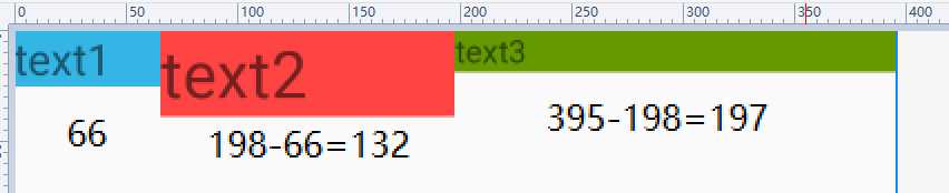
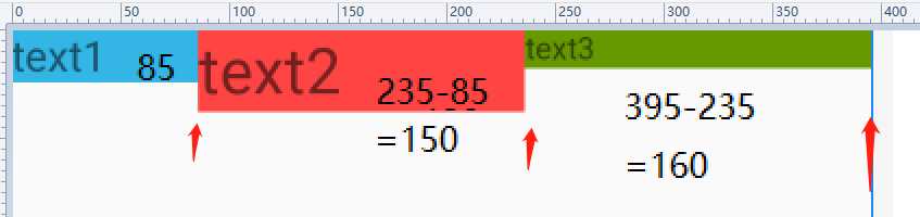
?可以看出来 三个text 的宽度在误差范围内是和weight权重相同的 1:2:3,所以单个text 的宽度计算就为:
假设屏幕的宽度为P,单个子组件的大小为W,子组件的权重之和为G,该组件设置的权重为H
则 W = H/G*P
即当前 1:2:3
W = H/G*P = 1/(1+2+3)*P = 1/6P
text1占比为屏幕的 1/6
??情况二并没有像情况一一样,根据权重的比例 1:2:3,按照情况1的公式就不成立
?实际上权重是根据总屏幕的大小 P减去所有子组件的 layout_width 然后再根据权重进行分配的大小再加上 layout_width。这里说有点乱了,看分析。
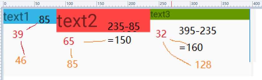
??用控件的大小减去文本的大小得到的宽度,考虑误差范围内,其实是 1:2:3的
假设屏幕的宽度为P,单个子组件的大小为W,子组件的权重之和为G,该组件设置的权重为H,子组件的layout_width为L
则 W = H/G*(P-3L)+L
即当前 1:2:3
text1的屏幕占比 W =H/G*(P-3L)+L = 1/(1+2+3)*(P-3L)+L
这里使用 wrap_content不好计算
反过来思考 当 L=0dp 时
W = 1/(1+2+3)*(P-0)+0= 1/6P
与上方结果一致
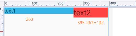
从上图可以看出 text1和text2 比例分别为 2:1,text3不见了,用上方的式子验证:
假设屏幕的宽度为P,单个子组件的大小为W,子组件的权重之和为G,该组件设置的权重为H,子组件的layout_width为L
则 W = H/G*(P-3L)+L
即当前 1:2:3
由于此时 layout_width是match_parent,则 L= P
text1的屏幕占比 W =H/G*(P-3L)+L = 1/(1+2+3)*(P-3L)+L=1/(1+2+3)*(P-3P)+P = 1/6*(-2P)+P= 2/3P
由此
text2的 W = 1/3P
text3的 W = 3/(1+2+3)*(-2P)+P = 0dp
那也就是说text3并不是超出屏幕没显示,而是他的宽度就是为0 //可以添加一个滚动控件来验证一下
?总结
我们得到的统一公式,来计算这个屏幕占比问题(其实话说回来,你整这么麻烦干嘛,直接使用0dp不爽吗,当然一些场景可能需要 warpcontent)
假设屏幕的宽度为P,单个子组件的大小为W,子组件的权重之和为G,该组件设置的权重为H,子组件的layout_width为L
则 W = H/G*(P-3L)+L
标签:行修改 决定 encoding false ora 好的 平台无关 cal 公式
原文地址:https://www.cnblogs.com/xqz0618/p/linearlayout.html