标签:select gradient after cell 宽度 背景图 ace drawing 连接点
clip-path是由clip演化而来的样式属性,表示裁剪元素的一部分来显示,其余部分隐藏。顾名思义clip-path着重于path路径。
最先想到的场景就是登录某平台后显示的头像框,比如圆形的,就是将方形的头像裁剪出圆形来显示。其次就是用于绘制图形,比如一个红色的正方形等。或者绘制不规则图形,以及显示图形的不规则的一部分。
通常用法就是结合背景色或背景图片,来进行裁剪
基本语法:<clip-source> | [ <basic-shape> || <geometry-box> ] | none
inset()可以传入5个参数,分别对应top,right,bottom,left的裁剪位置,round radius(可选,圆角)//示例 clip-path: inset(2em 3em 2em 1em round 2em);
circle()可以传人2个可选参数;
1. 圆的半径,默认元素宽高中短的那个为直径,支持百分比
2. 圆心位置,默认为元素中心点
//半径公式
如果半径使用百分比:圆的半径 = (sqrt(width^2+height^2)/sqrt(2)) * 百分比

//示例
clip-path: circle(30% at 150px 120px);
ellipse()可以传人3个可选参数;
1. 椭圆的X轴半径,默认是宽度的一半,支持百分比
2. 椭圆的Y轴半径,默认是高度的一半,支持百分比
3. 椭圆中心位置,默认是元素的中心点

//示例
clip-path: ellipse(45% 30% at 50% 50%);
//语法
polygon( <fill-rule>? , [ <length-percentage> <length-percentage> ]# )
//说明
<fill-rule>可选,表示填充规则用来确定该多边形的内部。可能的值有nonzero和evenodd,默认值是nonzero
后面的每对参数表示多边形的顶点坐标(X,Y),也就是连接点

//示例
clip-path: polygon(50% 0,100% 50%,0 100%);
polygon可以有理论上无数多个点。一个可以方便取点坐标的网站:
http://betravis.github.io/shape-tools/polygon-drawing/
还可以结合动画,比如
.clip-path2{
        transition: 0.4s cubic-bezier(1, -1, 0, 2);
        clip-path: circle(30% at 200px 100px)
    }
  .clip-path2:hover{
        clip-path: circle(20% at 200px 100px)
}这里做一个9宫格,然后将中间格子与其他格子连线。上下左右可以直接用横向和纵向的直线,但是四个角的连线就需要用斜线。这里可以用clip-path来画斜线。这里例子中使用了另一种画斜线的方法,但是需要旋转角度确定才可以,相对来说clip-path可以结合百分比更方便。代码如下:
  1 <html>
  2     <head>
  3         <style>
  4         .box {
  5             width: 100%;
  6             height: 100%;
  7             position: relative;
  8         }
  9         .box div {
 10             box-sizing: border-box;
 11         }
 12         .flex-sp-b {
 13             display: flex;
 14             justify-content: space-between;
 15         }
 16         .flex-c {
 17             flex-direction: column;
 18         }
 19         .flex-r {
 20             flex-direction: row;
 21         }
 22         .union {
 23             width: 22%;
 24         }
 25         .cell {
 26             height: 22%;
 27             border: 1px solid #348efd;
 28             display: flex;
 29             justify-content: center;
 30             align-items: center;
 31         }
 32         .lines {
 33             position: absolute;
 34         }
 35         .line {
 36             border: 1px solid #9a9a9a;
 37             position: absolute;
 38         }
 39         .line-single {
 40             width: 17%;
 41             height: 17%;
 42             border: none;
 43         }
 44         .line1 {
 45             left: 22%;
 46             top: 22%;
 47             background: linear-gradient(26deg, transparent 49.5%, #9a9a9a 49.5%, #9a9a9a 51.5%, transparent 51.5%);
 48         }
 49         .line2 {
 50             width: 17%;
 51             height: 0px;
 52             top: 50%;
 53             left: 22%;
 54         }
 55         .line3 {
 56             left: 22%;
 57             top: 61%;
 58             background: linear-gradient(154deg, transparent 49.5%, #9a9a9a 49.5%, #9a9a9a 51.5%, transparent 51.5%);
 59         }
 60         .line4 {
 61             height: 17%;
 62             width: 0px;
 63             left: 50%;
 64             top: 22%;
 65         }
 66         .line6 {
 67             height: 17%;
 68             width: 0px;
 69             left: 50%;
 70             top: 61%;
 71         }
 72         .line7 {
 73             left: 61%;
 74             top: 22%;
 75             background: linear-gradient(154deg, transparent 49.5%, #9a9a9a 49.5%, #9a9a9a 51.5%, transparent 51.5%);
 76         }
 77         .line8 {
 78             width: 17%;
 79             height: 0px;
 80             top: 50%;
 81             left: 61%;
 82         }
 83         .line9 {
 84             left: 61%;
 85             top: 61%;
 86             background: linear-gradient(26deg, transparent 49.5%, #9a9a9a 49.5%, #9a9a9a 51.5%, transparent 51.5%);
 87         }
 88         .line11 {
 89             left: 22%;
 90             top: 22%;
 91             clip-path: polygon(-1% -2%, 102% 99%, 100% 101%, -1% 2%);
 92             background: deeppink;
 93         }
 94         .line33 {
 95             left: 22%;
 96             top: 61%;
 97             clip-path: polygon(-1% 99%, 1% 101%, 101% 1%, 99% -1%);
 98             background: deeppink;
 99         }
100         .line77 {
101             left: 61%;
102             top: 22%;
103             clip-path: polygon(-1% 99%, 1% 101%, 101% 1%, 99% -1%);
104             background: deeppink;
105         }
106         .line99 {
107             left: 61%;
108             top: 61%;
109             clip-path: polygon(-1% -2%, 102% 99%, 100% 101%, -1% 2%);
110             background: deeppink;
111         }
112         h1:after
113   {
114   content:url(beep.wav);
115   }
116         </style>
117     </head>
118     <body>
119         <div class="box flex-sp-b flex-r">
120             <div class="union flex-sp-b flex-c">
121                 <div class="cell">1</div>
122                 <div class="cell">2</div>
123                 <div class="cell">3</div>
124             </div>
125             <div class="union flex-sp-b flex-c">
126                 <div class="cell">4</div>
127                 <div class="cell">5</div>
128                 <div class="cell">6</div>
129             </div>
130             <div class="union flex-sp-b flex-c">
131                 <div class="cell">7</div>
132                 <div class="cell">8</div>
133                 <div class="cell">9</div>
134             </div>
135             <div class="box lines">
136                 <div class="line line1 line-single"></div>
137                 <div class="line line11 line-single"></div>
138                 <div class="line line2"></div>
139                 <div class="line line3 line-single"></div>
140                 <div class="line line33 line-single"></div>
141                 <div class="line line4"></div>
142                 <div class="line line6"></div>
143                 <div class="line line7 line-single"></div>
144                 <div class="line line77 line-single"></div>
145                 <div class="line line8"></div>
146                 <div class="line line9 line-single"></div>
147                 <div class="line line99 line-single"></div>
148             </div>
149         </div>
150     </body>
151 </html>
效果如下:
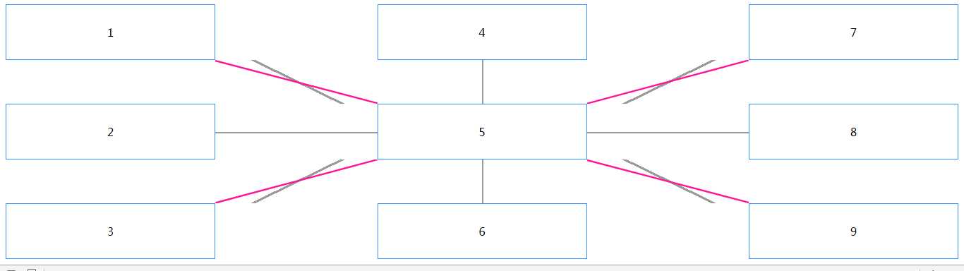
这里为了对比,将两种斜线都显示了出来,粉红色是clip-path画的,灰色是旋转实现的,宽高变化后,灰色线就对接不到顶点了,但是clip-path的线会随之拉伸。
标签:select gradient after cell 宽度 背景图 ace drawing 连接点
原文地址:https://www.cnblogs.com/ljwsyt/p/12623902.html