标签:text 关联 btn util android ring vertica enc recycle
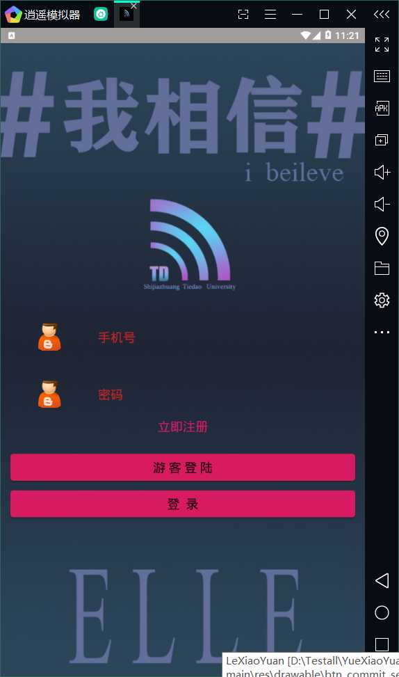
今天做的是登陆界面的实现。
分了两个阶段:1、布局的实现(由于对于布局不能够熟悉的运用,还有各种捆版事件)
这个输入框由于考虑到后期还要用到,所以直接专门写了一个aciivity,到后面需要用的时候调用一下就行。
package com.example.YueXiaoYuan.views;

import android.content.Context;
import android.content.res.Resources;
import android.content.res.TypedArray;
import android.text.InputType;
import android.util.AttributeSet;
import android.view.LayoutInflater;
import android.view.View;
import android.widget.EditText;
import android.widget.FrameLayout;
import android.widget.ImageView;
import android.widget.ResourceCursorAdapter;

import androidx.annotation.NonNull;
import androidx.annotation.Nullable;

import com.example.YueXiaoYuan.R;

/**
 * Input_icon输入框前面的图标
 * Input_hint输入框的提示内容
 * is_Password输入框的内容是否以密文的方式进行展示
 * */
public class InputView extends FrameLayout {
    private int inputIcon;
    private String inputHint;
    private boolean isPssword;
    private View mView;
    private ImageView mIvIcon;
    private EditText mEtInput;

    public InputView(@NonNull Context context) {
        super(context);
        init(context,null);
    }

    public InputView(@NonNull Context context, @Nullable AttributeSet attrs) {
        super(context, attrs);
        init(context,attrs);
    }

    public InputView(@NonNull Context context, @Nullable AttributeSet attrs, int defStyleAttr) {
        super(context, attrs, defStyleAttr);
        init(context,attrs);
    }

    public InputView(@NonNull Context context, @Nullable AttributeSet attrs, int defStyleAttr, int defStyleRes) {
        super(context, attrs, defStyleAttr, defStyleRes);
        init(context,attrs);
    }
    private  void init(Context context ,AttributeSet attrs){
        if (attrs==null)return;
        //根据attrs获取自定义属性
        TypedArray typedArray=context.obtainStyledAttributes(attrs, R.styleable.inputView);
        inputIcon=typedArray.getResourceId(R.styleable.inputView_input_icon,R.mipmap.ic_launcher);
        inputHint=typedArray.getString(R.styleable.inputView_input_hint);
        isPssword=typedArray.getBoolean(R.styleable.inputView_is_password,false);
        typedArray.recycle();
        //绑定layout布局
        mView= LayoutInflater.from(context).inflate(R.layout.input_view,this,false);
        mIvIcon=mView.findViewById(R.id.iv_icon);
        mEtInput=mView.findViewById(R.id.et_input);
        //布局关联属性
        mIvIcon.setImageResource(inputIcon);
        mEtInput.setHint(inputHint);
        mEtInput.setInputType(isPssword ? InputType.TYPE_CLASS_TEXT| InputType.TYPE_TEXT_VARIATION_PASSWORD:InputType.TYPE_CLASS_PHONE);

        addView(mView);
    }
    public String getInputStr(){
        return mEtInput.getText().toString().trim();
    }
}
这是布局代码
<?xml version="1.0" encoding="utf-8"?>
<LinearLayout
    xmlns:android="http://schemas.android.com/apk/res/android"
    android:orientation="horizontal"
    android:layout_width="match_parent"
    android:layout_height="@dimen/inputviewHeight"
    android:gravity="center_vertical"
    android:paddingLeft="@dimen/marginSize"
    android:paddingRight="@dimen/marginSize"
    >

    <ImageView
        android:id="@+id/iv_icon"
        android:layout_width="wrap_content"
        android:layout_height="54dp"
        android:src="@drawable/zh"></ImageView>

    <EditText
        android:id="@+id/et_input"
        android:layout_width="match_parent"
        android:layout_height="match_parent"
        android:textColorHint="#C22525"
        android:background="@null"
        android:hint="用户名"

        android:paddingLeft="@dimen/marginSize"
        android:paddingRight="@dimen/marginSize"
        android:textSize="@dimen/titleSize"></EditText>

</LinearLayout>
values定义到的属性:
<?xml version="1.0" encoding="utf-8"?>
<resources>
    <!-- 声明样式-->
    <declare-styleable name="inputView">
        <!--输入框前面的小图标-->
        <attr name="input_icon" format="reference"></attr>
        <!--输入框的提示信息-->
        <attr name="input_hint" format="string"></attr>
        <!--输入框的内容是否以密文的形式进行展示-->
        <attr name="is_password" format="boolean"></attr>
    </declare-styleable>

</resources>
<?xml version="1.0" encoding="utf-8"?>
<resources>
    <dimen name="titleSize">18sp</dimen>
    <dimen name="inputviewHeight">44dp</dimen>
    <dimen name="marginSize">16dp</dimen>
    <dimen name="marginSize2">455dp</dimen>
    <dimen name="marginSize3">655dp</dimen>
    <dimen name="btnHeight">44dp</dimen>
    <dimen name="radius">5dp</dimen>
</resources>
同样,按钮后期需要的地方也有很多,所以直接写一个模板,到时候只需要套用就可以了。
<?xml version="1.0" encoding="utf-8"?>
<selector xmlns:android="http://schemas.android.com/apk/res/android">
    <!--view高亮-->
    <item android:state_focused="true" android:drawable="@drawable/btn_commit_h"></item>
    <item android:state_pressed="true" android:drawable="@drawable/btn_commit_h"></item>
    <item android:state_selected="true" android:drawable="@drawable/btn_commit_h"></item>
    <!--默认-->
    <item android:drawable="@drawable/btn_commit_n"></item>
</selector>
<?xml version="1.0" encoding="utf-8"?>
<shape xmlns:android="http://schemas.android.com/apk/res/android" android:shape="rectangle">
    <!--实体的颜色-->
    <solid android:color="@color/colorAccent"></solid>
    <!-- 弧度-->
    <corners android:radius="@dimen/radius"></corners>

</shape>
<?xml version="1.0" encoding="utf-8"?>
<shape xmlns:android="http://schemas.android.com/apk/res/android" android:shape="rectangle">
    <!--实体的颜色-->
    <solid android:color="@color/colorAccentH"></solid>
    <!-- 弧度-->
    <corners android:radius="@dimen/radius"></corners>

</shape>
<?xml version="1.0" encoding="utf-8"?>
<resources>
    <color name="colorPrimary">#008577</color>
    <color name="colorPrimaryDark">#00574B</color>
    <color name="colorAccent">#D81B60</color>
    <color name="colorAccentH">#E6DFE0</color>
    <color name="mainColor">#A09C9C</color>
</resources>
<!--登录按钮的封装-->
    <style name="commitBtn">
        <item name="android:layout_width">match_parent</item>
        <item name="android:layout_height">@dimen/btnHeight</item>
        <item name="android:textSize">@dimen/titleSize</item>
        <item name="android:layout_marginLeft">@dimen/marginSize</item>
        <item name="android:layout_marginRight">@dimen/marginSize</item>
        <item name="android:background">@drawable/btn_commit_select</item>

    </style>
明天进行登陆手机号和密码的限制页面的跳转以及注册界面的布局。
标签:text 关联 btn util android ring vertica enc recycle
原文地址:https://www.cnblogs.com/moxihuishou/p/12764822.html