标签:ace force rms auto box day data otc ott
1. 调用接口获取json数据,为了方便演示,这里使用本地json;
“label”用于判断什么组件,“type”用于判断组件类型,“name”组件name属性,“title”字段名,“placeholder”默认提示信息,“maxLength”输入最长长度,“required”是否必填,“requiredMessage”必填提示信息,“ruleType”校验规则的类型,“checkRule”校验规则的长度,“ruleMessage”校验规则的提示信息,“option”选择项内容,“mode”选择的类型(单选、多列、日期等),“checked”是否选中等;可根据实际情况需要,和组件的属性来对接口返回字段增改删;
// 动态表单数据
module.exports = {
"errcode": 0,
"data": [{
"sort": 1,
"label": "input",
"type": "text",
"name": "sqrxm",
"title": "申请单位名称",
"placeholder": "请填写申请单位名称",
"maxLength": 20,
"required": true,
"requiredMessage": "请填写申请单位名称",
"ruleType": "string",
"checkRule": "1,50",
"ruleMessage": "申请单位名称必须为1-50个字符!"
},
{
"sort": 2,
"label": "input",
"type": "text",
"name": "sqrdz",
"title": "申请单位地址",
"placeholder": "请填写申请单位地址",
"maxLength": 20,
"required": true,
"requiredMessage": "请填写申请单位地址",
"ruleType": "string",
"checkRule": "1,50",
"ruleMessage": "申请单位地址必须为1-50个字符!"
},
{
"sort": 3,
"label": "select",
"type": "",
"name": "township",
"title": "所属镇区",
"required": false,
"ruleType": "notcheck",
"checkRule": "",
"ruleMessage": "不需要",
"option": [‘请选择‘, ‘东区‘, ‘石岐区‘, ‘古镇‘, ‘五桂山‘, ‘其他‘],
"mode": "selector",
"index": 0
},
{
"sort": 4,
"label": "select",
"type": "",
"name": "sqrzjlx",
"title": "申请单位证件类型",
"placeholder": "请选择申请单位证件类型",
"required": true,
"requiredMessage": "请选择申请单位证件类型",
"ruleType": "notnull",
"checkRule": "",
"ruleMessage": "请选择申请单位证件类型",
"option": [‘请选择‘, ‘统一社会信用代码‘, ‘工商营业执照‘, ‘组织机构代码‘, ‘登记证‘, ‘其他‘],
"mode": "selector",
"index": 0
},
{
"sort": 5,
"label": "select",
"type": "",
"name": "dlxzq",
"title": "多列选择器",
"placeholder": "",
"required": true,
"requiredMessage": "",
"ruleType": "notnull",
"checkRule": "",
"ruleMessage": "请选择城市",
"option": [
[‘中国‘, ‘伊朗‘],
[‘广东省‘, ‘山东省‘],
[‘中山市‘, ‘北京‘, ‘上海‘, ‘广州‘]
],
"mode": "multiSelector",
"multiIndex": [0, 0, 0]
},
{
"sort": 6,
"label": "select",
"type": "",
"name": "rqxzq",
"title": "日期选择器",
"placeholder": "",
"required": true,
"requiredMessage": "",
"ruleType": "notnull",
"checkRule": "",
"ruleMessage": "请选择日期",
"option": null,
"mode": "date",
"index": 0
},
{
"sort": 7,
"label": "radio",
"type": "",
"name": "radio",
"title": "单选框",
"placeholder": "",
"required": false,
"ruleType": "notcheck",
"checkRule": "",
"ruleMessage": "不需要",
"option": [{
"value": "radio1",
"text": "选项1"
},
{
"value": "radio2",
"text": "选项2"
}
]
},
{
"sort": 8,
"label": "checkbox",
"type": "",
"name": "checkbox",
"title": "复选框",
"placeholder": "",
"required": false,
"ruleType": "notcheck",
"checkRule": "",
"ruleMessage": "不需要",
"option": [{
"value": "checkbox1",
"text": "选项1"
},
{
"value": "checkbox2",
"text": "选项2"
},
{
"value": "checkbox3",
"text": "选项3"
}
]
},
{
"sort": 9,
"label": "switch",
"type": "",
"name": "switch",
"title": "开关选择器",
"placeholder": "",
"maxLength": 0,
"required": false,
"ruleType": "notcheck",
"checkRule": "",
"ruleMessage": "不需要",
"checked": "checked"
},
{
"sort": 10,
"label": "slider",
"type": "",
"name": "slider",
"title": "滑动选择器",
"placeholder": "",
"maxLength": 0,
"required": false,
"ruleType": "notcheck",
"checkRule": "",
"ruleMessage": "不需要",
"option": {
"min": 5,
"max": 100,
"step": 5,
"value": 50
}
},
{
"sort": 11,
"label": "textarea",
"type": "",
"name": "sqsy",
"title": "申请事由",
"placeholder": "请填写申请事由",
"maxLength": 2000,
"required": false,
"ruleType": "notcheck",
"checkRule": "",
"ruleMessage": "不需要"
}
]
}
2. 循环json数据(v-for="(item, index) in portData"),根据每一项内容判断显示的组件和组件属性,为了便于扩充,建议把所有表单常用的组件都进行判断;以后无论什么组件,直接获取接口渲染;
下面实现了组件“input”、“select”(多种)、“radio”、“checkbox”、“switch”、“slider”、“textarea”;
<template>
<view class="form-box">
<form @submit="formSubmit">
<view v-for="(item, index) in portData" :key="item.sort">
<!-- input类型 -->
<view class="uni-form-item uni-column" v-if="item.label == ‘input‘">
<view class="title">{{item.title}}(文本框)</view>
<input class="uni-input" :name="item.name" :placeholder="item.placeholder" :maxlength="item.maxLength" />
</view>
<!-- select类型 -->
<!-- 普通选择器 -->
<view class="uni-form-item uni-column" v-if="item.label == ‘select‘ && item.mode == ‘selector‘">
<view class="title">{{item.title}}(普通选择器)</view>
<picker @change="bindPickerChange" :mode="item.mode" :value="item.index" :range="item.option" :name="item.name"
:data-index="index">
<view class="uni-input">{{item.option[item.index]}}</view>
</picker>
</view>
<!-- #ifndef MP-ALIPAY -->
<!-- 多列选择器(支付宝需要用piker-view实现) -->
<view class="uni-form-item uni-column" v-if="item.label == ‘select‘ && item.mode == ‘multiSelector‘">
<view class="title">{{item.title}}</view>
<picker :mode="item.mode" @columnchange="bindMultiPickerColumnChange" :value="item.multiIndex" :range="item.option"
:name="item.name" :data-index="index">
<view class="uni-input">{{item.option[0][item.multiIndex[0]]}},{{item.option[1][item.multiIndex[1]]}},{{item.option[2][item.multiIndex[2]]}}</view>
</picker>
</view>
<!-- #endif -->
<!-- #ifdef MP-ALIPAY -->
<view class="uni-form-item uni-column" v-if="item.label == ‘select‘ && item.mode == ‘multiSelector‘">
<view class="title" @click="togglePicker">{{country}}, {{province}}, {{city}}</view>
<picker-view class="picker-view" v-if="visible" :indicator-style="indicatorStyle" :value="item.multiIndex" :name="item.name" :data-index="index" @change="bindChange">
<picker-view-column>
<view class="item" v-for="(item,index) in item.option[0]" :key="index">{{item}}</view>
</picker-view-column>
<picker-view-column>
<view class="item" v-for="(item,index) in item.option[1]" :key="index">{{item}}</view>
</picker-view-column>
<picker-view-column>
<view class="item" v-for="(item,index) in item.option[2]" :key="index">{{item}}</view>
</picker-view-column>
</picker-view>
</view>
<!-- #endif -->
<!-- 日期选择器 -->
<view class="uni-form-item uni-column" v-if="item.label == ‘select‘ && item.mode == ‘date‘">
<view class="title">{{item.title}}</view>
<picker :mode="item.mode" :value="date" :start="startDate" :end="endDate" @change="bindDateChange" :name="item.name">
<view class="uni-input">{{date}}</view>
</picker>
</view>
<!-- radio类型 -->
<view class="uni-form-item uni-column" v-if="item.label == ‘radio‘">
<view class="title">{{item.title}}</view>
<radio-group :name="item.name">
<label v-for="(radioData, index) in item.option" :key="index">
<!-- 加color为了解决小程序颜色差异 -->
<radio color="#007aff" :value="radioData.value" /><text>{{radioData.text}}</text>
</label>
</radio-group>
</view>
<!-- checkbox类型 -->
<view class="uni-form-item uni-column" v-if="item.label == ‘checkbox‘">
<view class="title">{{item.title}}</view>
<checkbox-group :name="item.name">
<label v-for="(checkboxData, index) in item.option" :key="index">
<!-- 加color为了解决小程序颜色差异 -->
<checkbox color="#007aff" :value="checkboxData.value" /><text>{{checkboxData.text}}</text>
</label>
</checkbox-group>
</view>
<!-- switch类型 -->
<view class="uni-form-item uni-column" v-if="item.label == ‘switch‘">
<view class="title">{{item.title}}</view>
<!-- 加color为了解决小程序颜色差异 -->
<switch color="#007aff" name="switch" :checked="item.checked" />
</view>
<!-- slider类型 -->
<view class="uni-form-item uni-column" v-if="item.label == ‘slider‘">
<view class="title">{{item.title}}</view>
<!-- 加activeColor为了解决小程序颜色差异 -->
<slider activeColor="#007aff" :min="item.option.min" :max="item.option.max" :step="item.option.step" :value="item.option.value"
:name="item.name" show-value></slider>
</view>
<!-- textarea类型 -->
<view class="uni-form-item uni-column" v-if="item.label == ‘textarea‘">
<view class="title">{{item.title}}(多文本框)</view>
<textarea :placeholder="item.placeholder" auto-height />
</view>
</view>
<view class="uni-btn-v">
<button form-type="submit" type="primary">保存</button>
</view>
</form>
</view>
</template>
<script>
// 用来计算当前日期、开始日期和结束日期
function getDate(type) {
const date = new Date();
let year = date.getFullYear();
let month = date.getMonth() + 1;
let day = date.getDate();
if (type === ‘start‘) {
// 有效期开始的日期
year = year - 60;
} else if (type === ‘end‘) {
// 有效期结束的日期
year = year + 2;
}
month = month > 9 ? month : ‘0‘ + month;;
day = day > 9 ? day : ‘0‘ + day;
return `${year}-${month}-${day}`;
}
let graceChecker = require(‘../../../common/js/graceChecker.js‘);
export default {
data() {
return {
portData: null,
date: getDate({
format: true
}),
startDate: getDate(‘start‘),
endDate: getDate(‘end‘),
country: ‘中国‘,
province: ‘广东省‘,
city: ‘中山市‘,
/**
* 解决动态设置indicator-style不生效的问题
*/
visible: false,
indicatorStyle: `height: ${Math.round(uni.getSystemInfoSync().screenWidth/(750/100))}px;`
}
},
onLoad() {
const res = require(‘../../../common/js/json/form.js‘); // 获取表单json数据
this.portData = res.data;
},
methods: {
// 普通选择器
bindPickerChange: function(e) {
let index = e.target.dataset.index; // 获取该类型属于portData的那一个index
this.portData[index].index = e.target.value; // 替换该类型的index达到选择更换
},
// 多列选择器
bindMultiPickerColumnChange: function(e) {
console.log(‘修改的列为:‘ + e.detail.column + ‘,值为:‘ + e.detail.value);
let index = e.target.dataset.index;
this.portData[index].multiIndex[e.detail.column] = e.detail.value;
// 强制重新渲染
this.$forceUpdate();
},
// 支付宝小程序切换picker-view
togglePicker: function(e) {
this.visible = !this.visible;
},
bindChange: function(e) {
const val = e.detail.value;
let country_index = val[0]; // 获取国家的index
let province_index = val[1]; // 获取省份的index
let city_index = val[2]; // 获取城市的index
let index = e.target.dataset.index;
this.country = this.portData[index].option[0][country_index];
this.province = this.portData[index].option[1][province_index];
this.city = this.portData[index].option[2][city_index];
},
// 日期选择器
bindDateChange: function(e) {
this.date = e.detail.value
},
// 表单提交
formSubmit: function(e) {
// console.log(‘form发生了submit事件,携带数据为:‘ + JSON.stringify(e.detail.value));
// 定义表单规则
let rule = [];
this.portData.map((item, index) => {
rule.push({
name: item.name,
ruleType: item.ruleType,
checkRule: item.checkRule,
required: item.required,
ruleMessage: item.ruleMessage
})
});
// 进行表单检查
let formdata = e.detail.value;
let checkRes = graceChecker.check(formdata, rule);
if (checkRes) {
uni.showToast({title:"验证通过!", icon:"none"});
} else {
uni.showToast({ title: graceChecker.error, icon: "none" });
}
}
}
}
</script>
<style>
.form-box {
background-color: #f4f5f6;
padding: 0 30rpx;
}
.uni-form-item .title {
padding: 20rpx 0;
}
.uni-form-item input {
width: 100%;
background-color: #fff;
padding: 8rpx;
font-size: 24rpx;
box-sizing: border-box;
}
.uni-form-item textarea {
background-color: #fff;
font-size: 24rpx;
width: 100%;
padding: 8rpx 0;
}
.uni-input-placeholder {
font-size: 24rpx;
}
.uni-btn-v {
margin-top: 40rpx;
}
/* .picker-view {
position: absolute;
bottom: 0;
width: 100%;
margin-left: -30rpx;
background-color: #fff;
} */
</style>
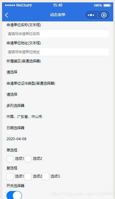
3. 最终效果。
标签:ace force rms auto box day data otc ott
原文地址:https://www.cnblogs.com/zhyp/p/12919721.html