标签:blog body deb blank get lin 高度 ade 图片
经典的上-中-下布局。
当页面内容高度小于可视区域高度时,footer 吸附在底部;当页面内容高度大于可视区域高度时,footer 被撑开排在 content 下方
demo link
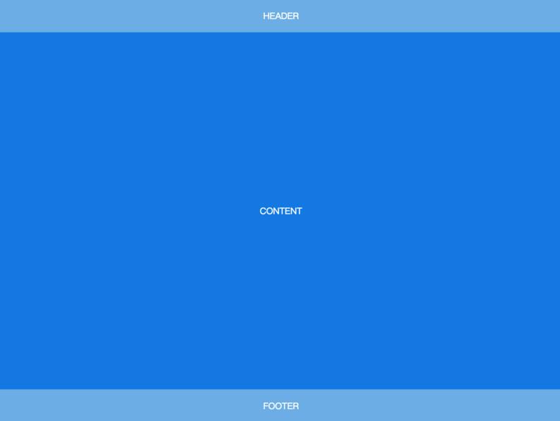
<body>
  <header>HEADER</header>
  <article>CONTENT</article>
  <footer>FOOTER</footer>
</body>
body {
  min-height: 100vh;
  display: flex;
  flex-direction: column;
}
article {
  flex: auto;
}
在上-中-下布局的基础上,加了左侧定宽 sidebar。
demo link
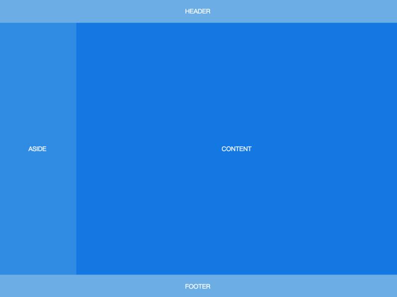
<body>
  <header>HEADER</header>
  <div class="content">
    <aside>ASIDE</aside>
    <article>CONTENT</article>
  </div>
  <footer>FOOTER</footer>
</body>
body {
  min-height: 100vh;
  display: flex;
  flex-direction: column;
}
.content {
  flex: auto;
  display: flex;
}
.content article {
  flex: auto;
}
左边是定宽 sidebar,右边是上-中-下布局。
demo link
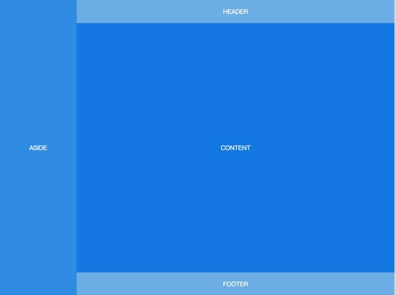
<body>
  <aside>ASIDE</aside>
  <div class="content">
    <header>HEADER</header>
    <article>CONTENT</article>
    <footer>FOOTER</footer>
  </div>
</body>
body {
  min-height: 100vh;
  display: flex;
}
aside {
  flex: none;
}
.content {
  flex: auto;
  display: flex;
  flex-direction: column;
}
.content article {
  flex: auto;
}
还是上-中-下布局,区别是 header 固定在顶部,不会随着页面滚动。
demo link
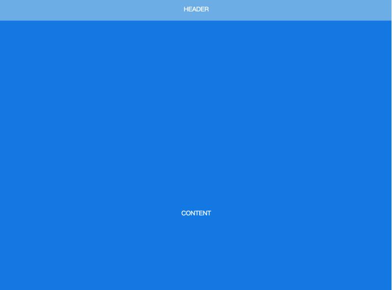
<body>
  <header>HEADER</header>
  <article>CONTENT</article>
  <footer>FOOTER</footer>
</body>
body {
  min-height: 100vh;
  display: flex;
  flex-direction: column;
  padding-top: 60px;
}
header {
  height: 60px;
  position: fixed;
  top: 0;
  left: 0;
  right: 0;
  padding: 0;
}
article {
  flex: auto;
  height: 1000px;
}
左侧 sidebar 固定在左侧且与视窗同高,当内容超出视窗高度时,在 sidebar 内部出现滚动条。左右两侧滚动条互相独立。
demo link
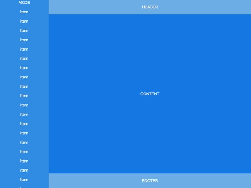
<body>
  <aside>
    ASIDE
    <p>item</p>
    <p>item</p>
    <!-- many items -->
    <p>item</p>
  </aside>
  <div class="content">
    <header>HEADER</header>
    <article>CONTENT</article>
    <footer>FOOTER</footer>
  </div>
</body>
办公资源网址导航 https://www.wode007.com
 1 body {
 2   height: 100vh;
 3   display: flex;
 4 }
 5 aside {
 6   flex: none;
 7   width: 200px;
 8   overflow-y: auto;
 9   display: block;
10 }
11 .content {
12   flex: auto;
13   display: flex;
14   flex-direction: column;
15   overflow-y: auto;
16 }
17 .content article {
18   flex: auto;
19 }
标签:blog body deb blank get lin 高度 ade 图片
原文地址:https://www.cnblogs.com/ypppt/p/13029824.html