标签:loading ota key 简单 mat near width 旋转 设定
话不多说,先上效果图
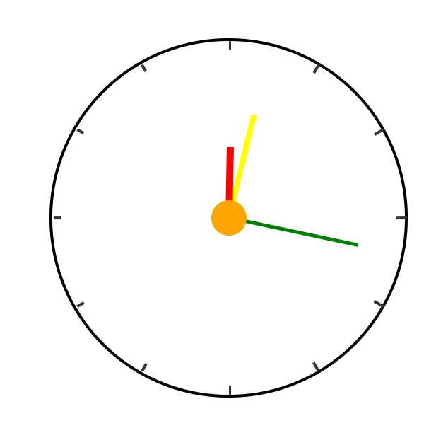
本demo没使用JavaScript,纯CSS3实现,下面是完整代码
  1 <html>
  2     <head>
  3         <meta charset="UTF-8">
  4         <title>时钟</title>
  5         <style type="text/css">
  6             .screen{
  7               width: 400px;
  8               height: 400px;
  9               border-radius: 50%;
 10               border: 3px solid black;
 11               margin: 200px auto;
 12               position: relative;
 13             }
 14             .line{
 15               width: 3px;
 16               height: 400px;
 17               background-color: #333333;
 18               position: absolute;
 19               left: 200px;
 20             }
 21             .line:nth-child(2){
 22               transform: rotateZ(30deg);
 23             }
 24             .line:nth-child(3){
 25         transform: rotateZ(60deg);
 26       }
 27       .line:nth-child(4){
 28         transform: rotateZ(90deg);
 29       }
 30       .line:nth-child(5){
 31         transform: rotateZ(120deg);
 32       }
 33       .line:nth-child(6){
 34         transform: rotateZ(150deg);
 35       }
 36       .cover{
 37         width: 380px;
 38         height: 380px;
 39         border-radius: 50%;
 40         position: absolute;
 41         left: 10px;
 42         top: 10px;
 43         background-color: #fff;
 44       }
 45       .hour{
 46         width: 8px;
 47         height: 80px;
 48         background-color: red;
 49         position: absolute;
 50         top: 120px;
 51         left: 196px;
 52         transform-origin: bottom;
 53         animation: spin 43200s linear infinite;
 54       }
 55       .min{
 56         width: 6px;
 57         height: 120px;
 58         background-color: yellow;
 59         position: absolute;
 60         top: 80px;
 61         left: 197px;
 62         transform-origin: bottom;
 63         animation: spin 3600s linear infinite;
 64       }
 65       .second{
 66         width: 4px;
 67         height: 150px;
 68         background-color: green;
 69         position: absolute;
 70         top: 50px;
 71         left: 198px;
 72         transform-origin: bottom;
 73         animation: spin 60s linear infinite;
 74         animation-timing-function: steps(60);
 75       }
 76       .center{
 77         width: 40px;
 78         height: 40px;
 79         border-radius: 50%;
 80         background-color: orange;
 81         position: absolute;
 82         top: 180px;
 83         left: 180px;
 84       }
 85       @keyframes spin{
 86           from{
 87             transform: rotateZ(0deg);
 88           }
 89           to{
 90             transform: rotateZ(360deg);
 91           }
 92       }
 93         </style>
 94     </head>
 95     <body>
 96       <div class="screen">
 97         <div class="line"></div>
 98         <div class="line"></div>
 99         <div class="line"></div>
100         <div class="line"></div>
101         <div class="line"></div>
102         <div class="line"></div>
103         <div class="cover"></div>
104         <div class="second"></div>
105         <div class="min"></div>
106         <div class="hour"></div>
107         <div class="center"></div>
108       </div>
109     </body>
110 </html>
其实很简单,就是用div结合CSS3的旋转属性把时分秒针画出来,再把刻度线等画一下;再利用CSS3的动画属性让3根针动起来即可。有兴趣的小伙伴也可以结合js代码获取当前时间并设定3根针的初始角度,让本demo变成一个实时的时钟哦~
女神镇楼

标签:loading ota key 简单 mat near width 旋转 设定
原文地址:https://www.cnblogs.com/alt-fsh/p/13335782.html