标签:png idt nowrap direction 情况下 img 视图 art 排列
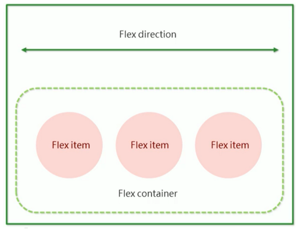
flex是flexible Box的缩写,意为“弹性布局”,用来为盒状模型提供最大的灵活性,任何一个容器都可以指定为flex布局。
当我们为父盒子设为flex布局以后,子元素的float、clear和vertical-align属性将失效。
伸缩布局=弹性布局=伸缩盒布局=弹性盒布局=flex布局
采用Flex布局的元素,称为Flex容器(flex container),简称“容器”。它的所有子元素自动成为容器成员,称为Flex项目(flex item),简称“项目”。
总结flex布局原理:
就是通过给父盒子添加flex属性,来控制子盒子的位置和排列方式。
以下6个属性是对父元素设置的
flex-direction: 设置主轴的方向
justify-content: 设置主轴上的子元素排列方式
flex-wrap: 设置子元素是否换行
align-content: 设置侧轴上的子元素的排列方式(多行)
align-items: 设置侧轴上的子元素排列方式(单行)
flex-flow:复合属性,相当于同时设置了flex-direction和flex-wrap
flex-direction: 设置主轴的方向
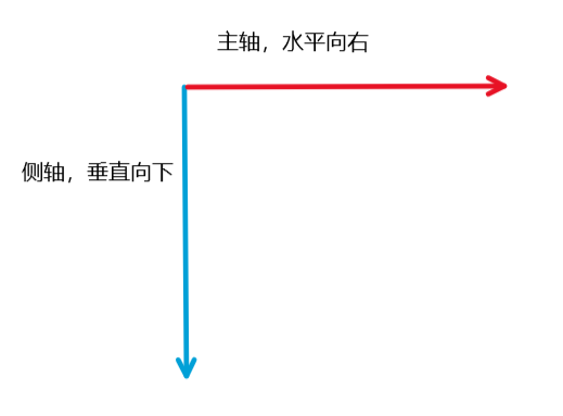
主轴和侧轴
在flex布局中,是分为主轴和侧轴两个方向,同样的叫法有:行和列、x轴和y轴
默认主轴方向就是X轴,水平向右
默认侧轴方向就是y轴,水平向下
属性值
flex-direction属性决定主轴的方向(即项目的排列方向)
注意:主轴和侧轴是会变化的,就看flex-direction设置谁为主轴,剩下的就是侧轴。而我们的子元素就是跟着主轴来排列的。
| 属性值 | 说明 |
|---|---|
| row | 默认值从左到 |
| row-reverse | 从右到左 |
| column | 从上到下 |
| column-reverse | 从下到上 |
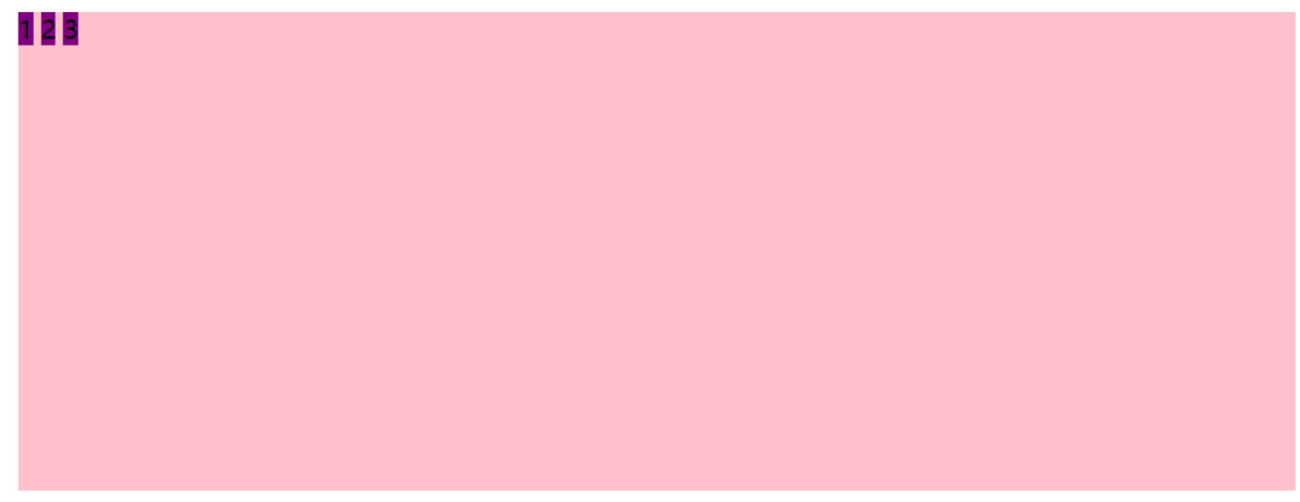
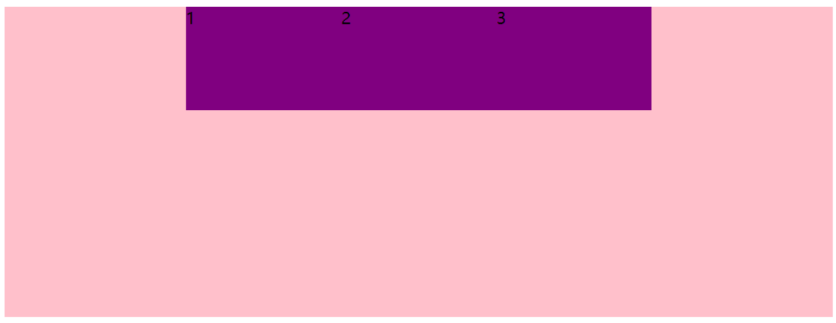
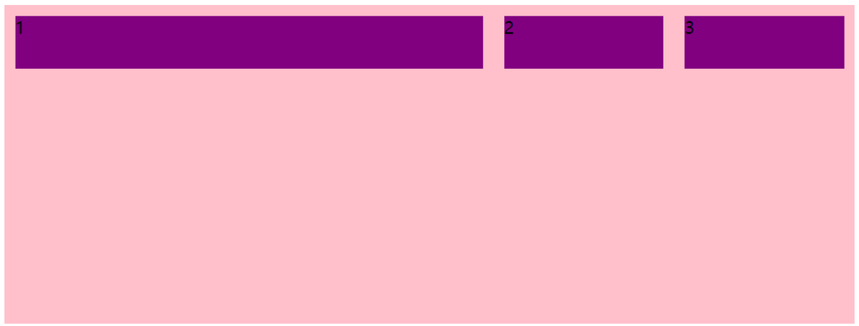
页面代码:
    <style type="text/css">
            div{
                width: 800px;
                height: 300px;
                background-color: pink;
            }
            div span{
                width: 150px;
                height: 100px;
                background-color: purple;
            }
        </style>
    </head>
    <body>
        <div>
            <span>1</span>
            <span>2</span>
            <span>3</span>
        </div>
    </body>
视图:
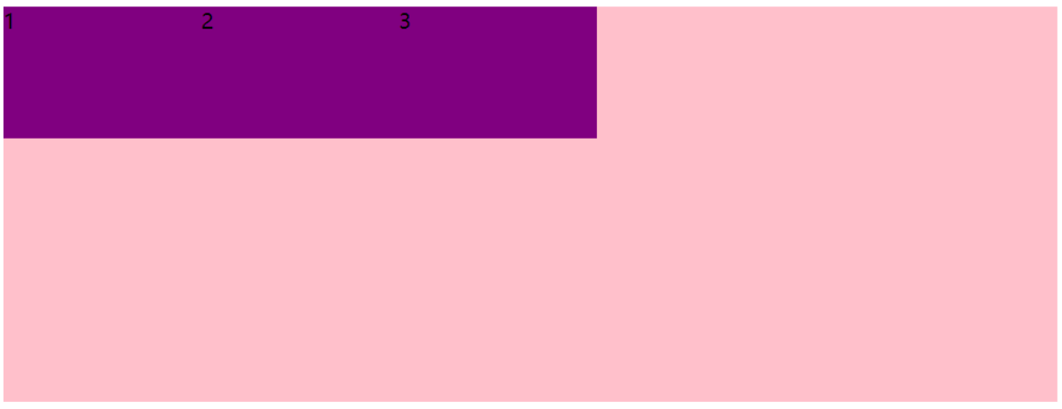
给父级元素添加flex属性:display: flex;
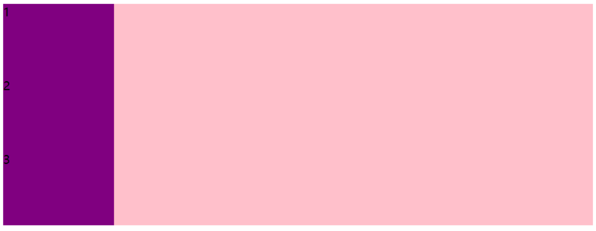
默认的主轴是X轴:子元素跟着主轴排列
flex-direction: row
<style type="text/css">
            div{
                display: flex;
                width: 800px;
                height: 300px;
                background-color: pink;
            }
            div span{
                width: 150px;
                height: 100px;
                background-color: purple;
            }
        </style>
视图:
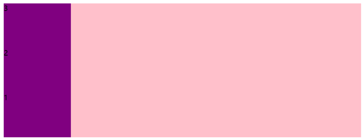
flex-direction: row-reverse
 <style type="text/css">
            div{
                display: flex;
                flex-direction: row-reverse;
                width: 800px;
                height: 300px;
                background-color: pink;
            }
            div span{
                width: 150px;
                height: 100px;
                background-color: purple;
            }
        </style>
视图:

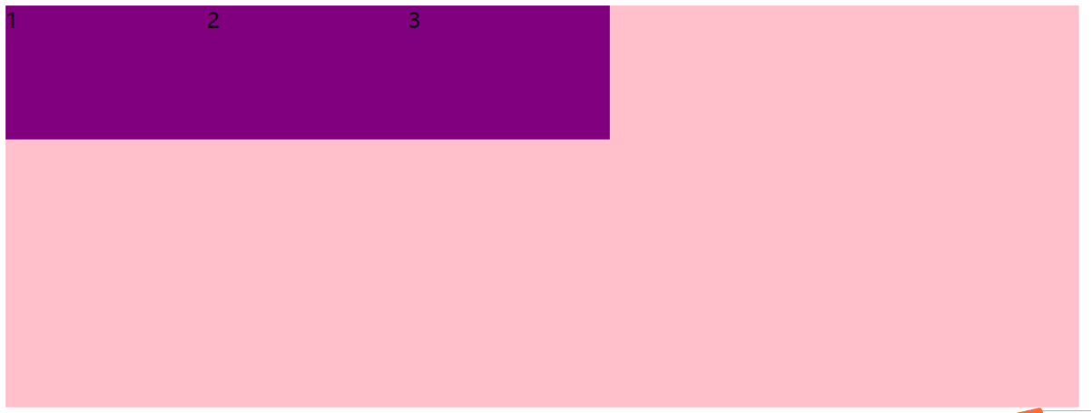
flex-direction: column
<style type="text/css">
            div{
                display: flex;
                flex-direction: column;
                width: 800px;
                height: 300px;
                background-color: pink;
            }
            div span{
                width: 150px;
                height: 100px;
                background-color: purple;
            }
        </style>
视图:
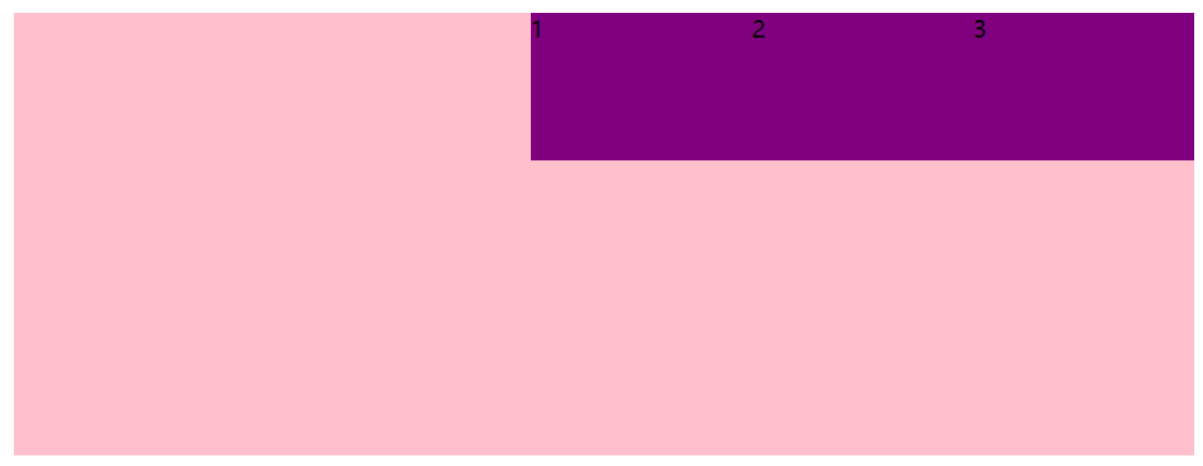
flex-direction: column-reverse
<style type="text/css">
            div{
                display: flex;
                flex-direction: column-reverse;
                width: 800px;
                height: 300px;
                background-color: pink;
            }
            div span{
                width: 150px;
                height: 100px;
                background-color: purple;
            }
        </style>
视图:
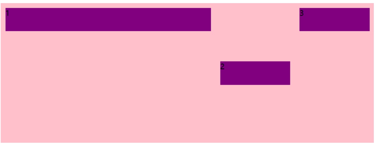
justify-content:设置主轴上的子元素排列方式
注意:使用这个属性之前一定要确定好主轴是哪个
| 属性值 | 说明 |
|---|---|
| flex-start | 默认值 从头部开始,如果主轴是x轴,则从左到右 |
| flex-end | 从尾部开始排列 |
| center | 从主轴居中对齐,如果主轴是x轴则水平居中 |
| space-around | 平分剩余空间 |
| space-between | 先两边贴边,再平分剩余空间 |
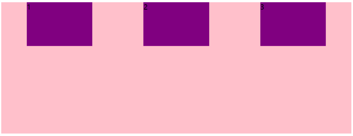
主轴为X轴(flex-direction: row)
justify-content: flex-start
div{
                display: flex;
                flex-direction: row;
                justify-content: flex-start;
                width: 800px;
                height: 300px;
                background-color: pink;
            }
视图:
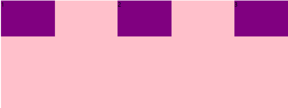
justify-content: flex-end
div{
                display: flex;
                flex-direction: row;
                justify-content: flex-end;
                width: 800px;
                height: 300px;
                background-color: pink;
            }
视图:
justify-content: center
div{
                display: flex;
                flex-direction: row;
                justify-content: center;
                width: 800px;
                height: 300px;
                background-color: pink;
            }
视图:
justify-content: space-around
div{
                display: flex;
                flex-direction: row;
                justify-content: space-around;
                width: 800px;
                height: 300px;
                background-color: pink;
            }
视图:
justify-content: space-between
div{
                display: flex;
                flex-direction: row;
                justify-content: space-between;
                width: 800px;
                height: 300px;
                background-color: pink;
            }
视图:
flex-wrap:设置子元素是否换行
默认情况下,项目都排在一条线(又称轴线)上。flex布局中默认是不换行的。
| 属性 | 说明 |
|---|---|
| nowrap | 默认值,不换行 |
| wrap | 换行 |
| wrap-reverse | 倒序换行 |
flex-wrap: nowrap
div{
                display: flex;
                flex-direction: row;
                justify-content: flex-start;
                flex-wrap: nowrap;
                width: 800px;
                height: 300px;
                background-color: pink;
            }
视图:
flex-wrap: wrap
div{
                display: flex;
                flex-direction: row;
                justify-content: flex-start;
                flex-wrap: wrap;
                width: 800px;
                height: 300px;
                background-color: pink;
            }
视图:
flex-wrap: wrap-reverse
div{
                display: flex;
                flex-direction: row;
                justify-content: flex-start;
                flex-wrap: wrap-reverse;
                width: 800px;
                height: 300px;
                background-color: pink;
            }
视图:
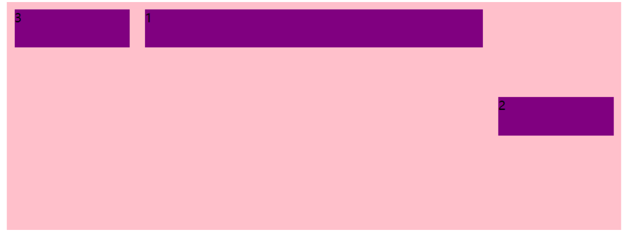
align-item:设置侧轴上的子元素排列方式(单行)
该属性是控制子项在侧轴(默认是y轴)上的排列方式,在子项为单项的时候使用
| 属性值 | 说明 |
|---|---|
| flex-start | 从上到下 |
| flex-end | 从下到上 |
| center | 居中,垂直居中 |
| stretch | 默认值 拉伸 |
align-item: flex-start
div{
                display: flex;
                flex-direction: row;
                justify-content: flex-start;
                flex-wrap: nowrap;
                align-items: flex-start;
                width: 800px;
                height: 300px;
                background-color: pink;
            }
视图:
align-item: flex-end
div{
                display: flex;
                flex-direction: row;
                justify-content: flex-start;
                flex-wrap: nowrap;
                align-items: flex-end;
                width: 800px;
                height: 300px;
                background-color: pink;
            }
视图:
align-item: center
div{
                display: flex;
                flex-direction: row;
                justify-content: flex-start;
                flex-wrap: nowrap;
                align-items: center;
                width: 800px;
                height: 300px;
                background-color: pink;
            }
视图:
align-item: stretch,拉伸 子盒子不需要设置高度
div{
                display: flex;
                flex-direction: row;
                justify-content: flex-start;
                flex-wrap: nowrap;
                align-items: stretch;
                width: 800px;
                height: 300px;
                background-color: pink;
            }
            div span{
                width: 150px;
                /*height: 100px;*/
                background-color: purple;
                margin: 10px;
            }
视图:
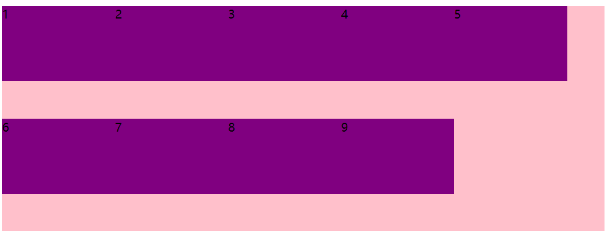
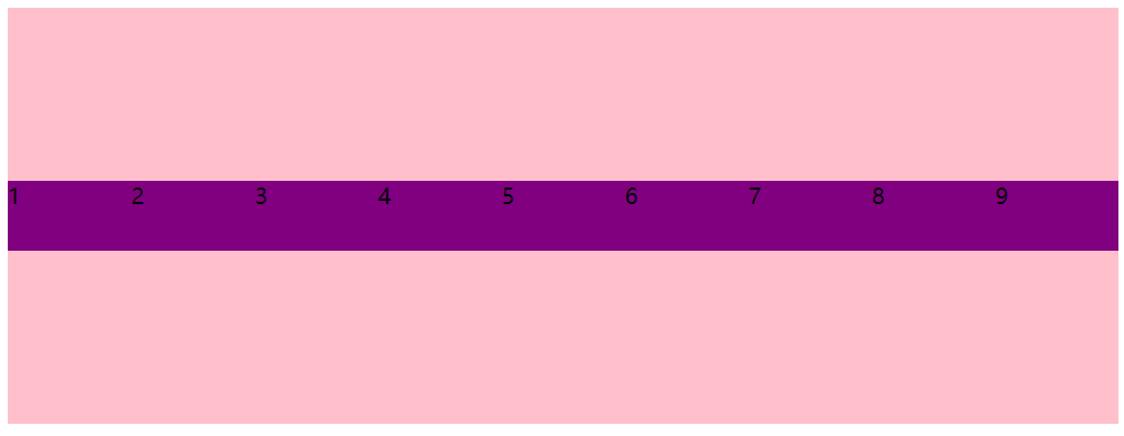
align-content:设置侧轴上的子元素的排列方式(多行),并且只能用于子项出现 换行的情况(多行),在单行下是没有效果的。
| 属性值 | 说明 |
|---|---|
| flex-start | 默认值 在侧轴的头部开始排列 |
| flex-end | 在侧轴的尾部开始排列 |
| center | 在侧轴中间显示 |
| space-around | 子项在侧轴平分剩余空间 |
| space-between | 子项砸侧轴先分布在两头,再平分剩余空间 |
| stretch | 设置子项元素高度平分父元素高度 |
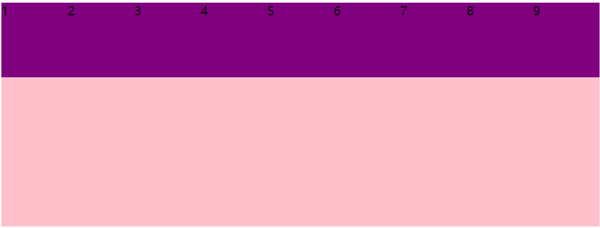
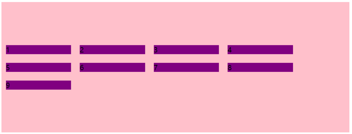
align-content: flex-start
<style type="text/css">
            div{
                display: flex;
                flex-direction: row;
                justify-content: flex-start;
                flex-wrap: wrap;
                /*align-items: flex-end;*/
                align-content: flex-start;
                width: 800px;
                height: 300px;
                background-color: pink;
            }
            div span{
                width: 150px;
                /*height: 100px;*/
                background-color: purple;
                margin: 10px;
            }
        </style>
    </head>
    <body>
        <div>
            <span>1</span>
            <span>2</span>
            <span>3</span>
            <span>4</span>
            <span>5</span>
            <span>6</span>
            <span>7</span>
            <span>8</span>
            <span>9</span>
        </div>
    </body>
视图:
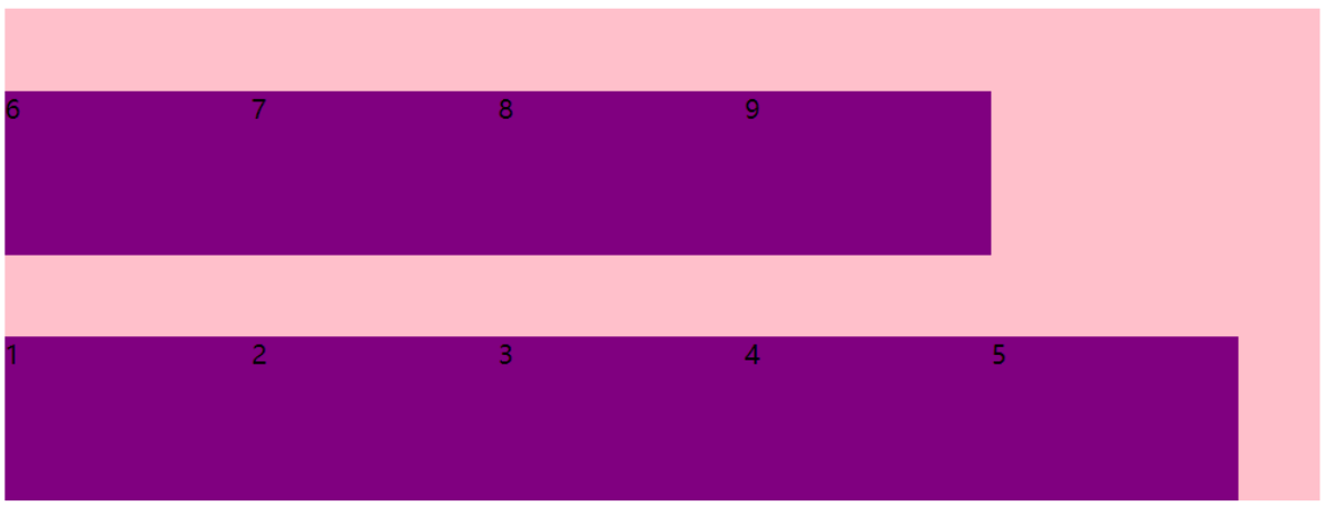
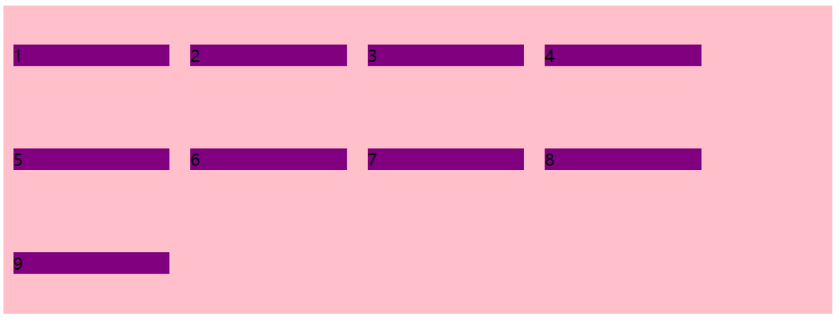
align-content: flex-end
div{
                display: flex;
                flex-direction: row;
                justify-content: flex-start;
                flex-wrap: wrap;
                /*align-items: flex-end;*/
                align-content: flex-end;
                width: 800px;
                height: 300px;
                background-color: pink;
            }
视图:
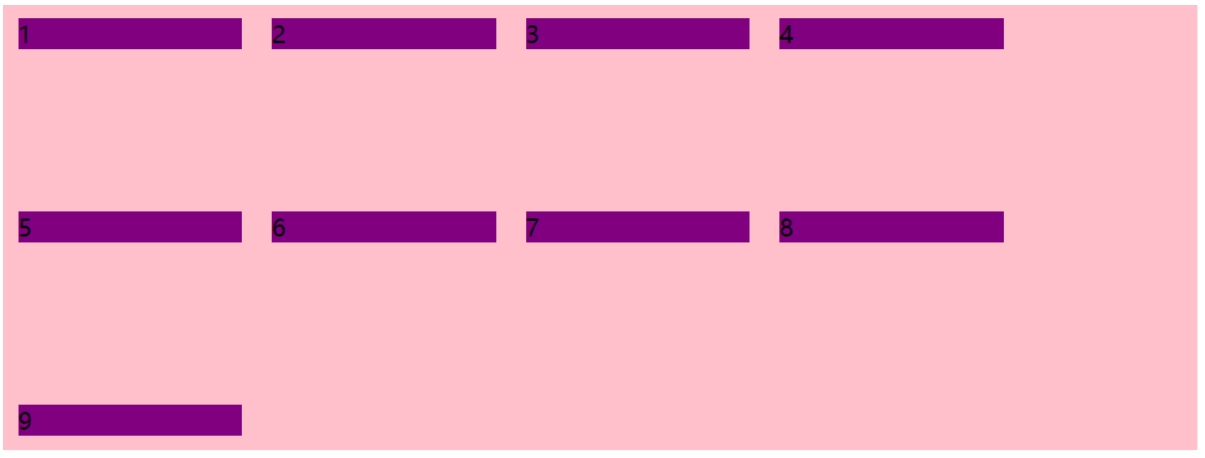
align-content: center
div{
                display: flex;
                flex-direction: row;
                justify-content: flex-start;
                flex-wrap: wrap;
                /*align-items: flex-end;*/
                align-content: center;
                width: 800px;
                height: 300px;
                background-color: pink;
            }
视图:
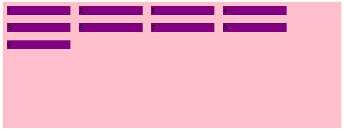
align-conter: space-around
div{
                display: flex;
                flex-direction: row;
                justify-content: flex-start;
                flex-wrap: wrap;
                /*align-items: flex-end;*/
                align-content: space-around;
                width: 800px;
                height: 300px;
                background-color: pink;
            }
视图:
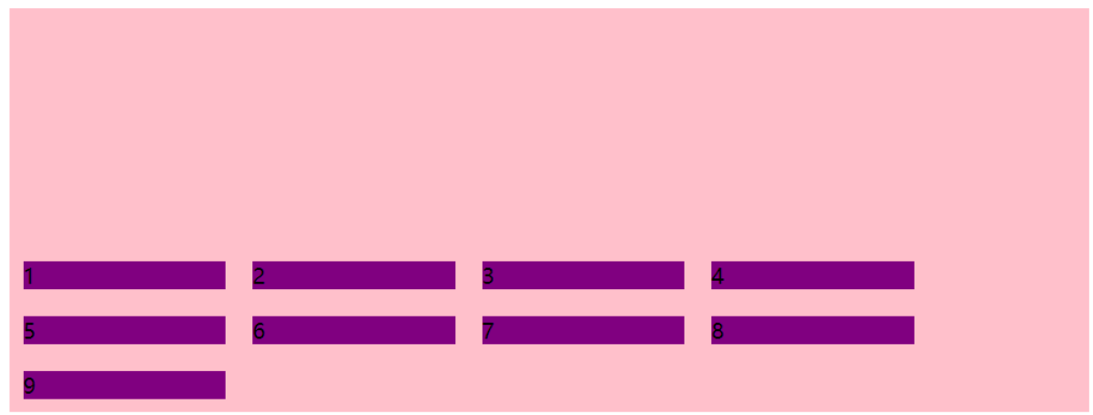
align-content: space-between
div{
                display: flex;
                flex-direction: row;
                justify-content: flex-start;
                flex-wrap: wrap;
                /*align-items: flex-end;*/
                align-content: space-between;
                width: 800px;
                height: 300px;
                background-color: pink;
            }
视图:
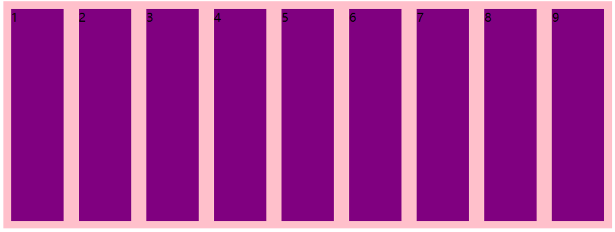
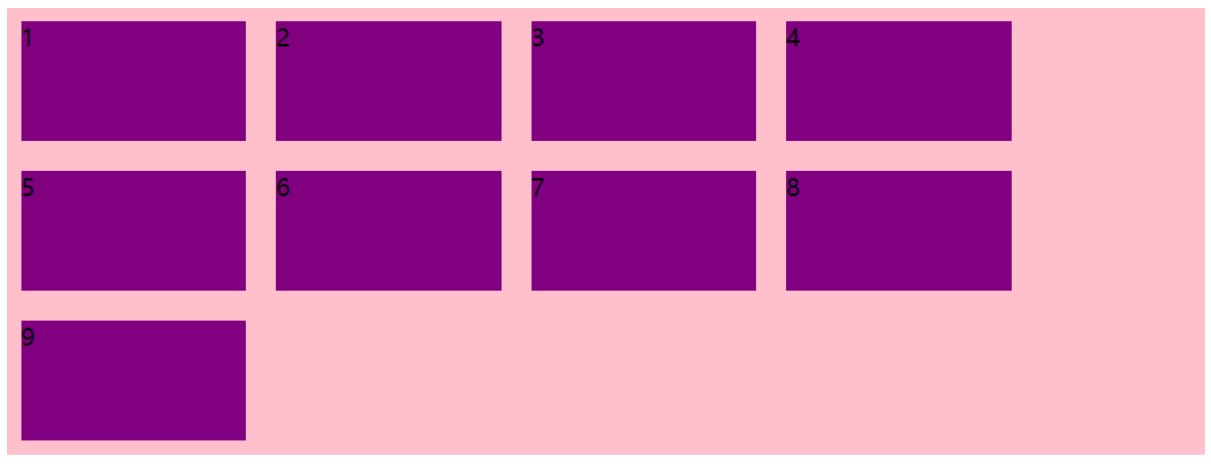
align-content: stretch 需子元素不设置高度的时候生效
div{
                display: flex;
                flex-direction: row;
                justify-content: flex-start;
                flex-wrap: wrap;
                /*align-items: flex-end;*/
                align-content: stretch;
                width: 800px;
                height: 300px;
                background-color: pink;
            }
视图:
align-content和align-items的区别
align-items适用于单行情况下,只有上对齐、下对齐、居中和拉伸
align-content适应于换行(多行)的情况下(单行情况下无效),可以设置上对齐、下对齐、居中、拉伸以及平均分配剩余空间等属性值
单行使用align-items,多行使用align-content
flex-flow属性是flex-direction和flex-wrap属性的复合属性
flex-flow:row wrap;
以下为flex子项常见的属性:
flex:定义子项分配的剩余空间,用flex来表示占多少份
align-self:控制子项自己在侧轴上排列的方式。允许单个项目与其他项目不一样的排列方式,可覆盖align-items属性。默认为auto,表示继承父元素的align-items属性。如无父元素,等同于stretch。
order: 定义项目的排列顺序。数值越小越靠前,默认为零。
flex:定义子项分配的剩余空间,用flex来表示占多少份
<style type="text/css">
            div{
                display: flex;
                flex-direction: row;
                justify-content: flex-start;
                flex-wrap: nowrap;
                align-items: flex-start;
                /*align-content: stretch;*/
                width: 800px;
                height: 300px;
                background-color: pink;
            }
            div span{
                width: 150px;
                height: 50px;
                background-color: purple;
                margin: 10px;
            }
            div .span1{
                flex: 2;
            }
        </style>
    </head>
    <body>
        <div>
            <span class="span1">1</span>
            <span class="span2">2</span>
            <span class="span3">3</span>
        </div>
    </body>
视图:
align-self:控制子项自己在侧轴上排列的方式
<style type="text/css">
            div{
                display: flex;
                flex-direction: row;
                justify-content: flex-start;
                flex-wrap: nowrap;
                align-items: flex-start;
                /*align-content: stretch;*/
                width: 800px;
                height: 300px;
                background-color: pink;
            }
            div span{
                width: 150px;
                height: 50px;
                background-color: purple;
                margin: 10px;
            }
            div .span1{
                flex: 2;
            }
            div .span2{
                align-self: center;
            }
        </style>
    </head>
    <body>
        <div>
            <span class="span1">1</span>
            <span class="span2">2</span>
            <span class="span3">3</span>
        </div>
    </body>
视图:
<style type="text/css">
div{
  display: flex;
   flex-direction: row;
  justify-content: flex-start;
  flex-wrap: nowrap;
   align-items: flex-start; /*align-content: stretch;*/
   width: 800px;
   height: 300px;
   background-color: pink;
 }
div span{
 width: 150px;
 height: 50px;
 background-color: purple;
 margin: 10px;
}
div .span1{
 flex: 2;
 }
div .span2{
 align-self: center;
 }
div .span3{
 order: -1;
 }
</style>

</head>
<body>
    <div>
        <span class="span1">1</span>
        <span class="span2">2</span>
        <span class="span3">3</span>
    </div>
</body>
视图:
标签:png idt nowrap direction 情况下 img 视图 art 排列
原文地址:https://www.cnblogs.com/xiamengz/p/13679607.html