标签:htm html size com jquery order option poi line
下面我就为大家带来一篇html+js+highcharts绘制圆饼图表的简单实例。我觉得挺不错的,现在就分享给大家,也给大家做个参考。一起跟随我过来看看吧
实例如下:
|
1
2
3
4
5
6
7
8
9
10
11
12
13
14
15
16
17
18
19
20
21
22
23
24
25
26
27
28
29
30
31
32
33
34
35
36
37
38
39
40
41
42
43
44
45
46
47
48
49
50
51
52
53
54
55
56
57
58
59
60
61
62
63
64
65
66
67
68
69
70
71
72
73
74
75
76
77
78
79
80
81
82
83
84
|
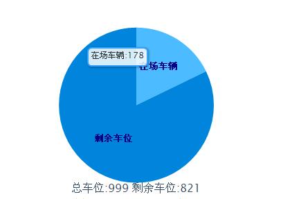
<!DOCTYPE html PUBLIC "-//W3C//DTD XHTML 1.0 Strict//EN" "http://www.w3.org/TR/xhtml1/DTD/xhtml1-strict.dtd"><head><meta http-equiv="Content-Type" content="text/html; charset=gb2312" /><title>html+js+highcharts绘制圆饼图表的简单实例</title><script type="text/javascript" src="jquery-1.4.2.min.js" ></script><script type="text/javascript" src="highcharts.js" ></script> </head><body> <div id="content"> <br><br><br><!--DEMO start--><div id="pie_chart" class="chart_combo"></div> <script type="text/javascript"> var chart; $(function () { var totalMoney=999<span style="white-space:pre"> </span>var zccw=178<span style="white-space:pre"> </span>var sycw=821 $(document).ready(function() { chart = new Highcharts.Chart({ chart: { renderTo: ‘pie_chart‘, plotBackgroundColor: ‘white‘,//背景颜色 plotBorderWidth: 0, plotShadow: false }, title: { text: ‘总车位:‘+totalMoney +‘ 剩余车位:‘+ sycw , verticalAlign:‘bottom‘, y:-60 }, tooltip: {//鼠标移动到每个饼图显示的内容 pointFormat: ‘{point.name}: <b>{point.percentage}%</b>‘, percentageDecimals: 1, formatter: function() { return this.point.name+‘:‘+totalMoney*this.point.percentage/100; } }, plotOptions: { pie: { size:‘60%‘, borderWidth: 0, allowPointSelect: true, cursor: ‘pointer‘, dataLabels: { enabled: true, color: ‘#000‘, distance: -50,//通过设置这个属性,将每个小饼图的显示名称和每个饼图重叠 style: { fontSize: ‘10px‘, lineHeight: ‘10px‘ }, formatter: function(index) { return ‘<span style="color:#00008B;font-weight:bold">‘ + this.point.name + ‘</span>‘; } }, padding:20 } }, series: [{//设置每小个饼图的颜色、名称、百分比 type: ‘pie‘, name: null, data: [ {name:‘在场车辆‘,color:‘#3DA9FF‘,y:zccw}, {name:‘剩余车位‘,color:‘#008FE0‘,y:sycw}, ] }] }); }); }); </script> </div> </body></html> |
以上这篇html+js+highcharts绘制圆饼图表的简单实例就是我分享给大家的全部内容了,希望能给大家一个参考,也希望大家多多支持我。
标签:htm html size com jquery order option poi line
原文地址:https://www.cnblogs.com/ypha/p/13773913.html