标签:inpu tps nta res glob str add net simple
基于上一篇, 继续向basic.xml中添加下面的代码。 xml完整源码在文末。
        <HBox>
          <VBox>
            <!-- Progress -->
            <HBox margin="0,10" height="32">
              <Progress class="progress_blue" name="progress" value="0" margin="10"/>
            </HBox>

            <!-- Slider -->
            <HBox margin="0,0,0,10" height="32">
              <Slider class="slider_green" name="slider" value="0" margin="10"/>
            </HBox>
          </VBox>

          <VBox width="120">
            <CircleProgress name="circle_progress" circular="true"  height="80" width="80"
            circlewidth="10" bgcolor="gray" fgcolor="green" value="0"  clockwise="true"  min="1" max="100" margin="10"
            textpadding="10,32,10,10" normaltextcolor="darkcolor" indicator="logo_18x18.png"/>
          </VBox>

        </HBox>
      </HBox>
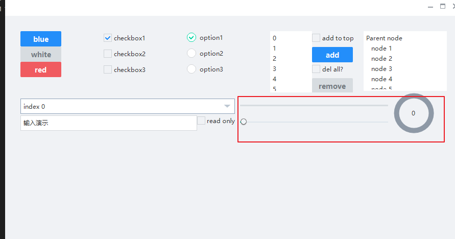
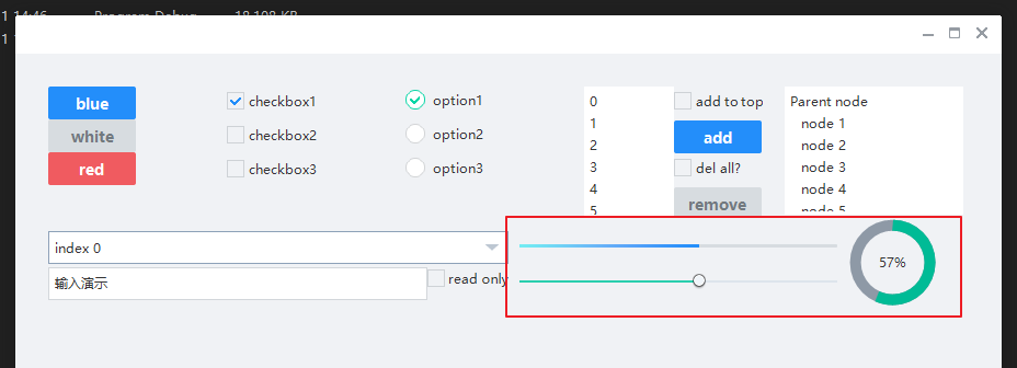
这里,创建了slider,progress和circleprogress控件,如上图样式显示。
	// progressbar
	ui::Progress*  pprogress_;
	// slider
	ui::Slider*		pslider_;
	// 圆形进度条
	ui::CircleProgress* pcircle_progress_;
类中继续添加下面的代码,用于监听滑块的值发生变化
	// 用于处理slider值变化时设置进度条和环形进度条的值
	bool OnSliderValueChanged(ui::EventArgs* msg);
void BasicForm::InitWindow()
{
  	......
	// 9.关联progress控件
	//----------------------------------------------------------------------------------------
	pprogress_		= dynamic_cast<ui::Progress*>(FindControl(L"progress"));

	// 10.关联slider控件
	//----------------------------------------------------------------------------------------
	pslider_		= dynamic_cast<ui::Slider*>(FindControl(L"slider"));
	if (pslider_)
	{
		pslider_->AttachValueChange(nbase::Bind(&BasicForm::OnSliderValueChanged, this, std::placeholders::_1));
	}

	// 11. 关联环形进度条
	//----------------------------------------------------------------------------------------
	pcircle_progress_ = dynamic_cast<ui::CircleProgress*>(FindControl(L"circle_progress"));
	if (pcircle_progress_)
	{
		pcircle_progress_->SetValue(0);
		pcircle_progress_->SetText(L"0");
	}

	// 设置最大和最小值
	//----------------------------------------------------------------------------------------
	// 因为slider和circlieprogress控件都是继承的Progress
	auto set_progress_border = [](ui::Progress* pcontrol)
	{
		if (pcontrol)
		{
			pcontrol->SetMinValue(min_val_0);
			pcontrol->SetMaxValue(max_val_100);
		}
	};

	set_progress_border(pprogress_);
	set_progress_border(pslider_);
	set_progress_border(pcircle_progress_);
}
OnSliderValueChanged函数源码如下:
bool BasicForm::OnSliderValueChanged(ui::EventArgs* msg)
{
	if (pprogress_ && pslider_ && pcircle_progress_)
	{
		double cur_val = pslider_->GetValue();

		// 设置进度条显示
		pprogress_->SetValue(cur_val);

		// 设置环形进度条
		pcircle_progress_->SetValue(cur_val);
		TCHAR szBuffer[32] = { 0 };
		swprintf_s(szBuffer, _T("%.0f%%"), cur_val);
		pcircle_progress_->SetText(szBuffer);
	}

	return false;
}
<?xml version="1.0" encoding="UTF-8"?>
<Window size="900,600" caption="0,0,0,35">
  <VBox bkcolor="bk_wnd_darkcolor">
    <HBox width="stretch" height="35" bkcolor="bk_wnd_lightcolor">
      <Control />
        <Button class="btn_wnd_min" name="minbtn" margin="4,6,0,0" />
        <Box width="21" margin="4,6,0,0">
          <Button class="btn_wnd_max" name="maxbtn"/>
          <Button class="btn_wnd_restore" name="restorebtn" visible="false"/>
        </Box>
      <Button class="btn_wnd_close" name="closebtn" margin="4,6,8,0"/>
    </HBox>

    <!--下面是中间的控件-->
    <VBox padding="30, 30, 30, 30" >
      <HBox height="120">
        <VBox>
          <!-- Buttons -->
          <Button class="btn_global_blue_80x30" name="btn_blue" text="blue" />
          <Button class="btn_global_white_80x30" name="btn_white" text="white"/>
          <Button class="btn_global_red_80x30" name="btn_red" text="red"/>
        </VBox>

        <!--checkbox-->
        <VBox>
          <CheckBox class="checkbox_font12" name="checkbox1" text="checkbox1" margin="0,5,0,10" selected="true"/>
          <CheckBox class="checkbox_font12" name="checkbox2" text="checkbox2" margin="0,5,0,10"/>
          <CheckBox class="checkbox_font12" name="checkbox3" text="checkbox3" margin="0,5,0,10"/>
        </VBox>

        <!-- option-->
        <VBox>
          <Option class="circle_option_2" name="option1" group="option_group" text="option1" margin="0,3,0,10" selected="true"/>
          <Option class="circle_option_2" name="option2" group="option_group" text="option2" margin="0,3,0,10"/>
          <Option class="circle_option_2" name="option3" group="option_group" text="option3" margin="0,3,0,10"/>
        </VBox>

        <HBox>
          <!-- List -->
          <VListBox class="list" name="list" padding="5,3,5,3">
          </VListBox>
          <VBox>

            <!-- Buttons -->
            <CheckBox class="checkbox_font12" name="list_checkbox_add_to_top" text="add to top" margin="0,5,0,10"/>
            <Button class="btn_global_blue_80x30" name="list_btn_add" text="add" />

            <CheckBox class="checkbox_font12" name="list_checkbox_remove_all" text="del all?" margin="0,5,0,10"/>
            <Button class="btn_global_white_80x30" name="list_btn_remove" text="remove"/>
          </VBox>
        </HBox>

        <!-- TreeView -->
        <TreeView class="list" name="tree" padding="5,3,5,3" margin="20">
        </TreeView>
      </HBox>

      <!--第二行控件开始-->
      <HBox height="85">
        <VBox>
          <!--combobox-->
          <Combo class="list" name="combo" height="30" margin="0,12,0,0" padding="6" bkimage="file=‘../public/combo/normal.png‘ corner=‘5,5,30,5‘"/>
          <HBox>
            <RichEdit class="simple input" name="rich_edit_1" text="输入演示" height="30" margin="0,3" padding="6,6,6" promptmode="true" prompttext="Single line text control" promptcolor="lightcolor"/>
            <CheckBox class="checkbox_font12" name="rich_edit_readonly" text="read only" margin="0,5,0,10"/>
          </HBox>
        </VBox>


        <HBox>
          <VBox>
            <!-- Progress -->
            <HBox margin="0,10" height="32">
              <Progress class="progress_blue" name="progress" value="0" margin="10"/>
            </HBox>

            <!-- Slider -->
            <HBox margin="0,0,0,10" height="32">
              <Slider class="slider_green" name="slider" value="0" margin="10"/>
            </HBox>
          </VBox>

          <VBox width="120">
            <CircleProgress name="circle_progress" circular="true"  height="80" width="80"
            circlewidth="10" bgcolor="gray" fgcolor="green" value="0"  clockwise="true"  min="1" max="100" margin="10"
            textpadding="10,32,10,10" normaltextcolor="darkcolor" indicator="logo_18x18.png"/>
          </VBox>

        </HBox>
      </HBox>


    </VBox> <!--下面是中间的控件 结束-->
  </VBox>
</Window>
nim_duilib(10)之slider、progress and circleprogress
标签:inpu tps nta res glob str add net simple
原文地址:https://www.cnblogs.com/pandamohist/p/14120367.html