标签:spro actions rop bing ati style tor erb target
什么是一键三连?
哔哩哔哩弹幕网中用户可以通过长按点赞键同时完成点赞、投币、收藏对UP主表示支持,后UP主多用“一键三连”向视频浏览者请求对其作品同时进行点赞、投币、收藏。
去年在云之幻大佬的 哔哩 项目里看到一键三连的 UWP 实现,觉得挺有趣的,这次参考它的代码重新实现一次,最终成果如下:
下面这些是一键三连的核心功能:
这篇文章将介绍如何使用自定义控件实现上面的功能。写简单的自定义控件的时候,我推荐先写完代码,然后再写控件模板,但这个控件也适合一步步增加功能,所以这篇文章用逐步增加功能的方式介绍如何写这个控件。
万事起头难,做控件最难的是决定控件名称。不过反正也是玩玩的 Demo,就随便些用 ProgressButton 吧,因为有进度又可以点击。
第二件事就是决定这个按钮继承自哪个控件,可以选择继承 Button 或 RangeBase 以减少需要自己实现的功能。因为长按这个需求破坏了点击这个行为,所以还是放弃 Button 选择 RangeBase 比较好。然后再加上 Content 属性,控件的基础代码如下:
[ContentProperty(Name = nameof(Content))]
public partial class ProgressButton : RangeBase
{
    public ProgressButton()
    {
        DefaultStyleKey = typeof(ProgressButton);
    }

    public object Content
    {
        get => (object)GetValue(ContentProperty);
        set => SetValue(ContentProperty, value);
    }
}
在控件模板中用一个 CornerRadius 很大的 Border 模仿圆形边框,ContentControl 显示 Content,RadialProgressBar 显示进度,控件模板的大致结构如下:
<ControlTemplate TargetType="local:ProgressButton">
    <Grid x:Name="RootGrid">
        <Border x:Name="RootBorder"
                        Margin="{TemplateBinding Padding}"
                        Background="{TemplateBinding Background}"
                        BorderBrush="{TemplateBinding BorderBrush}"
                        BorderThickness="1"
                        CornerRadius="100">
            <ContentControl x:Name="ContentControl"
                                    HorizontalAlignment="{TemplateBinding HorizontalContentAlignment}"
                                    VerticalAlignment="{TemplateBinding VerticalContentAlignment}"
                                    Content="{TemplateBinding Content}"
                                    Foreground="{TemplateBinding Foreground}" />
        </Border>
        <control:RadialProgressBar x:Name="PressProgressBar"
                                           Background="Transparent"
                                           Foreground="{StaticResource PrimaryColor}"
                                           Maximum="{TemplateBinding Maximum}"
                                           Minimum="{TemplateBinding Minimum}"
                                           Outline="Transparent"
                                           Value="{TemplateBinding Value}" />
    </Grid>
</ControlTemplate>
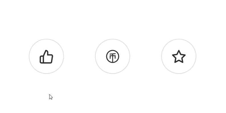
这时候的调用方式及效果如下所示:
<lab:ProgressButton x:Name="LikeButton" Content="" />
<lab:ProgressButton x:Name="CoinButton" Content="" Value="0.5" />
<lab:ProgressButton x:Name="FavoriteButton" Content="" Value="1" />
有了上面的代码,后面的功能只需要按部就班地一个个添加上去。我从以前的代码里抄来状态相关的代码。虽然定义了这么多状态备用,其实我也只用到 Idle 和 Completed,其它要用到的话可以修改 ControlTemplate。
public enum ProgressState
{
    Idle,
    InProgress,
    Completed,
    Faulted,
}
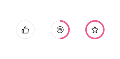
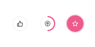
在控件模板中添加一个粉红色的带一个同色阴影的圆形背景,其它状态下隐藏,在切换到 Completed 状态时显示。为了好看,还添加了 ImplictAnimation 控制淡入淡出。
<ContentControl x:Name="CompletedElement"
                Template="{StaticResource CompletedTemplate}"
                Visibility="Collapsed">
    <animations:Implicit.HideAnimations>
        <animations:OpacityAnimation SetInitialValueBeforeDelay="True"
                                     From="1"
                                     To="0"
                                     Duration="0:0:0.3" />
    </animations:Implicit.HideAnimations>
    <animations:Implicit.ShowAnimations>
        <animations:OpacityAnimation SetInitialValueBeforeDelay="True"
                                     From="0"
                                     To="1"
                                     Duration="0:0:0.6" />
    </animations:Implicit.ShowAnimations>
</ContentControl>
在 VisualStateManager 中加入 ProgressStates 这组状态,只需要控制 Completed 状态的 Setters,显示粉红色的背景,隐藏边框,文字变白色。
<VisualStateGroup x:Name="ProgressStates">
    <VisualState x:Name="Idle" />
    <VisualState x:Name="InProgress" />
    <VisualState x:Name="Completed">
        <VisualState.Setters>
            <Setter Target="RootBorder.BorderBrush" Value="Transparent" />
            <Setter Target="ContentControl.Foreground" Value="White" />
            <Setter Target="CompletedElement.Visibility" Value="Visible" />
        </VisualState.Setters>
    </VisualState>
    <VisualState x:Name="Faulted" />
</VisualStateGroup>
作为一个 Button,按钮的 PointOver 和 Pressed 状态当然必不可少,这些逻辑我参考了 真篇文章 最后一部分代码(不过我没有加入 Click 事件)。在控件模板中也制作了最简单的处理:
<VisualStateGroup x:Name="CommonStates">
    <VisualState x:Name="PointerOver">
        <VisualState.Setters>
            <Setter Target="ContentControl.Opacity" Value="0.8" />
        </VisualState.Setters>
    </VisualState>
    <VisualState x:Name="Pressed">
        <VisualState.Setters>
            <Setter Target="ContentControl.Opacity" Value="0.6" />
        </VisualState.Setters>
    </VisualState>
</VisualStateGroup>
气泡动画来源于火火的 BubbleButton,它封装得很优秀,ProgressButton 只需要在 Completed 状态下设置 BubbleView.IsBubbing = true 即可触发气泡动画,这大大减轻了 XAML 的工作:
<Setter Target="BubbleView.IsBubbing" Value="True" />

<bubblebutton:BubbleView x:Name="BubbleView"
                         HorizontalAlignment="Stretch"
                         VerticalAlignment="Stretch"
                         Foreground="{StaticResource PrimaryColor}" />
因为要实现长按功能,所以我没有实现 Button 的 Click,而是使用了 GestureRecognizer 的 Tapped 和 Holding,订阅这两个事件,触发后重新抛出。
private GestureRecognizer _gestureRecognizer = new GestureRecognizer();

public ProgressButton()
{
    _gestureRecognizer.GestureSettings = GestureSettings.HoldWithMouse | GestureSettings.Tap | GestureSettings.Hold;
    _gestureRecognizer.Holding += OnGestureRecognizerHolding;
    _gestureRecognizer.Tapped += OnGestureRecognizerTapped;
}

public event EventHandler<HoldingEventArgs> GestureRecognizerHolding;
public event EventHandler<TappedEventArgs> GestureRecognizerTapped;

protected override void OnPointerPressed(PointerRoutedEventArgs e)
{
    // SOME CODE
    var points = e.GetIntermediatePoints(null);
    if (points != null && points.Count > 0)
    {
        _gestureRecognizer.ProcessDownEvent(points[0]);
        e.Handled = true;
    }
}

protected override void OnPointerReleased(PointerRoutedEventArgs e)
{
    // SOME CODE
    var points = e.GetIntermediatePoints(null);
    if (points != null && points.Count > 0)
    {
        _gestureRecognizer.ProcessUpEvent(points[0]);
        e.Handled = true;
        _gestureRecognizer.CompleteGesture();
    }
}

protected override void OnPointerMoved(PointerRoutedEventArgs e)
{
    // SOME CODE
    _gestureRecognizer.ProcessMoveEvents(e.GetIntermediatePoints(null));
}

private void OnGestureRecognizerTapped(GestureRecognizer sender, TappedEventArgs args)
{
    GestureRecognizerTapped?.Invoke(this, args);
}

private void OnGestureRecognizerHolding(GestureRecognizer sender, HoldingEventArgs args)
{
    GestureRecognizerHolding?.Invoke(this, args);
}
由于一键三连属于业务方面的功能(要联网、检查状态、还可能回退),不属于控件应该提供的功能,所以 ProgressButton 只需要实现到这一步就完成了。
终于要实现一键三连啦。首先创建三个 ProgressButton, 然后互相双向绑定 Value 的值并订阅事件:
<lab:ProgressButton x:Name="LikeButton"
Content=""
GestureRecognizerHolding="OnGestureRecognizerHolding"
GestureRecognizerTapped="OnGestureRecognizerTapped" />
<lab:ProgressButton x:Name="CoinButton"
Content=""
GestureRecognizerHolding="OnGestureRecognizerHolding"
GestureRecognizerTapped="OnGestureRecognizerTapped"
Value="{Binding ElementName=LikeButton, Path=Value}" />
<lab:ProgressButton x:Name="FavoriteButton"
Content=""
GestureRecognizerHolding="OnGestureRecognizerHolding"
GestureRecognizerTapped="OnGestureRecognizerTapped"
Value="{Binding ElementName=LikeButton, Path=Value}" />
处理 Tapped 的代码很简单,就是反转一下状态:
private void OnGestureRecognizerTapped(object sender, Windows.UI.Input.TappedEventArgs e)
{
    var progressButton = sender as ProgressButton;
    if (progressButton.State == ProgressState.Idle)
        progressButton.State = ProgressState.Completed;
    else
        progressButton.State = ProgressState.Idle;
}
Holding 的代码就复杂一些,设置一个动画的 Taget 然后启动动画,动画完成后把所有 ProgressButton 的状态改为 Completed,最后效果可以参考文章开头的 gif:
private void OnGestureRecognizerHolding(object sender, Windows.UI.Input.HoldingEventArgs e)
{
    var progressButton = sender as ProgressButton;
    if (e.HoldingState == HoldingState.Started)
    {
        if (!_isAnimateBegin)
        {
            _isAnimateBegin = true;
            (_progressStoryboard.Children[0] as DoubleAnimation).From = progressButton.Minimum;
            (_progressStoryboard.Children[0] as DoubleAnimation).To = progressButton.Maximum;
            Storyboard.SetTarget(_progressStoryboard.Children[0] as DoubleAnimation, progressButton);
            _progressStoryboard.Begin();
        }
    }
    else
    {
        _isAnimateBegin = false;
        _progressStoryboard.Stop();
    }
}

private void OnProgressStoryboardCompleted(object sender, object e)
{
    LikeButton.State = ProgressState.Completed;
    CoinButton.State = ProgressState.Completed;
    FavoriteButton.State = ProgressState.Completed;
}
很久没有认真写 UWP 的博客了,我突然有了个大胆的想法,在这个时间点,会不会就算我胡说八道都不会有人认真去验证我写的内容?毕竟现在写 UWP 的人又不多。不过放心,我对 UWP 是认真的,我保证我是个诚实的男人。
不过这个一键三连功能做出来后,又好像,完全没机会用到嘛。难得都做出来了,就用来皮一下。
标签:spro actions rop bing ati style tor erb target
原文地址:https://www.cnblogs.com/dino623/p/Three_Actions_With_One_Click.html