标签:spl html tab 高度 mamicode back tle src ack
<!DOCTYPE html>
<html>
<head>
<title></title>
<style type="text/css">
*{
margin:0px;
border: 0px;
box-sizing:border-box;
}
div{
border: 1px solid black;
}
.left{
height: 100px;
width: 100px;
background-color: red;
}
.right{
height: 100px;
width: 100px;
background-color: blue;
}
.center{
height: 100px;
}
.floatDiv .left{
float: left;
}
.floatDiv .right{
float: right;
}
.floatDiv .center{
}
.positionDiv .left{
position: absolute;
left: 0px;
}
.positionDiv .right{
position: absolute;
right: 0px;
}
.positionDiv .center{
margin-left: 100px;
margin-right: 100px;
}
.tableDiv{
display: table;
width:100%;
}
.tableDiv .left{
display: table-cell;
}
.tableDiv .right{
display: table-cell;
}
.tableDiv .center{
display: table-cell;
}
.flexDiv{
display:flex;
}
.flexDiv .left{
}
.flexDiv .right{
}
.flexDiv .center{
flex:1;
}
.gridDiv{
display: grid;
width: 100%;
grid-template-rows:100px;
grid-template-columns:100px auto 100px;
}
.gridDiv .left{
}
.gridDiv .right{
}
.gridDiv .center{
}
</style>
</head>
<body>
<h1>float实现布局</h1>
<div class="floatDiv">
<div class="left"></div>
<div class="right"></div>
<div class="center">
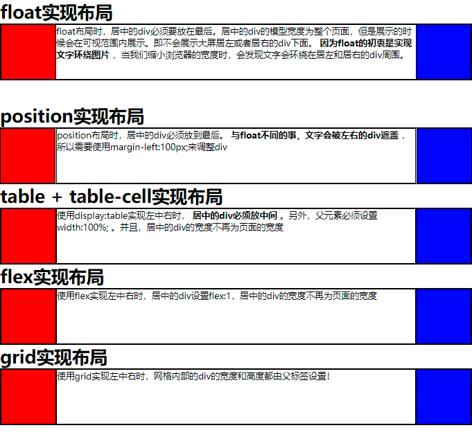
float布局时,居中的div必须要放在最后。居中的div的模型宽度为整个页面,但是展示的时候会在可视范围内展示。即不会展示大屏居左或者居右的div下面。
<strong>
因为float的初衷是实现文字环绕图片
</strong>
,当我们缩小浏览器的宽度时,会发现文字会环绕在居左和居右的div周围。
</div>
</div>
<br/><br/>
<h1>position实现布局</h1>
<div class="positionDiv">
<div class="left"></div>
<div class="right"></div>
<div class="center">
position布局时,居中的div必须放到最后。
<strong>
与float不同的事,文字会被左右的div遮盖
</strong>
,所以需要使用margin-left:100px;来调整div
</div>
</div>
<h1>table + table-cell实现布局</h1>
<div class="tableDiv">
<div class="left"></div>
<div class="center">
使用display:table实现左中右时,
<strong>
居中的div必须放中间
</strong>
。另外,父元素必须设置width:100%; 。并且,居中的div的宽度不再为页面的宽度
</div>
<div class="right"></div>
</div>
<h1>flex实现布局</h1>
<div class="flexDiv">
<div class="left"></div>
<div class="center">
使用flex实现左中右时,居中的div设置flex:1,居中的div的宽度不再为页面的宽度
</div>
<div class="right"></div>
</div>
<h1>grid实现布局</h1>
<div class="gridDiv">
<div class="left"></div>
<div class="center">
使用grid实现左中右时,网格内部的div的宽度和高度都由父标签设置!
</div>
<div class="right"></div>
</div>
</body>
</html>
标签:spl html tab 高度 mamicode back tle src ack
原文地址:https://www.cnblogs.com/mu--yu/p/14584997.html