这一小节我们先来讲解一个“模态弹出框”,插件的源文件:modal.js。
右侧代码编辑器(30行)就是单独引入 bootstrap 中发布出的“modal.js”文件。
样式代码:
? LESS版本:modals.less
? Sass版本:_modals.scss
? 编译后的Bootstrap:对应bootstrap.css文件第5375行~第5496行
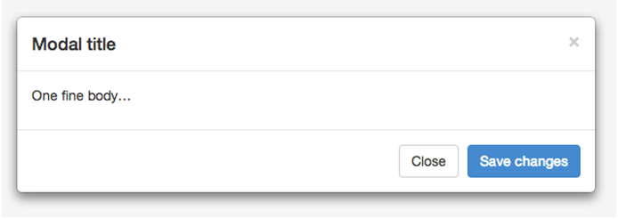
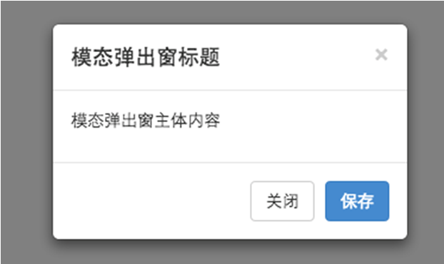
在 Bootstrap 框架中把模态弹出框统一称为 Modal。这种弹出框效果在大多数 Web 网站的交互中都可见。比如点击一个按钮弹出一个框,弹出的框可能是一段文件描述,也可能带有按钮操作,也有可能弹出的是一张图片。如下图所示:
<!DOCTYPE html>
<html>
<head>
<meta charset="utf-8">
<title>导入JavaScript插件</title>
<link rel="stylesheet" href="//maxcdn.bootstrapcdn.com/bootstrap/3.2.0/css/bootstrap.min.css">
</head>
<body>
<button class="btn btn-primary" type="button">点击我</button>
<div class="modal" id="mymodal">
    <div class="modal-dialog">
        <div class="modal-content">
            <div class="modal-header">
				<button type="button" class="close" data-dismiss="modal"><span aria-hidden="true">×</span><span class="sr-only">Close</span></button>
				<h4 class="modal-title">模态弹出窗标题</h4>
			</div>
			<div class="modal-body">
				<p>模态弹出窗主体内容</p>
			</div>
			<div class="modal-footer">
				<button type="button" class="btn btn-default" data-dismiss="modal">关闭</button>
				<button type="button" class="btn btn-primary">保存</button>
			</div>
		</div><!-- /.modal-content -->
	</div><!-- /.modal-dialog -->
</div><!-- /.modal -->

<script src="http://libs.baidu.com/jquery/1.9.0/jquery.js"></script>
<script src="http://cdn.bootcss.com/bootstrap/2.3.1/js/bootstrap-transition.js"></script>
<script src="http://cdn.bootcss.com/bootstrap/2.3.1/js/bootstrap-modal.js"></script>
<script>
  $(function(){
    $(".btn").click(function(){
      $("#mymodal").modal("toggle");
    });
  });
</script>
</body>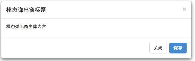
</html>Bootstrap框架中的模态弹出框,分别运用了“modal”、“modal-dialog”和“modal-content”样式,而弹出窗真正的内容都放置在“modal-content”中,其主要又包括三个部分:
? 弹出框头部,一般使用“modal-header”表示,主要包括标题和关闭按钮
? 弹出框主体,一般使用“modal-body”表示,弹出框的主要内容
? 弹出框脚部,一般使用“modal-footer”表示,主要放置操作按钮
如下图所示:
模态弹出窗的结构如下:
<div class="modal show"> <div class="modal-dialog"> <div class="modal-content"> <div class="modal-header"> <button type="button" class="close" data-dismiss="modal"><span aria-hidden="true">×</span><span class="sr-only">Close</span></button> <h4 class="modal-title">模态弹出窗标题</h4> </div> <div class="modal-body"> <p>模态弹出窗主体内容</p> </div> <div class="modal-footer"> <button type="button" class="btn btn-default" data-dismiss="modal">关闭</button> <button type="button" class="btn btn-primary">保存</button> </div> </div><!-- /.modal-content --> </div><!-- /.modal-dialog --> </div><!-- /.modal -->
弹出窗的主体样式实现:
但是对于一个模态弹出窗而言,modal-content才是样式的关键。其主要设置了弹出窗的边框、边距、背景色和阴影等样式。
/*bootstrap.css文件第5412行~第5423行*/
.modal-content {
  position: relative;
  background-color: #fff;
  -webkit-background-clip: padding-box;
          background-clip: padding-box;
  border: 1px solid #999;
  border: 1px solid rgba(0, 0, 0, .2);
  border-radius: 6px;
  outline: 0;
  -webkit-box-shadow: 0 3px 9px rgba(0, 0, 0, .5);
          box-shadow: 0 3px 9px rgba(0, 0, 0, .5);
}
除此之外,modal-content中的modal-header、modal-body和modal-footer三个部分样式设置:
/*bootstrap.css文件第5441行~第5461行*/
.modal-header {
  min-height: 16.42857143px;
  padding: 15px;
  border-bottom: 1px solid #e5e5e5;
}
.modal-header .close {
  margin-top: -2px;
}
.modal-title {
  margin: 0;
  line-height: 1.42857143;
}
.modal-body {
  position: relative;
  padding: 15px;
}
.modal-footer {
  padding: 15px;
  text-align: right;
  border-top: 1px solid #e5e5e5;
}
这三个部分主要控制一些间距的样式。而modal-footer都是用来放置按钮,所以底部还对包含的按钮做了一定的样式处理。
/*bootstrap.css文件第5462行~第5471行*/
.modal-footer .btn + .btn {
  margin-bottom: 0;
  margin-left: 5px;
}
.modal-footer .btn-group .btn + .btn {
  margin-left: -1px;
}
.modal-footer .btn-block + .btn-block {
  margin-left: 0;
}
实现原理解析:
bootstrap中的“模态弹出框”有以下几个特点:
1、模态弹出窗是固定在浏览器中的。
2、单击右侧全屏按钮,在全屏状态下,模态弹出窗宽度是自适应的,而且modal-dialog水平居中。
3、当浏览器视窗大于768px时,模态弹出窗的宽度为600px。
固定在浏览器(源代码)实现:
/*bootstrap.css文件第5379行~第5389行*/
.modal {
  position: fixed;
  top: 0;
  right: 0;
  bottom: 0;
  left: 0;
  z-index: 1050;
  display: none;
  overflow: hidden;
  -webkit-overflow-scrolling: touch;
  outline: 0;
}
水平居中(源代码)实现:
/*bootstrap.css文件第5407行~第5411行*/
.modal-dialog {
  position: relative;
  width: auto;
  margin: 10px;
}
当浏览器视窗大于768px时,模态弹出窗的宽度为600px(源代码)实现:
/*bootstrap.css文件第5479行~第5491行*/
@media (min-width: 768px) {
  .modal-dialog {
    width: 600px;
    margin: 30px auto;
  }
  .modal-content {
    -webkit-box-shadow: 0 5px 15px rgba(0, 0, 0, .5);
            box-shadow: 0 5px 15px rgba(0, 0, 0, .5);
  }
  .modal-sm {
    width: 300px;
  }
}
蒙板样式实现:
大家或许注意到了,在做模态弹出窗时,底部常常会有一个透明的黑色蒙层效果,如下图所示:
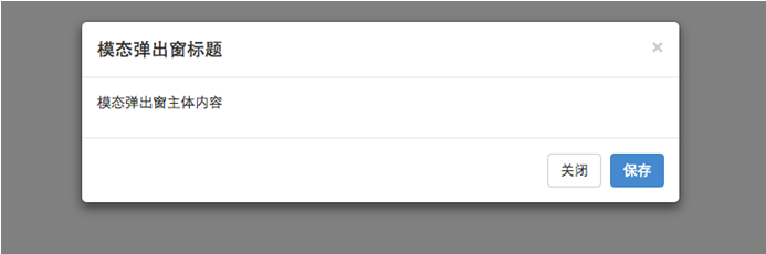
在Bootstrap框架中为模态弹出窗也添加了一个这样的蒙层样式“modal-backdrop”,只不过他默认情况下是全屏黑色的:
/*bootstrap.css文件第5424行~第5432行*/
.modal-backdrop {
  position: fixed;
  top: 0;
  right: 0;
  bottom: 0;
  left: 0;
  z-index: 1040;
  background-color: #000;
}
同样,给其添加了一个过渡动画,从fade到in,把opacity值从0变成了0.5。上图展示的就是in状态下的效果:
/*bootstrap.css文件第5433行~第5440行*/
.modal-backdrop.fade {
  filter: alpha(opacity=0);
  opacity: 0;
}
.modal-backdrop.in {
  filter: alpha(opacity=50);
  opacity: .5;
}
两种尺寸选择:
除此之外,Bootstrap框架还为模态弹出窗提供了不同尺寸,一个是大尺寸样式“modal-lg”,另一个是小尺寸样式“modal-sm”。其结构上稍做调整:
<!-- 大尺寸模态弹出窗 -->
<div class="modal fade bs-example-modal-lg" tabindex="-1"role="dialog" aria-labelledby="myLargeModalLabel" aria-hidden="true">
    <divclass="modal-dialog modal-lg">
       <divclass="modal-content"> ... </div>
    </div>
</div>
<!-- 小尺寸模态弹出窗 -->
<divclass="modal fade bs-example-modal-sm"tabindex="-1"role="dialog" aria-labelledby="mySmallModalLabel" aria-hidden="true">
    <divclass="modal-dialog modal-sm">
       <divclass="modal-content"> ... </div>
    </div>
</div>
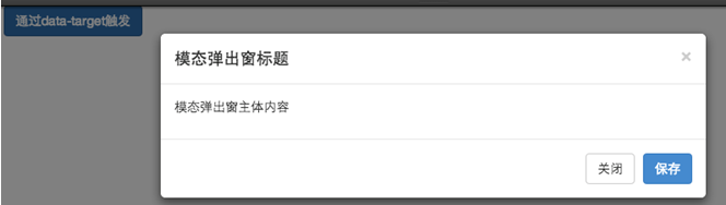
来简单的看一个示例效果:
对于这两种尺寸的模态弹出窗,Bootstrap在媒体查询中做过处理:代码同上见bootstrap.css
原文地址:http://blog.csdn.net/lovesomnus/article/details/44056577