标签:
先上成果:

完整代码如下:
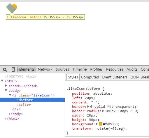
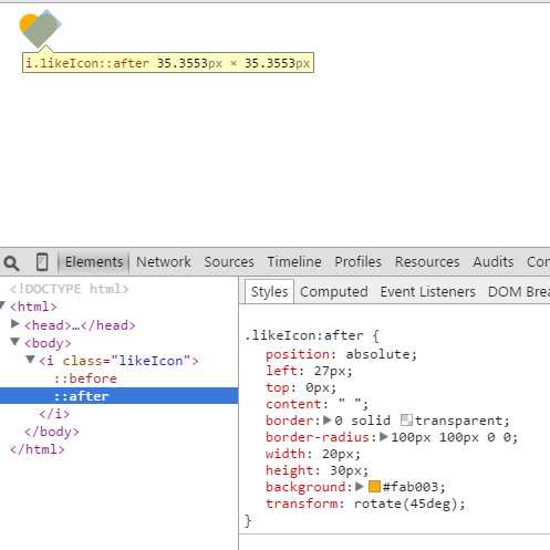
 1 <!DOCTYPE html>
 2 <html>
 3 <head>
 4     <meta charset="utf-8"/>
 5     <title>CSS3画爱心</title>
 6     <style>
 7         .likeIcon {
 8             width: 40px;
 9             height: 60px;
10             position: relative;
11         }
12
13         .likeIcon:before {
14             position: absolute;
15             left: 20px;
16             content: " ";
17             border: 0 solid transparent;
18             border-radius: 100px 100px 0 0;
19             width: 20px;
20             height: 30px;
21             background: #fab003;
22             transform: rotate(-45deg);
23
24         }
25
26         .likeIcon:after {
27             position: absolute;
28             left: 27px;
29             top: 0px;
30             content: " ";
31             border: 0 solid transparent;
32             border-radius: 100px 100px 0 0;
33             width: 20px;
34             height: 30px;
35             background: #fab003;
36             transform: rotate(45deg);
37
38         }
39     </style>
40 </head>
41 <body>
42
43     <i class="likeIcon"></i>
44
45 </body>
46 </html>
3.两张图看原理
标签:
原文地址:http://www.cnblogs.com/anywing/p/4729121.html