标签:div wrap 方法 中间 class 详细介绍 float red contain
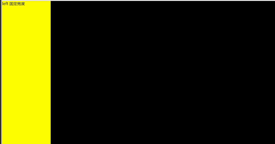
1.左栏固定,右栏自适应
<!DOCTYPE html>
<html>
<head>
    <title>一栏固定一栏自适应</title>
    <style type="text/css">
        *{
            margin: 0;
            padding:0;
        }
        #left{
            width: 200px;
            height: 600px;
            float: left;
            background-color: #fffc00;
        }
        #main{
            height: 600px;
            width: auto;;
            background-color: #000;
        }
    </style>
</head>
<body>
<!--一栏固定一栏自适应-->
<div id="left">left 固定宽度</div>
<div id="main">main 自适应宽度</div>
</body>
</html>
实现效果:
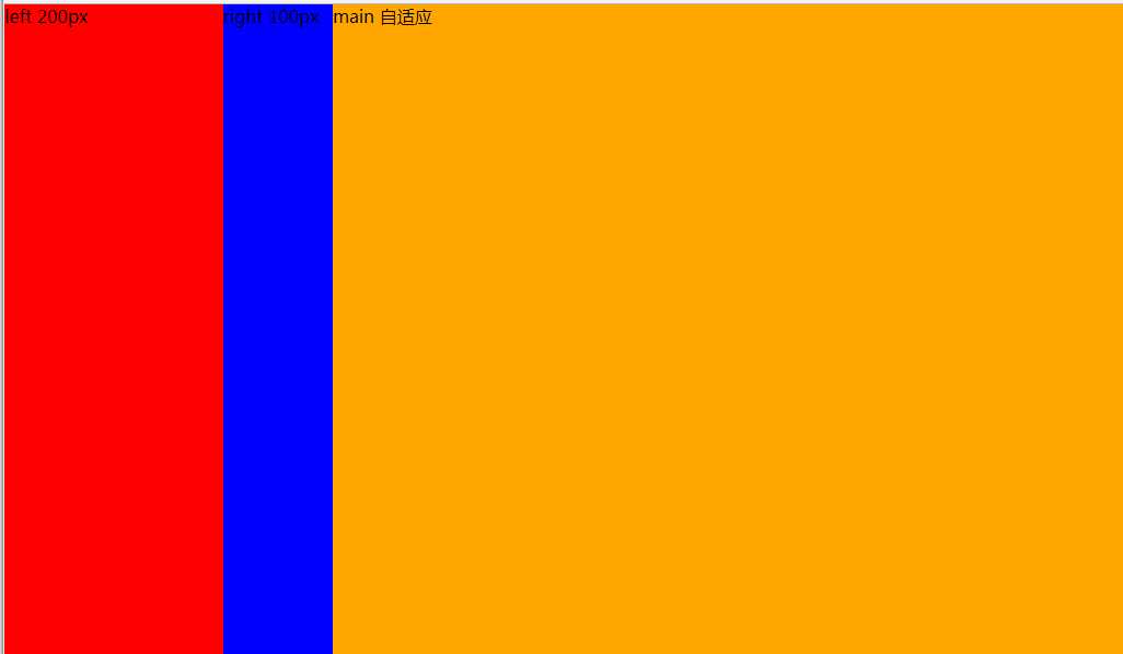
2左右两栏固定,中间自适应
方法一:使用float浮动
自身浮动法的原理就是对左右两栏分别使用float:left和float:right。float使左右两栏脱离文档流。中间元素不浮动,还在正常的文档流中,对中间元素使用margin指定左右外边距对其进行定位
<!DOCTYPE html>
<html>
<head>
    <title>左右两栏固定,中间自适应</title>
    <style type="text/css">
        *{
            margin: 0;
            padding:0;
        }
        #container{
            width: 100%;
            margin: 0 auto;
        }
        #left{
            width: 200px;
            height: 600px;
            float: left;
            background-color: red;
        }
        #right{
            width: 100px;
            height: 600px;
            float: left;
            background-color: blue;
        }
        #main{
            height: 600px;
            background-color: orange;
            margin: 0 100px 0 200px;
        }
    </style>
</head>
<body>


<div id="container">
    <div id="left">left 200px</div>
    <div id="right">right 100px</div>
    <div id="main">main 自适应</div>
</div>
</body>
</html>

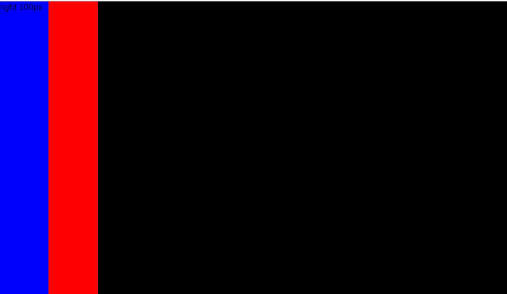
方法二:使用绝对定位
原理:将左右两栏进行absolute定位,使其脱离文档流。中间的一栏会自动浮到上面,然后使用left和right分别对应另外两个元素的宽度。
<!DOCTYPE html>
<html>
<head>
    <title>左右两栏固定,中间自适应</title>
    <style type="text/css">
        *{
            margin: 0;
            padding:0;
        }
        #container{
            width: 100%;
            margin: 0 auto;
        }
        #left{
            width: 200px;
            height: 600px;
            float: left;
            background-color: red;
        }
        #right{
            width: 100px;
            height: 600px;
            float: left;
            background-color: blue;
        }
        #main{
            height: 600px;
            background-color: orange;
            margin: 0 100px 0 200px;
        }
    </style>
</head>
<body>


<div id="container">
    <div id="left">left 200px</div>
    <div id="right">right 100px</div>
    <div id="main">main 自适应</div>
</div>
</body>
</html>
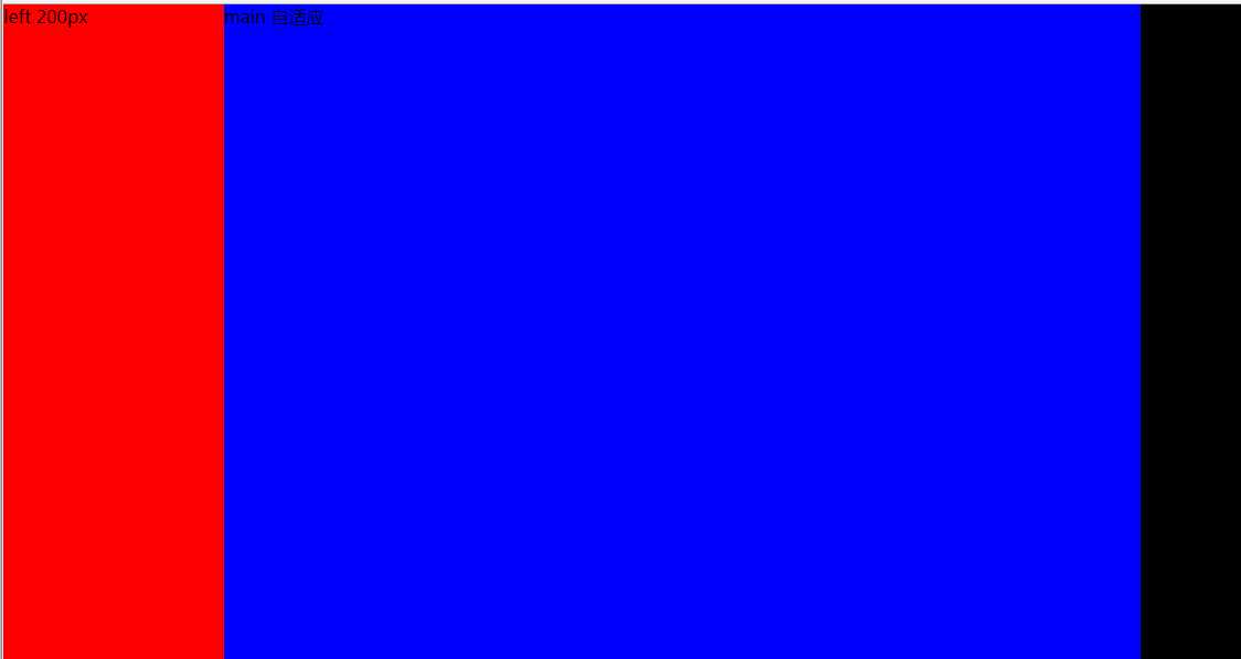
方法三:使用负margin(圣杯布局)
原理:这里不做详细介绍圣杯布局。可自行百度。放下代码。
<!DOCTYPE html>
<html>
<head>
    <title></title>
    <style type="text/css">
        *{
            margin: 0;
            padding: 0;
        }
        #wrap{
            width: 100%;
            float: left;
        }
        #main{
            height: 600px;
            margin: 0 100px 0 200px;
            background-color: #000;
        }
        #left{
            width: 200px;
            height: 600px;
            float: left;
            margin-left: -100%;
            background-color: red;
        }
        #right{
            width: 100px;
            height: 600px;
            float: left;
            margin-left: -100%;
            background-color: blue;
        }
    </style>
</head>
<body>


<div id="wrap">
    <div id="main">main 自适应</div>
</div>

<div id="left">left 200px</div>
<div id="right">right 100px</div>
</body>
</html>
方法四:使用flex(css3新特性)
<!DOCTYPE html>
<html>
<head>
    <title></title>
    <style type="text/css">
        *{
            margin: 0;
            padding: 0;
        }
        #container{
            width: 100%;
            display: flex;
        }
        #left{
            width: 200px;
            height: 600px;
            background-color: red;
        }
        #right{
            width: 100px;
            height: 600px;
            background-color: #000;
        }
        #main{
            height: 600px;
            background-color: blue;
            width: auto;
            flex: 1;
        }
    </style>
</head>
<body>


<div id="container">
    <div id="left">left 200px</div>
    <div id="main">main 自适应</div>
    <div id="right">right 100px</div>
</div>
</body>
</html>
标签:div wrap 方法 中间 class 详细介绍 float red contain
原文地址:http://www.cnblogs.com/chaofei/p/7747690.html