标签:src def code Dimension 屏幕 direct sans cti dir
本文基于React Native 0.52
Demo上传到Git了,有需要可以看看,写了新内容会上传的。Git地址 https://github.com/gingerJY/React-Native-Demo
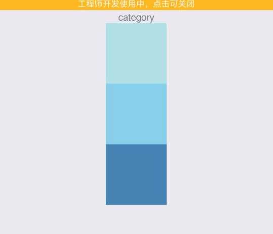
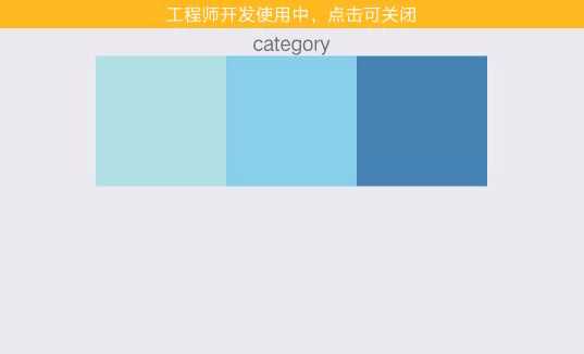
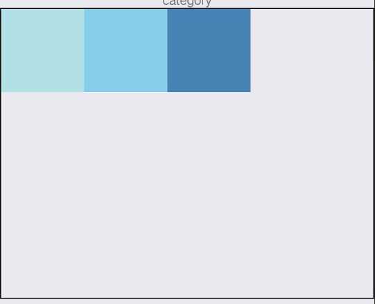
flexDirection决定主轴的排列方向。
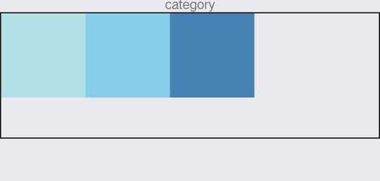
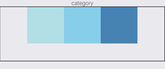
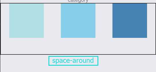
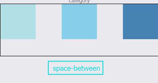
justifyContent决定其子元素沿着主轴的排列方式。(以下例子主轴方向为row)
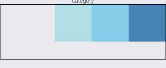
alignItems决定其子元素沿着次轴的排列方式。(以下例子主轴方向为row,次轴方向为column)
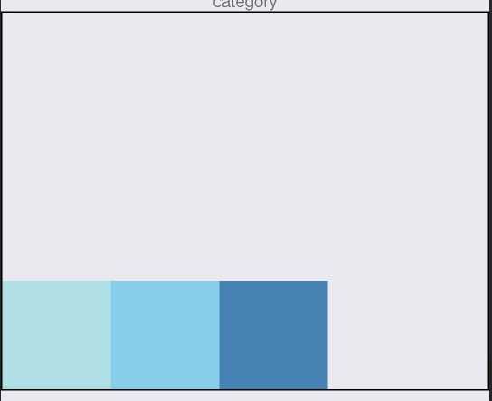
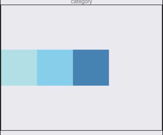
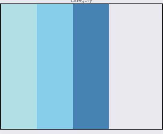
可以自己试着改变看看,需要注意的是alignItems设为stretch时,要把子元素的次轴尺寸去掉(例如主轴方向为row,则去掉height)。
import React, { Component } from ‘react‘;
import {
    StyleSheet,
    View,
    Text,
    Dimensions,
} from ‘react-native‘;

// 取得屏幕的宽高Dimensions
const { width, height } = Dimensions.get(‘window‘);

export default class category extends Component {

    render() {
        return (
            <View style={styles.container}>
                <Text>category</Text>
                <View style={styles.flexBox}>
                    <View style={{width: 80, height:80, backgroundColor: ‘powderblue‘}} />
                    <View style={{width: 80, height:80, backgroundColor: ‘skyblue‘}} />
                    <View style={{width: 80, height:80, backgroundColor: ‘steelblue‘}} />
                </View>
            </View>
        );
    }
}
const styles = StyleSheet.create({
    container: {
        flex: 1,
        alignItems: ‘center‘,
    },
    flexBox:{
        width:width,
        height:280,
        borderWidth:1,

        flexDirection:‘row‘,//主轴方向
        justifyContent:‘space-between‘, //flex-start,flex-end,center,space-between,space-around
        alignItems:‘center‘,//flex-start,flex-end,center,stretch
    }
});
END-------------------------------------------------------
React Native学习(九)—— 使用Flexbox布局
标签:src def code Dimension 屏幕 direct sans cti dir
原文地址:https://www.cnblogs.com/MaiJiangDou/p/8746525.html