标签:set info group randn idt 限制 red var max
一.单条
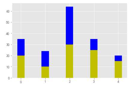
import numpy as np
import matplotlib.pyplot as plt

N = 5
y1 = [20, 10, 30, 25, 15]
y2 = [15, 14, 34 ,10,5]
index = np.arange(5)

bar_width = 0.3
plt.bar(index , y1, width=0.3 , color=‘y‘)
plt.bar(index , y2, width=0.3 , color=‘b‘ ,bottom=y1)
plt.show()
二.误差棒
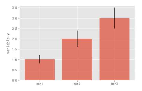
mean_values = [1,2,3]
#误差范围
variance = [0.2,0.4,0.5]
bar_label = [‘bar1‘,‘bar2‘,‘bar3‘]

x_pos = list(range(len(bar_label)))
plt.bar(x_pos,mean_values,yerr=variance,alpha=0.7)
max_y = max(zip(mean_values,variance))
plt.ylim([0,max_y[0]+max_y[1]*1.2])
plt.ylabel(‘variable y‘)
plt.xticks(x_pos,bar_label)
plt.show()
三.背靠背
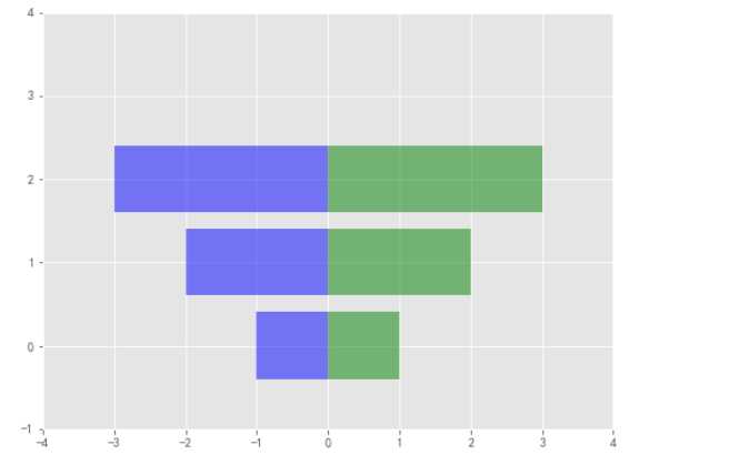
x1 = np.array([1,2,3])
x2 = np.array([2,2,3])

bar_labels = [‘bar1‘,‘bar2‘,‘bar3‘]
fig = plt.figure(figsize=(8,6))
y_pos = np.arange(len(x1))
y_pos = [x for x in y_pos]
#bar竖着 barh横着
plt.barh(y_pos,x1,color=‘g‘,alpha=0.5)
plt.barh(y_pos,-x1,color=‘b‘,alpha=0.5)
#x y轴范围限制
plt.xlim(-max(x2)-1,max(x1)+1)
plt.ylim(-1,len(x1)+1)
plt.show()
四.三条
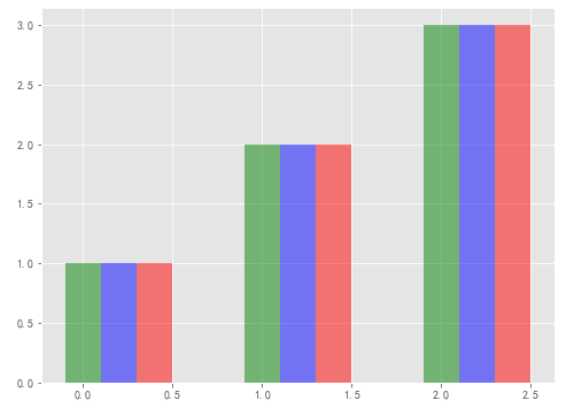
green_data = [1,2,3]
blue_data = [3,2,1]
red_data = [2,3,1]
labels = [‘group 1‘,‘group 2‘,‘group 3‘]

pos = list(range(len(green_data)))
width = 0.2
fig,ax = plt.subplots(figsize=(8,6))

plt.bar(pos, green_data,width,alpha=0.5,color=‘g‘,label=labels[0])
plt.bar([p+width for p in pos], green_data,width,alpha=0.5,color=‘b‘,label=labels[1])
plt.bar([p+width*2 for p in pos], green_data,width,alpha=0.5,color=‘r‘,label=labels[2])
plt.show()
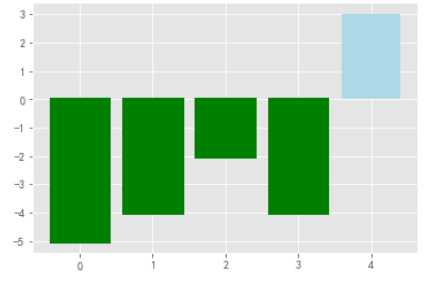
五.正负
x = np.arange(5)
#(-5,5)随机五个数
y = np.random.randint(-5,5,5)
fig,ax = plt.subplots()
v_bars = ax.bar(x,y,color=‘lightblue‘)
for bar,height in zip(v_bars,y):
    if height < 0:
        bar.set(edgecolor = ‘darkred‘, color = ‘green‘, linewidth = 3)
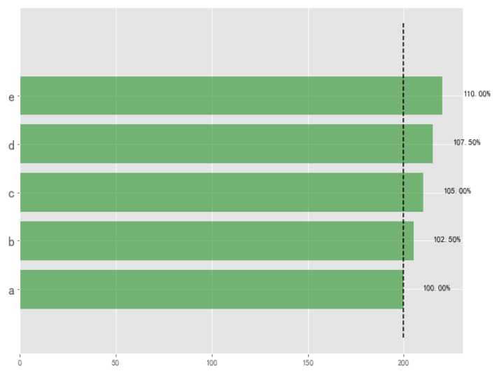
六.标线
#随机五个数
data = range(200,225,5)
#坐标标注
bar_labels = [‘a‘,‘b‘,‘c‘,‘d‘,‘e‘]
#条形的长宽
fig = plt.figure(figsize=(10,8))
#5个
y_pos = np.arange(len(data))
plt.yticks(y_pos, bar_labels, fontsize=16)
bars = plt.barh(y_pos,data,alpha = 0.5,color = ‘g‘)
#按照最小值的位置画垂直的竖线
plt.vlines(min(data), -1, len(data)+0.5,linestyles=‘dashed‘)
#把值写到后面
for b,d in zip(bars,data):
    plt.text(b.get_width() + b.get_width()*0.05,
             b.get_y()+b.get_height()/2,
             ‘{0:.2%}‘.format(d/min(data)))
plt.show()
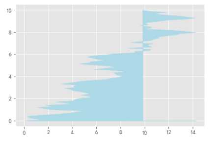
另:折线填充
x = np.random.randn(100).cumsum()
y = np.linspace(0,10,100)

fig,ax = plt.subplots()
#折线图填充
ax.fill_between(x,y,color=‘lightblue‘)
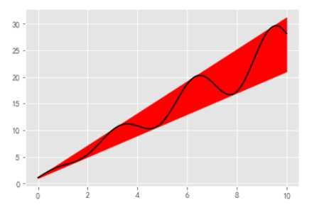
x = np.linspace(0,10,200)
y1 = 2*x + 1
y2 = 3*x +1.2
y_mean = 0.5*x*np.cos(2*x) + 2.5*x + 1.1
fig,ax = plt.subplots()
ax.fill_between(x,y1,y2,color=‘red‘)
ax.plot(x,y_mean,color=‘black‘)
标签:set info group randn idt 限制 red var max
原文地址:https://www.cnblogs.com/lingluo2017/p/9484568.html